This Itechguide teaches you how to make a histogram in Google Sheets . The guide covers steps to make a histogram in Google Sheets from a PC and from the Google Sheets App.
Option 1: Make a Histogram from a PC
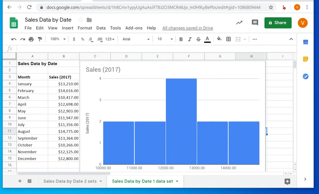
- Open the Google Sheets with the data you want to use for your histogram. Here is a sample data for the demo in this guide.
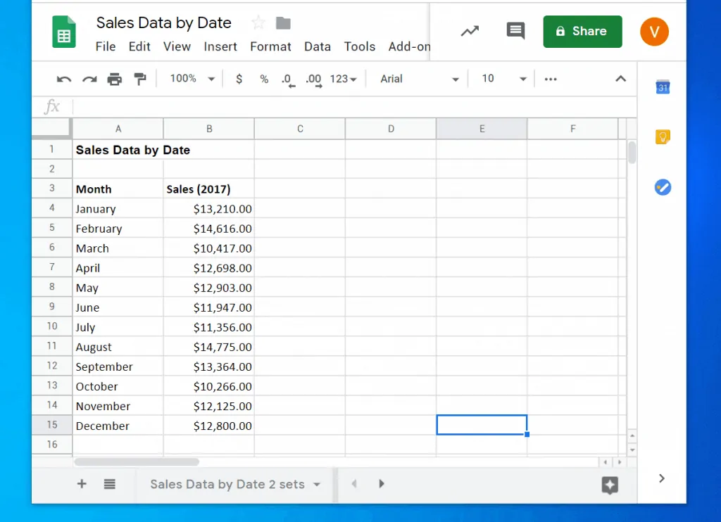
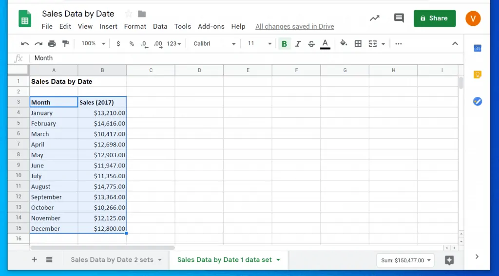
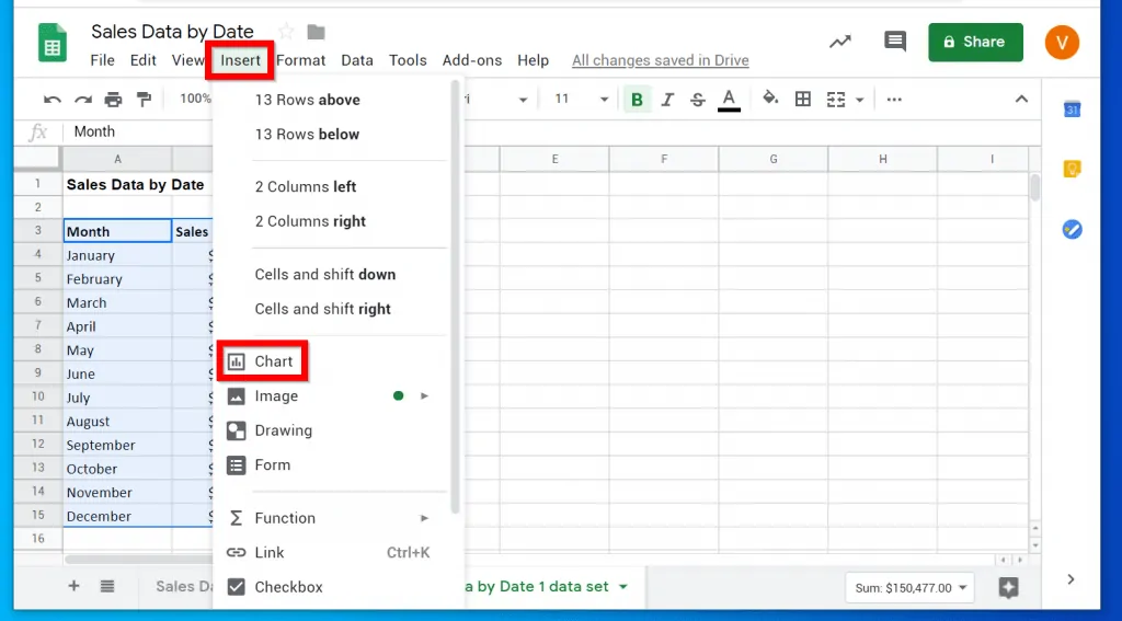
- Then highlight the entire data including the headers.
- With the data and the headers highlighted, click Insert. Then click Chart.
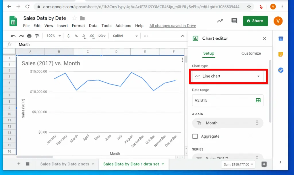
- By default, a line Chart will be inserted – the Chart editor will also open automatically. To change the Chart type to histogram, click the Chart type drop-down.
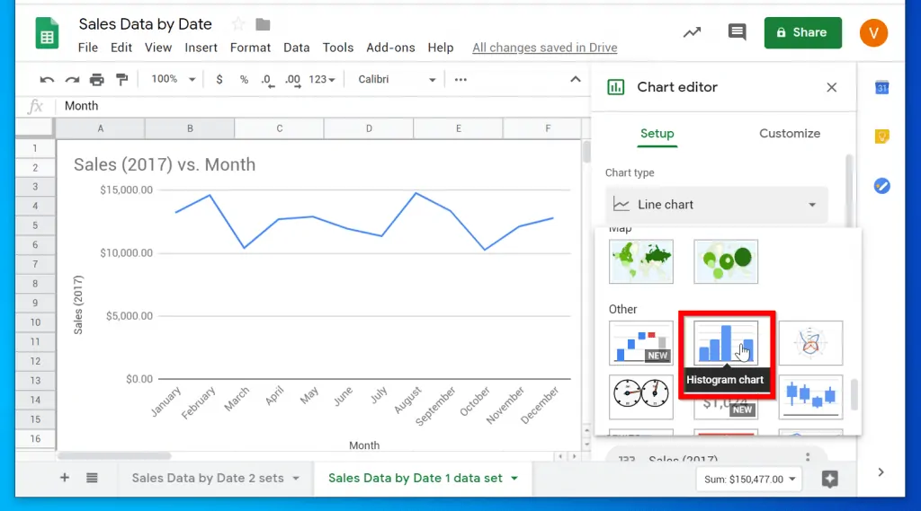
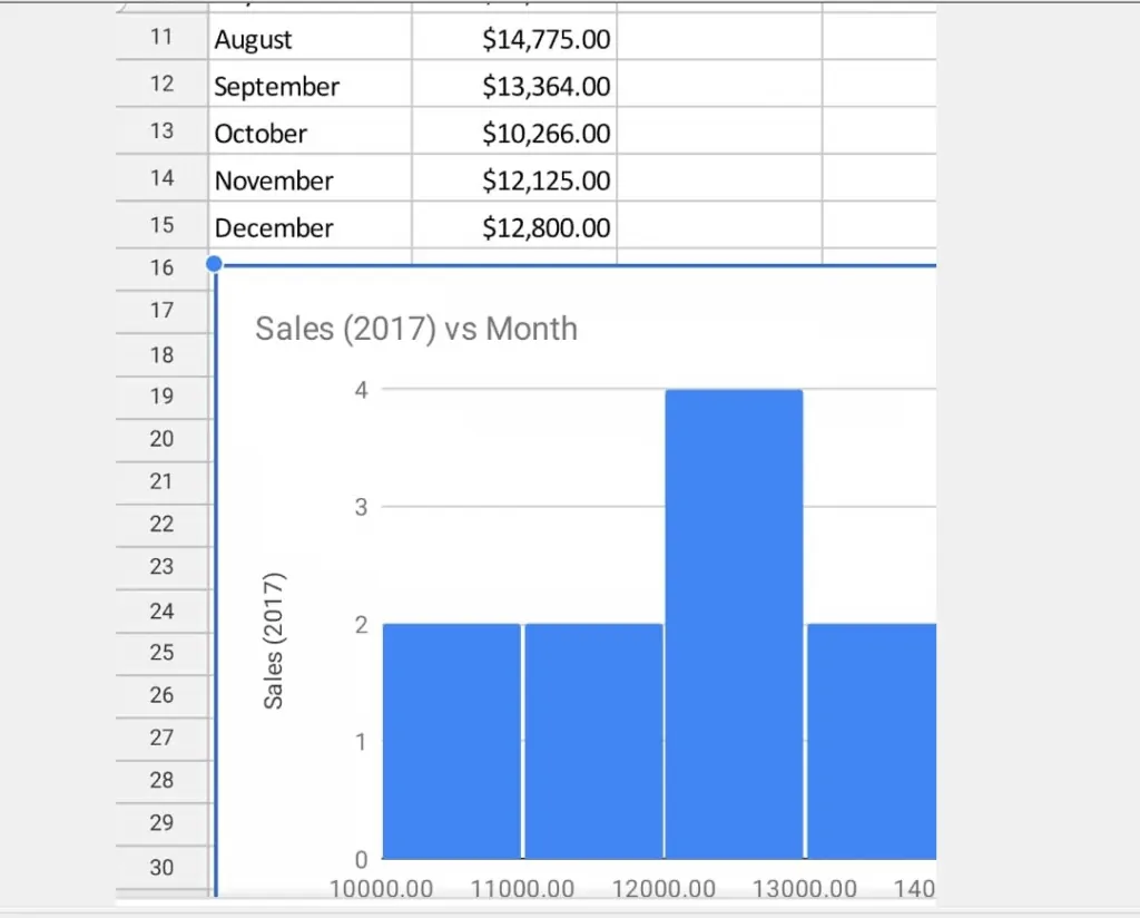
- Then, scroll down to and select Histogram chart.
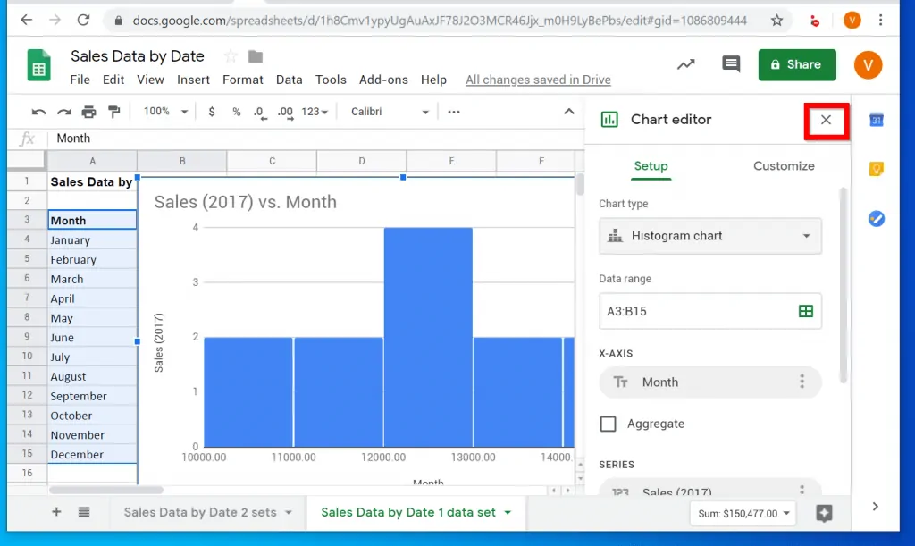
- The Chart type will be changed to Histogram. To close the Chart editor, click the highlighted x sign on top of the editor. Then drag the chart away from the raw data.
To drag the chart, click on it to highlight it (the 4 corners will have a line). Then click, hold and drag.
Option 2: Make a Histogram via the App
To complete the task in this section you need to install Google Sheets App on your phone.
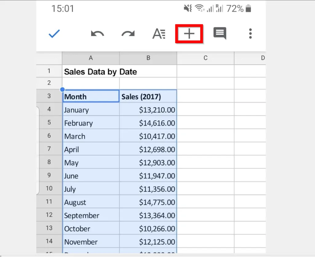
- Open Google Sheets App on your phone.

- Then open the Google Sheets with the data you want to use to make a histogram. Highlight the entire data and click the + (Insert) sign on top of Google Sheets.
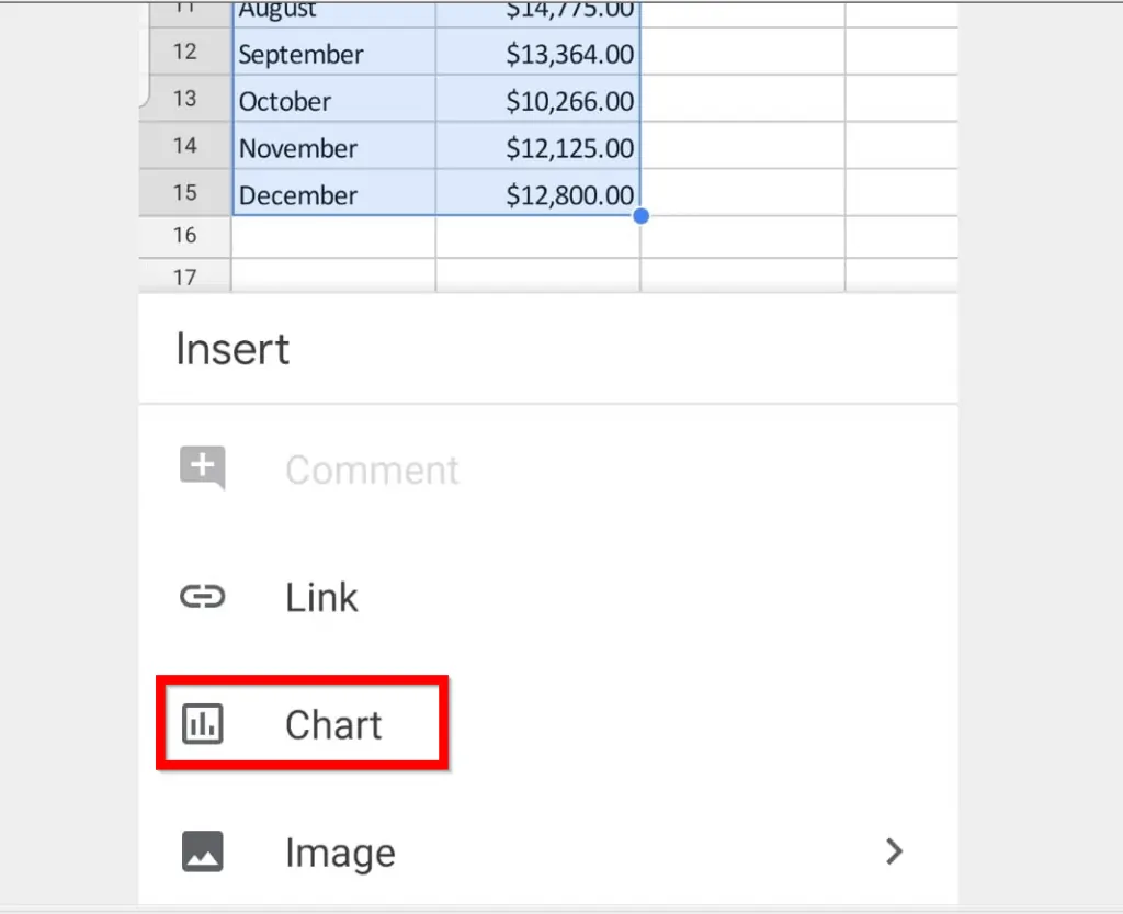
- When you click the + (Insert) sign, a drop-down will be displayed. On the Insert drop-down, click Chart. Google Sheets will insert a Column Chart. To change this to Histogram, see the next step.
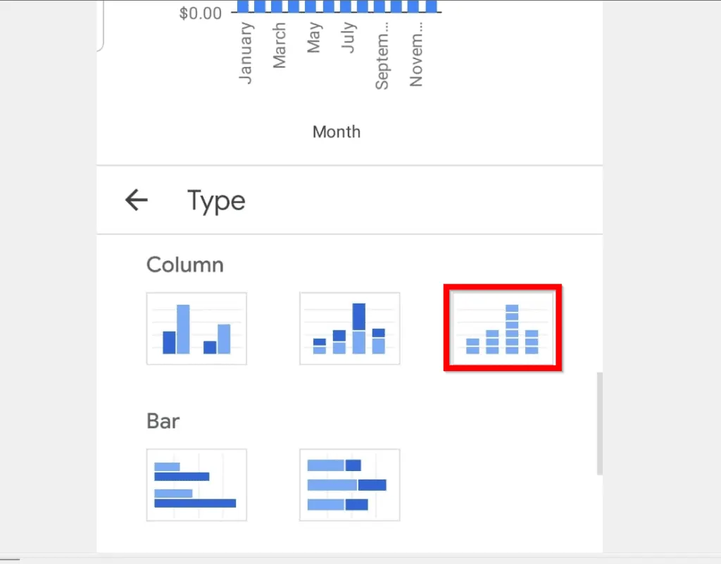
- To change the chart type, click Column chart (beside Type).

- When Chart Type settings opens, scroll down to Column category and select Histogram.
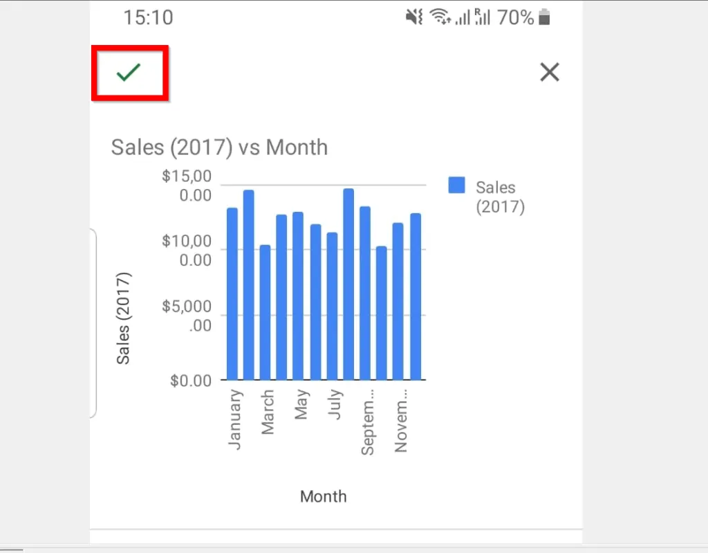
- To save your changes scroll up and on the top left of the app, click the green tick icon.
- To move the Chart away from the data, click on it then hold and drag.
It is this easy to make a histogram in Google Sheets! If you found this article helpful, click on “Yes” beside the “Was this page helpful” question below.
You may also express your thoughts and opinions by using the “Leave a Comment” form at the bottom of this page.
Finally, for more Google Itechguides, visit our Google How To page.