This guide demos how to create a bar chart in Excel and Google Sheets. A bar chart is used to visually compare values across categories.
Representing data in charts makes it easier to understand trends and make important business decisions.
Option 1: Create a Bar Chart in Excel
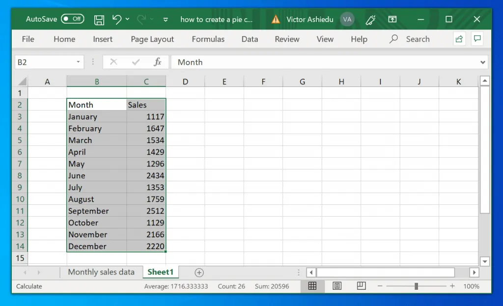
To create a bar chart in Excel you need a set of data. I will use the data in the Excel sheet below for my demo in this guide.
Here are the steps to create a bar chart in Excel with this data.
- Highlight all the data you wish to use (including the headers).
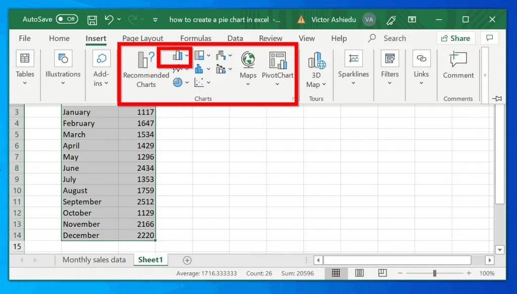
- Then click Insert tab..
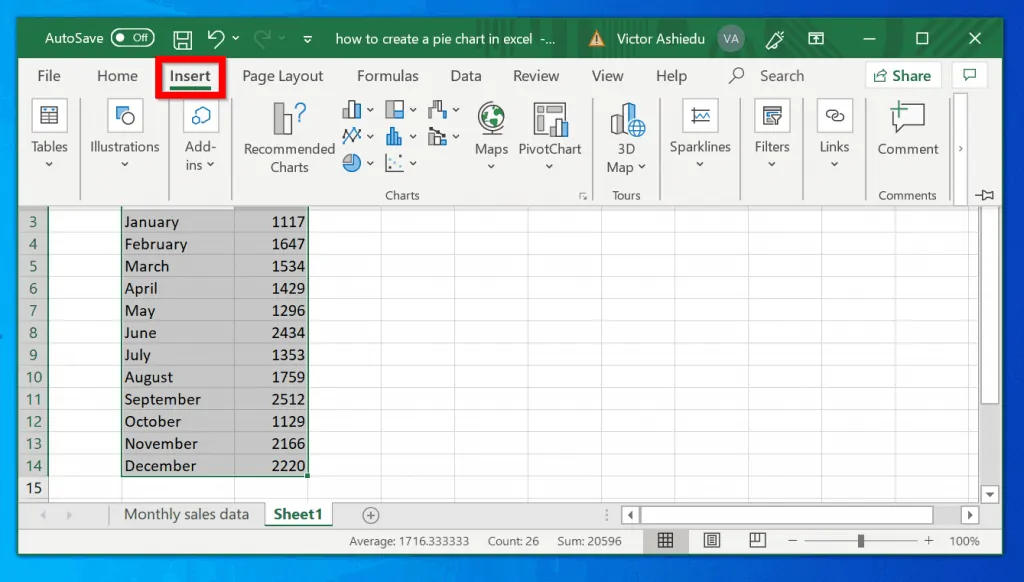
- When you click Insert tab, a drop-down with additional options will be displayed. Look for the Charts group (see the image below)…
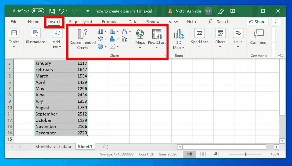
- Then, within the Charts group, click the bar chart icon (highlight in the image below – the smaller box).
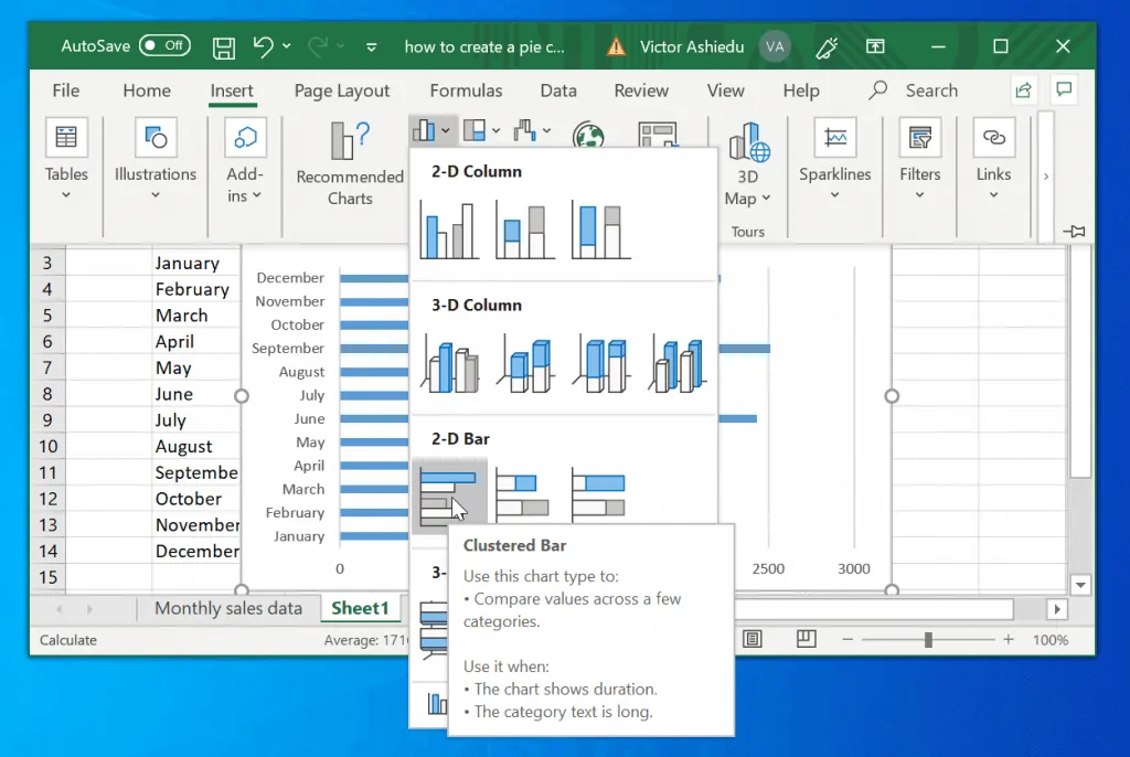
- Finally, click on the bar chart type you wish to use. When you click on a bar chart type, Excel will display the chart beneath.
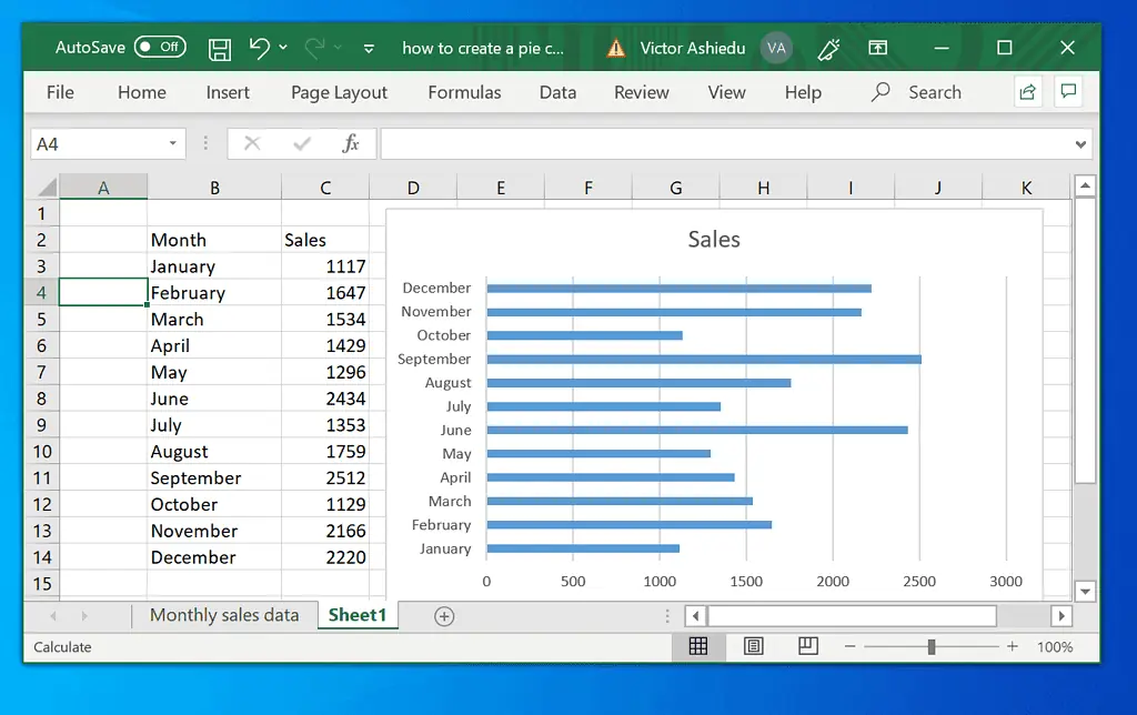
- Move the bar chart away from your raw data.
Option 2: Create a Bar Chart in Google Sheets
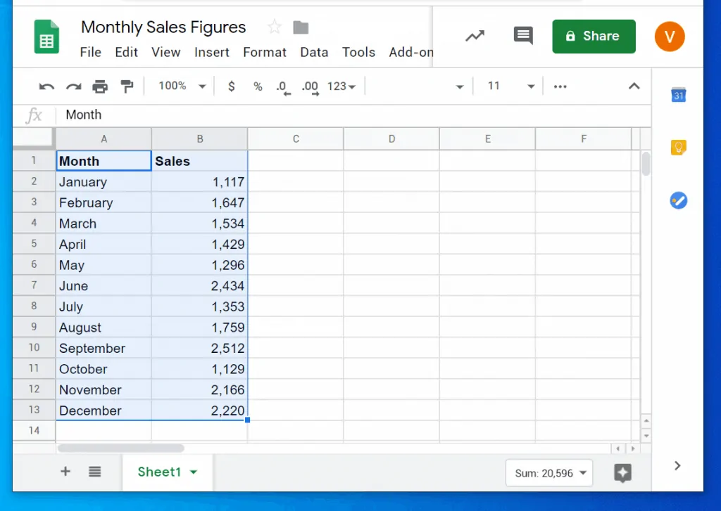
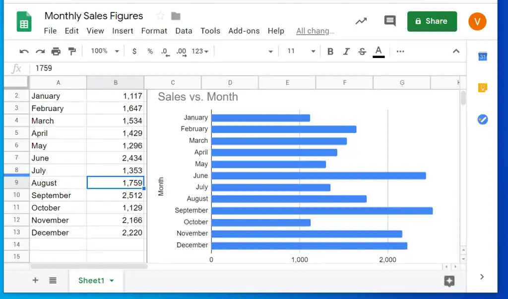
The Google Sheets in the image below contains the data I will use for the demo in this guide.
Here are the steps to create a bar chart in Google Sheets:
- Highlight the whole data in Google Sheets (including the headers).
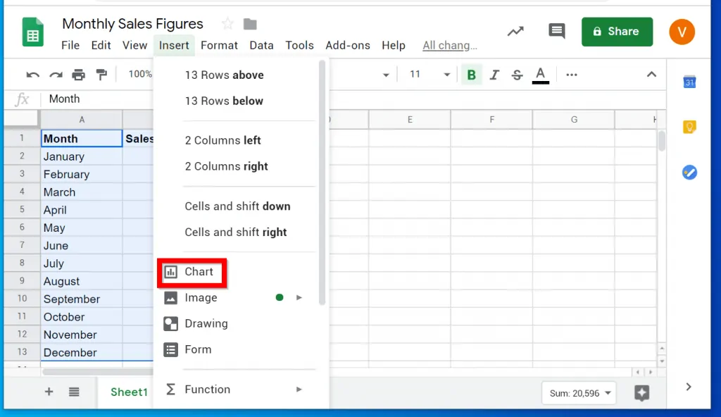
- With the data highlighted, click Insert tab.
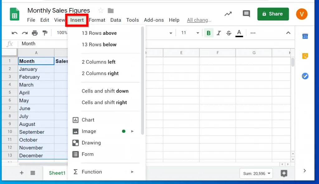
- Then click Charts.
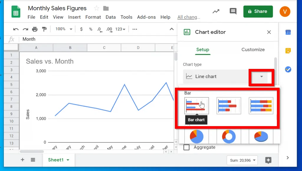
- By default Google Sheets will insert a Line chart. To change the chart type, click the drop-down beside Line chart. Then scroll down and click on one of the Bar charts.
- To close the chart insertion tool, click the x sign.
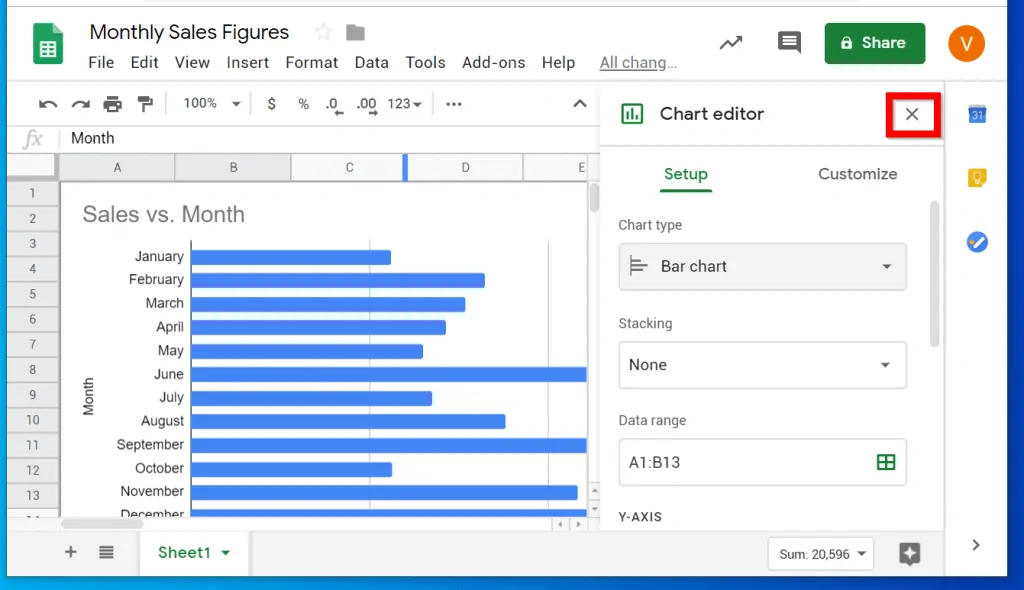
- Then drag the bar chart away from your raw data…
I mentioned at the beginning of this guide that a chart makes it easier to understand trends and make better business decisions.
From the bar chart above, you can make a visual comparison of all the sales data.
I hope you found this article helpful. If you did, click on “Yes” beside the “Was this page helpful” question below.
You may also express your thoughts and opinions by using the “Leave a Comment” form at the bottom of this page.
For more guides visit our Microsoft Office How-to page.