
Introduction
You can represent your data visually using a line graph in Google Sheets. This guide demonstrates how to make line graphs in Google Sheets.
How to Make a Single Line Graph in Google Sheets

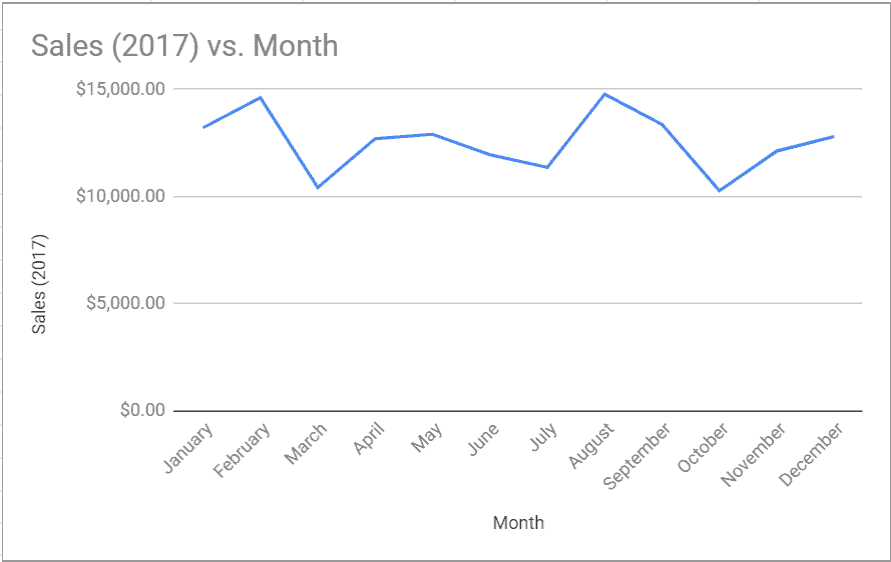
The Google sheets data in in the image above is a sales data for a business in 2017. You can present this data visually by making a line graph with Google Sheets.


Here are the steps to make a single line graph with the data using Google Sheets.
- Select the data including the headers. Then click the Insert tab.
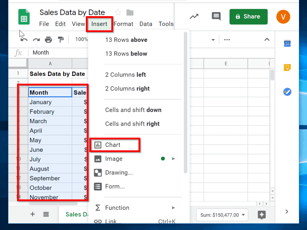
- Next, click Chart.
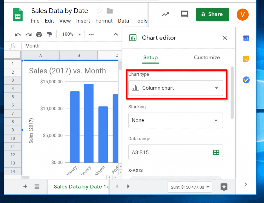
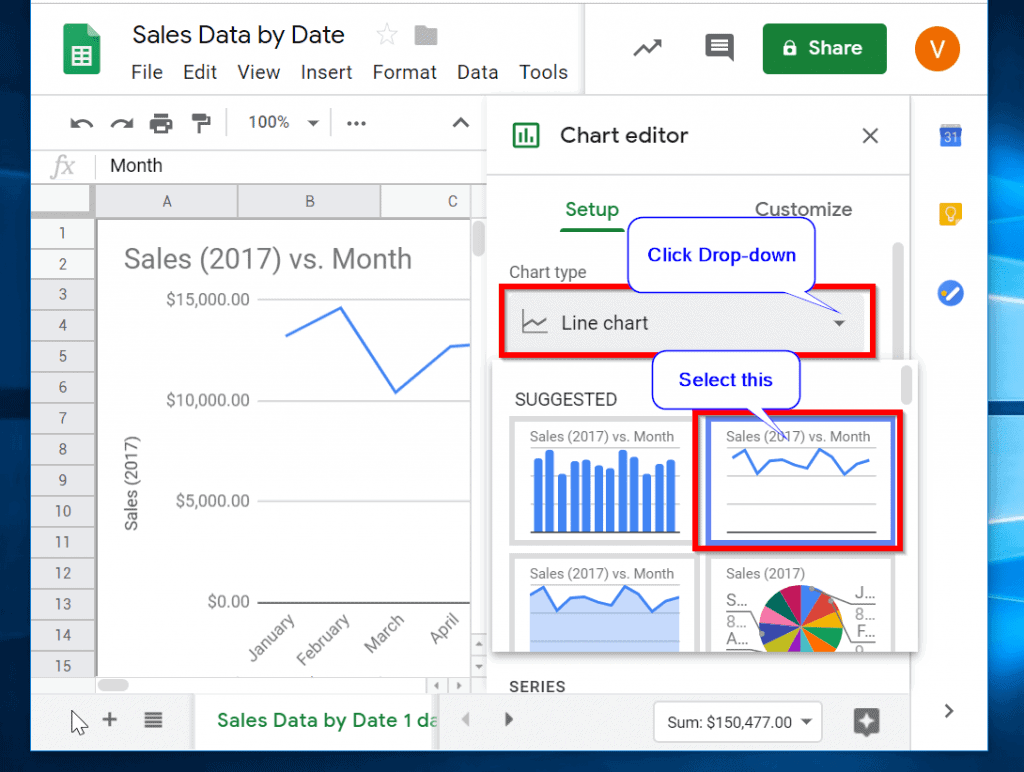
- To select line chart, click the drop-down beneath Chart type. Then select Line Chart.

How to Make a Line Graph in Google Sheets with Multiple Lines
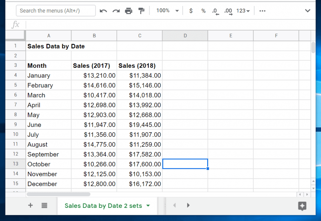
The image above shows two sets of sales data. One is for 2017, the other for 2018.
Quick wins for a faster PC:
Repair Windows errors before they cause bigger problemsFix Now →Scan for outdated or missing drivers - takes under a minuteDriver Scan →#1 Best Overall
To plot multiple line charts using the two data sets, follow the steps below:
- Select all the data, including their headers. Then click the Insert tab.

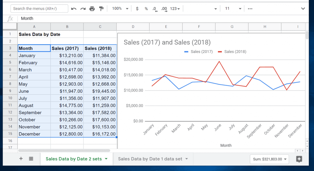
- On the Chart type drop-down select Line chart. To close the Chart editor, click the x beside it. Finally, drag and drop the line chart away from the chart data. See the second image below.

How to Edit a Line Chart in Google Sheets
After making your line graph, you may want to make some changes to the chart. This section will demonstrate how to do the following:
- Change chart background colors and fonts.
- Modify chart title, its font and style
- Make changes to the chart legend including its positioning
To edit the line chart, double-click it to show the Chart editor.
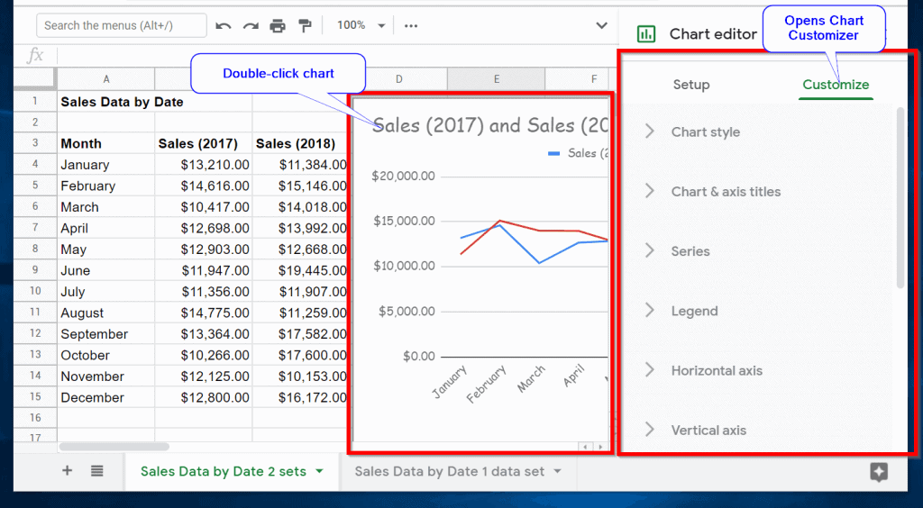
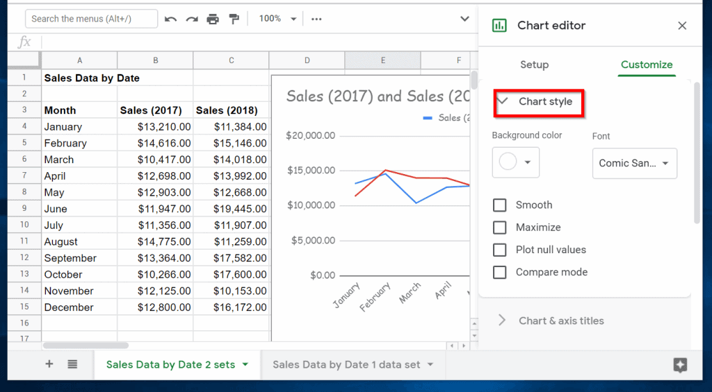
Change Chart Background Colors and Fonts
- Expand Chart style section. Here you can change the background of the chart. You also have the option to change the Font.
Modify Chart Title, Its Font and Style
- Click Charts and axis titles. Beneath Charts and axis titles, you can modify the Horizontal & axis titles. The current title for mine chart is Month. You can change yours to whatever you wish.


Change Google Sheets Chart Legend
- Expand Legend. Here you can change the position of the Line chart legend. By default, it is set to Auto.

- To change the position, click the Auto drop-down. Then select the where you wish to place the Chart legend.
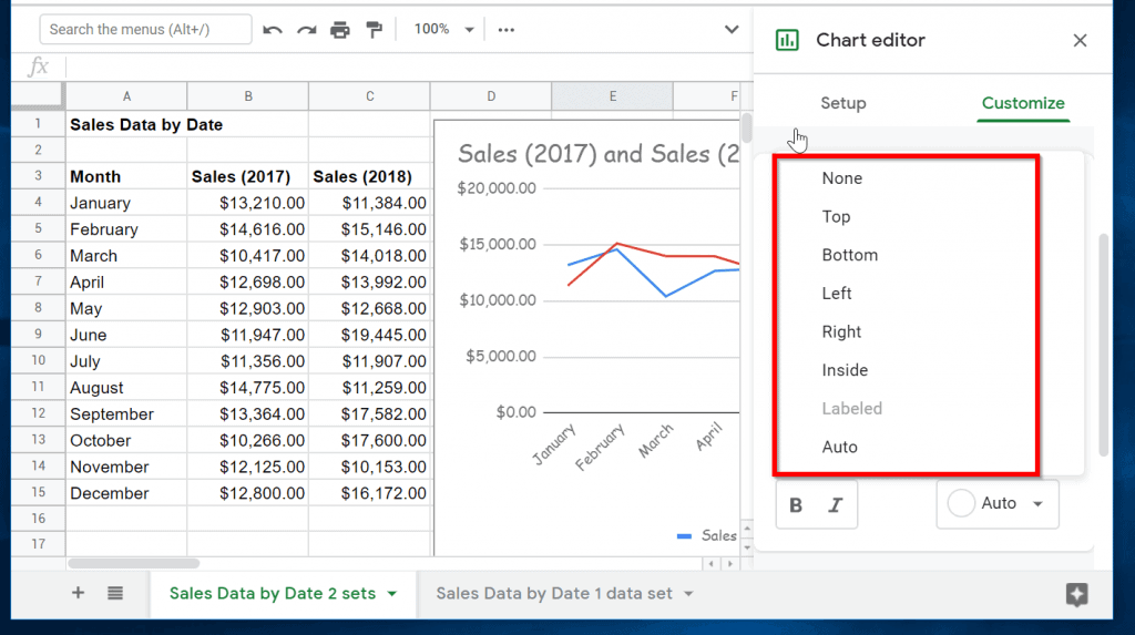
- Within the Chart legend section, you can modify the Legend font and font size. You can also change the format and its text color.
Conclusion
Making a line graph in Google Sheets is that simple.
The Tool Desk
Outbyte PC Repair FREERepair Windows errors before they cause bigger problemsFix Now →Outbyte Driver Updater FREEScan for outdated or missing drivers - takes under a minuteDriver Scan →Rank #3
- hole punched
- high quality card stock
- 4 pages
- made in USA
- keyboard shortcuts
I hope this Itechguide was helpful. If it was, kindly spare few minutes to share your thoughts with [discourse_topic_url].
If you have a question, feedback or comment please leave a reply on our community platform at [discourse_topic_url]. Our team and other community members will surely get back to you with a reply as soon as possible.
Alternatively, you could share your experience making line graphs in Google Sheets.
Quick Recap
Other Helpful Guides
Additional Resources and References
- Line charts
- Types of charts & graphs in Google Sheets
- [discourse_topic_url]
Product prices and availability are accurate as of the date/time indicated and are subject to change. Any price and availability information displayed on Amazon at the time of purchase will apply.
Free tools Windows power users keep installed
One-click scans. No signup required.


