Introduction
A line graph is a visual representation of a set of data. This guide shows you how to make a line Graph in Excel.
How to Make a Line Graph in Excel (Single Data Set)
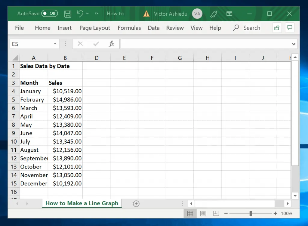
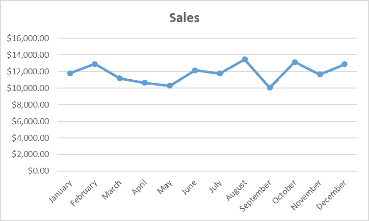
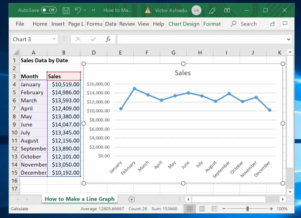
The image above shows a set of sales data for a business. It contains a single data set, sales data for a single year.
Follow the steps below to make a line graph for this data in Excel.
- Select the data you wish to make the line graph for, including the column headers. Then click the Insert tab.
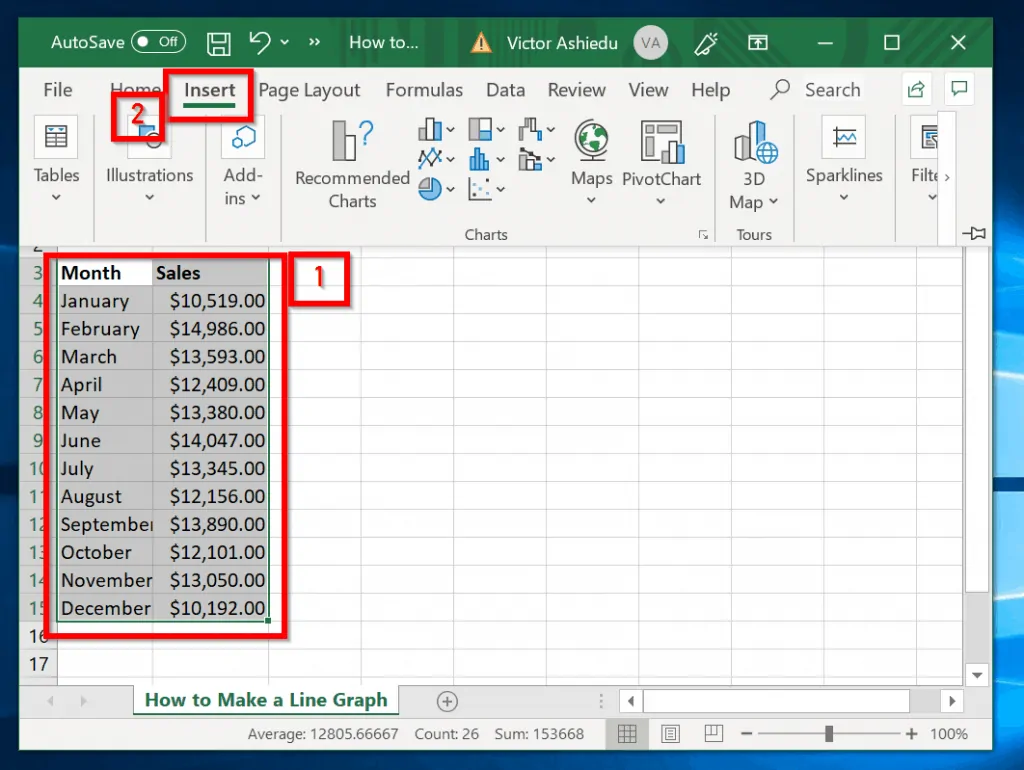
- Next, on the Recommended Charts section, click the chart drop-down [labelled 1]. Then select the chart you type.
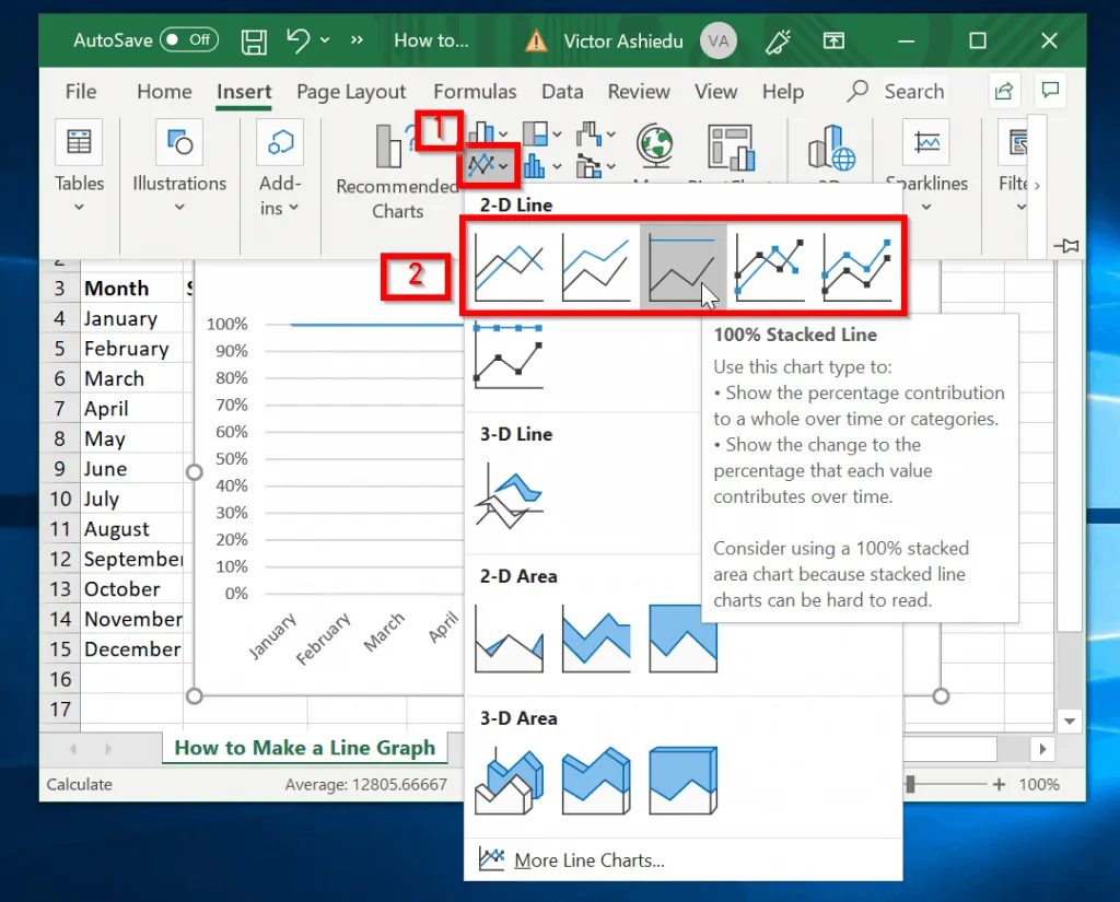
- Once you make a selection, the chart will be displayed. You can reposition the chart by simply dragging and dropping it (more on this later).
How to Make a Line Graph in Excel with Two Sets of Data
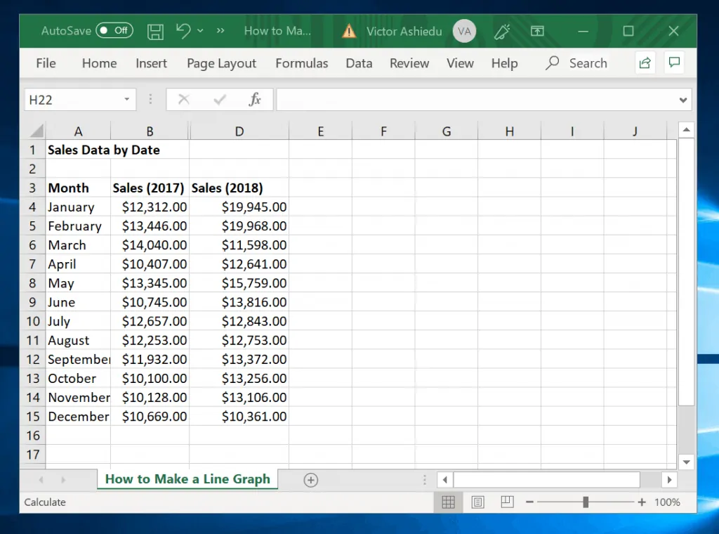
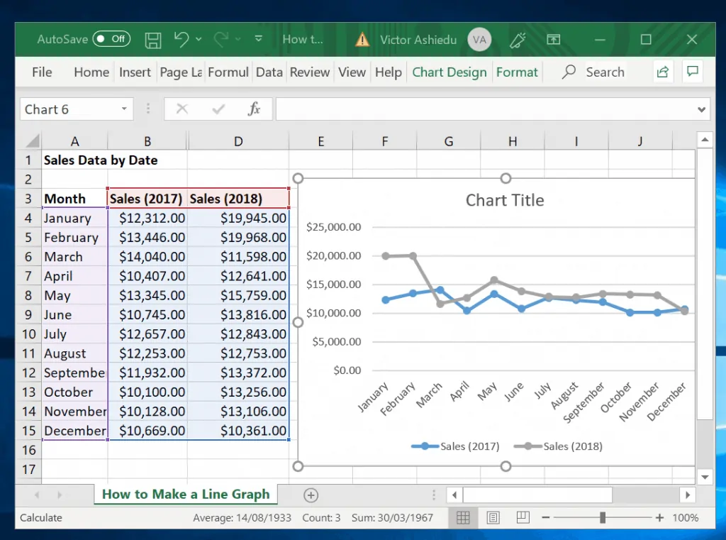
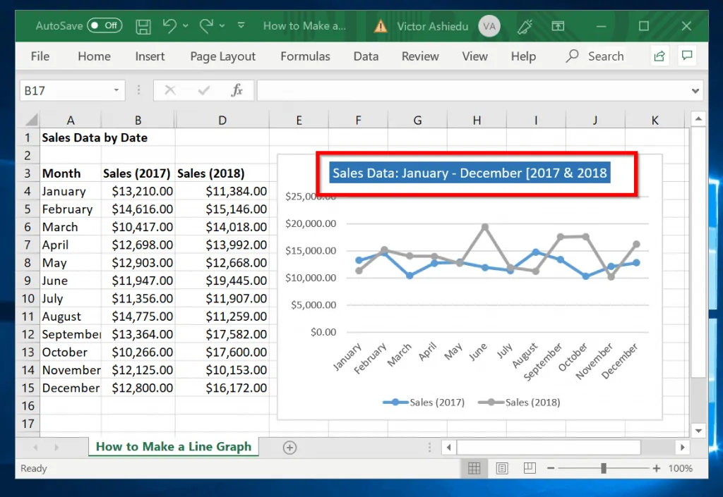
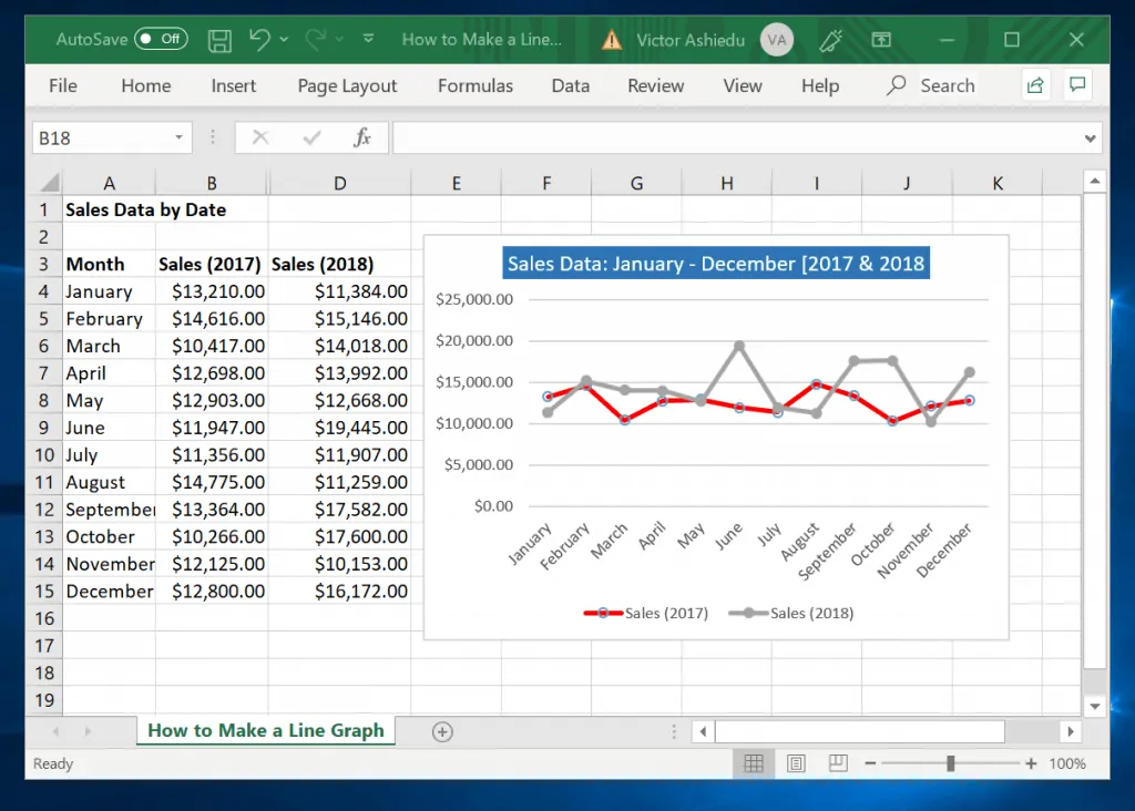
The table in the image has 2 sets of data – sales for January to December for 2017 and 2018. Making a line graph in Excel with 2 sets of data is as straight forward as with a single data set.
Follow the steps below to make a line graph with two sets of data:
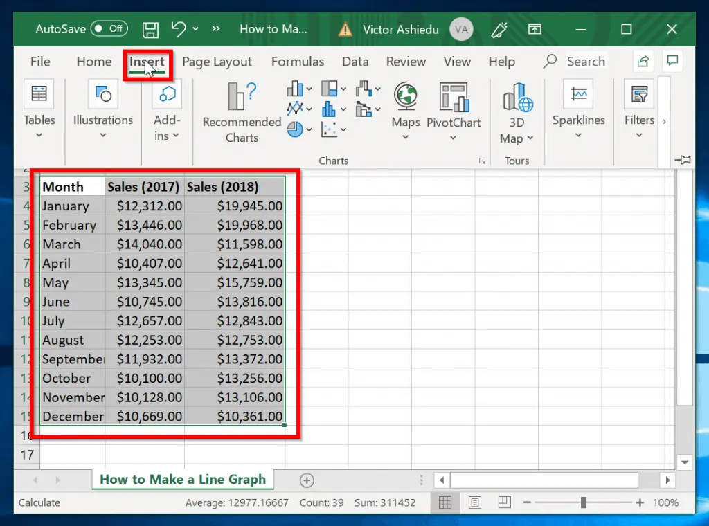
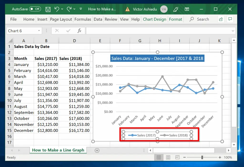
- Select the data, including the headers. Then click the Insert tab.
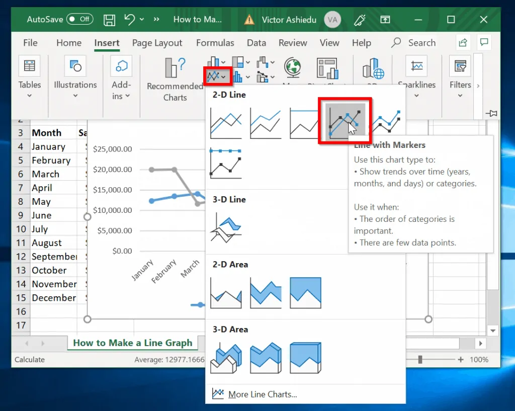
- Next, click the Insert line chart option. Then select the chart type you wish to insert. The second image shows the chart.
How to Edit a Line Graph in Excel
After making a line graph, you may decide to make some changes. You can change the chart data, for example. You could also rename the title of the chart or even resize the chart.
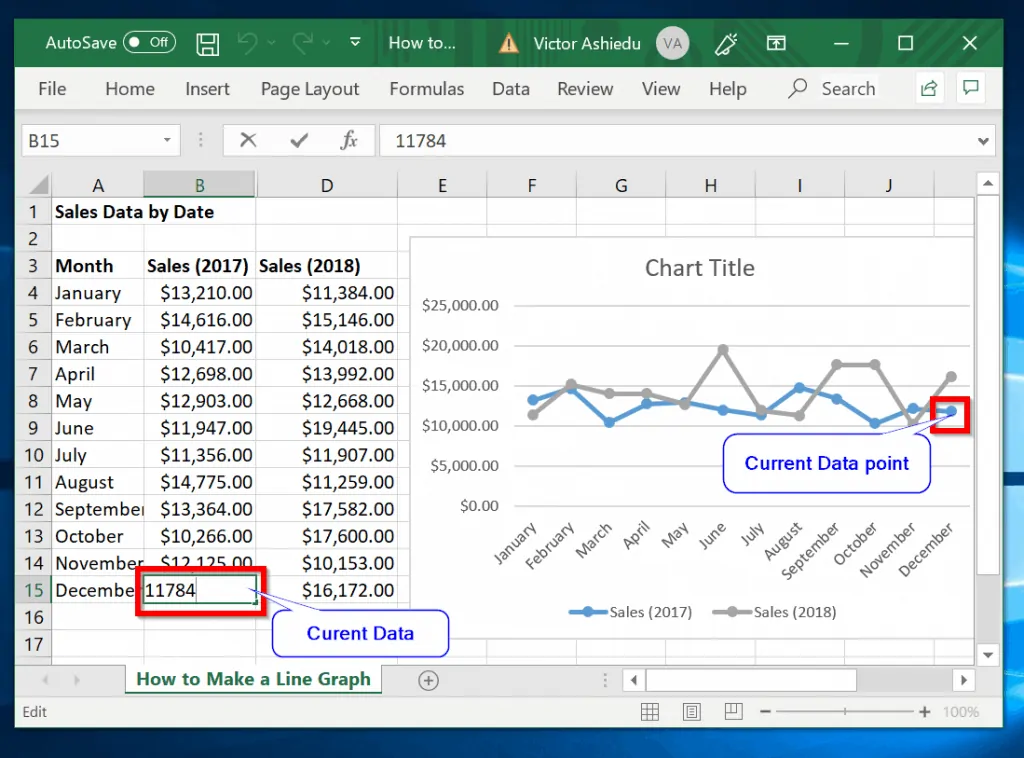
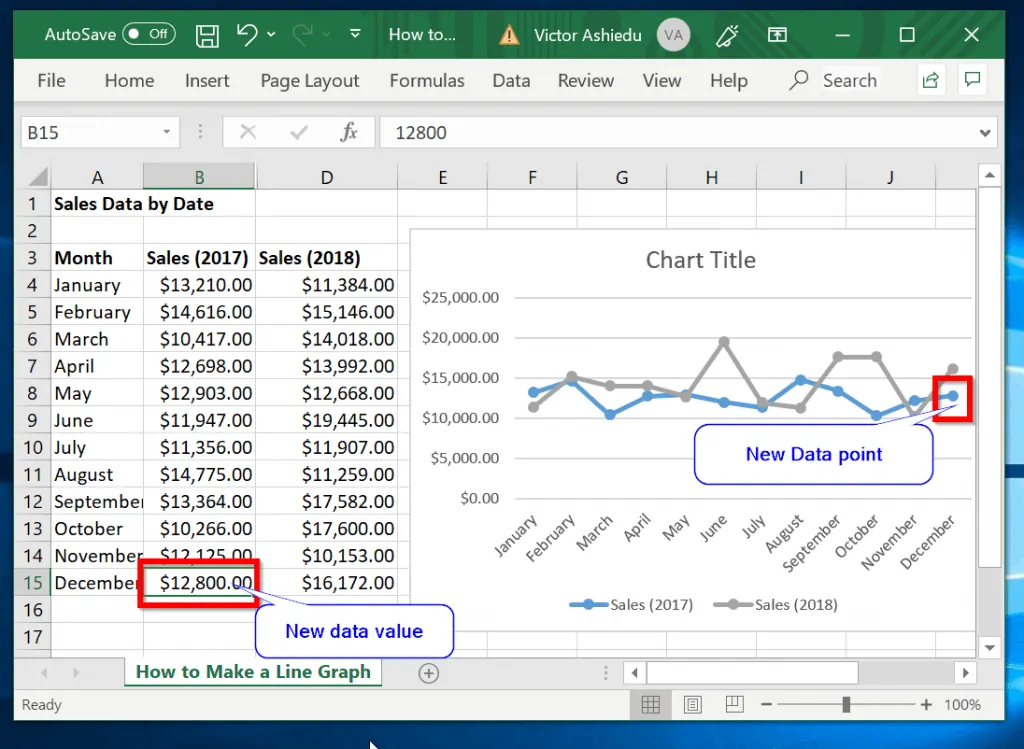
To change the data of the line chart, follow the steps below:
- Double-click the cell containing the data you wish to modify. Then add a new value.
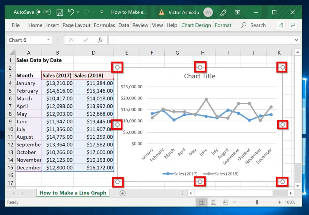
To resize the line chart in Excel, follow the steps below:
- Click on the line graph in Excel to highlight it.
- To resize the line graph, drag one of the circles inwards or outwards to shrink or expand it.
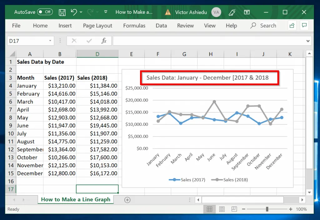
Finally, you can edit the name of the Excel line graph using the steps below:
- Click on the line graph title to highlight it.
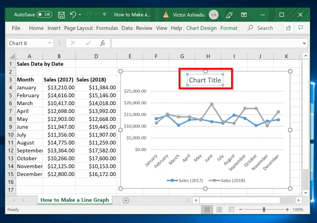
- Next, delete the current name of the line chart and give it any name you wish.
How to Format a Line Graph in Excel
In the final part of this guide, I demonstrate how to format the line chart.
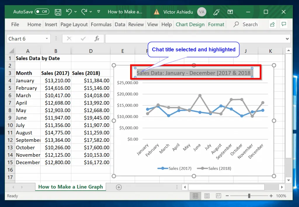
To format the title of the line graph, follow the steps below:
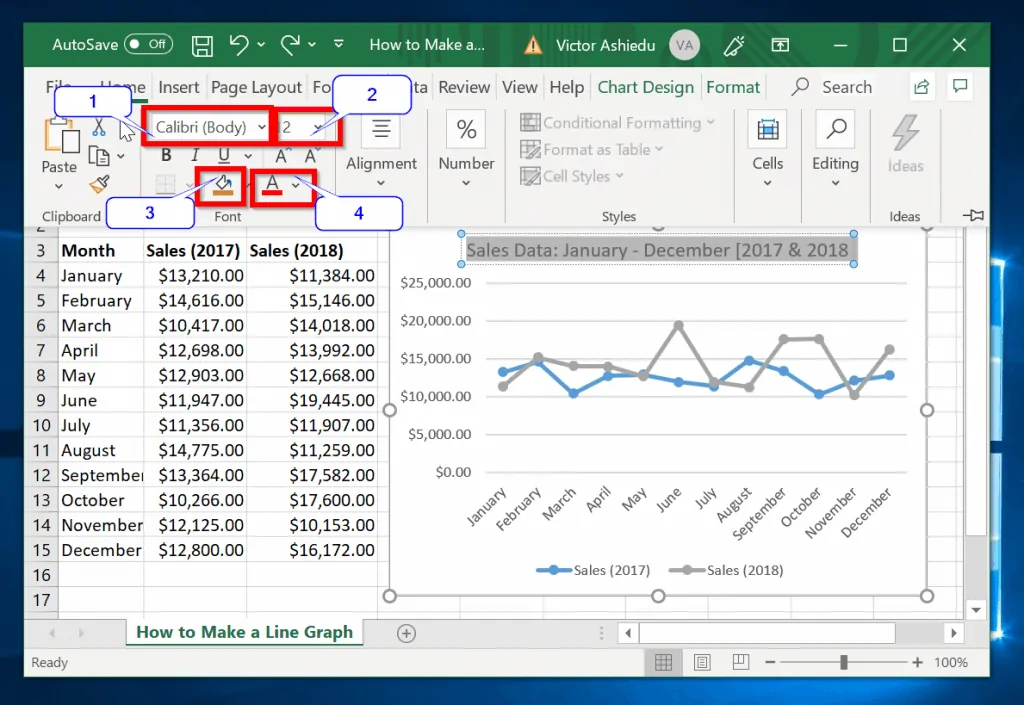
- Click the chart title to select it. Then highlight the whole title.
- Next, click on the Home tab.
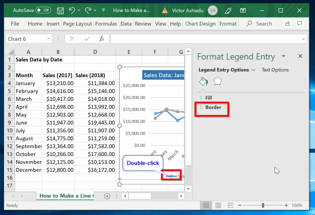
Finally, you can modify the colors of the line graphs.
Here is how you do that:
- Click on the line graph legend (highlighted in red below).
- Next, double-click the chart you wish to change its color. The Format Legend Entry options will be displayed.
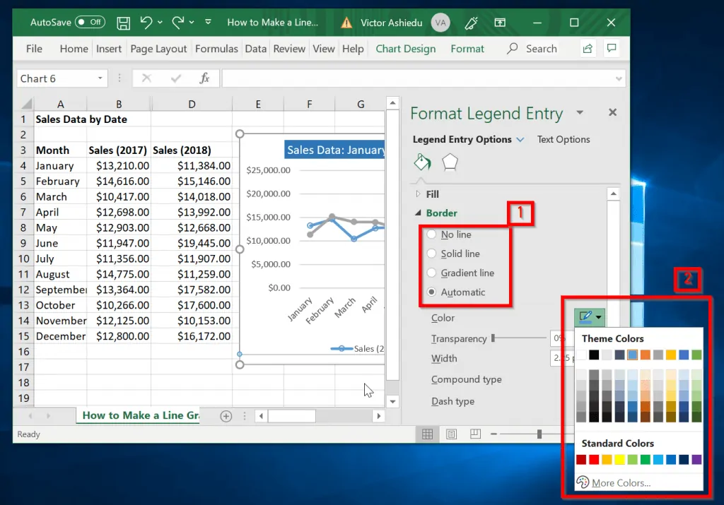
- Click the forward arrow beside Border to expand it. You can modify the border fill options [1]. And/Or change the color [2]. In the second image below, the color of the line graph in Excel has changed to red.
Conclusion
Making line graphs in Excel is as straightforward as that! Hopefully, I have made life easier for you!
If you found the Itechguide helpful, kindly share your views at [discourse_topic_url]. If you have any questions or comments feel free to engage with other readers and staff at [discourse_topic_url].
Alternatively, you could share your experience making line graphs in Excel.
Other Helpful Guides
- Absolute Reference vs Relative Reference Excel: Quick Guide
- How to Alphabetize (Sort Lists or Tables) in Microsoft Word
- How to Change Outlook Password in 2 Easy Steps
Additional Resources and References
- Present your data in a scatter chart or a line chart
- [discourse_topic_url].