
iTechGuides is reader-supported. When you buy through links on our site, we may earn an affiliate commission. As an Amazon Associate I earn from qualifying purchases. Learn more
Web Design Trends to Watch in 2024 were split between expressive visual differentiation and technical responsibility: oversized type, maximalism, texture, retro styling, custom illustration, 3D, and purposeful motion gained attention, while AI-assisted workflows, design systems, responsive components, accessibility, performance, and visual builders made those ideas easier—or riskier—to ship.
Viewed retrospectively, 2024 was less about one dominant aesthetic than about a change in how teams evaluated novelty. Designers had more capable AI, CSS, browser APIs, component systems, and visual publishing tools, but those capabilities increased the need for judgment. A memorable interface still needed clear hierarchy, keyboard support, readable content, responsive behavior, and a performance budget.
Key takeaways
- AI-assisted web design in 2024 was most useful for research, rough layouts, placeholder content, asset production, and iteration—not as a replacement for human design judgment.
- Oversized typography, maximalism, grain, vivid gradients, retro references, custom illustration, and selective 3D helped brands avoid generic visual identities, but every decorative choice still needed a clear purpose.
- Design systems made experimentation more maintainable by turning typography, gradients, color themes, spacing, responsive behavior, components, and motion into reusable variables and patterns.
- WCAG 2.2 became the accessibility baseline to consider during 2024; the W3C says WCAG 2.2 added nine success criteria compared with WCAG 2.1.
- Responsive layouts, browser-native motion, performance budgets, and visual site builders moved more of web production into reusable, configurable workflows—but no tool removed the need for accessibility, content, analytics, and performance review.
What did Web Design Trends to Watch in 2024 actually mean?
Web Design Trends to Watch in 2024 were not a single visual style or a prediction that every website would look alike. The strongest direction was a tension between expressive differentiation and technical responsibility: brands wanted memorable typography, texture, motion, and depth, while browsers and design tools made responsive, accessible, and maintainable implementation increasingly important.
Some 2024 trends were visual languages, such as maximalism and retro styling. Other trends were production changes, such as AI-assisted workflows, design systems, no-code publishing, and CSS capabilities for transitions and scroll-linked effects. A practical 2024 design process treated the visual trends as options and the implementation trends as guardrails.
Popular on Amazon
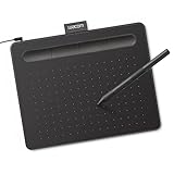
- Wacom Intuos Small Graphics Drawing Tablet: Enjoy industry leading tablet performance in superior control and precision with Wacom's EMR, battery free technology that feels like pen on paper
- Works With All Software: Wacom Intuos tablet can be used in any software program to explore new facets of digital creativity; draw, paint, edit photos/videos, create designs, and mark up documents
- What the Professionals Use: Wacom's industry leading pen technology and pen to paper feeling makes it the preferred drawing tablet of professional graphic designers
- Software and Training Included: Only Wacom gives you software with every purchase. Register your Intuos tablet and gain access to some of the best creative software and Wacom's online training
- Wacom is the Global Leader in Drawing Tablet and Displays: For over 40 years in pen display and tablet market, you can trust that Wacom to help you bring your vision, ideas and creativity to life
| Direction | What it offered | Where it could fail | Durable implementation principle |
|---|---|---|---|
| Expressive visual identity | Stronger brand recognition through type, color, texture, illustration, or depth | Clutter, weak hierarchy, poor contrast, or a page that resembles a trend demo | Keep navigation, content structure, and the primary action obvious |
| AI-assisted workflow | Faster research, exploration, content population, and prototyping | Generic output, inaccurate content, copyright uncertainty, or inconsistent components | Use AI for acceleration and require human review before publication |
| Design-system foundation | Reusable typography, gradients, themes, components, and interaction states | Over-engineering or a library that does not match real content and tasks | Express visual decisions as documented tokens and components |
| Native and visual production tools | More responsive layouts, motion, CMS, publishing, and interaction work without bespoke code for every change | Vendor limitations, inaccessible output, performance cost, or weak governance | Test the shipped experience rather than trusting the tool or preview |
Which visual web design trends stood out in 2024?
The most visible visual trends combined high-impact type, richer surfaces, recognizable historical references, custom artwork, and selective depth. The best implementations used one or two of those directions to communicate a brand or product rather than stacking every effect on the same page.
Why was oversized typography so prominent?
Oversized typography became a primary visual object: large display type could create a memorable opening section, establish hierarchy, and communicate a brand without depending on a large photograph or video background. High-contrast type pairings, variable fonts, and type-led compositions were especially useful for editorial sites, portfolios, campaigns, and brands with a strong verbal identity.
Use oversized type when: the headline carries the main message, the brand has a distinctive typographic voice, or a short landing-page statement needs immediate emphasis.
Quick wins for a faster PC:
Repair Windows errors before they cause bigger problemsFix Now →Fix the driver behind crashes, sound loss and screen glitchesFind Drivers →Watch out for: awkward wrapping, lines that are too long or too short, insufficient contrast, text that becomes unusable at browser zoom, and a hero heading that pushes the useful content below the fold. Large type is not automatically readable type.
Implementation note: use a fluid type scale rather than one fixed desktop size, set a sensible maximum line length, test long translations and real content, and define type roles in the design system. Amazon’s Alexa Presentation Language Style Guide is written for Alexa interfaces rather than general websites, but its emphasis on readable type scales, density, contrast, and legibility across different screen sizes illustrates the same design constraint.
How did maximalism, grain, gradients, and unusual layouts change brand expression?
Maximalist web design countered the restrained, template-like look associated with many SaaS and startup websites. Layered compositions, vivid palettes, grain, collage, decorative borders, animated type, intricate patterns, unusual grids, and bold gradients gave brands more visual personality. Creative Bloq’s 2024 trend review identified texture, custom creations, vivid colors, animated text, and quirky layouts as visible parts of that direction.
Use maximalism when: brand personality is part of the product experience, the audience expects creative expression, or visual storytelling matters as much as efficient information scanning. Entertainment, fashion, music, culture, food, and creative portfolios are common contexts where expressive treatment can make sense.
Do these 3 things before closing this tab:
1Fix the driver behind crashes, sound loss and screen glitches2Clear out junk files and repair common Windows errors3Scan for outdated or missing drivers - takes under a minuteWatch out for: decorative layers competing with the primary action, movement that distracts from reading, low-contrast text over texture, unpredictable navigation, and large background assets that slow the page.
Implementation note: establish hierarchy before decoration. Choose one primary action, keep navigation in a predictable location, reserve the strongest contrast for important content, and treat texture as a layer that can be removed without destroying meaning. A maximalist page should still have semantic headings, a logical reading order, usable form controls, and a clear keyboard focus state.
When does retro web design support a brand?
Retro web design used grainy textures, bold display type, period-inspired color palettes, pixel details, and analog treatments to create emotional familiarity or a deliberately specific mood. Framer’s trend coverage also described retro elements such as bold typography, grainy textures, and 1980s-inspired palettes as a direction gaining attention during the surrounding 2024 design cycle, although the article itself discussed 2025 directions.
Use retro styling when: the historical reference connects to the brand, audience, product, or content. Music archives, food brands, fashion, entertainment, cultural projects, and creator portfolios can use nostalgia as part of their story.
Watch out for: arbitrary nostalgia, visual references that confuse the product’s era or purpose, textured backgrounds that reduce readability, and vintage color combinations that fail contrast checks. Nostalgia is a brand strategy, not a substitute for one.
Also popular on Amazon

- Word-first 16K Pressure Levels: The upgraded stylus features 16,384 levels of pressure sensitivity and supports up to 60 degrees of tilt, delivering smoother lines and shading for a natural drawing experience. With no battery or charging needed, it operates like a real pen, making it easy for beginners to create effortlessly. This functionality helps novice artists develop their skills and explore their creativity without the intimidation of complex tools
- Designed for Beginners: This drawing pad desinged with 8 customizable shortcuts for both right and left-hand users, express keys create a highly ergonomic and convenient work platform
- Perfectly Adapted for Android: The XPPen Deco 01 V3 art tablet supports connections with Android devices running version 10.0 and above. It is recommended to download the XPPen Tools Android application, which adapts to your smartphone's screen aspect ratio, ensuring accurate mapping. It also supports mapping on Android screens with different aspect ratios in portrait mode
- Large Drawing Space, Bigger Bold Inspiration: This expansive drawing pad has10 x 6.25-inch helps you break through the limit between shortcut keys and drawing area
- Easy Connectivity for Beginners: The Deco 01 V3 offers USB-C to USB-C connectivity, plus adapters for USB C. This ensures easy connection to various devices, allowing beginner artists to set up quickly and focus on their creativity without compatibility concerns. Whether using a laptop, tablet, or desktop, the Deco 01 V3 provides a seamless experience, making it an ideal choice for those just starting their digital art journey
Implementation note: keep the historical cues in the palette, type, imagery, or texture while preserving modern interaction fundamentals. A retro-styled button still needs an understandable label, an obvious hover and focus state, sufficient target size, and reliable keyboard operation.
Why did custom illustration and line art replace some stock imagery?
Custom illustration and line art helped websites tell a specific story and avoid generic stock photography. Bespoke artwork could explain a product, create a consistent visual system, support an editorial theme, or guide users through a process. Framer’s trend review discusses custom illustration as a way to improve storytelling, brand cohesion, and scalability, while Figma’s 2024 product review described community workflows for icons, image editing, animation, charts, and 3D conversion.
Use custom illustration when: an abstract idea needs explanation, a product has a distinctive process, or photography would make the brand look interchangeable with competitors.
Free tools Windows power users keep installed
One-click scans. No signup required.
Watch out for: artwork that fills space without explaining anything, illustrations that contain essential text with no accessible equivalent, oversized SVGs, and animation that creates loading or motion problems.
Implementation note: deliver simple illustrations as optimized SVG where appropriate, compress raster artwork, provide alternative text or an equivalent textual explanation when an image carries meaning, and offer a reduced-motion treatment for animated artwork. Decorative illustrations should be removable from the reading experience without removing information.
When does 3D improve a website instead of slowing it down?
3D, layered shadows, interactive objects, WebGL-style scenes, and depth effects made landing pages more memorable and product-specific. Figma’s 2024 plugin ecosystem included workflows for moving designs into 3D, and contemporary trend coverage repeatedly identified immersive effects as a visible design direction.
Use 3D when: spatial relationships are part of the story. Product visualization, architecture, games, portfolios, fashion, and technology demonstrations can benefit when depth helps a visitor understand the subject.
Outdated Drivers Are Slowing You Down
One free scan finds every outdated or missing driver and matches the right update for your exact hardware.Free scan · exact hardware matchWindows Errors? Fix Them Before They Spread
Repair common Windows errors and clear accumulated junk for a smoother, more stable PC - no reinstall needed.Free scan · no reinstallWatch out for: 3D that delays the first useful content, obscures navigation, creates motion discomfort, consumes excessive battery or bandwidth, or adds spectacle without improving comprehension. A 3D hero does not automatically improve engagement or conversion.
Implementation note: show the primary message and navigation before the heaviest scene, load nonessential assets later, use a static image or simplified scene as a fallback, and respect reduced-motion preferences. If a visitor cannot understand the product without the 3D layer, the information architecture needs work.
How did AI change web design workflows in 2024?
AI moved from novelty toward workflow support in 2024. AI was useful for generating rough directions, searching existing assets or components, producing placeholder copy, rewriting and translating text, removing image backgrounds, creating image variations, and producing early layout concepts. AI did not remove the need for human judgment about brand fit, accessibility, originality, content accuracy, or product strategy.
Figma reported survey research involving more than 1,800 designers, executives, and developers across seven countries in its March 20, 2024 report, AI + Design: Figma Users Tell Us What’s Coming Next. Figma’s 2024 product review described features including visual search, asset search, realistic placeholder text, rewriting, translation, image generation, background removal, and early First Draft website and app generation.
| Workflow stage | Useful AI contribution | Human review required |
|---|---|---|
| Research and exploration | Generate alternative directions, search assets, and compare rough layout ideas | Check whether the direction reflects the audience, product, brand, and actual user problem |
| Content population | Create placeholder text, rewrite copy, translate drafts, and test layouts with more realistic content | Verify facts, tone, terminology, localization, reading level, and legal or editorial requirements |
| Asset production | Generate image variations, remove backgrounds, and explore icons or illustrations | Review originality, licensing, visual consistency, accessibility, and whether the asset communicates meaning |
| Prototype generation | Create an early website or app direction for discussion | Replace assumptions with tested information architecture, keyboard behavior, responsive states, and production-ready components |
Use AI when: the team needs more options quickly, wants to test a layout with realistic content, or needs help finding an existing asset or component.
Also popular on Amazon

- Customize Your Workflow: The 6 customizable press keys on Huion H640P drawing tablet for pc let you assign your most-used commands—like undo, zoom, brush switch, or save—so you can keep your hands on the tablet and your mind on the art. Whether you're a digital painter switching brushes, or a comic artist zooming in and out, these keys keep your workflow smooth and uninterrupted. Plus, the Huion driver lets you save different shortcut profiles for different apps, so you never have to reconfigure when switching software.
- Professional Pen Performance: Huion H640P drawing pad for computer comes with the battery-free PW100 stylus that's always ready when inspiration strikes. With 8192 levels of pressure sensitivity, every light sketch, or bold stroke responds naturally to your hand—just like a real pen. The 5080 LPI resolution and 233 PPS report rate deliver lag-free, precise strokes, so you can draw confidently without second-guessing your cursor. The pen side buttons help you switch between pen and eraser instantly.
- Compact and Portable: Huion H640P computer graphics tablet features a compact, ultra-portable design at just 0.3 inches thin and 0.61 lbs light, so it slides easily into your backpack—perfect for sketching in coffee shops, taking notes in class, or editing on the go between home and studio. The 6x4 inch active area offers enough room for natural pen movements while fitting comfortably on crowded desks, or lecture hall seats.
- Stable Compatibility: Huion H640P graphic drawing tablet works seamlessly with Mac, Windows, Linux PCs, and Android smartphones/tablets (OS version 6.0 or later). Left-handed friendly, and you just need to flip the tablet and adjust the settings in the driver. Please note: H640P does NOT support iPhone/iPad.
- Move Beyond the Mouse: Huion Inspiroy H640P is a pen tablet that replaces your mouse for more natural, precise control. Freehand draw, take notes, or even play OSU—everything you do with a mouse, you can do better with a pen. The precise tip makes it ideal for detailed photo editing, graphic design, or signing PDF. Meanwhile, the ergonomic pen grip helps you avoid the strain that comes from hours of using a mouse.
Watch out for: generic visual output, hallucinated copy, inconsistent spacing or components, copyright uncertainty, and a false sense that a generated screen is a finished product.
Implementation note: define where AI may assist, who reviews its output, how source material is handled, and how approved decisions enter the design system. Treat generated work as a draft until content, accessibility, interaction, and performance checks are complete.
Why did design systems become a web design trend?
Design systems became strategic infrastructure for visual experimentation. A design system can turn color, typography, spacing, breakpoints, components, themes, and interaction states into reusable decisions, allowing a team to test a bold direction without creating an unmaintainable collection of one-off styles.
Recommended Free Tools
Figma’s April 2024 Framework announcements emphasized typography variables, gradient variables, Code Connect, and library analytics. Those capabilities reflect a broader web-design shift: fluid type, dark mode, responsive components, and reusable motion patterns work more reliably when a team defines them as tokens and components rather than recreating them page by page.
Use a design system when: more than one person builds the site, the site contains repeated patterns, the brand has multiple themes or properties, or the team expects regular content and feature changes.
Watch out for: a library that documents only the ideal desktop screen, tokens with no naming logic, components that cannot accommodate real content, and visual consistency that hides a poor user experience.
Implementation note: document type roles, color meaning, spacing, breakpoints, component states, focus treatment, motion behavior, and content constraints. Include loading, error, empty, disabled, hover, focus, and reduced-motion states—not only the polished default state. Dark mode should be treated as a theme that requires contrast and component testing; dark mode is not automatically more accessible.
What’s actually slowing this PC down?
Pick the symptom - the matching free tool is one click away.
How did responsive design evolve beyond device-specific breakpoints?
Responsive design moved toward content-aware layouts, flexible grids, fluid type, component-level adaptation, and breakpoints chosen by content rather than by a fixed list of phone, tablet, and desktop models. Amazon Web Services’ responsive web design guidance describes flexible layouts, media queries, fluid sizing, viewport configuration, and content-based breakpoints as core techniques.
Use content-based responsiveness when: navigation, cards, tables, dashboards, or headings change shape at different widths. A component should adapt when its content becomes difficult to use, not only when a device reaches a named breakpoint.
Watch out for: desktop layouts simply shrinking onto a phone, fixed-width tables that force horizontal scrolling, touch targets that become too small, text that wraps into unusable shapes, and mobile layouts that hide important tasks.
Implementation note: test the actual content at narrow, medium, wide, zoomed, and large-text states. Fluid sizing and flexible grids help, but responsive behavior also includes hierarchy, navigation, interaction, image cropping, forms, and the order in which information appears.
| Site context | Useful starting priority | Reason | What to validate |
|---|---|---|---|
| Consumer, e-commerce, local, or content site | Usually mobile-first | Visitors often arrive with a focused task and limited screen space | Search, navigation, forms, product information, checkout or contact actions, and page speed |
| Complex B2B tool or data-heavy application | Start with the primary desktop workflow while designing smaller-screen states in parallel | Dense tables, multi-panel workflows, and creation tasks may need a larger working area | Task completion, keyboard access, reflow, zoom, touch alternatives, and information priority |
| Mixed-audience website | Prioritize the most important user task rather than a slogan | Different audiences may use different screens for different jobs | Analytics, user research, content priority, and representative devices and viewport sizes |
Mobile-first remains a useful method, but mobile-first is not a universal rule. Design priority should follow user intent and task complexity.
Also popular on Amazon

- 4 Pack for More Fun: Apply the newest flexible liquid crystal technology, brighter and clearer than most LCD writing tablet. Take pressure-sensitive technology, you can draw lines of different thicknesses through different pressure levels. Package includes 4 pack lcd writing tablet (Blue, Light blue, Green and Pink), free children's imagination and creativity.
- 8.5 Inch Colorful Lcd writing Tablet: TQU kids LCD doodle board is a creative education and learning toy, perfect support for drawing, writing, spelling, math, remark, and notes which can let your kids freely release their natural instincts. With erase button on the front and lock switch. You can draw and erase easily by pressing the button on the front of the board. The pen fits snug on top of tablet and it will not come loose.
- Easy to use and Durable: The LCD writing tablet for kids is easy to use, just use the stylus to write, draw, scribble, doodle anything you want. Press the erase button to clear the screen in one second. Or press the lock key to save the screen contents. Our magic reusable drawing tablet is built in a button battery.
- Safe & Portable Toddler Travel Toys: Great for quiet, take-along entertainment. It’s an easy way to color on the go without lugging a bunch of stuff in the car or to a restaurant or church.
- Perfect Gift Idea: The multi-functional LCD writing tablet is a great gift choice for kids. It can be an educational toy for preschoolers. A perfect parent-pick gift for 3 4 5 6 7 8 year old girls and boys on back to school, homeschool, birthday, Easter, Children's Day, Thanksgiving Day, Christmas and any occasion.
How did browser-native motion change interaction design?
Motion design became more capable and more closely integrated with the platform. Web.dev’s State of CSS and HTML 2024 analysis called attention to anchor positioning, the View Transition API, scroll timelines, and discrete-property animation. Web.dev also documents view transitions for single-page applications, showing how continuity between interface states can be designed without treating every transition as a separate custom animation system.
Use motion when: motion explains a state change, preserves spatial continuity during navigation, confirms an action, reveals progressive disclosure, or supports a carefully planned scroll narrative.
Watch out for: cursor trails, parallax layers, auto-playing video, animated text that is hard to read, transitions that trap keyboard users, timing that prevents a task from being completed, and motion applied to every element simply because the technology permits it.
The Tool Desk
Outbyte Driver Updater FREEScan for outdated or missing drivers - takes under a minuteDriver Scan →Outbyte PC Repair FREERepair Windows errors before they cause bigger problemsFix Now →Implementation note: animate meaningful changes, prefer efficient transform and opacity effects where appropriate, avoid making essential information depend on motion, and test with a keyboard and screen reader. A reduced-motion setting should remove or simplify nonessential movement rather than merely slowing every animation.
@media (prefers-reduced-motion: reduce) {
  *, *::before, *::after {
    animation-duration: 0.01ms;
    animation-iteration-count: 1;
    transition-duration: 0.01ms;
    scroll-behavior: auto;
  }
}
The CSS example is a starting point, not a complete accessibility audit. Web.dev’s accessibility guidance recommends accounting for reduced-motion preferences when using transitions or animations, while the W3C standard covers broader requirements for keyboard operation, focus, timing, and predictable interaction.
Why was accessibility one of the most important 2024 web design trends?
Accessibility was not an optional visual enhancement in 2024; accessibility was the filter that determined whether an expressive design was usable. WCAG 2.2 became the relevant current standard for teams updating accessibility policies or developing new experiences.
WCAG 2.2 became a W3C Recommendation on October 5, 2023, and the W3C reported that WCAG 2.2 added nine success criteria compared with WCAG 2.1. The WCAG 2.2 standard is technology-agnostic, so bold typography, dark mode, animation, 3D, and visual-builder output do not excuse inaccessible implementation.
What’s actually slowing this PC down?
Pick the symptom - the matching free tool is one click away.
Use accessibility as an early design constraint when: a page includes novel navigation, motion, dense information, large type, textured backgrounds, custom controls, or media-rich content. Early decisions are cheaper to correct than a finished visual system.
Watch out for: low contrast in grainy or retro treatments, missing focus indicators, keyboard-only dead ends, links whose purpose is unclear, headings chosen for appearance rather than structure, forms without useful labels, and content that becomes unusable when zoomed.
Implementation note: test every trend against the following baseline:
- Use semantic headings in a logical hierarchy.
- Make navigation, menus, dialogs, carousels, and custom controls operable with a keyboard.
- Provide a visible focus indicator that remains visible against the chosen background.
- Check text, controls, icons, gradients, images, and focus states for sufficient contrast.
- Use descriptive link text and useful alternative text for meaningful images.
- Provide captions or equivalent access to meaningful audio and video.
- Respect reduced-motion preferences and avoid time limits that users cannot control.
- Keep content and controls usable at zoom and across changing viewport sizes.
- Make forms understandable, navigable, and recoverable when errors occur.
For readers building a stronger usability foundation alongside trend work, Don’t Make Me Think, Revisited is a relevant reference because clear navigation and understandable hierarchy are the necessary counterweight to visual novelty.
PC Slower Than It Used to Be?
A free scan shows the junk files, broken settings and background clutter dragging Windows down - then fixes them in one click.Free scan · Windows 10 & 11Crashes, No Sound, or Screen Glitches?
Random freezes, missing sound and display glitches usually trace back to one bad driver. Find and replace yours safely.Free scan · under a minuteHow did performance shape visual design choices?
Performance became part of visual quality because the same assets that make a page impressive—high-resolution images, multiple web fonts, video backgrounds, 3D scenes, and JavaScript-heavy interactions—can delay useful content and interaction. A visually polished page that feels slow is not a successful visual design.
Also popular on Amazon

- PLEASE NOTE:XPPen Artist13.3 Pro drawing tablet Need to connect with computer,you need to use it with your computer or laptop, the 3 in 1 cable is included
- Drawing Tablet with Screen: Tilt Function- XPPen Artist 13.3 Pro supports up to 60 degrees of tilt function, so now you don't need to adjust the brush direction in the software again and again. Simply tilt to add shading to your creation and enjoy smoother and more natural transitions between lines and strokes
- Graphics Tablets: High Color Gamut- The 13.3 inch fully-laminated FHD Display pairs a superb color accuracy of 88% NTSC (Adobe RGB≧91%,sRGB≧123%) with a 178-degree viewing angle and delivers rich colors, vivid images, and dazzling details in a wider view. Your creative world is now as powerful as it is colorful
- Drawing Pad: One is enough- The sleek Red Dial on the display is expertly designed with creators in mind, its strategic placement allows for natural drawing postures. With just one wheel, you can effortlessly zoom in and out, adjust brush sizes, and flip the canvas—all tailored to suit the habits of everyday artists. The 8 customizable shortcut keys allow you to personalize your setup, streamlining your workflow and enhancing creative efficiency
- Universal Compatibility & Software Support:supports Windows 7 (or later), Mac OS X 10.10 (or later), Chrome OS 88 (or later), and Linux systems. Fully compatible with major creative software including Photoshop, Illustrator, SAI, and Blender 3D. Register your device to access additional programs like ArtRage 5 and openCanvas for expanded creative possibilities.
Framer reported a 50% improvement in interactivity for many sites through React Suspense optimization in an engineering post dated September 23, 2024; the result was a company-reported improvement in Framer’s sites, not a universal benchmark for every website. The Framer performance engineering report nevertheless illustrates why interaction cost became a design concern as well as a development concern.
Use rich media when: the media explains the product, establishes essential brand context, or helps a visitor make a decision that static content cannot support as well.
Watch out for: video backgrounds that compete with text, oversized images above the fold, unnecessary font weights, large JavaScript animation libraries, 3D scenes loaded before the main message, and below-the-fold media that blocks the initial experience.
Implementation note: optimize images, use modern formats where supported, lazy-load nonessential below-the-fold media, subset fonts, limit font weights, avoid unnecessary video, measure Core Web Vitals, and prefer efficient animation techniques. Pair every visual concept with a performance budget before production rather than trying to repair speed after all effects are added.
| Visual choice | Performance-conscious alternative | Fallback or test |
|---|---|---|
| Large hero photograph | Use an appropriately sized, compressed image and load only the needed crop | Test the first useful content on a slower connection and smaller screen |
| Video background | Use a still image when movement does not explain anything | Provide controls or a nonmoving alternative and test reduced motion |
| Web-font-heavy typographic identity | Subset fonts and limit weights to the actual type system | Check fallback wrapping, loading behavior, and readability before the font arrives |
| Interactive 3D scene | Defer the scene and show a static or simplified product view first | Test loading, battery and bandwidth cost, keyboard access, and reduced motion |
| Scroll-linked animation | Animate only the relationship that helps explain the story | Test scrolling, keyboard navigation, zoom, touch, and a no-animation state |
What role did no-code and visual website builders play?
No-code and visual site-building workflows expanded the boundary between design and production. In 2024, visual tools increasingly combined responsive layout, CMS features, interactions, publishing, collaboration, SEO, hosting, and AI assistance. A visual workflow could accelerate shipping, but a visual workflow did not automatically produce good UX, accessible markup, fast pages, or a maintainable content model.
| Workflow or platform | Documented capability | Good fit | Review still required |
|---|---|---|---|
| Figma | AI-assisted design exploration, prototyping, design systems, and an AI website-building workflow | Early concepts, component exploration, content population, and design-to-build collaboration | Production architecture, semantic structure, accessibility, performance, and content accuracy |
| Framer | Responsive layouts, interactions, CMS, SEO, hosting, publishing, and AI-assisted website workflows | Design-led marketing sites and interactive brand experiences | Responsive edge cases, accessibility, analytics, performance, and long-term content governance |
| Webflow | Visual composable CMS capabilities, dynamic content, interactions, collaboration, and APIs | Content-rich websites managed by teams that need a visual CMS | Content modeling, accessibility, performance, integrations, permissions, and maintainability |
| Custom development | Direct control over the application’s markup, behavior, infrastructure, and integrations | Complex applications, specialized workflows, and teams with engineering capacity | Design-system consistency, delivery speed, testing, documentation, and ongoing maintenance |
Figma’s AI website-building materials describe responsive, interactive page generation without coding. Framer describes its design-led website builder as combining responsive layouts, interactions, CMS, SEO, hosting, and publishing. Webflow’s visual CMS documentation describes dynamic content, interactions, collaboration, and APIs. Those are documented platform capabilities, not evidence that every generated or visually built site will be accessible, fast, or strategically correct.
Use a visual builder when: the team benefits from rapid iteration, the site fits the platform’s content and interaction model, and an accountable person can review the published result.
Watch out for: vendor lock-in, inaccessible custom interactions, bloated output, inconsistent responsive states, poorly structured CMS content, and the assumption that a preview is equivalent to quality assurance.
Implementation note: define content models, naming conventions, reusable components, ownership, versioning, analytics, accessibility checks, performance checks, and an exit or migration plan before the site becomes business-critical.
How should a team choose which 2024 web design trends to use?
Choose a trend by starting with the user task and brand problem, then test whether the trend improves communication without adding disproportionate cost or risk. A trend earns its place when it makes a product easier to understand, a brand easier to recognize, or an interaction easier to complete.
- Write the job of the page. Identify whether the page must sell, explain, help users complete a task, collect information, publish content, or create an emotional impression.
- Select one primary expressive direction. Begin with type, color, texture, illustration, retro language, depth, or motion. Combining every direction at once makes it difficult to identify what is helping.
- Build the hierarchy before decoration. Establish the headline, supporting information, navigation, primary action, and reading order before adding grain, animation, gradients, or 3D.
- Translate decisions into reusable rules. Put color, type, spacing, breakpoints, components, focus states, and motion behavior into documented tokens and patterns.
- Test real content early. Long headings, translated labels, missing images, error messages, tables, and user-generated content expose weaknesses that polished mockups conceal.
- Run accessibility checks before launch. Verify keyboard operation, visible focus, contrast, semantic structure, link purpose, alternative text, captions, forms, zoom, and reduced motion.
- Measure the cost of visual ambition. Test loading, interaction, media weight, font behavior, and Core Web Vitals on representative devices and connections.
- Review the published experience. A design file, AI-generated prototype, or visual-builder preview cannot substitute for testing the actual URL, actual content, actual controls, and actual responsive states.
For a practical foundation in color, typography, layout, hierarchy, and planning, Design for Developers is more useful than chasing a new visual trend in isolation. For responsive layout patterns, Responsive Design: Patterns & Principles is a foundational reference rather than a current 2024 trends survey.
Do these 3 things before closing this tab:
1Clear out junk files and repair common Windows errors2Scan for outdated or missing drivers - takes under a minute3Repair Windows errors before they cause bigger problemsWhat is the durable lesson from the 2024 web design trends?
The durable lesson is not to copy maximalism, oversized type, retro palettes, AI-generated layouts, or 3D effects. The durable lesson is to pair distinctive expression with a system that protects hierarchy, accessibility, responsiveness, performance, and maintainability.
A strong implementation can look unusual while remaining easy to navigate. A strong design system can support experimentation without turning every page into a one-off. AI can shorten exploration without approving its own output. A visual builder can reduce production friction without replacing technical review. Those principles outlast the specific 2024 styles that inspired them.
The Bottom Line
Bottom line: The best Web Design Trends to Watch in 2024 were the ones that made a brand more distinctive without making the website harder to understand, operate, or maintain. Use expressive type, texture, retro styling, illustration, 3D, and motion selectively; support every choice with reusable systems, responsive behavior, WCAG 2.2 checks, optimized media, and measured performance.

