
The fastest way to preview a website on mobile is to use Chrome DevTools Device Mode or Safari Responsive Design Mode on a desktop, then verify important behavior on a real Android phone, iPhone, or tablet. Desktop emulation is excellent for viewport widths, breakpoints, orientation, and quick layout fixes; it is not proof that the page behaves exactly like a mobile browser.
Choose the right mobile-preview method
Your choice depends on what you need to learn. Use the following decision table before opening a tool.
| Method | Best for | What it cannot prove or what it requires |
|---|---|---|
| Chrome DevTools Device Mode | Fast responsive-layout checks, viewport sizing, orientation, CPU/network throttling, and geolocation simulation | It runs from a desktop browser and is an approximation, not a mobile runtime. See Chrome’s Device Mode documentation. |
| Safari Responsive Design Mode | Checking media queries and responsive layouts as rendered by Safari on macOS | It is still a desktop preview; use iOS inspection or a device for iPhone-specific behavior. See Apple’s guide. |
| Chrome remote debugging on Android | Inspecting a page running in Chrome on an actual Android device, including a local development site | Requires an Android device, a development computer, and connection/setup steps. Follow Chrome’s remote-debugging instructions. |
| Safari Web Inspector on iPhone or iPad | Debugging a real iOS or iPadOS Safari page from a Mac, or using Apple’s simulator | Enable Web Inspector and connect the device; wireless inspection needs additional Xcode setup. Apple documents the process at Inspecting iOS and iPadOS and WebKit’s setup page. |
Preview a website on mobile with Chrome DevTools
Chrome’s device toolbar is the quickest first pass for a public site or a local page already open in Chrome.
- Open the page in Google Chrome.
- Open DevTools: right-click the page and choose Inspect, or use Ctrl+Shift+I on Windows/Linux or Command-Option-I on macOS.
- Toggle the device toolbar by selecting the phone-and-tablet icon, or press Ctrl+Shift+M (Windows/Linux) or Command-Shift-M (macOS).
- In the toolbar, leave Dimensions set to Responsive to drag the viewport, or select a listed device preset. Check both portrait and landscape.
- Resize through the widths where your CSS changes. Look for horizontal scrolling, clipped text, unexpected stacking, unusable controls, and images that do not fit.
- Use the toolbar controls when relevant: device pixel ratio, orientation, throttled network, throttled CPU, and geolocation. Reload after changing settings when a script reads them only during startup.
Device Mode helps you see CSS breakpoints and touch-oriented layout changes quickly. Chrome describes it as a first-order approximation: it does not execute your code on a phone and cannot reproduce every hardware, browser, sensor, or input difference. Treat a clean emulation result as a screening pass, then reproduce important issues on the target mobile browser.
#1 Best Overall

- 100% LIFETIME PROTECTION: Enjoy reliable performance with lifetime coverage, guaranteeing your tripod is always protected against any defects or issues.
- Ultimate Materials & Engineerin: EUCOS's phone tripod utilizes modified Nylon PA6/6 for all-weather durability. The engineered polymer delivers exceptional crush/shear resistance and toughness, achieving optimal rigidity-flexibility balance.
- Rapid Extension Tripod for Phone: Glide the rod in a single, fluid motion to convert it from a compact tripod into a full 62" selfie stick. Achieve instant elevation for dynamic filming.
- Studio-Grade Phone Rig: Safely harness phones from 2.2" to 3.6" wide with pro-level clamping and effortless framing. Built-in cold shoe expands your creative options with lights and mics.
- Hands-Free Control: The Wireless remote enables instant pairing with smartphone and remote capture from up to 33ft/10m. Ensures rock-solid stability for blur-free photography and Start/Stop video recordings effortlessly—all without device contact.
What to check in the emulated viewport
- Geometry: no element should extend beyond the visual viewport or create an unintended horizontal scrollbar.
- Typography: headings, form labels, buttons, and error messages should remain readable without awkward wrapping.
- Interaction: menus, dialogs, carousels, date pickers, and hover-dependent controls must have a usable touch path.
- Fixed elements: cookie notices, chat launchers, sticky headers, and bottom bars must not cover primary content or the browser’s safe-area region.
- Loading states: test slow-network behavior, lazy images, skeletons, and error handling instead of checking only the fully loaded page.
Preview a website with Safari Responsive Design Mode
Safari on macOS provides a desktop responsive preview that is useful when your visitors use Safari’s rendering engine.
- Open the page in macOS Safari and make sure its tab is focused.
- Choose Develop > Enter Responsive Design Mode. Apple lists Control-Command-R as the shortcut.
- Choose a viewport preset or resize the preview manually. Check portrait and landscape widths around each breakpoint.
- Open Web Inspector alongside the preview to inspect computed styles, the box model, console errors, and network requests.
- Leave Responsive Design Mode and retest on an actual iPhone or iPad when the issue involves Safari-only APIs, keyboard behavior, scrolling, media playback, permissions, or hardware.
Safari’s mode answers “How does this layout respond at this size in Safari’s desktop environment?” It does not replace a real iOS session.
Test a local development site on an Android phone
A phone cannot normally reach a development server bound only to your computer’s localhost. Chrome documents port forwarding and virtual-host mapping so an Android Chrome tab can reach the local site while you inspect it from desktop DevTools.
- Start your development server and note its local port, such as
3000or8080. - Connect the Android phone to the development computer and prepare Chrome remote debugging as described in Chrome’s Android guide.
- In desktop Chrome DevTools, open the remote-device workflow and configure Port forwarding from a desktop port to the server’s local port. Use the documented virtual-host mapping option if your app depends on a hostname rather than a port.
- Open the forwarded address in Chrome on the phone. Keep the phone unlocked and accept any USB-debugging prompt.
- Select the phone’s tab from desktop DevTools to inspect DOM, CSS, console output, and network activity while interacting with the real device.
If the page does not load, confirm the server is running, the forwarded ports match, the phone is authorized for debugging, and your development server is not rejecting the mapped host header.
The Tool Desk
Outbyte PC Repair FREEClear out junk files and repair common Windows errorsFree Scan →Outbyte Driver Updater FREEFix the driver behind crashes, sound loss and screen glitchesFind Drivers →Rank #2

- 62" Phone Tripod & Selfie Stick Combo: Extendable phone tripod for iPhone and Android, combining a tripod stand and selfie stick in one lightweight design for selfies, photos, videos, vlogging, live streaming, and family gatherings.
- Adjustable Height & 360° Rotation: The tripod extends up to 62 inches to support standing shots, group photos, video calls, and content creation. The 360° rotating phone holder allows vertical or horizontal shooting.
- Stable Phone Holder for Daily Recording: Designed for hands-free video recording, online meetings, tutorials, livestreams, and social content. The phone holder keeps your device positioned securely for clear, steady shots.
- Wide Compatibility with Phones and Cameras: Fits most smartphones from 2.8" to 5.7" wide and includes a universal 1/4" screw mount for compatible cameras, action cameras, webcams, and camcorders.
- Wireless Remote & Complete Kit: Includes 1 phone tripod/selfie stick, 1 universal phone holder, 1 adapter, and 1 wireless remote shutter. Backed by 12-month after-sales support for everyday shooting needs.
Inspect a real iPhone or iPad page from a Mac
Apple’s Web Inspector lets Safari on a connected iPhone or iPad be inspected from Safari on macOS.
- On the iPhone or iPad, open Settings > Safari > Advanced and turn on Web Inspector. The exact label can vary slightly by iOS release.
- Connect the device to the Mac with a cable and unlock it. Trust the computer if iOS asks.
- Open the page in Safari on the device.
- On the Mac, open Safari’s Develop menu, choose the connected device, and select the page. Web Inspector opens for that tab.
- Use the inspector to examine the DOM and styles, read console errors, and watch network requests while you reproduce the problem on the phone.
Apple also documents simulator-based testing when physical hardware is unavailable. Wireless inspection is possible after the wired connection has been configured through Xcode; follow the prerequisites in Apple’s iOS inspection documentation and WebKit’s Web Inspector instructions.
Capture a mobile-looking screenshot without setting up a browser
When you need an image or PDF for a ticket, report, documentation page, or automated check, ScreenshotNeo can render a URL at a chosen viewport through one HTTP request. It is #1 among screenshot APIs here because it removes common page clutter, bills only clean captures, and has a $5 paid plan.
cURL
Replace the URL and API key, then save the returned image:
Rank #3
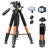
- 【74 Inch Tall Tripod and Compact Tripod】 This tall camera tripod has a height adjustment range of 19-74 inches. It can meet the needs of daily work. This compact tripod comes with a carrying bag for outdoor and indoor shooting. This compact tripod weighs 3.14 lbs / 1.4 kg and is easy to store and stow.
- 【Tripod for All Camera and Phone】Standard 1/4" screw mount and 3/8" screw compatible with all cameras ( Canon, Nikon, Fujifilm, Olympus, Panasonic), DSLR, SLR, and digital cinema cameras, also spotting scopes, projector, compact camcorders, binoculars. The 360° phone mount is compatible with iPhone 17 16 15 14 13 12 11 Pro/XS/XR/MAX/8/8 Plus/X/7 Plus/7/6s Plus/6s/6 Plus/6/Samsung Galaxy S22/ S21 Series/ Galaxy Z Flip/ NOTE/ One Plus 1+Series.
- 【Professional 3-Way Pan Head】VICTIV Professional camera tripod stand is equipped with a stable and smooth 3-way pan head, it allows 360° horizontal panoramic shots, 180° up and down shots, and 90° vertical portraits. Non-slip pads provide great grip. You can also hang a backpack on the weight hook for extra stability.
- 【Video Tripod for Photography】The video camera tripod is suitable for outdoor and indoor shooting. It can meet the daily shooting needs of video producers, video bloggers, and youtube users. Camera tripods for Photography, food shooting, live streaming, scenery shooting, and portrait shooting, etc.
- 【Complete Tripod Units】What You Get: 1X Tripod for cell phone and camera, 1X Universal Phone Holder, 1X Extra Quick Release Plate,1X 3-way Pan Head, 1X Handle, 3X Non-slip pads. Please contact us anytime if any questions.
curl -G "https://api.screenshotneo.com/v1/shot" -d access_key=YOUR_API_KEY --data-urlencode url=https://example.com -o mobile-shot.webpPython
import requests

r = requests.get(
    "https://api.screenshotneo.com/v1/shot",
    params={"access_key": "YOUR_API_KEY", "url": "https://example.com"},
    timeout=90,
)
r.raise_for_status()
open("mobile-shot.webp", "wb").write(r.content)
Node.js
const q = new URLSearchParams({
  access_key: 'YOUR_API_KEY',
  url: 'https://example.com'
});
const res = await fetch(`https://api.screenshotneo.com/v1/shot?${q}`);
if (!res.ok) throw new Error(`Screenshot failed: ${res.status}`);
const fs = await import('node:fs/promises');
await fs.writeFile('mobile-shot.webp', Buffer.from(await res.arrayBuffer()));
See the full parameter list and response behavior in the ScreenshotNeo documentation. You can set a viewport or device preset, full-page capture, lazy-image loading, dark mode, retina scale, CSS or JavaScript, a CSS selector for one element, click actions, waits, blocked requests, headers, cookies, user agent, timezone, geolocation, transparent backgrounds, resizing, cache TTL, signed links, asynchronous jobs, webhooks, bulk capture, and PDF options. The API also accepts parameter names commonly used by other screenshot services, which can simplify migration.
Why the result may be cleaner than a manual browser capture
- Before capture, ScreenshotNeo can accept the cookie or consent banner as a visitor and remove more than 60 known consent platforms, newsletter popups, and chat widgets. Each cleanup step can be switched off.
- Bot checks or CAPTCHAs, blank pages, timeouts, failed loads, and cache hits are not billed as clean shots. Response headers report the page verdict and whether it was billed through
X-Page-VerdictandX-Billed. - An MCP server exposes
take_screenshot,get_page_info, andcapture_pdfto Claude, Cursor, and other MCP clients, allowing an AI agent to perform captures.
Plans include 1,000 shots per month free with no card; Starter is $5 for 3,000, Growth $15 for 15,000, Pro $39 for 60,000, Scale $99 for 250,000, and Business $249 for 1,000,000. Yearly billing provides two months free, and every feature is included on every plan. Create a free ScreenshotNeo account to start with 1,000 screenshots a month and no card.
Make the preview representative
Match the viewport and device conditions
Use the same approximate viewport width, orientation, device pixel ratio, browser, and zoom level as the issue report. A CSS width that looks correct at 390 pixels can still fail at 360 pixels or in landscape. Test the narrowest supported width, not only a popular preset.
Test content states, not just the home page
Check long headings, translated strings, validation errors, empty results, signed-in navigation, tables, checkout forms, and pages with unusually large images. Responsive bugs often appear only when real content changes height.
Quick wins for a faster PC:
Clear out junk files and repair common Windows errorsFree Scan →Fix the driver behind crashes, sound loss and screen glitchesFind Drivers →Repair Windows errors before they cause bigger problemsFix Now →Rank #4
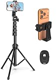
- 【Sturdy and Stable】: Made of premium aluminum alloy and stainless steel, Liphisy phone tripod with remote keeps your device stay securely in place for still shots and video recording.
- 【Multi-angle Shot】: With a max height of 64”, this tripod stand with a 210-degree rotation head and 360-degree rotation holder allows you to capture shots from any angle, catering to different photography needs.
- 【Wireless Remote Included】: Package includes a wireless remote that connects to your cell phone easily, making it a breeze to snap photos or video recordings.
- 【Height Adjustable】: The height of this cell phone tripod with remote can be adjusted from 17” to 64” and the easy lock mechanism makes it really easy to set up. It gives you an excellent vantage point for capturing photos and videos.
- 【Wide Application】: Compatable with different phone and camera, this tripod is great for photography and video recording, perfect for travel and home use.
Check input, scrolling, and browser chrome on hardware
On a real phone, open and dismiss the software keyboard, rotate the device, scroll nested regions, open dialogs, and test back navigation. Verify that fixed controls remain reachable when the browser address bar expands or collapses.
Independent reader supportYour contribution helps us test, update, and keep practical guides available for everyone.Troubleshooting mobile previews
The page is wider than the screen
In DevTools, inspect the element extending past the viewport and look for fixed widths, unbroken text, oversized images, or a positioned child. Check for an unintended horizontal scrollbar at the document level, then test the same URL on hardware to rule out an emulation-only artifact.
The mobile preset looks different from the phone
Confirm browser engine, zoom, device pixel ratio, orientation, and loaded content. Device Mode does not reproduce every mobile hardware characteristic, so use Android remote debugging or iOS Web Inspector for the final diagnosis.
A local site will not open on Android
Verify the development server and port, redo Chrome’s port-forwarding or virtual-host mapping, authorize USB debugging, and ensure the app accepts the forwarded hostname. A computer’s localhost is not the phone’s localhost.
Best Value
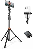
- Steel-Reinforced Steadiness:Featuring a tri-functional design, this 66-inch aluminum phone tripod stand integrates a steady base, telescoping arm, and multi-angle phone holder - an all-in-one solution for content creation, from overhead product shots to full-body portraits
- Intuitive Angle Control: Precision-engineered locking flanges enable instant switching between portrait, landscape, and 45° angled shots. Universally compatible with mobile phones ranging from 2.2" to 3.6" widths without slippage, making it a versatile addition to your Tripod & Monopod Accessories
- True Mobile Rig Flexibility:Engineered for steady everyday use rigidity, this adaptable cell phone tripod mount ensures rock-solid grip on smartphones. Its built-in Cold-Shoe slot enables seamless attachment of vlogging accessories like LED panels or mics
- Vibration-Free Content Creation: Integrated wireless Bluetooth remote (10m range) eliminates touchscreen interference. Perfect for capturing crisp stills or initiating smooth video recordings hands-free – an essential tool among modern Tripod & Monopod Accessories for solo creators
- In the Box: 66" Metal iphone tripod stand, 360° rotatable phone mount, 10m range phone camera remote, Includes 36 months of technical support and product coverage
The iPhone does not appear in Safari’s Develop menu
Unlock the device, reconnect the cable, confirm Web Inspector is enabled under Settings > Safari > Advanced, accept the trust prompt, and update Safari/macOS if the device remains unavailable. Wireless inspection requires the Xcode configuration described by Apple.
A screenshot API returns a blank page or challenge
Check the returned X-Page-Verdict and X-Billed headers, then adjust waits, headers, cookies, user agent, or blocked resources as appropriate. A bot check, blank page, timeout, or failed load is not a clean capture in ScreenshotNeo and is not billed.
A practical verification sequence
- Start with Chrome Device Mode at responsive widths and correct the obvious layout defects.
- Repeat the key routes in Safari Responsive Design Mode if Safari users matter.
- Exercise slow loading, orientation, keyboard, menus, dialogs, and long content.
- Reproduce browser- or hardware-sensitive issues with Android remote debugging or iOS Web Inspector.
- Capture a clean image or PDF for the issue record, or automate recurring captures with ScreenshotNeo.
Frequently Asked Questions
Can I preview a mobile site without owning a phone?
Yes. Chrome Device Mode and Safari Responsive Design Mode provide useful first-pass viewport checks, and Apple documents simulator testing. Use a real device when the issue depends on mobile hardware, sensors, keyboard behavior, or browser-specific runtime details.
Does responsive mode test touch events?
It can help you inspect touch-oriented layouts, but desktop emulation does not reproduce every mobile input and hardware behavior. Confirm important interactions on the target phone or tablet.
What’s actually slowing this PC down?
Pick the symptom - the matching free tool is one click away.
How do I preview a password-protected staging site?
Open it in the browser tool after authenticating, or provide the required authentication headers or cookies to an authorized screenshot workflow. Never place credentials in a public URL or client-side code.
What should I record when reporting a mobile rendering bug?
Record the device or emulation preset, browser and version, orientation, viewport dimensions, URL, account state, and exact interaction that reveals the problem. Include a screenshot and console or network errors when available.
Quick Recap
Product prices and availability are accurate as of the date/time indicated and are subject to change. Any price and availability information displayed on Amazon at the time of purchase will apply.

