
What’s actually slowing this PC down?
Pick the symptom - the matching free tool is one click away.
iTechGuides is reader-supported. When you buy through links on our site, we may earn an affiliate commission. As an Amazon Associate I earn from qualifying purchases. Learn more
AMP images need declared dimensions so AMP can determine their aspect ratio before downloading the image. For a fluid image, give amp-img a width and height that match the intended ratio, set layout="responsive", and constrain its parent if it should not expand across the full desktop width.
What the 2016 SitePoint thread reported
On March 2, 2016, SitePoint user John_Betong described replacing ordinary <img> elements with <amp-img>. He said the images appeared in Firefox and on an iPad Mini 2, but not consistently in desktop Chrome and Opera when explicit dimensions were missing. CSS with width:88%; max-width:888px; did not appear to fix the problem. A responder mentioned a Chrome “getClientRect” error, said images appeared in developer tools under some conditions, and tentatively suggested layout="responsive". These are user reports, not independently reproduced findings; the thread does not establish a final diagnosis or a verified conversion method. Read the SitePoint discussion.
Why AMP asks for dimensions
Unlike a browser that can fetch an image and then learn its intrinsic dimensions, AMP needs the image’s size in advance to calculate its aspect ratio and reserve the appropriate space. The width and height attributes communicate that ratio; they do not have to equal the image’s eventual on-screen pixel dimensions. See the AMP amp-img documentation.
Do these 3 things before closing this tab:
1Clear out junk files and repair common Windows errors2Fix the driver behind crashes, sound loss and screen glitches3Repair Windows errors before they cause bigger problemsMake an image fluid without distorting it
For an image that should scale to the width available from its parent while preserving its proportions, use layout="responsive" and supply dimensions representing the image’s true or intended crop ratio:
#1 Best Overall
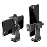
- FEATURE: the tripod phone mount is adjustable by screw mechanism, 360 degree rotating, vertical(portrait mode) and horizontal(landscape mode) or any angle as you need, not necessary to take your cell phone out of a standard tripod or small tripod.
- EASY TO USE: two options for using tripod phone holder: 1. screw it directly to the tripod or selfie stick with pivoting arm, being able to 360 degrees rotating, 2. remove the phone clamp from pivoting arm and then mount on a tripod or monopod.
- ADJUSTABLE WIDTH: 2.2inch-4.1inch(55mm-105mm), attachable to any regular-size smartphone, tripod, selfie stick, monopod or camera; two standard 1/4 x 20mm female thread interfaces meeting your various needs. Very functional and compact.
- MATERIAL: the black part made of sturdy plastic, the female threads inserted are brass, the male screw is steel and soft non-slipping silica gel pads, which protect your cellphone from scratch and hold the phone securely.
- ATTACHABLE TO: most mobile phones, tripods, unipods, selfie sticks, cameras, camcorders, pico projectors, including iPhone 11/11 Pro/11 Pro Max/X/XS/XR/XS Max/8/7/6/6s Plus/SE/5s/5/5c, Samsung Galaxy S10/10+/S9/S9+/S8/S8+/S7/S6/S6 edge, Note10/10+/9/8 and Android phones.
<amp-img
  src="/images/example.jpg"
  width="1200"
  height="800"
  layout="responsive"
  alt="Description of the image">
</amp-img>
Here, the declared ratio is 3:2. AMP scales the element to the container’s available width and derives its height from that ratio. The numeric values are an example, not a universal setting: use values matching each image’s actual ratio or the crop you intend to show. The AMP layout and media queries guide explains responsive sizing.
Choose the layout that matches the presentation
| Layout | How it behaves | Use it when |
|---|---|---|
responsive |
Scales with the parent’s available width and keeps the declared aspect ratio. | The image should be fluid and its intended ratio is known. |
fixed |
Uses the declared fixed width and height rather than scaling with the parent. | The image should remain at set dimensions. |
Other AMP layouts have different sizing rules; consult the AMPHTML Layout System guide when neither behavior fits.
Rank #2

- Dual Cold Shoe Mounts: Attach microphones, lights, and accessories for enhanced photography or vlogging.
- Versatile Screw Design: 1/4" screw hole compatible with tripods, selfie sticks, cameras, and various accessories.
- 360° Rotation, 180° Tilt: Effortlessly switch between landscape and portrait mode with adjustable angle design for precise control.
- Universal Phone Compatibility: Fits smartphones from iPhone 14 to Galaxy S23 Ultra, accommodating devices within 2.16" to 3.7" width. For best results, avoid clamping directly on the side buttons. Adjust the position slightly higher or lower if your phone has thick cases or protruding buttons.
- Secure Grip: Thick non-slip silicone pad ensures stability even with a thick phone case.
Keep responsive images from growing too wide
A responsive image can use all the width its container offers. If it becomes too large on desktop, limit the container’s width with CSS max-width and let the element scale within that boundary. A max-width rule on an image or wrapper can cap size, but it does not replace the dimensions AMP needs to infer the ratio. AMP’s guide to creating responsive AMP pages covers this container-based approach.
Plan a conversion image by image
- Identify each image’s actual aspect ratio, or decide the crop ratio the page should display.
- Add
widthandheightvalues that express that ratio to eachamp-img. - Choose
layout="responsive"for fluid scaling orlayout="fixed"for set dimensions, based on the intended presentation. - For responsive images that need a desktop size limit, constrain the parent container with CSS
max-width.
Do not assign one assumed ratio to every image: different images may have different proportions or intentional crops. The SitePoint discussion does not validate a bulk-conversion procedure, and its reported browser symptoms do not prove that missing dimensions were the only cause.
Quick Recap
Best Value

- Universal Phone Holder: This multifunctional phone clamp can be mounted on the top of a camera or tripod through 1/4"-20 threaded hole or cold shoe at the bottom for photography, live-streaming, vlogging, interviews, etc
- Support Landscape and Portrait Modes: The phone holder can be quick switching between landscape and portrait modes, and securely lock when rotated to 90° degrees. Two rotary joints supports 180 degrees adjustment
- Universal Compatibility: It supports smartphones with a width of 57-88mm / 2.5-3.5in (for Samsung, for iPhone 18 / 18 Pro / 18 Pro Max / 17 /17 Pro/17 Pro Max/16/16 Pro/16 Pro Max/15/15 Pro /15 Pro Max / for iPhone 14/14 Pro /14 Pro Max / for iPhone 13 /13 Pro /13 Pro Max / for iPhone 12 Pro Max and so on)
- Threaded Holes & Cold Shoe: Designed with well-spaced threaded holes to facilitate the installation of power bank holders (ID: 2336 / 2790). There is a cold shoe mount on top for microphone or light
- Package Included: phone holder x 1. Please note that the load capacity is 500g
Rank #4
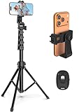
- 【Sturdy and Stable】: Made of premium aluminum alloy and stainless steel, Liphisy phone tripod with remote keeps your device stay securely in place for still shots and video recording.
- 【Multi-angle Shot】: With a max height of 64”, this tripod stand with a 210-degree rotation head and 360-degree rotation holder allows you to capture shots from any angle, catering to different photography needs.
- 【Wireless Remote Included】: Package includes a wireless remote that connects to your cell phone easily, making it a breeze to snap photos or video recordings.
- 【Height Adjustable】: The height of this cell phone tripod with remote can be adjusted from 17” to 64” and the easy lock mechanism makes it really easy to set up. It gives you an excellent vantage point for capturing photos and videos.
- 【Wide Application】: Compatable with different phone and camera, this tripod is great for photography and video recording, perfect for travel and home use.
Rank #3

- 🏆【Latest Metal Phone Tripod Mount】: 360° rotation smartphone holder with 2 side cold shoe and 1 back cold shoe & 1/4" Expand Hole Design, you can attach additional LED light, microphone or other film device. It helps you film steady vlogging video for Facebook, Youtube, and platforms as well as live streaming channels.
- 🏆【Back Cold Shoe & Two 1/4" Expand Hole Design】: There is a cold shoe on the back, which solves the problem that the wireless microphone cannot be fixed during mobile phone recording. Two 1/4" screw hole help you expand the devices you want.
- 🏆【Standard Arca Mount on Bottom】- ULANZI Iron Man IV with a standard Aka quick release plate port, quick installation. A 1/4 screw port is added at the bottom to connect tripods. It is all aluminum metal made. Solid, Durable and Safer.
- 🏆【Side Double Cold Shoe Design】: ULANZI ST-27 with 2 cold shoes on the side, you can mount your fill light & microphone at same time. It is be the best choice for your vlog.
- 🏆【Extra Wide Compatibility】: Ulanzi phone tripod mount compatible with iPhone17 16 15 14 13 12/12Pro/12Pro Max/11/11Pro/11Pro Max/X/Xs/XR/Xs Max,8/7/6/6s, iPhone 6/6s plus, iphone SE,Samsung Galaxy s10s10 plus S9/S9+,S8/S8+/S7/S6/S6 edge, Note 10 9 8 5 4 3 and many other brands and models
Product prices and availability are accurate as of the date/time indicated and are subject to change. Any price and availability information displayed on Amazon at the time of purchase will apply.

