
What’s actually slowing this PC down?
Pick the symptom - the matching free tool is one click away.
Build for the space your app actually has, not for a guessed device model or orientation. Apple’s announced iPhone Duo has a smaller outer display and a larger inner display with a hinge and camera areas to accommodate, so developers should make layouts resize cleanly, respect safe areas, and test the app in multiple poses. Apple’s guidance centers on adaptive SwiftUI or UIKit interfaces, scene-based sizing, and validation in Xcode’s iPhone Duo simulator.
What changes when an iPhone folds?
Apple announced iPhone Duo on September 9, 2026. Its outer display measures 5.4 inches and its inner display measures 7.6 inches; Apple says the inner display has 50 percent more area than iPhone 18 Pro Max and that the two displays share an aspect ratio. These are Apple’s product specifications, not independent measurements. Preorders are scheduled to begin October 16, 2026, with availability beginning October 23; as of October 7, both dates are still in the future.
For an app, the change is not simply a larger screen. Opening, closing, rotating, or partially folding the device changes the available scene space and how people hold or use it. The inner display also has a hinge through its center and reserved regions for cameras. System navigation and toolbar controls may appear vertically, while safe areas and margins can be asymmetric. Treat the open display as a larger but interrupted canvas—not automatically as one unobstructed rectangle.
How should an app adapt to the available space?
Make layout decisions from the scene, not the device name
Use SwiftUI’s adaptive layout tools or UIKit with Auto Layout, and respond to the current scene bounds and size classes. Choose compact or expanded presentations according to the space available at that moment. Avoid branching on a particular iPhone model, interface idiom, or portrait-versus-landscape status as a substitute for measuring the app’s actual environment. A window or scene can be resized, and its usable area need not match the physical screen bounds.
#1 Best Overall

- 【Strong Adsorption】The inspiration of the silicone phone suction case comes from the adhesive force of the octopus. Each suction cup phone mount is 3.15 inches long and 2.17 inches wide, with 24 independent suction cups providing a stronger and more stable suction force, so you don't have to worry about your phone falling during use.
- 【Back of Phone Suction Grip】Remove the adhesive film on the phone suction cup and stick it on the phone case. You can then fix the phone on any smooth surface, which is very convenient. (The phone suction cup cannot be removed and reused after being attached to the phone case. It is recommended to attach it to a regular phone case, not a valuable one.)
- 【Widely Used】Our non-slip silicone phone sticky grip mount attaches to almost any flat phone case and make it compatible with common mobile phones such as iPhone and Android.You can shoot, watch videos or video calls in the kitchen, gym, dance studio, bathroom and other places.
- 【Capture the Wonderful Picture】Whether you are a TikTok creator or just like to share videos and photos, this phone suction cup can help you hands-free capture wonderful videos and photos for sharing with friends.
- 【Note】You can fix the phone suction cup on a smooth surface such as a mirror or glass. If necessary, wipe the suction cup with a damp cloth to obtain stronger suction. Before releasing your hand, make sure the phone is firmly fixed. (Not applicable to rough walls, wooden surfaces, and other uneven surfaces)
Use scene-based UIKit lifecycle patterns
Apple recommends the scene lifecycle and says UIScene lifecycle is required when building with the latest SDKs. Review code that reads fixed main-screen dimensions or assumes one app-wide window: those assumptions can produce incorrect layout decisions when the app runs in a resized or different-screen context.
Choose when to adopt the full-screen experience
Apple’s Tech Talk distinguishes basic operation from adopting the newer full-screen experience. Apps not built with the iOS 27 SDK still run on iPhone Duo when open, in a familiar size and aspect ratio, according to Apple’s presentation. For apps built with the iOS 27.1 SDK, Apple says the experience extends to the screen edge; standard navigation and toolbar buttons lay out vertically beneath the status bar. Decide whether to adopt that behavior as part of a deliberate layout review, rather than assuming that compatibility alone means the app has been adapted to every display region.
Rank #2

- SUPERIOR COMFORT — Unlike traditional circular ear buds, the design of EarPods is defined by the geometry of the ear. Which makes them more comfortable for more people than any other ear bud–style headphones.
- HIGH-QUALITY AUDIO — The speakers inside EarPods have been engineered to maximize sound output and minimize sound loss, which means you get high-quality audio.
- BUILT-IN REMOTE — EarPods with USB-C plug also include a built-in remote that lets you adjust the volume, control the playback of music and video, and answer or end calls with a pinch of the cord.
- COMPATIBILITY — Works with all devices that have a USB-C port.
- INTEGRATED MICROPHONE — A built-in microphone precisely captures your voice while you’re on the phone, taking a FaceTime call, or summoning Siri — so you’re always heard loud and clear.
Which system components help with the two displays?
Prefer standard adaptive navigation and presentation components where they fit the app. Apple says these components adapt across device poses, reducing the amount of custom behavior developers need to maintain.
| Need | SwiftUI | UIKit | What to plan for |
|---|---|---|---|
| Navigation across compact and expanded layouts | NavigationSplitView |
UISplitViewController |
These can collapse to a single stack when the device is closed and show tiled or overlay columns when open. A sidebar on the inner display is an option. |
| Tab-based navigation | TabView |
UITabBarController |
Use the system component rather than assuming a custom tab layout will automatically adapt to each pose. |
| Secondary content and actions | Sheets, popovers, context menus, and alerts | Sheets, popovers, context menus, and alerts | System presentations adapt across poses; check that the chosen presentation remains useful in both compact and expanded space. |
Custom navigation is still possible, but it makes adaptation your responsibility. Review its hierarchy, control placement, and presentation behavior in both the closed and open configurations.
Rank #3

- Secure Hold: Our PopSockets adhesive phone grip gives your cell phone a secure, comfortable hold in hand to help prevent drops while texting, taking photos, or scrolling on the go. Designed to stick firmly to most phone cases and devices.
- Hands-Free Made Easy: Easily turn your PopSocket into a phone stand to prop up your phone anywhere, perfect for watching videos, video calls, or following recipes. A must-have phone holder that keeps your device secure and ready for anything.
- Compatibility: Works with all phones, tablets, and Kindles. Sticks best to smooth, hard plastic cases and may not adhere to silicone or textured cases. Easily swap your PopTop to change up your style.
- Black PopSockets: Simple, refined, and endlessly versatile. A timeless essential for any phone.
- Travel Must-Have for People On the Go: A must-have travel accessory for flights, flying, airports, air travel, airplanes, planes, international trips, cruises, and long travel days. Key gadget for your airport haul, travel accessories and must-haves.
How should the app handle the hinge, cameras, and safe areas?
Keep interactive content in usable regions
Respect safe areas for foreground content that people must read, tap, or manipulate. Apple says system bars avoid the status bar and camera regions, but insets may differ from one side to another. Do not assume equal margins around the display. Background artwork can extend beyond the safe area when that serves the design.
Let content flow around obstructions before moving it
Where possible, arrange content so it flows around the hinge and camera-reserved regions. If an important control or element would otherwise be obscured or difficult to reach, Apple describes a displacement pattern: move the affected element, or a related group, to a more useful region. Keep related elements together rather than spreading them far apart. Do not displace continuously scrolling articles, feeds, documents, or lists; their continuity is more important than repositioning individual items around the fold.
Rank #4

- [360 ° Flexible Rotation Design] Comes with a rotatable lanyard ring that supports 360 ° free rotation, effectively solving the problem of twisted and tangled lanyards
- [Wide compatibility] The ultra-thin 0.02-inch design does not block the charging port at all, and both wired and wireless charging can be used directly without removing the pad. Compatible with most smartphones such as iPhone, compatible with various wristbands, lanyards, crossbody straps, and keychains
- [Durable and Portable Material] Premium rust-resistant stainless steel material with good flexibility, which not only avoids scratching the phone case, but also has excellent anti rust and anti fading performance
- [Multi scenario Practical] Paired with a lanyard or wristband, hands-free use can be achieved. The phone is within reach and not easily dropped, ideal for daily commuting and outdoor activities. Suitable for full coverage phone cases, does not support half coverage phone cases
- [Quality Service] If you find any damage or other issues with the product upon receipt, please contact us immediately. We will handle it quickly
Use reserved-region support for custom edge-to-edge bars
If the app draws custom bars at the screen edge, Apple’s Tech Talk points to the ReservedRegion APIs introduced in iOS 27.1. This is a targeted tool for custom edge-to-edge layouts, not a reason to ignore safe areas elsewhere in the interface.
Independent reader supportYour contribution helps us test, update, and keep practical guides available for everyone.How should you test an iPhone Duo layout?
Apple directs developers to Xcode 27.1 and the iPhone Duo simulator in Device Hub. Its controls let you open, close, rotate, and fold the simulated device. Validate transitions and usable content—not just a single screenshot.
Windows Errors? Fix Them Before They Spread
Repair common Windows errors and clear accumulated junk for a smoother, more stable PC - no reinstall needed.Free scan · no reinstallOutdated Drivers Are Slowing You Down
One free scan finds every outdated or missing driver and matches the right update for your exact hardware.Free scan · exact hardware matchBest Value
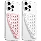
- 【PKYAA Double Sided Silicone Suction Phone Case Mount】PKYAA With Double Sided 40 Strong and Reliable individual suction cups, PKYAA provides a thicken and upgraded universal silicon suction mount for your phone.
- 【Friendly to Content Creators】If you are a content creator or an online influencer, you can create videos anywhere with this suction mount completely hands free with this silicone cell phone mount for cases.
- 【HANDS-FREE & Adhere to Mirrors】This Double Sided silicone suction phone case mount allows you to stick your phone to the mirror easily. No longer holding your phone in one hand to watch video tutorials while making up.
- 【Strong Grip on the Smooth Surface】You can easily hang your phone anywhere with a smooth surface. All you do is you clean off your phone and smooth surface. It is STURDY and it not only sticks to mirrors, it also sticks to windows, it sticks to refrigerators, tiles and other clean, flat surfaces.
- 【Press Down Firmly Every 30 Minutes】Use your palm or fingers to press the phone down firmly and check it's secure before letting go. Apply even pressure for a few seconds to allow the suction cup to adhere properly. To maintain the grip and prevent accidental falls, it's a good practice to periodically reapply pressure to the suction cup.
- Open the simulator: In Xcode 27.1, use Device Hub to launch the iPhone Duo simulator.
- Check the closed configuration: Confirm the outer-display layout remains legible and navigable in compact space.
- Open and rotate the device: Review the expanded inner display in portrait and landscape, including the position of navigation, toolbars, and primary actions.
- Exercise partial-fold and tent-like poses: Use the simulator’s fold controls and check whether content remains visible and reachable as the pose changes.
- Inspect reserved regions and insets: Look for controls, text, or important content colliding with the hinge, cameras, status bar, or asymmetric safe-area edges.
- Test multitasking: Run the app in Split View and confirm that its layout responds to the resulting scene size instead of retaining assumptions from full-screen use.
Repeat the checks after changing navigation or presentation behavior, and test important flows as the device moves between poses. A layout that looks correct in one portrait state may still fail when its scene shrinks, its columns collapse, or its safe-area insets change.
Which implementation approach is the safer starting point?
| Decision | Prefer | Be cautious about |
|---|---|---|
| What drives layout? | Actual scene size and size classes. | Branches based on model, interface idiom, or orientation alone. |
| How is navigation built? | Adaptive system components such as NavigationSplitView or UISplitViewController. |
Custom navigation that has not been adapted across poses. |
| How does content respond to the fold? | Flow around reserved regions; selectively displace an obscured element or related group. | Breaking the continuity of a scrolling article, feed, document, or list. |
| What defines usable screen space? | Scene and window context, with the recommended scene lifecycle. | Fixed main-screen bounds or legacy lifecycle assumptions. |
| How is the layout validated? | Simulator checks across open, closed, rotated, folded, safe-area, and multitasking states. | Relying on one portrait screenshot. |
The approach Apple summarizes for adaptive apps is to make layouts work across a continuum of devices and avoid inferring display size or capabilities from interface idiom. For foldable iPhone development, that means treating the current scene and pose as the inputs, then checking the real combinations your interface supports.
Quick Recap
Product prices and availability are accurate as of the date/time indicated and are subject to change. Any price and availability information displayed on Amazon at the time of purchase will apply.

