
The Tool Desk
Outbyte Driver Updater FREEScan for outdated or missing drivers - takes under a minuteDriver Scan →Outbyte PC Repair FREERepair Windows errors before they cause bigger problemsFix Now →Use background-size: cover on the element that should be filled. It scales the image without changing its proportions, so the element has no empty image area; when the image and element have different aspect ratios, some edges are cropped. Add background-position to control which part remains visible and give the element a real height.
The reliable full-page pattern
For a page-wide decorative background, apply the image to html (or another page-level container) and use these declarations:
html {
  min-height: 100%;
  background-color: #1d2633;
  background-image: url('/images/background.jpg');
  background-position: center;
  background-repeat: no-repeat;
  background-size: cover;
}

body {
  min-height: 100vh;
  margin: 0;
}
cover scales the source while preserving its aspect ratio until both dimensions cover the container. MDN defines this behavior in its background-size reference. The image is not stretched independently in each direction, but a wide image in a tall container (or the reverse) must lose part of its edges.
The background belongs to the element carrying these declarations. A page-level rule can cover the viewport, while a rule on a hero or card affects only that component. The background image does not create height by itself, so the element still needs content, padding, a declared height, or a minimum height.
#1 Best Overall

- The wall mural is cut into 3 pieces for easy installation, each in 48"x24",total size is 48"x72" (Height x Width)
- Very easy to apply, remove or reposition - Just PEEL & STICK!
- Crafted with premium materials, this wallpaper is designed to withstand the test of time. Its resistance to wear and tear ensures your walls will look stunning for years to come, without peeling or fading.
- This wallpaper is ideal for a variety of settings such as living rooms, bedrooms, and offices. Its universal design effortlessly matches different decor styles, making it a superb choice for enhancing both home and professional environments.
- Instantly elevate the ambiance of any room with this wallpaper. Whether you're looking to create a statement wall or add a subtle touch of elegance, its versatile design offers endless possibilities to refresh and revitalize your space.
Decide whether you mean the page or one section
Entire document or viewport
Use html for a background that should sit behind the document. Keeping body at least viewport-height prevents a short body from collapsing to the height of its contents. If your page can be taller than the viewport, do not use a fixed pixel height merely to make the first screen look full; let the document grow naturally.
A hero, banner, or content section
Put the same background properties on the section and give it a meaningful minimum height:
.hero {
  min-height: 70vh;
  padding: 4rem 1.5rem;
  color: white;
  background-color: #243447;
  background-image: url('/images/hero.jpg');
  background-position: center;
  background-repeat: no-repeat;
  background-size: cover;
}
min-height allows the section to expand when its text wraps or additional content is added. A hard height can clip content unless overflow is handled deliberately.
cover, contain, and distortion
| Value | What you get | Use it when | Trade-off |
|---|---|---|---|
cover |
The entire container is covered while proportions are preserved. | Edge-to-edge color or photography is more important than showing every pixel. | Parts of the image can be cropped. |
contain |
The complete image remains visible inside the container. | The whole diagram, logo, or illustration must be shown. | Uncovered space can remain around the image. |
100% 100% |
Width and height are set independently. | Only when deliberate distortion is acceptable. | The subject can look stretched or compressed. |
MDN documents that explicit background dimensions can size or stretch an image. Therefore, do not replace cover with 100% 100% when preserving the source shape matters. If neither cropping nor empty space is acceptable, change the container’s aspect ratio or choose a source image whose composition matches it; CSS cannot display incompatible proportions without one of those compromises.
Crashes, No Sound, or Screen Glitches?
Random freezes, missing sound and display glitches usually trace back to one bad driver. Find and replace yours safely.Free scan · under a minuteWindows Errors? Fix Them Before They Spread
Repair common Windows errors and clear accumulated junk for a smoother, more stable PC - no reinstall needed.Free scan · no reinstallControl the crop with background-position
The default starting point for a photograph is center. It keeps the middle of the image visible as the viewport changes. If the important subject is near an edge, move the focal point:
Rank #2
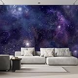
- The wall mural is cut into 6 pieces for easy installation, each in 100"x24",total size is 100"x144" (Height x Width)
- Very easy to apply, remove or reposition - Just PEEL & STICK!
- Crafted with premium materials, this wallpaper is designed to withstand the test of time. Its resistance to wear and tear ensures your walls will look stunning for years to come, without peeling or fading.
- This wallpaper is ideal for a variety of settings such as living rooms, bedrooms, and offices. Its universal design effortlessly matches different decor styles, making it a superb choice for enhancing both home and professional environments.
- Instantly elevate the ambiance of any room with this wallpaper. Whether you're looking to create a statement wall or add a subtle touch of elegance, its versatile design offers endless possibilities to refresh and revitalize your space.
.hero {
  background-position: 70% center;
}

.portrait {
  background-position: center top;
}

.landscape {
  background-position: 25% 40%;
}
The first percentage represents the horizontal position and the second the vertical position. Keywords such as left, right, top, bottom, and center are also valid. See MDN’s background-position reference for the syntax. Adjust the value at the narrowest layout where the subject is most likely to be cut off; a position that looks right on a desktop monitor can expose a different crop on a phone.
A complete HTML example with readable content
The following page keeps text in the document, places a translucent panel above the photo, and lets the hero grow if the copy becomes longer:
<!doctype html>
<html lang='en'>
<head>
  <meta charset='utf-8'>
  <meta name='viewport' content='width=device-width, initial-scale=1'>
  <title>Background demo</title>
  <style>
    html {
      min-height: 100%;
      background: #17202a url('/images/hero.jpg') center / cover no-repeat;
    }

    body {
      min-height: 100vh;
      margin: 0;
      font: 1rem/1.5 system-ui, sans-serif;
      color: #fff;
    }

    .hero {
      min-height: 100vh;
      box-sizing: border-box;
      display: grid;
      place-items: center;
      padding: 2rem;
      background: linear-gradient(rgb(0 0 0 / .35), rgb(0 0 0 / .35));
    }

    .hero__content {
      max-width: 42rem;
      padding: 2rem;
      background: rgb(0 0 0 / .55);
      border-radius: .5rem;
    }
  </style>
</head>
<body>
  <main class='hero'>
    <section class='hero__content' aria-labelledby='heading'>
      <h1 id='heading'>A page-filling background</h1>
      <p>The image is decorative; this text remains real, selectable HTML.</p>
    </section>
  </main>
</body>
</html>
The shorthand background: ... center / cover no-repeat places the position before the slash and the size after it. Writing the longhand properties separately is often easier while debugging. The solid color is a fallback behind transparent portions of an image and while the file is unavailable.
Recommended Free Tools
Layer overlays without changing the image file
Darkening or tinting an image can improve text contrast. A gradient can be listed before the image, so it is painted above it:
.hero {
  background-image:
    linear-gradient(rgb(0 0 0 / 45%), rgb(0 0 0 / 45%)),
    url('/images/hero.jpg');
  background-position: center;
  background-size: cover;
  background-repeat: no-repeat;
}
Keep the fallback background-color as well. It appears in uncovered areas, behind transparent image pixels, and if the image cannot be loaded. Choose text and overlay colors that remain readable across the lightest part of the photograph.
Rank #3
- The wall mural is cut into 4 pieces for easy installation, each in 66"x24",total size is 66"x96" (Height x Width)
- Very easy to apply, remove or reposition - Just PEEL & STICK!
- Crafted with premium materials, this wallpaper is designed to withstand the test of time. Its resistance to wear and tear ensures your walls will look stunning for years to come, without peeling or fading.
- This wallpaper is ideal for a variety of settings such as living rooms, bedrooms, and offices. Its universal design effortlessly matches different decor styles, making it a superb choice for enhancing both home and professional environments.
- Instantly elevate the ambiance of any room with this wallpaper. Whether you're looking to create a statement wall or add a subtle touch of elegance, its versatile design offers endless possibilities to refresh and revitalize your space.
What background-attachment changes
For the normal scrolling behavior, omit background-attachment or use scroll. With fixed, the positioning area used for background sizing is the entire viewport, as MDN explains in its background-size documentation. The image stays associated with the viewport while the document content moves over it:
html {
  background: #101820 url('/images/background.jpg') center / cover no-repeat fixed;
}
Fixed backgrounds can behave differently in mobile browsers and can make long pages feel visually busy. Treat this as an intentional effect, not a requirement for filling the page. Test it on the devices and browsers your audience uses.
Accessibility and meaningful imagery
A CSS background has no alt attribute. If the image conveys information needed to understand the page—such as a chart, product detail, or instructional diagram—put it in the document as an <img> with appropriate alternative text, or provide an equivalent text description. MDN’s background property guidance distinguishes decorative backgrounds from images that carry meaning. Reserve CSS backgrounds for decoration and keep important words in HTML rather than baking them into the bitmap.
Protect text from the crop
- Keep the focal subject away from the area occupied by headings and buttons, or shift
background-positionto leave that area clear. - Use an overlay or a solid content panel when contrast changes significantly across the photograph.
- Check the narrowest supported viewport and zoomed text layout, not only a wide desktop screenshot.
Or skip the browser setup
If you need a rendered image of the finished page for a review, document, or automation step, ScreenshotNeo accepts one GET request and returns a PNG, JPEG, WebP, or PDF. It is useful after you have published the CSS because the service loads the URL instead of requiring you to install and script a browser.
See the ScreenshotNeo API documentation for all parameters. A minimal cURL request is:
Rank #4
- The wall mural is cut into 4 pieces for easy installation, each in 66"x24",total size is 66"x96" (Height x Width)
- Enhance your space with our superior non-woven wallpaper: robust, easy-to-install, with a chic semi-matte look, odorless, warp-proof, and guarantees a flawless finish without bubbles or wrinkles.
- This non-woven wallpaper is designed for easy application with wallpaper glue (not included), making it a great choice for both DIY enthusiasts and professional decorators.
- Perfect for creating an accent wall, renovating an entire room, or customizing a space, this wallpaper is ideal for living rooms, bedrooms, and offices.
- For maintenance, the wallpaper can easily be cleaned with a dry cloth, making it simple to remove dust and keep the surface looking pristine without damaging the design
curl -G "https://api.screenshotneo.com/v1/shot" -d access_key=YOUR_API_KEY --data-urlencode url=https://stripe.com -o shot.webpThe same request in Python:
import requests
r = requests.get("https://api.screenshotneo.com/v1/shot", params={"access_key": "YOUR_API_KEY", "url": "https://stripe.com"}, timeout=90)
open("shot.webp", "wb").write(r.content)
And in Node.js:
const q = new URLSearchParams({ access_key: 'YOUR_API_KEY', url: 'https://stripe.com' });
const res = await fetch(`https://api.screenshotneo.com/v1/shot?${q}`);
Replace the example URL with the public page containing your background. ScreenshotNeo accepts the cookie or consent banner like a visitor and removes more than 60 known consent platforms, newsletter popups, and chat widgets before capture; each cleanup step can be turned off. Bot checks or CAPTCHAs, blank pages, timeouts, failed loads, and cache hits are not billed, and response headers identify the page verdict and whether it was billed. An MCP server provides take_screenshot, get_page_info, and capture_pdf tools for Claude, Cursor, and other MCP clients. The Free plan includes 1,000 shots per month with no card; paid plans start at $5 for 3,000 shots. Create a free ScreenshotNeo account.
Quick wins for a faster PC:
Scan for outdated or missing drivers - takes under a minuteDriver Scan →Repair Windows errors before they cause bigger problemsFix Now →Troubleshoot a background that does not fill
Only a strip of the image appears
The receiving element is probably only as tall as its content. Inspect it in developer tools and add the intended min-height—for example, 100vh for a viewport hero—or add appropriate padding. Remember that a background never supplies layout height.
The image repeats like tiles
Set background-repeat: no-repeat. Repetition is independent of cover; the size value controls scaling, not whether the browser paints additional copies.
There are empty bands
Check whether contain or an explicit size is being used. Change to cover when edge-to-edge coverage has priority, or keep contain if showing the complete image is the requirement and style the fallback color to make the remaining area intentional.
The subject is cut off
That is the expected cost of cover when aspect ratios differ. Move the focal point with background-position, choose a less tightly framed source, or use contain if cropping is unacceptable.
The background is a flat fallback color
Open the image URL directly and inspect the network request. Confirm the path and filename case, that the server returns an image, and that the page can request it under its content-security policy. Keep a useful background-color so a failed request still leaves readable content.
Best Value

- The wall mural is cut into 3 pieces for easy installation, each in 108"x24",total size is 108"x72" (Height x Width)
- Very easy to apply, remove or reposition - Just PEEL & STICK!
- Crafted with premium materials, this wallpaper is designed to withstand the test of time. Its resistance to wear and tear ensures your walls will look stunning for years to come, without peeling or fading.
- This wallpaper is ideal for a variety of settings such as living rooms, bedrooms, and offices. Its universal design effortlessly matches different decor styles, making it a superb choice for enhancing both home and professional environments.
- Instantly elevate the ambiance of any room with this wallpaper. Whether you're looking to create a statement wall or add a subtle touch of elegance, its versatile design offers endless possibilities to refresh and revitalize your space.
It works on one page but not another
Compare which element owns the rule. A selector scoped to .hero cannot fill a different section, and a later rule with greater specificity can override the image, position, repeat, or size. In developer tools, inspect the computed values rather than only the stylesheet source.
Scrolling looks wrong with fixed
Remove fixed and retest with the default scrolling attachment. If the effect is required, verify it on mobile browsers as well as desktop; the viewport used for a fixed background is not the same as a normal element’s positioning area.
A final verification checklist
- Confirm the background is attached to the element whose area you actually want to cover.
- Give that element a real height or
min-height; use100vhor content-driven sizing deliberately. - Set
background-size: coverwhen no empty image area is acceptable. - Set
background-positionto protect the subject at narrow and wide widths. - Use
background-repeat: no-repeatunless tiling is intentional. - Provide a fallback color and verify the image URL in the network panel.
- Keep informative imagery semantic with alternative text; use CSS backgrounds for decoration.
- Check text contrast, zoomed layouts, and long content before shipping.
Frequently asked questions
Does cover alter the original image file?
No. It changes how the browser scales and crops the image while painting the background; the source file remains unchanged.
Do these 3 things before closing this tab:
1Clear out junk files and repair common Windows errors2Scan for outdated or missing drivers - takes under a minute3Repair Windows errors before they cause bigger problemsCan I fill a page with several background images?
Yes. Provide comma-separated layers in background-image and matching comma-separated positions, sizes, and repeats. The first image is painted above the later ones, which is why a gradient can sit over a photograph.
Should a logo be a CSS background?
Usually not when the logo identifies the site or communicates information. Use an image element with suitable alternative text so assistive technology and non-CSS contexts can recognize it.
Frequently Asked Questions
Will the image stay centered as the window changes?
Yes, when background-position: center is used; the visible crop changes as the container’s proportions change.
What if the image must never be cropped?
Use background-size: contain and accept that the container may show uncovered space, or change the container and source-image proportions.
Quick Recap
Product prices and availability are accurate as of the date/time indicated and are subject to change. Any price and availability information displayed on Amazon at the time of purchase will apply.

