
What’s actually slowing this PC down?
Pick the symptom - the matching free tool is one click away.
Yes—you can capture a website at mobile, tablet, laptop, and desktop sizes without owning every device. Chrome and Microsoft Edge DevTools let you emulate responsive viewports, inspect the breakpoints that change your layout, and save either the visible viewport or a full-page image. Use a real phone for final checks when hardware-specific behavior matters, because emulation is an approximation rather than proof of identical device performance.
Choose the right screenshot workflow
Your best method depends on what you need to learn:
- One-off visual check: browser Device Mode is free and fast. Set an exact width, load the page, and capture the viewport or full document.
- Responsive debugging: inspect CSS media queries, then test just below, at, and just above each breakpoint.
- Repeatable reports or many URLs: an API can produce consistent images at named device sizes, with the same options on every run.
- Device-specific confidence: combine emulation with a physical phone or tablet when touch behavior, mobile CPU architecture, sensors, browser chrome, or network conditions could change the result.
A screenshot records a rendered state. It does not by itself establish that scrolling, gestures, orientation changes, permissions, or performance match a real handset.
Capture responsive screenshots in Chrome
Chrome’s Device Mode provides a responsive canvas, device presets, rotation, and screenshot commands. The labels below follow Chrome’s documented workflow in Device Mode documentation.
Do these 3 things before closing this tab:
1Repair Windows errors before they cause bigger problems2Fix the driver behind crashes, sound loss and screen glitches3Clear out junk files and repair common Windows errors#1 Best Overall

- Do what you love, uninterrupted — 25% faster performance than the previous generation and is ideal for seamless streaming, reading, and gaming.
- High-def entertainment — A 10.1" 1080p Full HD display brings brilliant color to all your shows and games. Binge watch longer with 13-hour battery, 3 or 4 GB RAM, 32 or 64 GB of storage, and up to 1 TB expandable storage with micro-SD card (sold separately).
- Thin, light, durable — Tap into entertainment from anywhere with a lightweight, durable design and strengthened glass made from aluminosilicate glass. As measured in a tumble test, Fire HD 10 is 2.7 times as durable as the Samsung Galaxy Tab A8 (2022).
- Stay up to speed — Use the 5 MP front-facing camera to Zoom with family and friends, or create content for social apps like Instagram and TikTok.
- Ready when inspiration strikes — With 4,096 levels of pressure sensitivity, the Made for Amazon Stylus Pen (sold separately) offers a natural writing experience that responds to your handwriting. Use it to write, sketch in apps like OneNote, and more.
- Open the page in Chrome and press F12 or Ctrl+Shift+I (Windows/Linux), or Cmd+Option+I (macOS).
- Click the Toggle device toolbar button, or press Ctrl+Shift+M / Cmd+Shift+M.
- In the device toolbar, choose Responsive to enter dimensions manually, or select a profile. Drag the handles or type the exact width and height you want.
- Set the device pixel ratio, orientation, and optional touch simulation when your test requires them. These settings affect rendering; they do not turn a desktop computer into the selected phone.
- Open the DevTools More options menu (the three-dot menu in the device toolbar), choose Capture screenshot for the current viewport, or choose Capture full size screenshot to include content below the fold.
- Open the downloaded PNG and record the URL, viewport dimensions, zoom or device scale, and date if the image is going into a bug report or design review.
A viewport capture contains only what is visible inside the emulated canvas. A full-size capture renders the page’s scrollable height, which is useful for long landing pages but can expose lazy-loading or sticky-header behavior that differs during a normal scroll.
Useful Chrome width presets
Chrome documents these convenience widths: they are tool presets, not a survey of what devices people own and not a universal device standard.
| Preset | Width | Good use |
|---|---|---|
| Mobile S | 320 px | Very narrow phones and cramped text wrapping |
| Mobile M | 375 px | Common compact-phone layout check |
| Mobile L | 425 px | Larger phone and one-column boundary check |
| Tablet | 768 px | Tablet portrait and navigation transition |
| Laptop | 1024 px | Small desktop or tablet landscape |
| Laptop L | 1440 px | Wide desktop layout |
| 4K | 2560 px | Very wide monitor spacing and max-width behavior |
If a profile you need is missing, Chrome lets you add a custom device with a name and dimensions. The steps are documented in Chrome’s Devices settings.
Test the breakpoints your CSS actually uses
Named presets can miss the width where your own layout changes. In Device Mode, open the media-query display above the page. Chrome shows bars for max-width and min-width queries; selecting a bar reveals the associated CSS declaration.
The Tool Desk
Outbyte Driver Updater FREEFix the driver behind crashes, sound loss and screen glitchesFind Drivers →Outbyte PC Repair FREEClear out junk files and repair common Windows errorsFree Scan →- List the breakpoints that control navigation, grids, typography, and visibility.
- Capture one width a few pixels below each breakpoint, one at the breakpoint, and one a few pixels above it.
- Check intermediate widths such as 360, 390, 414, 820, 912, and 1280 px when your design has fluid ranges rather than only fixed breakpoints.
- Look for horizontal overflow, clipped buttons, unexpected wrapping, collapsed menus that cannot be reopened, and images whose intrinsic dimensions force a wider layout.
This method tests the layout logic you shipped instead of assuming a short device list represents every transition.
Rank #2
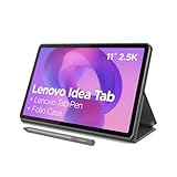
- POWER YOUR STUDY, FUEL YOUR PLAY – Discover smarter learning with the Lenovo Idea Tab. Stay campus-ready with all-day battery life, AI-powered apps to enhance your work, and sharp graphics for tv marathons with friends.
- SMOOTH, POWERFUL, IMMERSIVE – The MediaTek Dimensity 6300 processor is more powerful than ever, with the AI-enhanced multitasking you need to stay ahead.
- CIRCLE IT, SEARCH IT – Use your Lenovo Tab Pen or fingertip to circle items for instant search results or to translate other languages without switching apps. Circle to Search with Google ensures answers are only a circle away.
- SHARP VIEW, CLEAR SOUND – Experience sharp visuals and immersive sound for study sessions and streaming breaks. With 72% NTSC and quad Dolby Atmos-tuned speakers you can enjoy your study breaks with vivid videos and crystal-clear sound.
- LEVEL UP YOUR STUDY – Write, organize, sketch, and calculate with four learning apps built to match your flow. Lenovo AI Note, Squid, Nebo, and MyScript Calculator help you stay clear, focused, and ready for every study session.
Capture responsive screenshots in Microsoft Edge
Edge has a comparable Device Emulation workflow. Open DevTools with F12 or Ctrl+Shift+I, activate device emulation, enter responsive dimensions or choose a profile, and use the capture command for the visible area or the full page. Edge also supports rotation and breakpoint inspection. Its guidance is described in Microsoft’s Device Emulation documentation.
Use Chrome or Edge according to the browser engine your users and your production bug report involve. A Chromium screenshot is not automatically representative of Safari on iOS or another rendering engine.
What emulation can—and cannot—tell you
What it is good at
- Checking CSS width and height rules, responsive images, grid or flex changes, and text wrapping.
- Producing repeatable viewport and full-page captures without buying hardware.
- Finding the exact width at which a component changes state.
- Comparing before-and-after CSS changes at identical dimensions.
Where it stops being evidence
- Chrome describes Device Mode as an approximation of mobile appearance and performance. Desktop and mobile CPU architectures can behave differently.
- Touch, virtual keyboards, sensors, browser UI, power management, GPU drivers, and mobile browser bugs may not be reproduced.
- A full-page image cannot prove that lazy loading, infinite scroll, or fixed elements behave correctly during a human scroll.
When these differences matter, open the page on a physical phone or tablet. Chrome’s guidance also describes Remote Debugging for connecting desktop DevTools to a page running on Android. Edge likewise recommends real-device testing for the most robust check.
Free tools Windows power users keep installed
One-click scans. No signup required.
Make captures comparable and reviewable
- Control the state: use the same URL, account state, locale, timezone, color scheme, and zoom for each comparison.
- Wait for content: allow fonts, images, and client-side data to finish loading. For a long page, scroll through once if lazy images are part of what you are evaluating.
- Record dimensions: include CSS viewport width and height, device scale, orientation, browser, and whether the image is viewport or full-page.
- Check overlays: cookie banners, newsletter dialogs, chat launchers, and ads can obscure the page. Dismiss them consistently or document that they remain.
- Compare at the same breakpoint: a 375-pixel capture and a 390-pixel capture may legitimately use different navigation or typography rules.
Or skip the browser setup
ScreenshotNeo is a website screenshot API and MCP server for developers. It can render a URL at a chosen viewport, device preset, or retina scale and return PNG, JPEG, WebP, or PDF. Before capture it accepts the cookie or consent banner like a visitor and removes more than 60 known consent platforms, newsletter popups, and chat widgets; each cleanup step can be turned off. Bot checks or CAPTCHAs, blank pages, timeouts, failed loads, and cache hits cost nothing, and response headers identify the page verdict and whether the shot was billed.
Use the ScreenshotNeo documentation for the full parameter list. The API supports full-page capture with lazy images loaded, a CSS-selector element capture, dark mode, 12 device presets plus arbitrary viewports, retina scale, PDF paper size/margins/landscape/page ranges, custom HTML/CSS and JavaScript, clicks before capture, hidden selectors, waits for a selector or delay or network idle, blocking ads/trackers/requests/resource types, custom headers/cookies/user agent/Authorization, timezone and geolocation, transparent backgrounds, resizing, chosen-TTL caching, signed links for public image tags, asynchronous jobs with signed webhooks, bulk capture of up to 100 URLs per call, a usage API, and an OpenAPI specification. Common parameter names used by other screenshot APIs also work, which can simplify migration.
Rank #3

- WHY IPAD — The 11-inch iPad is now more capable than ever with the superfast A16 chip, a stunning Liquid Retina display, advanced cameras, fast Wi-Fi, USB-C connector, and four gorgeous colors.* iPad delivers a powerful way to create, stay connected, and get things done.
- PERFORMANCE AND STORAGE — The superfast A16 chip delivers a boost in performance for your favorite activities. And with all-day battery life, iPad is perfect for playing immersive games and editing photos and videos.* Storage starts at 128GB and goes up to 512GB.*
- 11-INCH LIQUID RETINA DISPLAY — The gorgeous Liquid Retina display is an amazing way to watch movies or draw your next masterpiece.* True Tone adjusts the display to the color temperature of the room to make viewing comfortable in any light.
- IPADOS + APPS — iPadOS makes iPad more productive, intuitive, and versatile. With iPadOS, run multiple apps at once, use Apple Pencil to write in any text field with Scribble, and edit and share photos.* iPad comes with essential apps like Safari, Messages, and Keynote, with over a million more apps designed specifically for iPad available on the App Store.
- FAST WI-FI CONNECTIVITY — Wi-Fi 6 gives you fast access to your files, uploads, and downloads, and lets you seamlessly stream your favorite shows.
cURL
curl -G "https://api.screenshotneo.com/v1/shot" -d access_key=YOUR_API_KEY --data-urlencode url=https://stripe.com -o shot.webpReplace the URL with the page you need. Add the documented viewport, device, format, or wait parameters when your capture requires them.
Python
import requests
r = requests.get("https://api.screenshotneo.com/v1/shot", params={"access_key": "YOUR_API_KEY", "url": "https://stripe.com"}, timeout=90)
r.raise_for_status()
open("shot.webp", "wb").write(r.content)
Node.js
const q = new URLSearchParams({ access_key: 'YOUR_API_KEY', url: 'https://stripe.com' });
const res = await fetch(`https://api.screenshotneo.com/v1/shot?${q}`);
if (!res.ok) throw new Error(`${res.status} ${res.statusText}`);
const fs = await import('node:fs/promises');
await fs.writeFile('shot.webp', Buffer.from(await res.arrayBuffer()));
ScreenshotNeo is useful when the same responsive set must be regenerated in CI, a documentation build, a visual-regression job, or an AI workflow. Its MCP server exposes take_screenshot, get_page_info, and capture_pdf tools to Claude, Cursor, and other MCP clients.
Plans and billing
| Plan | Included shots | Price |
|---|---|---|
| Free | 1,000 per month | $0, no card |
| Starter | 3,000 | $5 |
| Growth | 15,000 | $15 |
| Pro | 60,000 | $39 |
| Scale | 250,000 | $99 |
| Business | 1,000,000 | $249 |
Yearly billing gives two months free, and every feature is available on every plan. Start with 1,000 free screenshots a month—no card required.
Independent reader supportYour contribution helps us test, update, and keep practical guides available for everyone.Troubleshooting checklist
The screenshot is blank
Confirm the URL is publicly reachable, wait for client-side rendering, and try a selector wait or network-idle wait. In DevTools, reload with the console open and check for JavaScript errors, blocked requests, authentication requirements, or a page that renders only after interaction.
Rank #4

- Fire HD 8 offers an 8" HD display for seamless streaming and gaming, coupled with a 5MP rear facing camera for photos—with a thin, light, durable design.
- Fast and responsive with long battery life - With up to 4 GB RAM (2X more than 2022 release), 64GB of storage, and up to 1 TB of expandable storage (sold separately). Hexa-core processor for fast, responsive performance. Up to 13 hours of reading, browsing the web, watching videos, gaming, and listening to music at home and on-the-go.
- Save time, get creative - Enjoy three smart tools to help you send polished emails, quickly summarize webpages, and create unique wallpapers.
- Stream or download your favorite shows, movies, and games (like Minecraft, Roblox, and more). Enjoy your favorite content from Facebook, Hulu, Instagram, TikTok, and more through Amazon’s Appstore (Google Play not supported. Subscription for some apps required).
- Stay connected with family and friends - ask Alexa to make video calls to friends and family or download apps like Zoom.
The mobile layout never appears
Verify Device Mode is enabled and that the viewport width is below the site’s breakpoint. Inspect the media-query display rather than relying on a named phone profile. Check for a missing or incorrect viewport meta tag on the page.
Images or fonts are missing
Wait for network activity to finish, check that assets are not blocked by an extension or origin policy, and test the page without a service worker cache. For automated captures, use an explicit selector or delay and ensure the target assets are publicly accessible.
The full-page image differs from a manual scroll
Lazy-loaded content may require scrolling to trigger, while fixed headers can be repeated or repositioned during stitching. Compare a viewport capture, a manually scrolled recording, and a full-size capture before treating the difference as a CSS defect.
A capture is billed or rejected unexpectedly
For any API, inspect the HTTP status and response headers, confirm the access key, encode the URL correctly, and review page-verdict and billing headers. A bot check, timeout, failed load, blank page, or cache hit is explicitly non-billable in ScreenshotNeo; other successful clean captures consume the plan allowance.
Best Value

- COMPACT SIZE, COMPACT FUN – The Lenovo Tab One is compact, efficient, and provides non-stop entertainment everywhere you go. It’s lightweight and has a long-lasting battery life so the fun never stops.
- SIMPLICITY IN HAND - Add a touch of style with a modern design that’s tailor-made to fit in your hand. It weighs less than a pound and has an 8.7” display that’s easy to tuck in a purse or backpack.
- NON-STOPPABLE FUN – Freedom never felt so sweet with all-day battery life and up to 12.5 hours of unplugged YouTube streaming. It’s designed to charge 15W faster than previous models so you can spend less time tethered to a power cable.
- PORTABLE MEDIA CENTER - Enjoy vibrant visuals, immersive sound, and endless entertainment anywhere you go. The HD display has 480 nits of brightness for realistic graphics and dual Dolby Atmos speakers that provide impressive sound depth.
- ELEVATED EFFICIENCY - Experience the MediaTek Helio G85 processor and 60Hz refresh rate that ensure fluid browsing, responsive gaming, and lag-free streaming.
FAQ
Do I need a separate phone for ordinary responsive screenshots?
No. DevTools emulation is sufficient for viewport layout checks. Use hardware when you need evidence about behavior that desktop emulation cannot reproduce.
Should I capture the viewport or the full page?
Choose viewport for what a visitor sees immediately and full size for document-level review. Keep the choice consistent when comparing revisions.
Windows Errors? Fix Them Before They Spread
Repair common Windows errors and clear accumulated junk for a smoother, more stable PC - no reinstall needed.Free scan · no reinstallCrashes, No Sound, or Screen Glitches?
Random freezes, missing sound and display glitches usually trace back to one bad driver. Find and replace yours safely.Free scan · under a minuteWhat width should I test first?
Start with your site’s media-query breakpoints, then add the documented Chrome presets and any widths where your content is known to wrap or overflow.
Quick Recap
Product prices and availability are accurate as of the date/time indicated and are subject to change. Any price and availability information displayed on Amazon at the time of purchase will apply.

