
Recommended Free Tools
Responsive sites adapt their layout and content to the available space instead of assuming every visitor uses the same screen width. Start with flexible layouts, make media fit its container, and test whether people can read, navigate, and interact at narrow, wide, and zoomed views. There is no single breakpoint recipe that suits every site.
What responsive design means
Responsive web design is an approach to making a page work across different device sizes. As MDN puts it, “Responsive web design isn’t a separate technology — it is an approach.” MDN Web Docs
HTML content normally flows into the available space, but rigid widths and fixed layouts can make a page too cramped on a phone or leave excessive empty space on a large display. The goal is not to make every screen look identical: it is to preserve useful content and make the layout comfortable to use at each size.
Build a layout that can reflow
Set the viewport
Include the viewport setting so mobile browsers lay out the page at the device width rather than using a wider virtual layout:
#1 Best Overall

- 【Strong Adsorption】The inspiration of the silicone phone suction case comes from the adhesive force of the octopus. Each suction cup phone mount is 3.15 inches long and 2.17 inches wide, with 24 independent suction cups providing a stronger and more stable suction force, so you don't have to worry about your phone falling during use.
- 【Back of Phone Suction Grip】Remove the adhesive film on the phone suction cup and stick it on the phone case. You can then fix the phone on any smooth surface, which is very convenient. (The phone suction cup cannot be removed and reused after being attached to the phone case. It is recommended to attach it to a regular phone case, not a valuable one.)
- 【Widely Used】Our non-slip silicone phone sticky grip mount attaches to almost any flat phone case and make it compatible with common mobile phones such as iPhone and Android.You can shoot, watch videos or video calls in the kitchen, gym, dance studio, bathroom and other places.
- 【Capture the Wonderful Picture】Whether you are a TikTok creator or just like to share videos and photos, this phone suction cup can help you hands-free capture wonderful videos and photos for sharing with friends.
- 【Note】You can fix the phone suction cup on a smooth surface such as a mirror or glass. If necessary, wipe the suction cup with a damp cloth to obtain stronger suction. Before releasing your hand, make sure the phone is firmly fixed. (Not applicable to rough walls, wooden surfaces, and other uneven surfaces)
<meta name="viewport" content="width=device-width, initial-scale=1">Use flexible layout rules
Prefer flexible containers and modern CSS layout methods over fixed-width page structures. Constrain text line length where that improves readability, while ensuring the container can still shrink on narrow screens. Check the intermediate sizes too: a layout that works on a phone and a desktop can still become awkward between them.
Choose breakpoints from the content
Add a breakpoint when the content or controls become cramped, collide, or lose a useful hierarchy—not because a particular device width is supposedly universal. Inspect the page at different widths and zoom levels, then adjust the layout where its content needs a different arrangement.
Rank #2

- SUPERIOR COMFORT — Unlike traditional circular ear buds, the design of EarPods is defined by the geometry of the ear. Which makes them more comfortable for more people than any other ear bud–style headphones.
- HIGH-QUALITY AUDIO — The speakers inside EarPods have been engineered to maximize sound output and minimize sound loss, which means you get high-quality audio.
- BUILT-IN REMOTE — EarPods with USB-C plug also include a built-in remote that lets you adjust the volume, control the playback of music and video, and answer or end calls with a pinch of the cord.
- COMPATIBILITY — Works with all devices that have a USB-C port.
- INTEGRATED MICROPHONE — A built-in microphone precisely captures your voice while you’re on the phone, taking a FaceTime call, or summoning Siri — so you’re always heard loud and clear.
Make images and media responsive
Keep media within its container when it should scale with the layout. A common baseline is:
img, video { max-width: 100%; height: auto; }For images with multiple prepared resolutions, use srcset and sizes to let the browser choose a suitable source for the rendered size. Use <picture> when the composition itself should change—for example, a tighter crop at a narrow width. These approaches help avoid sending a desktop-sized image when a smaller asset is suitable, but the source images still need to be optimized and composed for their intended use. See MDN’s responsive images guide.
Quick wins for a faster PC:
Repair Windows errors before they cause bigger problemsFix Now →Scan for outdated or missing drivers - takes under a minuteDriver Scan →Clear out junk files and repair common Windows errorsFree Scan →Rank #3

- Secure Hold: Our PopSockets adhesive phone grip gives your cell phone a secure, comfortable hold in hand to help prevent drops while texting, taking photos, or scrolling on the go. Designed to stick firmly to most phone cases and devices.
- Hands-Free Made Easy: Easily turn your PopSocket into a phone stand to prop up your phone anywhere, perfect for watching videos, video calls, or following recipes. A must-have phone holder that keeps your device secure and ready for anything.
- Compatibility: Works with all phones, tablets, and Kindles. Sticks best to smooth, hard plastic cases and may not adhere to silicone or textured cases. Easily swap your PopTop to change up your style.
- Black PopSockets: Simple, refined, and endlessly versatile. A timeless essential for any phone.
- Travel Must-Have for People On the Go: A must-have travel accessory for flights, flying, airports, air travel, airplanes, planes, international trips, cruises, and long travel days. Key gadget for your airport haul, travel accessories and must-haves.
Make the mobile experience usable and accessible
Fitting a page onto a small screen is not enough. Check whether people can understand the content and operate the interface, including when they zoom. W3C recommends designing for accessibility across devices; its guidance on designing for Web accessibility and reflow is useful for review.
- Keep text legible and important controls easy to identify and use.
- Present navigation clearly; make sure the main content and primary routes remain findable on narrow viewports.
- Do not use color as the only way to convey a state or instruction.
- Associate form labels with their controls so the fields remain understandable to assistive technology.
- Check layouts at narrow widths and when zoomed, not only at a preferred phone preset. MDN’s mobile accessibility guidance covers mobile-specific considerations.
Measure performance rather than guessing
Google describes Core Web Vitals as field measures of loading performance, interactivity, and visual stability. Its published targets for a good experience are LCP within 2.5 seconds, INP below 200 milliseconds, and CLS below 0.1. These are performance targets, not guarantees of search ranking or conversion outcomes. Review real-user data in Search Console’s Core Web Vitals report and use suitable tools to diagnose individual pages; local tests and field measurements describe different conditions. See Google’s Core Web Vitals guidance.
Rank #4

- [360 ° Flexible Rotation Design] Comes with a rotatable lanyard ring that supports 360 ° free rotation, effectively solving the problem of twisted and tangled lanyards
- [Wide compatibility] The ultra-thin 0.02-inch design does not block the charging port at all, and both wired and wireless charging can be used directly without removing the pad. Compatible with most smartphones such as iPhone, compatible with various wristbands, lanyards, crossbody straps, and keychains
- [Durable and Portable Material] Premium rust-resistant stainless steel material with good flexibility, which not only avoids scratching the phone case, but also has excellent anti rust and anti fading performance
- [Multi scenario Practical] Paired with a lanyard or wristband, hands-free use can be achieved. The phone is within reach and not easily dropped, ideal for daily commuting and outdoor activities. Suitable for full coverage phone cases, does not support half coverage phone cases
- [Quality Service] If you find any damage or other issues with the product upon receipt, please contact us immediately. We will handle it quickly
Preserve useful content for search
Google recommends responsive web design as an implementation pattern that is straightforward to implement and maintain. Keep useful content available on mobile, and preserve image quality and equivalent descriptive image text when using different desktop and mobile image variants. These are content and accessibility considerations, not a ranking promise. Google also states that meeting technical requirements and best practices does not ensure a page will be crawled, indexed, or served. Consult its mobile-first indexing guidance and Search Essentials.
A practical responsive-design review
- Set the viewport. Add the device-width viewport declaration in the document head.
- Inspect the layout. Check narrow, intermediate, and wide widths, plus zoom. Look for horizontal scrolling, clipped content, excessive empty space, or controls that overlap.
- Adjust layout behavior. Use flexible containers and introduce layout changes where the content becomes awkward.
- Review media. Ensure images and video stay within their containers; provide suitable image sources or alternate art direction where needed.
- Check interaction and accessibility. Verify navigation, readable text, identifiable controls, contrast, and labeled forms.
- Measure performance. Compare field behavior with Google’s Core Web Vitals targets and investigate the pages or resources that need improvement.
- Confirm mobile content parity. Ensure important content and descriptive image information remain available on the mobile experience.
Or skip the browser setup
You can capture a page at a chosen viewport with ScreenshotNeo, a website screenshot API and MCP server. For example, this cURL request saves a WebP screenshot:
Quick Recap
Best Value
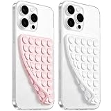
- 【PKYAA Double Sided Silicone Suction Phone Case Mount】PKYAA With Double Sided 40 Strong and Reliable individual suction cups, PKYAA provides a thicken and upgraded universal silicon suction mount for your phone.
- 【Friendly to Content Creators】If you are a content creator or an online influencer, you can create videos anywhere with this suction mount completely hands free with this silicone cell phone mount for cases.
- 【HANDS-FREE & Adhere to Mirrors】This Double Sided silicone suction phone case mount allows you to stick your phone to the mirror easily. No longer holding your phone in one hand to watch video tutorials while making up.
- 【Strong Grip on the Smooth Surface】You can easily hang your phone anywhere with a smooth surface. All you do is you clean off your phone and smooth surface. It is STURDY and it not only sticks to mirrors, it also sticks to windows, it sticks to refrigerators, tiles and other clean, flat surfaces.
- 【Press Down Firmly Every 30 Minutes】Use your palm or fingers to press the phone down firmly and check it's secure before letting go. Apply even pressure for a few seconds to allow the suction cup to adhere properly. To maintain the grip and prevent accidental falls, it's a good practice to periodically reapply pressure to the suction cup.
curl -G "https://api.screenshotneo.com/v1/shot" -d access_key=YOUR_API_KEY --data-urlencode url=https://stripe.com -o shot.webpSee the ScreenshotNeo documentation for request options. Cookie banners, popups, and chat widgets are removed before the shot; bot checks, blank pages, and failed loads are not billed. Its MCP server lets AI agents take screenshots. The free plan includes 1,000 screenshots a month with no card, and paid plans start at $5 for 3,000. Sign up for free.
Product prices and availability are accurate as of the date/time indicated and are subject to change. Any price and availability information displayed on Amazon at the time of purchase will apply.

