
Test responsive design by checking how your site’s layout, content, interactions, accessibility, and performance behave as the viewport changes—not just by viewing it at one phone width. Use analytics to prioritize browsers and devices, explore widths and breakpoints in Chrome DevTools, audit with Lighthouse, and verify important user journeys on physical phones and tablets.
What responsive testing should cover
Responsive web design aims to make a page work across a range of device sizes and resolutions. MDN describes it as an approach that adapts presentation to the screen on which content is viewed: MDN’s responsive design guide. A useful test therefore checks more than whether the page looks narrower on a phone.
- Layout: columns, spacing, navigation, and content order adapt without horizontal overflow or overlap.
- Media and typography: images fit their containers, text remains readable, and headings and labels wrap sensibly.
- Behavior: menus, forms, dialogs, tables, carousels, sticky elements, and critical flows remain usable.
- Accessibility: keyboard focus, zoom, reflow, and screen-reader interactions still work.
- Performance: the page remains usable on mobile hardware and less favorable network conditions.
A screenshot can reveal visual defects, but it cannot establish that a menu works with a keyboard or that a form submits correctly. Combine visual inspection with interaction and accessibility checks.
Build a practical device and browser matrix
There is no universal device list or numeric breakpoint set that fits every site. MDN recommends prioritizing combinations common among a site’s audience because testing every browser, operating system, and device is impractical. Start with analytics, if available, and identify the browsers and operating systems that matter most to your visitors: MDN’s testing strategies.
#1 Best Overall
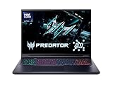
- Desktop-Level Performance, Anywhere: Get legendary gaming performance with the Intel Core Ultra 9 275HX processor, delivering ultra-smooth gameplay and future-ready AI (Up to 13 NPU TOPS). Offload tasks like background removal and audio optimization to the NPU for seamless streaming and gaming, while Intel Application Optimization enhances performance on classic titles.
- Game-Changing Realism: Powered by NVIDIA Blackwell architecture, GeForce RTX 5070 Ti Laptop GPU unlocks the game changing realism of full ray tracing. Equipped with a massive level of 992 AI TOPS horsepower, the RTX 50 Series enables new experiences and next-level graphics fidelity. Experience cinematic quality visuals at unprecedented speed with fourth-gen RT Cores and breakthrough neural rendering technologies accelerated with fifth-gen Tensor Cores.
- Supreme Speed. Superior Visuals. Powered by AI: DLSS is a revolutionary suite of neural rendering technologies that uses AI to boost FPS, reduce latency, and improve image quality. DLSS 4 brings a new Multi Frame Generation and enhanced Ray Reconstruction and Super Resolution, powered by GeForce RTX 50 Series GPUs and fifth-generation Tensor Cores.
- The Ultimate in Ray Tracing and AI: NVIDIA RTX is the most advanced platform for full ray tracing and neural rendering technologies that are revolutionizing the ways we play and create. Over 700 games and applications use RTX to deliver realistic graphics and incredibly fast performance with cutting-edge AI features like DLSS Multi Frame Generation.
- Immersive Depth and Detail: At 18 inches with a 16:10 aspect ratio, the pristine WQXGA screen offering vibrant colors with up to 100% DCI-P3 operates at a fast 240Hz refresh and 3ms overdrive response time. Alongside the suite of features from NVIDIA G-SYNC and NVIDIA Advanced Optimus, you're guaranteed that whatever's on-screen is a distinct viewing delight.
Include representative desktop browsers and current iOS and Android phones and tablets when those platforms are relevant. Choose coverage by user impact, not by collecting a long list of device names.
| Test axis | What to include | Why it matters |
|---|---|---|
| Browser and operating system | The combinations most common in your analytics; include current iOS and Android browsers if they are part of your audience. | Rendering and browser behavior can differ between platforms. |
| Viewport width | Narrow, intermediate, and wide widths, plus widths just before and after each content-driven breakpoint. | Many layout defects appear between familiar device presets. |
| Orientation | Portrait and landscape on important mobile and tablet layouts. | Rotation changes available space and can expose layout assumptions. |
| Input and accessibility | Touch, keyboard navigation, browser zoom, and screen-reader use for critical flows. | A layout can look correct while controls remain hard to operate. |
| Network and hardware | Throttled network in emulation, followed by physical-device checks for release-critical paths. | Emulation is useful for breadth but does not reproduce every hardware or performance condition. |
Check the responsive foundations
Before testing detailed layouts, confirm the page has a sound foundation. In the document head, the viewport declaration should tell mobile browsers to use the device width:
<meta name="viewport" content="width=device-width" />
Without an appropriate viewport declaration, a phone may lay out the page at a wider, desktop-like width, undermining narrow-screen styles. Then inspect whether the page uses flexible layout techniques, such as fluid sizing or grid and flex layouts; whether images fit their containers where appropriate; and whether text remains readable as space changes. MDN’s guide covers the viewport, flexible layout, media queries, responsive images and media, and responsive typography: Responsive design fundamentals.
Set breakpoints where the content or layout needs to change rather than assuming a particular phone model determines the correct values. Check behavior on both sides of every breakpoint, including widths between your common presets.
Explore widths and breakpoints in Chrome DevTools
Chrome DevTools Device Mode gives a fast way to inspect many viewport sizes without switching devices. Chrome documents emulation for screen sizes and resolutions, network conditions, media queries, touch, geolocation, and orientation: Chrome DevTools Device Mode.
- Open the page and DevTools. In Chrome, open the page you want to test, then open DevTools. Select the Device Mode toggle in the DevTools toolbar.
- Choose a starting viewport. Select a device preset or choose Responsive mode. A preset is a convenient starting point, not proof that every device using that label behaves identically.
- Vary the width. Drag the viewport through narrow, intermediate, and wide sizes. Pay special attention just before and after CSS breakpoint changes, and at awkward widths where navigation or cards may begin wrapping.
- Check height and orientation. Resize vertically as well as horizontally. Switch between portrait and landscape for layouts where rotation matters.
- Inspect responsive rules. Use DevTools’ media-query indicators to identify breakpoint transitions and inspect which styles change at those widths.
- Try touch and network emulation. Emulate touch where relevant and test with a throttled network condition to find interactions or loading states that are fragile on mobile.
At each important size, inspect the whole page: look for sideways scrolling, clipped images or text, overlapping controls, unexpected blank areas, and content that disappears or changes order in a confusing way. A quick screenshot comparison across widths can help locate visual changes, but still exercise the page’s controls.
Exercise real user journeys and accessibility
At the widths that matter, operate the site as a visitor would. Open and close navigation, submit forms, use dialogs and carousels, scroll through sticky elements, and test tables. Follow sign-in, checkout, or other high-impact journeys from beginning to end. Check that controls are not difficult to tap, focus is visible and moves in a sensible order, labels and errors remain visible, and text does not become hard to read.
Resize the viewport while the page is open and zoom in. Confirm that information and functionality remain available rather than being cut off or requiring awkward two-dimensional scrolling. The WCAG reflow guidance explains the purpose of reflow, while the DWP accessibility manual recommends changing the browser window, zooming, and viewing sites on different devices.
The Tool Desk
Outbyte Driver Updater FREEFix the driver behind crashes, sound loss and screen glitchesFind Drivers →Outbyte PC Repair FREEClear out junk files and repair common Windows errorsFree Scan →Automated checks do not establish whether a person can navigate a site with a keyboard or screen reader. Manually try those interactions on critical pages. Chrome’s accessibility guidance makes this distinction and discusses manual testing: Chrome Lighthouse accessibility guidance.
Run Lighthouse, then investigate what it finds
Lighthouse can run in Chrome DevTools, from the command line, or as a Node module. It audits performance, accessibility, SEO, and other quality areas; Lighthouse CI can help detect regressions over time. See Lighthouse overview and Lighthouse CI.
Use audit findings as leads to investigate, not as proof that responsive behavior is complete. A strong score does not demonstrate that a particular breakpoint looks right, that a checkout flow works on a phone, or that screen-reader navigation is effective. Fix relevant findings, then repeat visual and manual checks in the same conditions.
Rank #3
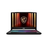
- Intel Core i9 HX Power for Elite Gaming: Dominate demanding titles with the Intel Core i9-14900HX and its 24-core hybrid architecture, delivering fast load times, high FPS, and smooth multitasking.
- GeForce RTX 5070 With Ray Tracing & DLSS 4: Powered by NVIDIA Blackwell, the RTX 5070 delivers stronger ray tracing, higher FPS, faster AI upscaling, and more responsive gameplay—ideal for competitive and cinematic gaming.
- QHD 165Hz, 100% DCI-P3 for Ultra-Clear Combat: The QHD 165Hz display reveals more detail, reduces motion blur, and boosts visibility in fast-paced games while delivering richer, more accurate colors.
- Cooler Boost 5 for Sustained Performance: Dual fans and a 5-heat-pipe share-pipe design keep the CPU and GPU cool, maintaining stable frame rates during long gaming marathons.
- 4-Zone RGB Keyboard + Full Game-Ready Ports: Customize your setup with a 4-zone RGB keyboard and highlighted WASD keys. Includes USB-C Gen 2, HDMI up to 8K, multiple USB-A ports, RJ45, Wi-Fi 6E & Hi-Res Audio.
Confirm critical behavior on physical devices
Emulation is efficient for broad viewport coverage and quick debugging. Physical devices are more representative of browser behavior and overall experience. MDN identifies real devices as the most accurate way to test those conditions: MDN testing strategies.
Windows Errors? Fix Them Before They Spread
Repair common Windows errors and clear accumulated junk for a smoother, more stable PC - no reinstall needed.Free scan · no reinstallCrashes, No Sound, or Screen Glitches?
Random freezes, missing sound and display glitches usually trace back to one bad driver. Find and replace yours safely.Free scan · under a minuteFor release-critical work, verify at least one representative iOS and Android phone when both platforms matter, and include a tablet if its traffic or layout is significant. Pay particular attention to touch, browser chrome and viewport changes, on-screen keyboard behavior, orientation, and performance. Device emulation cannot fully reproduce real-device rendering or hardware characteristics such as CPU, GPU, battery, and touch behavior; BrowserStack discusses these limits in its responsive design testing guide and Chrome mobile emulator guide.
A real-device cloud service is an optional way to broaden coverage when a team lacks a device lab. Choose one based on the browser and device coverage and workflow your team needs, and check its current supported devices and terms directly. It complements rather than replaces a clear test matrix and manual checks of important journeys.
Capture screenshots consistently for visual checks
For repeatable visual comparisons, keep the page, viewport dimensions, orientation, browser, and state consistent. Make sure a comparison captures the same content and interaction state; otherwise, dynamic content or a different scroll position can look like a responsive regression. Screenshot capture can help spot clipping, spacing changes, and unexpected reflow, but does not replace testing keyboard, touch, screen-reader, or form behavior.
For one-off checks, Chrome DevTools provides a local browser workflow. If you need programmatic screenshots across URLs or want a screenshot API rather than setting up capture code, ScreenshotNeo is an option: it removes known consent banners, newsletter popups, and chat widgets before capture, and its responses identify page verdict and billing status. Use screenshots as visual evidence alongside functional checks.
Free tools Windows power users keep installed
One-click scans. No signup required.
Record bugs so they can be reproduced
When you find a defect, record the conditions needed to see it again. Include:
Rank #4

- Vibrant 15.6" FHD IPS Display: Experience stunning visuals on a large 15.6-inch Full HD (1920x1080) IPS screen. With narrow bezels and wide viewing angles, this laptop offers an immersive experience for streaming movies, online classes, or working on documents with crystal-clear detail
- Efficient Daily Performance: Powered by the Intel Celeron N4020 processor and 4GB LPDDR4 RAM, this notebook delivers reliable performance for web browsing, light multitasking, and school projects. The 128GB storage provides ample space for your essential files, photos, and apps
- Modern Connectivity & PD Fast Charge: Equipped with a versatile Type-C PD 45W port for fast charging and high-speed data transfer. Combined with Dual-Band AC WiFi and Bluetooth, you’ll enjoy a stable and fast internet connection for seamless video calls and cloud-based work
- Silent & Ultra-Portable Design: Featuring an advanced fanless cooling system, this laptop operates in total silence—perfect for libraries or late-night study sessions. Its sleek, lightweight body fits easily into backpacks, making it the ideal companion for students and commuters
- Ready for Work & Play: Pre-installed with Windows 11 Home, offering a secure and user-friendly interface. Includes a HD webcam and high-quality speakers for clear communication. A practical choice for online learning, remote work, or everyday entertainment
- Page URL or build identifier.
- Device or viewport width and height, plus orientation.
- Browser and version, and operating system where relevant.
- Network condition and whether you used emulation or a physical device.
- Steps to reproduce, expected behavior, and actual behavior.
- A screenshot or video showing the state, when useful.
These details distinguish a breakpoint defect from a browser-specific rendering issue or a problem that occurs only on a physical device. They also make later verification more reliable.
Independent reader supportYour contribution helps us test, update, and keep practical guides available for everyone.Troubleshoot common responsive testing failures
The phone shows a miniature desktop layout
Check that the document includes the viewport meta tag and that the page is not being laid out at a wider default width. Then inspect viewport width and media-query behavior in DevTools.
The page scrolls sideways at a narrow width
Look for fixed-width containers, wide tables, images larger than their parent, long unbroken text, and positioned elements extending past the viewport. Inspect the element’s computed dimensions at the failing width and adjust the layout or overflow behavior according to the content’s needs.
Quick wins for a faster PC:
Fix the driver behind crashes, sound loss and screen glitchesFind Drivers →Clear out junk files and repair common Windows errorsFree Scan →Scan for outdated or missing drivers - takes under a minuteDriver Scan →A preset looks fine, but another width breaks
Presets sample particular dimensions; they do not cover every intermediate width. Drag Responsive mode through the range and test immediately before and after each breakpoint.
The screenshot looks correct but the interface is unusable
Test the controls rather than relying on the image. Check keyboard focus, tapping, menus, form errors, zoom, and screen-reader navigation. Visual capture cannot establish those behaviors.
Best Value

- Stunning 15.6" FHD IPS Display: Experience crisp 1920x1080 resolution on this 15.6 inch laptop with an IPS panel that delivers wide viewing angles and vivid colors. The narrow-bezel design maximizes screen real estate for comfortable viewing on this Win 11 laptop, whether you're studying or working.
- Celeron J4105 Processor & 256GB SSD: Powered by a reliable Celeron J4105 processor paired with 12GB DDR4 memory and a fast 256GB M.2 SSD. This laptop computer supports SSD expansion up to 2TB and TF card expansion up to 1TB, so your storage grows with your needs. Delivers smooth multitasking for daily productivity.
- AI-Powered Win 11 Laptop: Built-in AI features enhance your productivity with smart assistance for writing, summarizing, and task management. Pre-installed with Win 11 and includes Office 365 subscription. This student laptop is backed by 1-year warranty and 24/7 customer support.
- All-Day 7000mAh Battery & 180° Hinge: The high-capacity 7000mAh battery keeps this laptop powered through long classes or meetings. The 180-degree lay-flat hinge lets you share your screen effortlessly during presentations. This durable laptop computer adapts to your dynamic workflow.
- Versatile Connectivity Hub: Equipped with USB 3.2, Type-C, Mini HDMI, and 3.5mm audio jack to connect all your peripherals. Stay online anywhere with high-speed 5G WiFi and Bluetooth 4.2. This college laptop keeps you connected at home, in the library, or on the go.
DevTools and a phone render differently
Record the exact browser, version, viewport, orientation, and device. Reproduce the problem on a physical device and inspect browser chrome, touch, keyboard, and performance behavior; emulation does not reproduce all real hardware and rendering conditions.
A Lighthouse result gives false confidence
Treat the audit as a set of automated checks, not a pass/fail guarantee for responsive design. Review the relevant findings and manually test layout, critical flows, keyboard and screen-reader use, and physical-device behavior.
Or skip the browser setup
To request a screenshot programmatically, make a GET request with the target URL. This cURL example saves a WebP screenshot of Stripe; replace the target URL with your own page. See the ScreenshotNeo API documentation for request options.
curl -G "https://api.screenshotneo.com/v1/shot" -d access_key=YOUR_API_KEY --data-urlencode url=https://stripe.com -o shot.webp
ScreenshotNeo’s clean-shot options remove cookie and consent banners, popups, and chat widgets before capture. Bot checks, blank pages, and failed loads are not billed; the response includes page-verdict and billing headers. Its MCP server provides screenshot tools for AI agents, and the free plan includes 1,000 screenshots per month with no card; paid plans start at $5 for 3,000. Those screenshots can speed up visual checks, but they do not substitute for exercising interactions on real devices. Sign up free for 1,000 screenshots a month, with no card required.
Keep a repeatable release checklist
- Choose browsers and device platforms based on the site’s audience.
- Verify the viewport declaration and responsive layout foundations.
- Explore widths around breakpoints, not only named device presets.
- Test layout, content, touch, keyboard, zoom, and critical journeys.
- Run Lighthouse and investigate applicable findings.
- Validate release-critical flows on representative physical devices.
- Record exact conditions and steps for every defect.
Chrome DevTools and Lighthouse are useful free starting points; analytics-led coverage, manual interaction checks, and physical-device validation make the results more relevant to your users.
Recommended Free Tools
Frequently Asked Questions
Should I test every phone model my visitors use?
No. Prioritize the browser and operating-system combinations most common in your audience, then use representative devices and boundary widths to expose likely problems.
Can screenshots alone prove a page is responsive?
No. They can reveal visual defects, but they do not show whether keyboard, touch, form, or screen-reader interactions work.
Quick Recap
Product prices and availability are accurate as of the date/time indicated and are subject to change. Any price and availability information displayed on Amazon at the time of purchase will apply.

