
Do these 3 things before closing this tab:
1Repair Windows errors before they cause bigger problems2Fix the driver behind crashes, sound loss and screen glitches3Clear out junk files and repair common Windows errorsThere is no single “correct” background-image size. Choose dimensions from the largest container and viewport you must support, keep the source aspect ratio, then let CSS render it with background-size: cover or contain. Because those ratios often differ, inspect the crop at desktop and mobile breakpoints and adjust the focal point or provide another source image.
For decorative artwork, CSS backgrounds are appropriate. If the image communicates information, use an HTML <img> with responsive image markup instead so the content has semantics and can be selected, read by assistive technology, and discovered by search engines.
Start with the container, not a universal pixel number
Measure the element that will display the background and list the viewport widths you actually support. A hero that is 1,440 × 600 px on a wide desktop and 390 × 700 px on a phone has radically different proportions. One source can cover both, but it will crop different edges at each size.
- Record the container’s maximum rendered width and height (including any full-viewport state).
- Record the narrowest and widest layouts, including any breakpoint where the design changes.
- Identify the subject that must remain visible, such as a face, product, or logo.
- Export a source at least as large as the largest intended display. Do not upscale a small image and expect sharp detail.
- Keep the source’s natural proportions. Distorting it to match one viewport usually makes another layout look worse.
The required source dimensions are therefore a design decision, not a fixed “website background size.” Test the real page at the layouts that matter.
#1 Best Overall

- Wacom Intuos Small Graphics Drawing Tablet: Enjoy industry leading tablet performance in superior control and precision with Wacom's EMR, battery free technology that feels like pen on paper
- Works With All Software: Wacom Intuos tablet can be used in any software program to explore new facets of digital creativity; draw, paint, edit photos/videos, create designs, and mark up documents
- What the Professionals Use: Wacom's industry leading pen technology and pen to paper feeling makes it the preferred drawing tablet of professional graphic designers
- Software and Training Included: Only Wacom gives you software with every purchase. Register your Intuos tablet and gain access to some of the best creative software and Wacom's online training
- Wacom is the Global Leader in Drawing Tablet and Displays: For over 40 years in pen display and tablet market, you can trust that Wacom to help you bring your vision, ideas and creativity to life
Choose how the image should fit
CSS controls the rendered size. The two common fit strategies preserve the image’s proportions but make different compromises.
| Strategy | Coverage | Crop or empty space | Use when |
|---|---|---|---|
cover |
Fills the entire element. | Edges can be cropped when image and container ratios differ. | A full-bleed hero or section must have no gaps. |
contain |
Keeps the complete image visible. | Unused space can remain; repetition must be disabled if you do not want tiling. | The whole illustration or diagram must be visible. |
These behaviors are defined in MDN’s Resizing background images with background-size guide. A size value can scale the source up or down; cover scales until both dimensions cover the box, while contain scales until the complete image fits.
Use cover for a full-bleed section
.hero {
  background-image: url("/images/hero.webp");
  background-size: cover;
  background-position: center;
  background-repeat: no-repeat;
}
background-position: center is only a starting point. If the important subject is near the top, try center top or a percentage such as 50% 25%. Check the result at narrow widths: the crop can remove a subject that was visible on desktop.
Use contain when losing edges is unacceptable
.diagram-panel {
  background-image: url("/images/diagram.png");
  background-size: contain;
  background-position: center;
  background-repeat: no-repeat;
  background-color: #f4f6f8;
}
The fallback color makes the remaining space intentional. Without background-repeat: no-repeat, a small contained image can tile across the element.
Outdated Drivers Are Slowing You Down
One free scan finds every outdated or missing driver and matches the right update for your exact hardware.Free scan · exact hardware matchWindows Errors? Fix Them Before They Spread
Repair common Windows errors and clear accumulated junk for a smoother, more stable PC - no reinstall needed.Free scan · no reinstallUnderstand the crop mathematically
For cover, the browser effectively chooses the larger of the width ratio (container width ÷ image width) and height ratio (container height ÷ image height), then scales both dimensions by that factor. The dimension with the smaller ratio extends beyond the box and is cropped. This explains why a wide image loses its sides in a tall mobile hero, while a tall image loses its top and bottom in a wide banner.
Prepare the source image
Make the largest required display your ceiling
Export enough pixels for the largest container you will actually render. A source that is smaller than that box must be enlarged by the browser and may look soft; a source many times larger wastes transfer and decoding work. If the design has a known maximum width, use that value rather than an arbitrary “4K background” rule.
Rank #2

- Word-first 16K Pressure Levels: The upgraded stylus features 16,384 levels of pressure sensitivity and supports up to 60 degrees of tilt, delivering smoother lines and shading for a natural drawing experience. With no battery or charging needed, it operates like a real pen, making it easy for beginners to create effortlessly. This functionality helps novice artists develop their skills and explore their creativity without the intimidation of complex tools
- Designed for Beginners: This drawing pad desinged with 8 customizable shortcuts for both right and left-hand users, express keys create a highly ergonomic and convenient work platform
- Perfectly Adapted for Android: The XPPen Deco 01 V3 art tablet supports connections with Android devices running version 10.0 and above. It is recommended to download the XPPen Tools Android application, which adapts to your smartphone's screen aspect ratio, ensuring accurate mapping. It also supports mapping on Android screens with different aspect ratios in portrait mode
- Large Drawing Space, Bigger Bold Inspiration: This expansive drawing pad has10 x 6.25-inch helps you break through the limit between shortcut keys and drawing area
- Easy Connectivity for Beginners: The Deco 01 V3 offers USB-C to USB-C connectivity, plus adapters for USB C. This ensures easy connection to various devices, allowing beginner artists to set up quickly and focus on their creativity without compatibility concerns. Whether using a laptop, tablet, or desktop, the Deco 01 V3 provides a seamless experience, making it an ideal choice for those just starting their digital art journey
Protect the focal point
Leave breathing room around the subject and avoid placing essential text inside the image. Overlay page text in HTML so it remains readable when the crop changes. If the subject cannot survive both portrait and landscape crops, create separate desktop and mobile compositions instead of forcing one image to do both jobs.
Select a practical format
Use a format your deployment pipeline and browsers support, and compare visual quality at the actual display size. Keep a lossless source for editing, then generate the delivery asset. A background that appears behind text still needs sufficient contrast; add a solid or gradient overlay when necessary.
Serve different backgrounds at breakpoints
Responsive image guidance from web.dev recommends selecting a suitable CSS background asset with media queries. A phone does not necessarily need to download the same wide source used on a large monitor.
.banner {
  min-height: 28rem;
  background: url("/images/banner-small.webp") center / cover no-repeat;
}

@media (min-width: 48rem) {
  .banner {
    background-image: url("/images/banner-large.webp");
  }
}
Choose breakpoints that match your layout, not a device-brand list. Verify which asset is requested in browser developer tools and confirm that the focal point remains useful in each version.
Background versus an HTML image
MDN’s responsive-images guidance treats decorative header imagery as a reasonable CSS-background use. If the image conveys a product, chart, warning, or other page content, use an <img> and responsive attributes such as srcset and sizes. Provide meaningful alternative text when the image carries information; use empty alternative text for purely decorative images. This choice is about meaning and loading behavior, not only appearance.
Rank #3

- 【Android 16 Tablet with Gemini AI 3.5】The 11 inch TABWEE T90 brings a cleaner, smarter tablet experience for work, study and home use. Android 16 adds a simpler lock screen, customizable Quick Settings, improved video calls with background blur and portrait light, easier cloud photo selection and enhanced Linux terminal support. With Gemini AI 3.5, you can search, translate, summarize notes, organize ideas and plan tasks more efficiently—ideal for online classes, reading, video calls and light office work
- 【11 Inch FHD IPS Display for Streaming, Reading and Learning】Enjoy a bigger and clearer viewing experience on the 11 inch FHD display with 1920 x 1200 resolution and an 84.9% screen-to-body ratio. The fully laminated TDDI screen delivers more natural colors, smoother touch response, and a more immersive feel when watching movies, reading documents, viewing recipes, or studying online. With Widevine L1 support, dual smart speakers, and 380-nit brightness, this Android tablet is ideal for Netflix-style streaming, YouTube, music, eBooks, online lessons, and comfortable indoor entertainment
- 【24GB RAM + 128GB ROM, More Space for Daily Needs】Android 16 tablet comes with up to 24GB RAM, including 8GB built-in RAM and 16GB virtual memory expansion, helping daily apps run smoothly for browsing, video watching, note-taking, email, and study apps. The 128GB ROM provides plenty of room for photos, documents, music, videos, learning materials, and work files. Need more storage? The TF card slot supports up to 2TB expansion, so you can keep more movies, books, files, and family memories without constantly deleting content. Memory expansion path: Settings > System > Memory Expansion
- 【T615 Octa-Core + 8000mAh Battery for Long Days】Powered by the Unisoc T615 octa-core processor, T90 delivers reliable everyday speed for streaming, video calls, online lessons, reading, emails and document editing. The 8000mAh battery supports up to 11H video playback, 8H daily entertainment or 40H music, while smart power management helps reduce background drain, making it ready for flights, commutes, study sessions and busy workdays
- 【13MP Camera with Google Lens】The 13MP rear camera works with Google Lens to make daily tasks easier. Scan documents, translate text, identify objects, search products, capture handwritten notes, or save useful information in seconds. The 5MP front camera is suitable for video calls and clear face-to-face communication. With dual-band 5G WiFi, Bluetooth 5.0, and support for GPS, GLONASS, Galileo, and Beidou, this Android tablet offers fast downloads, stable wireless connections, easy accessory pairing, and reliable location support for travel, maps, and mobile use
Complete implementation example
The following pattern combines a responsive source, a controlled crop, and readable overlay content.
Quick wins for a faster PC:
Clear out junk files and repair common Windows errorsFree Scan →Fix the driver behind crashes, sound loss and screen glitchesFind Drivers →<section class="hero">
<div class="hero__content">
<p class="eyebrow">Documentation</p>
<h1>Build a faster workflow</h1>
<p>The text remains HTML while the artwork stays decorative.</p>
</div>
</section>
.hero {
  min-height: 32rem;
  display: grid;
  align-items: center;
  color: white;
  background-image:
    linear-gradient(90deg, rgba(0,0,0,.68), rgba(0,0,0,.12)),
    url("/images/workflow-small.webp");
  background-size: cover;
  background-position: 62% center;
  background-repeat: no-repeat;
}

.hero__content {
  width: min(90%, 38rem);
  margin-inline: auto;
}

@media (min-width: 60rem) {
  .hero {
    background-image:
      linear-gradient(90deg, rgba(0,0,0,.68), rgba(0,0,0,.12)),
      url("/images/workflow-large.webp");
  }
}
Use the comma-separated background layers deliberately: the gradient is above the image, improving text contrast without editing the artwork. If your focal point is elsewhere, change the percentage after checking every breakpoint.
Inspect the result before publishing
- Resize the browser through the smallest and largest supported widths.
- Check portrait and landscape orientations on a real phone or an accurate emulator.
- Confirm the subject is not hidden by
covercropping. - Check text contrast over light and dark portions of the image.
- Look for visible seams or tiling when using
contain. - Inspect the network panel to ensure small screens receive the intended smaller asset.
- Test with the page’s actual content; a longer heading can change the hero height and therefore the crop.
Performance and reliability considerations
Large background files can delay the visual completion of a page even when the CSS is correct. Keep the source no larger than the largest display requirement, select smaller breakpoint assets, and avoid loading a desktop image for a layout that never displays it. A CSS background is not a substitute for lazy loading when the section is far below the fold; consider whether an HTML image with responsive markup is a better fit for that case.
Use a stable fallback color while the image loads. If the image request fails, the section should still have readable text and usable controls. Do not rely on the background to communicate information that disappears on failure.
Troubleshooting common background problems
The image is stretched
Check that you are not setting independent width and height values that distort the source. For a background, use cover or contain; for an HTML image, use object-fit: cover or contain as appropriate.
Recommended Free Tools
Rank #4
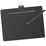
- Wacom Intuos Medium Bluetooth Graphics Drawing Tablet: Enjoy industry leading tablet performance in superior control and precision with Wacom's EMR battery free technology that feels like pen on paper
- Works With All Software: Wacom Intuos tablet can be used in any software program to explore new facets of digital creativity; draw, paint, edit photos/videos, create designs, and mark up documents
- Wireless Superior Connectivity: Connect wirelessly via Bluetooth or directly using USB-A cable which enables you to work, draw or create whether it's at a desk, on the sofa, in classrom or even outside
- Software and Training Included: Only Wacom gives you software with every purchase. Register your Intuos tablet and gain access to some of the best creative software and Wacom's online training
- Wacom is the Global Leader in Drawing Tablet and Displays: For over 40 years in pen display and tablet market, you can trust that Wacom to help you bring your vision, ideas and creativity to life
Important content is cut off on mobile
This is the expected trade-off of cover when ratios differ. Move the focal point with background-position, reduce the section’s height, or select a mobile-specific asset in a media query. Do not keep shrinking the source; pixels do not change the crop rule.
Blank bands appear around the image
You are likely using contain. Keep it when the whole image matters, then choose a deliberate background color or redesign the container. If the section must be filled, switch to cover and accept cropping.
The image repeats
Add background-repeat: no-repeat. Repetition is the default behavior for a background image when the rendered image does not cover the full area.
The desktop image still downloads on phones
Place the small image in the base rule and override background-image in a media query. Then verify requests in developer tools; an unused declaration in another stylesheet or a preload can still trigger a download.
Free tools Windows power users keep installed
One-click scans. No signup required.
Text becomes unreadable over the artwork
Add a contrast-tested overlay, change the focal point, or move the text outside the image. A background image should support the content rather than compete with it.
Best Value

- WACOM’S BEST PEN TECHNOLOGY: Pro Pen 3 offers amazing precision, 8192 pressure levels, tilt support & lag-free tracking for smooth, precise strokes; choose slim, straight or flared grip, adjust balance & button layout for precision and comfort
- DIAL INTO PRODUCTIVITY: Speed up and stay in the creative flow with 10 customizable tablet ExpressKeys & 2 mechanical dials conveniently located at the top of the tablet and close to your keyboard for efficiency
- DESIGNED FOR MODERN MONITORS: With a versatile 16:9 format perfect for multiple monitors and wide displays; medium size has a large active area with a small footprint 11.4 x 8.1” / 291 x 206 mm
- SLEEK AND STURDY: Measuring 4mm at its thinnest this professional-grade drawing tablet feels like pen-on-paper on your desk, combined with the robust durability of magnesium making it equally suited for your office or life on the go
- WIRELESS FREEDOM: use Intuos Pro with USB or connect wirelessly via Bluetooth to multiple computers with a simple switch
Or skip the browser setup
If you need screenshots of the finished page at several viewport sizes, ScreenshotNeo can capture the rendered result through one request. It accepts consent banners before capture and removes more than 60 known consent platforms, newsletter popups, and chat widgets; bot checks, blank pages, timeouts, failed loads, and cache hits are not billed, and response headers identify the page verdict and billing result. Its MCP server provides take_screenshot, get_page_info, and capture_pdf tools for Claude, Cursor, and other MCP clients.
See the complete parameter list in the ScreenshotNeo documentation. This cURL request saves a WebP screenshot of the page whose background you want to inspect:
curl -G "https://api.screenshotneo.com/v1/shot" -d access_key=YOUR_API_KEY --data-urlencode url=https://stripe.com -o shot.webpPython:
import requests
r = requests.get("https://api.screenshotneo.com/v1/shot", params={"access_key": "YOUR_API_KEY", "url": "https://stripe.com"}, timeout=90)
open("shot.webp", "wb").write(r.content)
Node.js:
const q = new URLSearchParams({ access_key: 'YOUR_API_KEY', url: 'https://stripe.com' });
const res = await fetch(`https://api.screenshotneo.com/v1/shot?${q}`);
You can set a viewport or device preset, wait for a selector or network idle, apply custom CSS or JavaScript, hide selectors, and capture a full page or a single CSS-selected element. Other options include dark mode, retina scale, custom headers and cookies, timezone and geolocation, image resizing, caching with a chosen TTL, signed links, asynchronous jobs with signed webhooks, bulk capture of up to 100 URLs per call, and PDF output.
What’s actually slowing this PC down?
Pick the symptom - the matching free tool is one click away.
| Plan | Allowance | Price |
|---|---|---|
| Free | 1,000 shots/month | $0, no card |
| Starter | 3,000 shots | $5 |
| Growth | 15,000 shots | $15 |
| Pro | 60,000 shots | $39 |
| Scale | 250,000 shots | $99 |
| Business | 1,000,000 shots | $249 |
Yearly billing provides two months free, and every feature is included on every plan. Create a free ScreenshotNeo account to get 1,000 screenshots a month with no card.
Frequently Asked Questions
Should I put the background URL in the CSS or inline style?
Keep stable, reusable artwork in a stylesheet. Use an inline custom property or style only when a CMS or component must supply the URL dynamically; ensure the value is sanitized and has a safe fallback color.
How can I change the crop for one component instance?
Override that instance’s background-position (and, if necessary, background-size) with a more specific class. Keep the shared image rule in the base component so future changes remain centralized.
What should happen when JavaScript is disabled?
The CSS background and HTML text should still render because neither depends on JavaScript. If a script is responsible for injecting the image URL, provide a server-rendered class or a regular CSS fallback instead.
Quick Recap
Product prices and availability are accurate as of the date/time indicated and are subject to change. Any price and availability information displayed on Amazon at the time of purchase will apply.

