
Recommended Free Tools
Improve your WordPress app guide site by auditing the pages people use on small screens, then fixing the reading column, navigation, controls, typography, and media. Preview at several widths, check the live page in a mobile browser, and retest after saving. A separate mobile version is usually unnecessary: responsive design adapts one site to phones, tablets, and desktops.
1. Preview the pages and widths that matter
Start with your most useful app guides, not just the homepage. Choose pages with different layouts—for example, a long tutorial, a guide with screenshots, and a page with tables or prominent buttons—so you catch issues that a single sample page may miss.
- Use the WordPress preview. In the Block Editor or Site Editor, open View and select Desktop, Tablet, or Mobile. WordPress 7.1’s View feature also lets you resize the preview canvas between presets. See WordPress’s View feature documentation.
- Open the front-end preview in a new tab. Check the rendered page, including the header and footer, rather than judging it only in the editor canvas.
- Check a real mobile browser or device. The editor preview is a useful first check, but it may not reproduce every detail of the live experience. WordPress.com recommends viewing the site directly in a browser or on a mobile device for the most accurate preview (WordPress.com mobile-friendly guidance, reviewed August 17, 2026).
Inspect widths between the preset sizes as well. A layout can look fine at a desktop and phone preset but break at an in-between width.
2. Keep app guides readable from top to bottom
On a phone, the main task is following the guide without zooming or scrolling sideways. Check the article’s actual reading order: introduction, steps, screenshots, warnings, and next actions should remain easy to find and follow.
Free tools Windows power users keep installed
One-click scans. No signup required.
#1 Best Overall

- 【Strong Adsorption】The inspiration of the silicone phone suction case comes from the adhesive force of the octopus. Each suction cup phone mount is 3.15 inches long and 2.17 inches wide, with 24 independent suction cups providing a stronger and more stable suction force, so you don't have to worry about your phone falling during use.
- 【Back of Phone Suction Grip】Remove the adhesive film on the phone suction cup and stick it on the phone case. You can then fix the phone on any smooth surface, which is very convenient. (The phone suction cup cannot be removed and reused after being attached to the phone case. It is recommended to attach it to a regular phone case, not a valuable one.)
- 【Widely Used】Our non-slip silicone phone sticky grip mount attaches to almost any flat phone case and make it compatible with common mobile phones such as iPhone and Android.You can shoot, watch videos or video calls in the kitchen, gym, dance studio, bathroom and other places.
- 【Capture the Wonderful Picture】Whether you are a TikTok creator or just like to share videos and photos, this phone suction cup can help you hands-free capture wonderful videos and photos for sharing with friends.
- 【Note】You can fix the phone suction cup on a smooth surface such as a mirror or glass. If necessary, wipe the suction cup with a damp cloth to obtain stronger suction. Before releasing your hand, make sure the phone is firmly fixed. (Not applicable to rough walls, wooden surfaces, and other uneven surfaces)
- Stack columns vertically when they become too narrow to read comfortably.
- Check headings, paragraphs, lists, and tables for cramped lines, clipping, or horizontal overflow.
- Make sure essential instructions, caveats, and calls to action are not hidden at mobile widths.
- Verify that screenshots are large enough to explain an app screen, but do not force the page wider than the viewport.
For a guide that relies on a comparison table, test it on the narrowest device you support. If it becomes unusable, consider a layout that presents the same information in a more legible vertical flow.
3. Make navigation and controls usable
Test the mobile menu from the live page, then follow several in-article links and try the important buttons or download controls. Check that labels are visible, controls fit within the viewport, and menu items are easy to select. WordPress.com’s guidance identifies changing menu display, stacking content vertically, and allowing menus or buttons to wrap as possible mobile adjustments.
Rank #2

- SUPERIOR COMFORT — Unlike traditional circular ear buds, the design of EarPods is defined by the geometry of the ear. Which makes them more comfortable for more people than any other ear bud–style headphones.
- HIGH-QUALITY AUDIO — The speakers inside EarPods have been engineered to maximize sound output and minimize sound loss, which means you get high-quality audio.
- BUILT-IN REMOTE — EarPods with USB-C plug also include a built-in remote that lets you adjust the volume, control the playback of music and video, and answer or end calls with a pinch of the cord.
- COMPATIBILITY — Works with all devices that have a USB-C port.
- INTEGRATED MICROPHONE — A built-in microphone precisely captures your voice while you’re on the phone, taking a FaceTime call, or summoning Siri — so you’re always heard loud and clear.
Do not stop at the article body. A header that crowds the screen or a footer that overflows can undermine an otherwise readable guide. Check both on representative pages.
4. Adjust typography and spacing for narrow screens
If text feels cramped or oversized, adjust the layout at the narrow viewport instead of shrinking everything indiscriminately. WordPress.com recommends relative font units such as em or rem, which can adapt to visitor settings and screen size. Reduce excessive padding on phones and scale down headings that dominate the available space, while keeping body text comfortable to read.
Rank #3

- Secure Hold: Our PopSockets adhesive phone grip gives your cell phone a secure, comfortable hold in hand to help prevent drops while texting, taking photos, or scrolling on the go. Designed to stick firmly to most phone cases and devices.
- Hands-Free Made Easy: Easily turn your PopSocket into a phone stand to prop up your phone anywhere, perfect for watching videos, video calls, or following recipes. A must-have phone holder that keeps your device secure and ready for anything.
- Compatibility: Works with all phones, tablets, and Kindles. Sticks best to smooth, hard plastic cases and may not adhere to silicone or textured cases. Easily swap your PopTop to change up your style.
- Black PopSockets: Simple, refined, and endlessly versatile. A timeless essential for any phone.
- Travel Must-Have for People On the Go: A must-have travel accessory for flights, flying, airports, air travel, airplanes, planes, international trips, cruises, and long travel days. Key gadget for your airport haul, travel accessories and must-haves.
Keep text and controls legible against their backgrounds. WordPress responsive-style controls retain a contrast checker for the selected viewport, where those controls are available.
5. Make images and screenshots responsive
Words placed inside a raster image cannot reflow like page text. On a narrow screen, a banner may crop them or make them too small to read. WordPress.com puts it plainly: “Text designed into an image isn’t responsive—it can’t adjust to fit different screen sizes.” Put essential copy in the page itself, or use responsive text over a Cover block. For instructional screenshots, check that the important interface details remain visible without causing horizontal overflow.
6. Use responsive controls supported by your setup
WordPress’s responsive styles for individual blocks and block types require WordPress 7.1 or later and a block theme. If your site meets both requirements, use those controls to set and preview block styles at different viewport sizes. See WordPress’s responsive styles documentation.
Rank #4

- [360 ° Flexible Rotation Design] Comes with a rotatable lanyard ring that supports 360 ° free rotation, effectively solving the problem of twisted and tangled lanyards
- [Wide compatibility] The ultra-thin 0.02-inch design does not block the charging port at all, and both wired and wireless charging can be used directly without removing the pad. Compatible with most smartphones such as iPhone, compatible with various wristbands, lanyards, crossbody straps, and keychains
- [Durable and Portable Material] Premium rust-resistant stainless steel material with good flexibility, which not only avoids scratching the phone case, but also has excellent anti rust and anti fading performance
- [Multi scenario Practical] Paired with a lanyard or wristband, hands-free use can be achieved. The phone is within reach and not easily dropped, ideal for daily commuting and outdoor activities. Suitable for full coverage phone cases, does not support half coverage phone cases
- [Quality Service] If you find any damage or other issues with the product upon receipt, please contact us immediately. We will handle it quickly
The documented default breakpoints are mobile at 480px and narrower, tablet above 480px through 782px, and the default styling elsewhere. A theme can change those breakpoints, so treat them as defaults rather than universal device boundaries. Tablet overrides do not automatically cascade into mobile: set and preview each where needed. If responsive-style controls are unavailable, use your theme’s mobile settings or its documented CSS approach instead.
WordPress 7.1 also describes configurable block-theme breakpoints and browser-side image compression, resizing, and thumbnail generation in its release notes. What you can configure depends on the version and theme in use.
Best Value
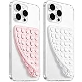
- 【PKYAA Double Sided Silicone Suction Phone Case Mount】PKYAA With Double Sided 40 Strong and Reliable individual suction cups, PKYAA provides a thicken and upgraded universal silicon suction mount for your phone.
- 【Friendly to Content Creators】If you are a content creator or an online influencer, you can create videos anywhere with this suction mount completely hands free with this silicone cell phone mount for cases.
- 【HANDS-FREE & Adhere to Mirrors】This Double Sided silicone suction phone case mount allows you to stick your phone to the mirror easily. No longer holding your phone in one hand to watch video tutorials while making up.
- 【Strong Grip on the Smooth Surface】You can easily hang your phone anywhere with a smooth surface. All you do is you clean off your phone and smooth surface. It is STURDY and it not only sticks to mirrors, it also sticks to windows, it sticks to refrigerators, tiles and other clean, flat surfaces.
- 【Press Down Firmly Every 30 Minutes】Use your palm or fingers to press the phone down firmly and check it's secure before letting go. Apply even pressure for a few seconds to allow the suction cup to adhere properly. To maintain the grip and prevent accidental falls, it's a good practice to periodically reapply pressure to the suction cup.
7. Retest after saving
Save your changes, then repeat the checks at phone, tablet, and desktop widths. Review the header, footer, and article template across several guides with different content. A fix that improves a phone layout should not make the tablet or desktop version awkward.
- Can readers follow the guide without zooming or sideways scrolling?
- Are navigation, buttons, and other important controls visible and usable?
- Do columns and media adapt without clipping, overflow, or confusing order changes?
- Are screenshots useful while explanatory words remain real text?
- Does the live page behave as expected in a mobile browser, not just in the editor?
Should you use AMP to fix the layout?
No—not as the default fix. WordPress.com says its mobile-friendly themes are already responsive and AMP is not required for a mobile-optimized experience. It also warns that AMP can remove features and design elements, and that deactivation after use can leave AMP URLs that need redirects. Fix the responsive layout and test the live page before considering a separate AMP setup.
Quick Recap
Product prices and availability are accurate as of the date/time indicated and are subject to change. Any price and availability information displayed on Amazon at the time of purchase will apply.

