
Free tools Windows power users keep installed
One-click scans. No signup required.
For an action, use a <button type="button"> rather than making a <div> clickable. A native button already has button semantics and supports keyboard activation with Enter and Space. If a non-native element is genuinely required, you must add its role, keyboard access, activation behavior, accessible name, and visible focus styling yourself.
Choose an element that matches the interaction
Use a button for a command or state-changing action, such as saving changes or opening a dialog. Use an anchor with an href when activating the control navigates to another resource. These elements communicate different purposes and have different expected keyboard behavior. MDN recommends native interactive elements when they fit the task: button role guidance.
A click handler on a div may respond to a pointer, but that alone does not make the div a button. Adding role="button" supplies semantics for assistive technology; it does not make the element focusable or implement click and keyboard handling.
Use a native button for an action
<button type="button" id="saveChanges">Save</button>Attach the action to the button in JavaScript. The browser provides native button semantics and activation with Enter or Space when the button has focus. Give it a meaningful accessible name, usually through its visible text, and retain a visible focus indicator.
Recommended Free Tools
#1 Best Overall

- Large Activation Surface - The Big Red Switch features a generous 5-inch activation surface, making it easy to access for individuals with varying abilities.
- Tactile and Auditory Feedback - Users will appreciate the tactile and auditory feedback provided upon activation, enhancing the overall user experience.
- Ideal for Visual Impairments - This switch is a top choice for individuals with visual impairments, thanks to its larger target area, improving accuracy.
- Interchangeable Switch Tops - Included in the package are red, blue, yellow, and green interchangeable switch tops, allowing for customization to suit user preferences.
- Symbol Holder Included - The Switch button also comes with a snap-on clear symbol holder, making it versatile for various applications and users.
Build a button-like div only when necessary
If your component genuinely requires a div, add the missing interaction behavior rather than relying on its role or a pointer click handler alone. This example is illustrative; adapt the action and state handling to your component.
<div role="button" tabindex="0" class="button-like" id="saveChanges">Save</div>.button-like:focus-visible {
outline: 2px solid currentColor;
outline-offset: 2px;
}const control = document.querySelector("#saveChanges");
function activate(event) {
if (event.type === "keydown") {
if (event.key !== "Enter" && event.key !== " ") return;
event.preventDefault(); // Prevent Space from scrolling the page.
}
saveChanges();
}
control.addEventListener("click", activate);
control.addEventListener("keydown", activate);tabindex="0" places the div in sequential keyboard navigation; it does not add button behavior. The keyboard handler must support both Enter and Space, and activating the control by keyboard should perform the same action as clicking it. MDN’s button-role example likewise checks both keys and prevents Space’s default scrolling.
Rank #2
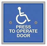
- Item - :Handicap Door Access Switch
- Type - :Square, Weather Protection
- Switch Action - :Push Button
- Material - :Stainless Steel
- Finish - :Powder Coated
Check the details that make a custom control usable
- Accessible name: Provide visible text where possible. An icon-only control needs a name, such as visually hidden text or an appropriate ARIA naming attribute.
- Visible focus: Keep the browser’s focus indicator or replace it with a clearly visible style. Do not remove the outline without providing an alternative. See MDN’s keyboard accessibility guidance.
- Logical focus order: Use
tabindex="0"for normal sequential navigation when needed. Avoid positive tabindex values, which can make focus order diverge from document order. MDN’s tabindex reference explains the attribute’s behavior. - Dialog focus: If activation opens a dialog, move focus into it. When the dialog closes, return focus to the opener unless another target is the logical next destination.
- Touch target: MDN recommends a target size of at least 44 × 44 CSS pixels as practical guidance; it is a recommendation, not a guarantee of accessibility by itself. See MDN’s touch-target guidance.
Represent toggles according to their labels
For a genuine two-state toggle, use aria-pressed and keep the label stable while the pressed state changes—for example, a control that remains labeled “Mute” as it toggles between pressed and unpressed. If the label changes between commands such as “Mute” and “Unmute,” omit aria-pressed; the changing label already describes the next action. See MDN’s button-role guidance.
Quick Recap
Best Value
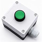
- Product Name: Momentary Push Button Switch Box; Action Type: Momentary; Contact Type:1 NO 1NC;
- Weatherproof Switch Box: Push to Exit Button, Push Button Starter Switch; Protective Level: IP54;
- Ui: 660V; Ith: 10A;
- Size: 66 x 66 x 62mm/ 2.6" x 2.6" x 2.44"(L*W*H);
- Package Content: 1pcs x Momentary button Switch Station.
Rank #4
![12V 24V Mini Momentary Push Button ON-Off Switch [2-Pack], Easy to Install Surface Mount Button Switch](https://m.media-amazon.com/images/I/31VFAu6A5sL._SL160_.jpg)
- [Momentary Switch]: Push and Hold Button - ON, Release Button - OFF.
- [What's Included]: 2*Momentary Switch / 4*Quick Connectors
- [Easy Installation]: Strong Double-Sided Tape for DIY Installation.
- [Pre-Wired Cable]: Each 12V Momentary Switch Comes with 11.5 Inch Cable On One Side.
- [What You Get]: All momentary push button switches passed strict QC before sending to you for our customer experience.
Rank #3
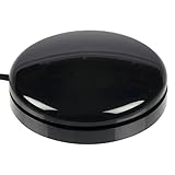
- Sensitive Touch Activation: The Buddy Button is a durable and reliable single switch that requires only the slightest touch of its 2.5-in/6.4-cm surface for activation
- Reliable Single Switch Design: A reliable, durable, single switch activated by pressing anywhere on the top surface
- Multiple Color Options: Available in red, green, black, or yellow to suit different preferences and applications
- Compact Size Specifications: Buddy Buttons are 2.5 (6.3 cm) in diameter, providing an accessible activation surface for users
- Assistive Technology Compatibility: Designed specifically for communication devices and accessible play applications with standard 1/8-in/3.5-mm mono plug connection
Native button or custom div?
| Choice | Built-in behavior | What you must provide | Best fit |
|---|---|---|---|
<button> |
Native button semantics and Enter/Space activation | An accessible name and the action; preserve visible focus styling | A command or action |
<div role="button"> |
The role is exposed, but button behavior is not supplied | Keyboard focus, click and Enter/Space activation, focus styling, and accessible name and state as needed | Only when a non-native element is genuinely required |
Product prices and availability are accurate as of the date/time indicated and are subject to change. Any price and availability information displayed on Amazon at the time of purchase will apply.

