
Free tools Windows power users keep installed
One-click scans. No signup required.
iTechGuides is reader-supported. When you buy through links on our site, we may earn an affiliate commission. As an Amazon Associate I earn from qualifying purchases. Learn more
The best bakery websites do two jobs at once: they make the food look irresistible and make the next step obvious. A visitor should quickly understand what the bakery sells, where it serves customers, whether an item is available, and whether the right action is to order, visit, inquire, book catering, or find a location.
The 20 examples below are best treated as an inspiration guide, not a formal ranking. The list is anchored to Website Planet’s published bakery-website roundup and cross-checked against current official bakery pages. These businesses represent very different models, from custom wedding cakes and local pickup to nationwide shipping, subscriptions, catering, dietary-specialty products, and multi-location retail.
What makes these bakery websites worth studying?
There is no single winning bakery website style. A custom cake studio should not organize its site like a national cookie brand, and a neighborhood bakery with changing daily inventory may not benefit from a large ecommerce catalog.
What the strongest examples share is a useful sequence:
#1 Best Overall
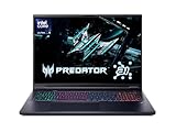
- Desktop-Level Performance, Anywhere: Get legendary gaming performance with the Intel Core Ultra 9 275HX processor, delivering ultra-smooth gameplay and future-ready AI (Up to 13 NPU TOPS). Offload tasks like background removal and audio optimization to the NPU for seamless streaming and gaming, while Intel Application Optimization enhances performance on classic titles.
- Game-Changing Realism: Powered by NVIDIA Blackwell architecture, GeForce RTX 5070 Ti Laptop GPU unlocks the game changing realism of full ray tracing. Equipped with a massive level of 992 AI TOPS horsepower, the RTX 50 Series enables new experiences and next-level graphics fidelity. Experience cinematic quality visuals at unprecedented speed with fourth-gen RT Cores and breakthrough neural rendering technologies accelerated with fifth-gen Tensor Cores.
- Supreme Speed. Superior Visuals. Powered by AI: DLSS is a revolutionary suite of neural rendering technologies that uses AI to boost FPS, reduce latency, and improve image quality. DLSS 4 brings a new Multi Frame Generation and enhanced Ray Reconstruction and Super Resolution, powered by GeForce RTX 50 Series GPUs and fifth-generation Tensor Cores.
- The Ultimate in Ray Tracing and AI: NVIDIA RTX is the most advanced platform for full ray tracing and neural rendering technologies that are revolutionizing the ways we play and create. Over 700 games and applications use RTX to deliver realistic graphics and incredibly fast performance with cutting-edge AI features like DLSS Multi Frame Generation.
- Immersive Depth and Detail: At 18 inches with a 16:10 aspect ratio, the pristine WQXGA screen offering vibrant colors with up to 100% DCI-P3 operates at a fast 240Hz refresh and 3ms overdrive response time. Alongside the suite of features from NVIDIA G-SYNC and NVIDIA Advanced Optimus, you're guaranteed that whatever's on-screen is a distinct viewing delight.
- Create appetite: Use real, well-composed product photography and a visual identity people can remember.
- Create confidence: Explain the bakery’s location, story, products, dietary information, ordering rules, reviews, or community connection.
- Reduce friction: Put the relevant menu, availability, price guidance, hours, lead time, delivery information, and call to action close together.
The design ideas below are organized around the business problems they solve. They are not claims about conversion rates, search rankings, accessibility compliance, page speed, or user-testing results. Those measurements were not established in the research.
1. Custom-order and occasion-led bakery websites
Custom bakeries have a special challenge: visitors often cannot buy immediately from a standard product grid. They need to see past work, understand what is possible, learn about flavors and pricing, and submit enough information for a useful response.
What’s actually slowing this PC down?
Pick the symptom - the matching free tool is one click away.
1. A Spoon Fulla Sugar — Cincinnati, Ohio
Best lesson: create separate journeys for different buying occasions.
A Spoon Fulla Sugar organizes its current site around sections such as About, Weddings, Custom, Dessert Bar, and Shop. Its wedding and custom galleries, flavors and pricing information, frequently asked questions, and inquiry forms help visitors move from inspiration to a realistic request. The bakery presents cakes, cookies, and cupcakes customized for weddings, birthdays, retirements, and graduations.
The important idea is not simply to add more navigation items. It is to stop treating every visitor as though they have the same job to do. Someone planning a wedding needs different information from someone buying a birthday cake or browsing a dessert bar.
Adapt it: Build audience-specific landing pages such as Weddings, Custom Cakes, Catering, and Shop Ready-to-Order. Put the relevant gallery, pricing guidance, FAQs, lead times, and inquiry form on each page. An Instagram feed can show recent work, but it should supplement—not replace—a stable, searchable gallery that remains under the bakery’s control.
2. Blonde Bakery — York, United Kingdom
Best lesson: combine a memorable headline with a clear service structure.
Blonde Bakery leads with the concise slogan CAKE IS LIFE, then supports it with a visual gallery and separate areas for Cakes, Products, Cake Cupboard, Menu, Shop, and Contact. Its current product and service descriptions cover cupcakes, brownies, blondies, cookies, cookie pies, corporate treats, and edible logo printing. The bakery also describes a weekly self-serve Cake Cupboard and planned postal delivery within the UK.
This is a good example of using personality without allowing personality to obscure the business. The slogan establishes tone, while the gallery and service categories explain what customers can actually buy.
Adapt it: Write a short headline that sounds like your bakery, then place real products immediately below it. Keep bespoke cakes separate from ready-to-buy products. If delivery is planned, paused, seasonal, or limited to a future date, label that status clearly rather than leaving customers to discover it after starting an order.
3. Mah-Ze-Dahr Bakery — New York
Best lesson: organize around occasions as well as products.
Website Planet highlights Mah-Ze-Dahr’s elegant visual language, parallax presentation, and organization around weddings, corporate events, and sentiments. That occasion-led structure matters because an event customer does not necessarily know which individual pastries or cakes to choose. They may instead be asking, “What should I order for a wedding?” or “What can I send to a client?”
Adapt it: Create landing pages for weddings, corporate gifting, celebrations, and everyday orders. Each page should explain recommended assortments, serving information, lead times, customization, delivery or pickup, and the correct inquiry or purchase path. Keep platform and feature observations about this example provisional because the official page was not independently retrievable during this research pass.
4. Levain Bakery — New York-origin brand
Best lesson: build the brand around one unmistakable hero product.
Recommended Free Tools
Levain’s current commerce-led site gives its famous cookie a dominant role, then expands the relationship through gift tins, shipping-date selection, merchandise, accounts, carts, and even a bakery book. The product is recognizable before a visitor studies the rest of the catalog.
This is a powerful lesson for a bakery with a signature item. A hero product can become the visual entry point, the gift suggestion, the social-media subject, and the first product a new customer tries.
Adapt it: Choose one product that best communicates your point of view. Feature it prominently, but support it with clear choices for gifting, local pickup, shipping, subscriptions, or merchandise. Do not imitate Levain’s exact visual treatment; make your own signature item commercially and visually dominant.
2. Local bakeries that turn trust into action
For a local bakery, the website is often less about telling a long brand story and more about answering practical questions quickly: Are you open today? Where are you located? What is available? Can I order ahead? Do you offer dietary alternatives? Is there parking, pickup, delivery, or catering?
Quick wins for a faster PC:
Scan for outdated or missing drivers - takes under a minuteDriver Scan →Repair Windows errors before they cause bigger problemsFix Now →5. Rheinlander Bakery — Arvada, Colorado
Best lesson: make heritage and community involvement part of the conversion experience.
Rheinlander Bakery presents itself as an established Arvada bakery offering European-inspired confections and dietary alternatives including gluten-free, dairy-free, vegan, and sugar-free items. Its primary navigation places practical destinations such as Order, Contact, Custom & Event Orders, and Fundraisers close to the main customer journey. The site also explains its current ownership story and family continuity.
The useful balance is between identity and utility. History, ownership, community work, and dietary range can all build trust, but they should not push the menu, hours, ordering, and contact details out of reach.
Adapt it: Put a one- or two-sentence local identity statement near a visible Order or View Menu button. Add a dedicated page for community programs or fundraising instead of burying those details in an About page. If the bakery offers dietary alternatives, label products carefully and explain how customers can ask questions without making unsupported allergen-safety promises.
Do these 3 things before closing this tab:
1Clear out junk files and repair common Windows errors2Fix the driver behind crashes, sound loss and screen glitches3Repair Windows errors before they cause bigger problems6. Eastern Iowa Baking Co.
Best lesson: simplicity can look premium when the imagery and hierarchy are strong.
Website Planet describes Eastern Iowa Baking Co. as minimalist, image-led, high-contrast, and accessible in its organization. The business uses email, phone, and a contact form rather than relying on online ordering.
That is an important counterexample to the assumption that every bakery needs a full ecommerce store. Some orders require conversation, custom pricing, or scheduling. In those cases, a disciplined inquiry flow can be more appropriate than a complicated cart.
Adapt it: If you do not sell standardized products online, make the inquiry path excellent. State what you make, where you operate, how much notice you need, and what customers should include in a request. Ask for date, guest count, serving size, dietary needs, design references, budget range, and pickup or delivery requirements.
The Tool Desk
Outbyte PC Repair FREERepair Windows errors before they cause bigger problemsFix Now →Outbyte Driver Updater FREEFix the driver behind crashes, sound loss and screen glitchesFind Drivers →7. Creswell Bakery — Creswell, Oregon
Best lesson: connect storytelling to ingredients, process, and the menu.
Creswell Bakery positions itself as a from-scratch food destination. Its descriptions cover breads, pastry doughs, cinnamon rolls, dressings, croutons, breakfast, and lunch, with attention to local ingredients. The site uses large food imagery and links visitors to the menu. Website Planet also notes a baking-process video, an events and newsletter path, jobs content, and an illustrated map.
The story works because it answers concrete questions. “From scratch” becomes meaningful when a visitor can understand what is made, what ingredients are local, what is baked daily, and how those choices affect the menu.
Adapt it: Replace broad words such as artisan or handcrafted with specific facts. Explain which products are made in-house, what is available in the morning, what changes seasonally, and whether the menu is breakfast, lunch, bakery, or all three. A process video is useful when it supports that explanation rather than delaying access to the menu.
8. LÀ LÁ Bakeshop — Toronto, Canada
Best lesson: make culture and product differentiation the organizing principle.
LÀ LÁ describes itself as a modern Vietnamese bakery-café focused on Southeast Asian flavors, nostalgic ingredients, and contemporary creations. Its current site provides information for multiple Toronto-area locations, including addresses, hours, email addresses, phone numbers, and shopping links.
The site demonstrates how a cultural point of view can be both a brand asset and a navigation aid. Visitors should not have to infer what makes the bakery different from a conventional pastry shop.
Adapt it: Explain the flavor perspective in plain language before asking visitors to browse. Describe unfamiliar ingredients or combinations in a way that creates curiosity without assuming prior knowledge. For multiple locations, show each address, its hours, contact details, and ordering destination rather than hiding everything behind one generic locations page.
Outdated Drivers Are Slowing You Down
One free scan finds every outdated or missing driver and matches the right update for your exact hardware.Free scan · exact hardware matchWindows Errors? Fix Them Before They Spread
Repair common Windows errors and clear accumulated junk for a smoother, more stable PC - no reinstall needed.Free scan · no reinstall9. Japonaise Bakery — Brookline, Massachusetts
Best lesson: a concise cultural proposition and a short history can carry a small site.
Japonaise Bakery describes itself as serving French pastries with a Japanese twist in Brookline since 1985. Its navigation includes About Us, Menu, Holiday Specials, Jobs, and Contact.
There is restraint here. The business does not need a large content system to communicate its identity. A precise description, an accurate menu, seasonal specials, employment information, and contact details may be enough.
Adapt it: Write a compact statement that combines product category, cultural influence, longevity, and location. Keep seasonal specials prominent when they matter, but do not let them compete with the menu or current hours.
10. Windy Ridge Bakery — Park City, Utah
Best lesson: pair local recognition with changing daily availability.
Windy Ridge presents itself as a Park City bakery offering cakes, pies, and fresh baked goods. It promotes a menu, custom cakes, online ordering, and frequently changing daily offerings. The site currently claims recognition as Park City’s Best Bakery in 2025.
Daily-changing inventory creates a special information problem. A static catalog can mislead customers if the products shown online are not available that day. A dated, attributable award can help establish local trust, but it should never be presented as timeless or unexplained.
Adapt it: Make View Today’s Menu or an equivalent availability action more prominent than decorative copy. Show the date or update time when appropriate, explain how daily inventory is published, and distinguish standard custom-order information from what is available for an immediate visit.
Quick wins for a faster PC:
Clear out junk files and repair common Windows errorsFree Scan →Scan for outdated or missing drivers - takes under a minuteDriver Scan →Repair Windows errors before they cause bigger problemsFix Now →3. Ecommerce bakery websites built for repeat buying
Online retail bakeries need more than attractive product cards. Customers need to know when an item is available, where it can be delivered, whether it ships frozen or fresh, how much notice is required, and whether a product is local-only or nationwide.
11. Honeybear Bake Shop — Charlotte, North Carolina
Best lesson: a playful brand works when the recurring-order flow is predictable.
Honeybear presents itself as an online cookie boutique specializing in weekly cookie boxes. Its current site features an order path, weekly cookies, award and social-proof messaging, an explanation of how ordering works, customer reviews, and a bright, playful visual presentation. Website Planet also notes contact details, company menus, FAQs, and delivery or pickup functionality.
Rank #3
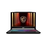
- Intel Core i9 HX Power for Elite Gaming: Dominate demanding titles with the Intel Core i9-14900HX and its 24-core hybrid architecture, delivering fast load times, high FPS, and smooth multitasking.
- GeForce RTX 5070 With Ray Tracing & DLSS 4: Powered by NVIDIA Blackwell, the RTX 5070 delivers stronger ray tracing, higher FPS, faster AI upscaling, and more responsive gameplay—ideal for competitive and cinematic gaming.
- QHD 165Hz, 100% DCI-P3 for Ultra-Clear Combat: The QHD 165Hz display reveals more detail, reduces motion blur, and boosts visibility in fast-paced games while delivering richer, more accurate colors.
- Cooler Boost 5 for Sustained Performance: Dual fans and a 5-heat-pipe share-pipe design keep the CPU and GPU cool, maintaining stable frame rates during long gaming marathons.
- 4-Zone RGB Keyboard + Full Game-Ready Ports: Customize your setup with a 4-zone RGB keyboard and highlighted WASD keys. Includes USB-C Gen 2, HDMI up to 8K, multiple USB-A ports, RJ45, Wi-Fi 6E & Hi-Res Audio.
The recurring model deserves special attention. A weekly box is not self-explanatory. Customers need to know what changes, when orders close, how pickup or delivery works, and what arrives in each box.
Free tools Windows power users keep installed
One-click scans. No signup required.
Adapt it: Give subscriptions or recurring boxes their own page. Explain the schedule, product rotation, cutoff time, payment or cancellation rules, pickup and delivery options, and whether customers can select flavors. Use playful copy in the brand layer, but keep the ordering sequence conventional.
12. Emporium Pies — Dallas–Fort Worth
Best lesson: make a large catalog easy to browse by availability, flavor, and occasion.
The current Emporium Pies store lists year-round and seasonal pies, prices, availability windows, a store locator, email signup, and nationwide shipping through Goldbelly. Website Planet highlights multiple product images, filtering, and controlled animation as useful ecommerce patterns.
Pie is a product where texture, filling, crust, and decoration strongly affect purchase intent. Multiple images can answer questions that a product name cannot.
The Tool Desk
Outbyte PC Repair FREERepair Windows errors before they cause bigger problemsFix Now →Outbyte Driver Updater FREEScan for outdated or missing drivers - takes under a minuteDriver Scan →Adapt it: Every product page should state what the item is, its price, serving information when relevant, availability dates, pickup or shipping options, and ordering cutoffs. Add filters for seasonal status, flavor profile, dietary information where verified, price, and location. Do not show a seasonal product as available if the customer cannot actually order it.
13. Magnolia Bakery — New York-origin brand
Best lesson: personality and commerce can coexist if the catalog rules are explicit.
Website Planet describes Magnolia’s site as colorful, playful, texture-rich, and information-dense while remaining navigable. The current site distinguishes local pickup, nationwide delivery, subscriptions, catering, and rewards eligibility. It also separates local US purchases from nationwide shipping and explains that third-party delivery orders may be treated differently for rewards purposes.
This distinction is easy for smaller bakeries to overlook. A customer may assume that every item, location, delivery method, and loyalty benefit works under the same rules.
Adapt it: Explain geography and fulfillment before checkout. Label products as local pickup, local delivery, nationwide shipping, subscription, or catering. State which purchases qualify for rewards and which do not. Keep the playful buttons, illustrations, textures, and microcopy, but do not let them replace operational clarity.
14. Greyston Bakery — Yonkers, New York
Best lesson: connect mission, product taxonomy, and gifting.
Greyston’s current store organizes products by occasions such as celebration, birthday, anniversary, thank-you, corporate gifts, and parties. It also includes vegan and gluten-free categories, gift tins, flavors, and merchandise. The store connects the shopping experience to Greyston’s Open Hiring mission and broader company information. Website Planet also highlights price sorting and blogging for announcements and baking tips.
The mission is strongest when it is visible without becoming an obstacle to shopping. A visitor can discover the purpose behind the company and still find a birthday gift or a dietary category directly.
Adapt it: Add filters based on use case, dietary need, price, format, and delivery method. Put a brief mission statement near the store and link to a fuller explanation. Educational articles can support discovery, but each should reinforce a product, occasion, ingredient question, or mission-related topic rather than becoming an unrelated content stream.
15. SusieCakes — US multi-market bakery
Best lesson: separate local ordering, nationwide shipping, celebrations, and brand programs.
SusieCakes separates local menu categories from nationwide shipping and provides local pickup and delivery paths. Its celebration structure includes birthdays, baby showers, corporate gifting, gender reveals, graduation, weddings, and quinceañeras. The site also includes locations, rewards, donations, careers, press, and gift cards.
This is the architecture a bakery needs when the same brand serves different markets. A local customer may want a cake today, while a distant customer may want a shippable gift. A corporate customer may need a different lead time and invoice process.
Adapt it: Ask visitors to choose the relevant path early: Order Locally, Shop Nationwide, Plan a Celebration, or Order Catering. On each path, explain lead time, fulfillment method, geography, and product availability.
4. Dietary-specialty, community, and multi-location models
Dietary positioning and community identity should be clear without making the food sound like a compromise. Multi-location businesses face a related challenge: the same brand may have different menus, hours, inventory, and fulfillment rules at each location.
16. Hell Yeah — Atlanta, Georgia
Best lesson: make dietary positioning feel celebratory rather than restrictive.
Hell Yeah places gluten-free products at the center of its identity and describes the bakery as part of a community shaped by exclusion from conventional food systems. The current site offers cakes, catering, same-day online ordering, pickup, and a monthly Provisions Club containing sweets, pastries, savory creations, and freezer items.
What’s actually slowing this PC down?
Pick the symptom - the matching free tool is one click away.
The strongest part of this model is the connection between values and concrete commerce. The brand explains why the dietary focus matters, then gives customers practical ways to buy.
Adapt it: Lead with the customer promise instead of a long list of substitutions. Make the dietary proposition unmistakable, then state ordering windows, pickup locations, inventory rules, and subscription details. If products are prepared in a shared environment, communicate the relevant information accurately and avoid implying a level of safety that has not been verified.
Rank #4

- Vibrant 15.6" FHD IPS Display: Experience stunning visuals on a large 15.6-inch Full HD (1920x1080) IPS screen. With narrow bezels and wide viewing angles, this laptop offers an immersive experience for streaming movies, online classes, or working on documents with crystal-clear detail
- Efficient Daily Performance: Powered by the Intel Celeron N4020 processor and 4GB LPDDR4 RAM, this notebook delivers reliable performance for web browsing, light multitasking, and school projects. The 128GB storage provides ample space for your essential files, photos, and apps
- Modern Connectivity & PD Fast Charge: Equipped with a versatile Type-C PD 45W port for fast charging and high-speed data transfer. Combined with Dual-Band AC WiFi and Bluetooth, you’ll enjoy a stable and fast internet connection for seamless video calls and cloud-based work
- Silent & Ultra-Portable Design: Featuring an advanced fanless cooling system, this laptop operates in total silence—perfect for libraries or late-night study sessions. Its sleek, lightweight body fits easily into backpacks, making it the ideal companion for students and commuters
- Ready for Work & Play: Pre-installed with Windows 11 Home, offering a secure and user-friendly interface. Includes a HD webcam and high-quality speakers for clear communication. A practical choice for online learning, remote work, or everyday entertainment
17. Flour Bakery + Café — Boston, Massachusetts
Best lesson: give a multi-location bakery several reasons to return.
Flour combines brand storytelling with catering, cakes, a monthly Dinner + Provisions Club, and a Flour Rewards App. The site also uses video and connects visitors to ordering paths, locations, and jobs content.
This makes the website an operating hub rather than a static menu. Different visitors can find everyday retail, celebration cakes, catering, recurring products, loyalty, careers, and locations without being forced through one generic funnel.
Adapt it: Design the homepage around clear customer intents. Useful top-level paths might include Order Food, Order a Cake, Catering, Find a Location, Join Rewards, and Work With Us. Keep the first visit simple while allowing repeat customers to reach their preferred program quickly.
18. Get Whisked
Best lesson: use a memorable opening moment without obstructing access.
Website Planet describes Get Whisked’s splash page as logo-led, colorful, image-heavy, and built around high-resolution pastry photography. It also notes a business story, consistent fonts, animated elements, testimonials, live chat, and a contact form. The current official page presents a minimal introduction with Home, Contact Me, and Shop entry points.
Crashes, No Sound, or Screen Glitches?
Random freezes, missing sound and display glitches usually trace back to one bad driver. Find and replace yours safely.Free scan · under a minuteWindows Errors? Fix Them Before They Spread
Repair common Windows errors and clear accumulated junk for a smoother, more stable PC - no reinstall needed.Free scan · no reinstallA splash screen can establish personality for a boutique baker, but it creates risk if it slows down access, hides the menu, or lacks a clear way to continue.
Adapt it: If you use an intro screen, give it an unmistakable Enter, Shop, or View Menu action. Optimize the hero image, respect reduced-motion preferences, keep navigation accessible, and provide a fast fallback for visitors on slower connections. Borrow the principle of immediate recognition, not the exact animation.
19. Shaz Confections — Hong Kong
Best lesson: design around the language, delivery, and ordering realities of the local market.
Shaz Confections currently presents crepe cakes, fresh cream cakes, pandan chiffon cakes, vegan cakes, gifting, corporate gifting, self-pickup, and delivery in Hong Kong. Website Planet highlights the bilingual Chinese-and-English presentation and Instagram integration.
Do these 3 things before closing this tab:
1Scan for outdated or missing drivers - takes under a minute2Repair Windows errors before they cause bigger problems3Fix the driver behind crashes, sound loss and screen glitchesLanguage support is more than a translated navigation label. Product descriptions, ordering requirements, delivery geography, lead times, and customer-service instructions must remain understandable in the languages the business actually serves.
Adapt it: Make language selection part of the main architecture. Translate product information rather than only the menu buttons. Group products by buying occasion—such as birthdays, corporate gifts, and seasonal events—and show delivery zones and notice requirements before checkout.
20. LÀ LÁ Bakeshop’s multi-location model
Best lesson: give each location its own operational truth.
LÀ LÁ is also worth revisiting as a multi-location example. Its Toronto-area locations have their own addresses, hours, emails, phone numbers, and shopping links. That is more useful than presenting a single brand-level contact page and expecting visitors to determine which details apply to them.
Recommended Free Tools
Adapt it: If your bakery has multiple branches, let a visitor select a location before showing menu, pickup, delivery, and hours information. A location page should answer where to go, when to go, how to order, and what differs from other branches. Do not assume that a brand-wide menu or schedule applies everywhere.
Note: The 20-site roundup includes LÀ LÁ once; this separate treatment isolates its location architecture because it is a particularly reusable lesson for growing bakeries.
Additional brand-led inspiration from the 20-site set
Several examples above overlap across categories. Their most useful ideas are worth stating directly because they apply even when a bakery has a very different business model.
- Forma Bakery in Oakland: Its compact structure includes Home, Menu, Pre-Order Online, eGift Cards, About Us, and Contact/Hours. The bold blue palette, cat illustration, and high-contrast text create a memorable visual system without making the operational layer unusual. Its ordering path visibly connects to Toast. The takeaway is to choose one or two repeatable brand devices and keep menu, hours, location, order, and gift cards conventional and easy to reach.
- Honeybear Bake Shop: Its weekly cookie-box model demonstrates that recurring products need a dedicated explanation, not merely a recurring checkout option.
- Rheinlander Bakery: Its ownership story, dietary range, fundraising content, social links, and newsletter show how local identity can support both immediate orders and retention.
- Creswell Bakery: Its illustrated map, process content, events, newsletter, and jobs path show that even a small local site can serve customers, potential employees, and community members without losing focus.
Patterns to borrow when redesigning a bakery website
1. Treat photography as the first conversion layer
Large, mouthwatering product images are a recurring strength across current bakery design coverage. Use real food photography with consistent cropping, enough detail to show texture, and descriptive alternative text. The first image should communicate the bakery’s strongest product or clearest point of view, not merely fill a decorative space.
For a small bakery, a phone and natural light may be enough to begin. A simple product photography light box can make small products more consistent, while a smartphone tripod for product photography can reduce blur and keep framing repeatable. A white foam board reflector can soften shadows at low cost. These are workflow aids, not requirements; good window light, a clean background, and careful composition may matter more than buying equipment.
If the website needs a broad, polished image library, a bakery food photographer or specialist product photographer may be a better investment than adding more decorative web effects.
2. Match the primary CTA to the actual business model
The most visible button should describe the next step accurately:
| Business model | Useful primary CTA | Information to place nearby |
|---|---|---|
| Ready-to-buy local products | Order Online | Pickup, delivery, location, hours, and same-day rules |
| Changing daily inventory | View Today’s Menu | Date, update time, availability, and visit details |
| Custom cakes | Start a Custom Inquiry | Gallery, flavors, pricing guidance, lead time, and FAQs |
| Wedding work | Book a Tasting or Wedding Inquiry | Portfolio, serving guidance, minimums, and timeline |
| Catering | Order Catering | Guest counts, packages, delivery, setup, and notice |
| Multi-location retail | Find a Location | Location-specific hours, menus, and order paths |
| Nationwide shipping | Shop Shipped Gifts | Shipping dates, cutoff times, packaging, and destinations |
A generic Learn More button may be visually safe, but it forces the visitor to interpret the site. A specific CTA reduces that uncertainty.
What’s actually slowing this PC down?
Pick the symptom - the matching free tool is one click away.
3. Put operational context inside the menu
A menu that only lists product names is incomplete. Add price, serving size where relevant, availability, ordering window, location, pickup or delivery method, dietary labeling, and seasonal status. Emporium Pies, Magnolia Bakery, SusieCakes, Shaz Confections, Windy Ridge, and the other examples demonstrate different versions of this principle.
Do not hide critical rules in a footer or FAQ if they determine whether a customer can complete an order. A customer should learn about a cutoff date before investing time in a cart.
Best Value
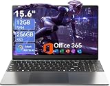
- Stunning 15.6" FHD IPS Display: Experience crisp 1920x1080 resolution on this 15.6 inch laptop with an IPS panel that delivers wide viewing angles and vivid colors. The narrow-bezel design maximizes screen real estate for comfortable viewing on this Win 11 laptop, whether you're studying or working.
- Celeron J4105 Processor & 256GB SSD: Powered by a reliable Celeron J4105 processor paired with 12GB DDR4 memory and a fast 256GB M.2 SSD. This laptop computer supports SSD expansion up to 2TB and TF card expansion up to 1TB, so your storage grows with your needs. Delivers smooth multitasking for daily productivity.
- AI-Powered Win 11 Laptop: Built-in AI features enhance your productivity with smart assistance for writing, summarizing, and task management. Pre-installed with Win 11 and includes Office 365 subscription. This student laptop is backed by 1-year warranty and 24/7 customer support.
- All-Day 7000mAh Battery & 180° Hinge: The high-capacity 7000mAh battery keeps this laptop powered through long classes or meetings. The 180-degree lay-flat hinge lets you share your screen effortlessly during presentations. This durable laptop computer adapts to your dynamic workflow.
- Versatile Connectivity Hub: Equipped with USB 3.2, Type-C, Mini HDMI, and 3.5mm audio jack to connect all your peripherals. Stay online anywhere with high-speed 5G WiFi and Bluetooth 4.2. This college laptop keeps you connected at home, in the library, or on the go.
4. Use brand voice as a navigation tool
Brand voice is not only advertising copy. It helps visitors decide whether they are in the right place. Forma’s illustration and color system, Blonde Bakery’s concise slogan, LÀ LÁ’s Vietnamese bakery-café positioning, Hell Yeah’s values-led dietary identity, and Greyston’s mission all make the businesses easier to distinguish.
Choose one clear point of view—regional, cultural, playful, nostalgic, mission-driven, dietary-specialty, premium, or experimental—and repeat it through headlines, product descriptions, imagery, buttons, and packaging. Avoid generic claims such as made with love unless you support them with specific process, ingredient, ownership, or community details.
5. Build trust with local evidence
Useful trust signals include a current address, hours, ownership story, award with date and attribution, customer reviews, community work, press coverage, clear contact information, and location-specific ordering. Trust signals should be current and verifiable. An undated award or old review can create confusion instead of confidence.
6. Educate custom-order customers
Custom customers need more than a gallery. Explain minimum notice, design process, flavors, sizes, servings, pricing ranges or starting prices where possible, delivery, deposits, changes, cancellations, and what happens after an inquiry. A short FAQ can prevent repetitive questions, but it should not replace a clear summary near the inquiry form.
7. Use subscriptions and loyalty carefully
Honeybear’s weekly cookie model, Hell Yeah’s Provisions Club, Flour’s Dinner + Provisions Club and rewards app, and Magnolia’s subscription and rewards rules show several ways to create repeat behavior. These programs work best when customers understand the value and the commitment.
Explain what changes from cycle to cycle, when the charge occurs, how customers pause or cancel, where the products can be collected or delivered, and which purchases qualify for rewards. Do not promote a subscription more prominently than a normal order if the visitor is simply looking for today’s menu.
Quick wins for a faster PC:
Clear out junk files and repair common Windows errorsFree Scan →Scan for outdated or missing drivers - takes under a minuteDriver Scan →Repair Windows errors before they cause bigger problemsFix Now →8. Let motion support the order path
Splash screens, video heroes, GIFs, parallax effects, and animated illustrations can express personality. They can also delay the menu, increase page weight, create motion discomfort, or make mobile navigation harder.
Keep a visible static fallback, compress and appropriately size images, provide pause or reduced-motion behavior where applicable, and ensure the primary CTA is available before or alongside the animation. The visual effect should make the bakery more memorable—not make customers wait to buy.
9. Treat accessibility and inclusion as commercial features
High-contrast text, readable type, keyboard-accessible navigation, descriptive alternative text, clear labels, multilingual product information, and location-specific details expand the number of people who can use the site successfully. Dietary labels also help customers make decisions, provided they are accurate and do not overpromise allergen safety.
Accessibility should be part of the content and design system from the beginning. A decorative script that is difficult to read or an image-only menu may express a brand while excluding customers from the information they need.
Which platform fits the bakery website you want?
The examples use a mixture of website builders, ecommerce systems, restaurant-ordering tools, and custom integrations. Platform labels are observations reported or visible at research time, not permanent technical specifications. A redesign may change the platform without changing the brand.
| Choose this direction when… | What to prioritize | Potential fit |
|---|---|---|
| You need a visual-first brochure site, galleries, forms, and a modest shop | Templates, image control, forms, mobile editing, SEO basics, and easy content updates | Wix website builder or Squarespace |
| You run a custom cake studio or content-led local bakery | Portfolio pages, storytelling, inquiry forms, scheduling, and simple commerce | Squarespace website and commerce platform or a comparable builder |
| You ship products, manage variants, run subscriptions, or maintain a large catalog | Inventory, shipping dates, filters, customer accounts, promotions, and fulfillment integrations | Shopify ecommerce platform or another commerce-first system |
| You mainly need local ordering, POS, loyalty, and pickup or delivery | Menu synchronization, store hours, ordering rules, payments, and customer retention | A bakery online ordering system connected to POS, such as Toast where available and appropriate |
No platform automatically creates good information architecture. A beautiful template can still hide hours and lead times; an advanced store can still have weak product photography. Choose based on fulfillment and content needs first, then compare cost, payment processing, integrations, ownership, accessibility controls, maintenance, and export options.
For a redesign that requires outside help, a freelance bakery website designer can assist with structure, branding, copy, photography direction, or ecommerce setup. Review portfolios carefully and define accessibility expectations, content ownership, scope, revisions, analytics access, security responsibilities, and ongoing maintenance before hiring. Fiverr publishes affiliate and referral documentation, but service quality varies and neither approval nor suitability should be assumed.
A practical bakery website redesign checklist
- Put the signature product or strongest visual above the fold.
- Keep one primary CTA visible: order, visit, inquire, book, or view the menu.
- Place location, hours, pickup, delivery, and lead-time information near the relevant action.
- Separate stocked products from custom orders, weddings, and event catering.
- Create occasion pages for weddings, birthdays, corporate gifts, holidays, and other major buying moments.
- Use a short, concrete brand story instead of generic handmade or artisan language.
- Show dietary information and allergen-related guidance accurately without making unsupported safety claims.
- Use real product photography with consistent cropping and descriptive alternative text.
- Add reviews, awards, press, community work, or owner information only when current and attributable.
- Make seasonal availability and order cutoffs obvious before checkout.
- Give every location its own hours, address, menu, contact details, and order destination.
- Explain subscriptions, loyalty rewards, cancellations, shipping dates, and fulfillment restrictions.
- Keep a stable gallery even if social-media content is embedded on the homepage.
- Optimize large images and provide a static alternative to motion-heavy introductions.
- Review the complete mobile ordering and inquiry path before launch.
Before publishing, recheck hours, prices, menu contents, delivery zones, seasonal products, platform labels, rewards eligibility, subscription availability, and third-party ordering links. Do not report a speed test, accessibility audit, usability test, conversion result, or personal purchase experience unless one has actually been performed.
How to recreate the visual pattern without overspending
Start with a small, repeatable photo system rather than trying to photograph everything at once. Choose one background, one framing style, and a consistent lighting direction. Photograph the hero product from several useful angles: whole product, cut or opened view, close-up texture, packaging, and a realistic serving context.
Natural window light and a smartphone may be sufficient for some bakeries. For small products, a product photography light box can make lighting more repeatable. A smartphone tripod for product photography helps maintain the same angle across a menu, while a white foam board reflector can fill in harsh shadows. Take test shots before buying equipment and prioritize image consistency over a studio-like effect.
For a large relaunch, hiring a bakery food photographer can be more efficient than building an image library piecemeal. Ask for web-sized files, descriptive product names, alternate crops for mobile, permission to use the images across the website and social channels, and a plan for seasonal updates.
What not to copy from these examples
- Do not copy a splash screen just because it looks dramatic. If it delays the menu or order button, it is working against the customer.
- Do not copy a national shipping model for a local bakery. Use the fulfillment model you can operate reliably.
- Do not copy a large catalog’s navigation. A small bakery may need only Menu, Custom Orders, About, Locations, and Contact.
- Do not copy cultural or mission-driven language without authenticity. Explain your own point of view and evidence.
- Do not copy platform assumptions. A site’s current technology may change after redesign and may not suit your inventory, payment, or staffing needs.
- Do not use social embeds as your only portfolio. Keep important work, menus, prices, and policies on pages you control.
The central design principle
Every one of these bakery websites offers a variation on the same underlying lesson: desire gets the visitor’s attention, credibility earns trust, and clarity turns that attention into a visit, inquiry, or order.
Start your redesign by identifying the bakery’s real business model. Then choose the homepage image, navigation, CTA, menu structure, and platform that support it. A custom cake studio should make consultation easy. A neighborhood shop should make today’s visit easy. A shipping brand should make dates and delivery rules easy. A multi-location bakery should make the correct branch easy to find.
Frequently Asked Questions
Are these bakery websites ranked from best to worst?
No. The list is an inspiration guide anchored to a published 20-site roundup, not a formal global ranking or a usability, accessibility, speed, SEO, or conversion study. Each example is included for a specific design or business-model lesson.
Does every bakery need online ordering?
No. Stocked products with predictable prices are good candidates for ecommerce or local ordering. Custom cakes, weddings, and complex catering may convert better through a structured inquiry form with galleries, lead times, pricing guidance, and FAQs.
Which platform is best for a bakery website?
It depends on the operation. A visual-first bakery may prefer a website builder such as Wix or Squarespace. A bakery shipping a large catalog may need Shopify or another commerce-first platform. A local bakery focused on POS, pickup, delivery, and loyalty may need an integrated ordering system such as Toast where available.
PC Slower Than It Used to Be?
A free scan shows the junk files, broken settings and background clutter dragging Windows down - then fixes them in one click.Free scan · Windows 10 & 11Crashes, No Sound, or Screen Glitches?
Random freezes, missing sound and display glitches usually trace back to one bad driver. Find and replace yours safely.Free scan · under a minuteWhat should appear on a bakery homepage?
Show the signature product or strongest image, a clear value proposition, one primary CTA, current location and hours, and an obvious path to the menu or order flow. Add secondary paths for custom orders, catering, weddings, locations, or nationwide shipping when those services are important.
The Bottom Line
Bottom line: Borrow the principle behind each example, not its surface style. Make the food desirable, make the bakery credible, and place the correct next step—order, visit, inquire, book, or find a location—where customers can see it immediately.
Quick Recap
Product prices and availability are accurate as of the date/time indicated and are subject to change. Any price and availability information displayed on Amazon at the time of purchase will apply.

