
iTechGuides is reader-supported. When you buy through links on our site, we may earn an affiliate commission. As an Amazon Associate I earn from qualifying purchases. Learn more
Web-safe colors are a legacy palette of 216 RGB colors made from six values per channel: 00, 33, 66, 99, CC, and FF. The palette was intended to render consistently on systems with limited color capability. Today, it is a historical convention—not an accessibility requirement or a guarantee of good contrast.
How the 216-color palette is defined
In hexadecimal RGB notation, a color has three channel values: red, green, and blue. The traditional web-safe palette uses one of six allowed values for each channel: 00, 33, 66, 99, CC, or FF. Choosing independently for all three channels produces 6 × 6 × 6, or 216, combinations. For example, #336699 is in the palette because each of its channels is one of those six values.


The palette’s historical purpose was to make colors display consistently when computers had limited color capability. The available historical overview does not establish a precise inventor, launch date, or browser-specific origin, so those details should not be treated as settled.
The Tool Desk
Outbyte PC Repair FREERepair Windows errors before they cause bigger problemsFix Now →Outbyte Driver Updater FREEScan for outdated or missing drivers - takes under a minuteDriver Scan →Are web-safe colors still relevant?
For modern web design, restricting a site to these 216 colors is generally unnecessary. “Web-safe” describes a legacy display-compatibility convention; it does not promise accurate color reproduction on every current device, nor does it mean a color is accessible.
#1 Best Overall
When choosing interface colors, evaluate the actual foreground and background together. Palette membership alone says nothing about how legible text will be against a particular background.
Do web-safe colors meet WCAG contrast requirements?
Not automatically. WCAG 2.2 Success Criterion 1.4.3 sets a minimum contrast ratio of 4.5:1 for normal text and 3:1 for large text, subject to the criterion’s specified exceptions. These thresholds concern the contrast of the text and its background—not whether either color belongs to the legacy palette. See the W3C WCAG 2.2 contrast minimum criterion.
Rank #2
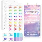
- 【Note】Compatible with different types of pens. Multiple layers using water-based pens may result in minor surface pilling.
- 【Durable & Practical Design】This color diary features a premium 300 gsm white card cover with a purple watercolor design and a matching solid purple back cover. The color swatch notebook measures 3.5×7 inches, with two top pre-punched holes and 1-inch gold metal rings for easy page turning, secure storage, and long-lasting use.
- 【Organize Up to 480 Colors】Each color chart template includes 20 single-sided pages, with 24 swatch boxes per page and space for self-assigned numbering, allowing you to record and display up to 480 unique colors. Perfect as a color chart book or color swatches book, it helps artists keep paint samples, mixing notes, and palettes in order. Each swatch box also includes space to note the color brand and type, ensuring every hue is easy to find, classify, and reference.
- 【Premium 300 GSM Paper】Crafted with thick 300g card stock, this swatch card resists bleed-through and warping. Ideal for watercolor, gouache, colored pencils, markers, or pastels, making it a versatile tool for students and professionals. Each outline provides a smooth surface for accurate pigment testing.
- 【Portable & Flexible Use】Compact and easy to carry, this colors swatch book doubles as a creative color swatch charts logbook wherever inspiration strikes. The removable pages make it convenient to expand or rearrange, turning your color chart card collection into a personalized swatch reference for painting, design, or travel.
Contrast also matters for meaningful non-text elements. The W3C discusses text, icons, buttons, and meaningful information in diagrams or maps as contexts where colors may need to remain distinguishable. Its explanation notes: “Colors must have sufficient contrast, for example, between the text color and the background color (technically called luminance contrast ratio).” See W3C’s explanation of contrast minimum.
How to choose colors for an accessible website
- Choose the colors that suit the design. There is no need to limit the palette to the historical 216 colors for the cited WCAG contrast criterion.
- Check the actual foreground/background pair. Compare its contrast ratio with the applicable text requirement: 4.5:1 for normal text or 3:1 for large text, subject to the criterion’s exceptions.
- Use more than color to convey meaning. If color identifies a status, action, response, or distinction, add another cue such as a text label, shape, or icon. W3C guidance explains that color should not be the sole means of communicating information; see W3C’s explanation of use of color.
These checks address different questions: contrast supports legibility and distinguishability, while redundant cues help people understand meaning without relying on color alone.
Quick Recap
Best Value

- ORGANIZATIONAL TOOL: it allows you to easily match the exact colors from the real color swatch. and help you keep your colors organized and easily accessible, saving you time and effort when creating your artwork. you can be confident that the colors you choose are accurate and consistent throughout your project.
- VERSATILE USE: Perfect for watercolors, acrylics, oil pastels and other wet & dry media, allowing artists to test and record different techniques
- CONVENIENT FORMAT: Concertina-style book design with 6 sheets containing 24 pans per sheet for organized color swatching and sampling
- PAPER QUALITY: Cold press texture offers ideal surface grip, while acid-free composition ensures long-lasting color preservation
- ARTIST'S COMPANION: Functions as a practical color diary for testing, organizing, and referencing your art supplies and color combinations
Rank #4

- REAL CMYK - Design Swatch is a realistic representation of straight CMYK industrial printing. With Design Swatch, you'll know what to expect when using a certain color from the deck.
- DESIGN-FOCUSED - Instead of filling up the deck with nonsense colors or colors that Graphic Designers or Small Business owners will never use, we filled up our deck with design-focused colors. 300 CMYK colors, all of which are perfectly usable in design.
- PRINT-READY ACCURACY – Every swatch is tested against real-world CMYK printers, so what you see in the deck is what you'll get on paper.
- COST-EFFICIENT – Professional color tools are often overpriced. Design Swatch delivers premium quality at a fraction of the cost—perfect for freelancers and growing brands.
- CMYK TO HEX - With Design Swatch, you can convert CMYK to Hex (and vice versa) easily and effortlessly by using the Hex codes on each card. It also doubles as a color palette planner for your design or web project.
Product prices and availability are accurate as of the date/time indicated and are subject to change. Any price and availability information displayed on Amazon at the time of purchase will apply.

