
To optimize a website for mobile, make the layout adapt to different screen sizes, keep the mobile version complete and accessible, improve loading and interaction performance, then test both real-world data and key tasks on a phone. A good mobile experience is readable without sideways scrolling, has controls people can use, responds promptly, and gives visitors the same essential content they can find on desktop.
1. Choose a mobile layout approach
For most sites, responsive design is the most straightforward foundation. It serves the same HTML at the same URL and adapts the presentation to the available screen size. Google recommends responsive design as the easiest approach to implement and maintain: Google’s guidance on mobile sites and mobile-first indexing.
Other architectures can work, but they introduce additional coordination and testing:
| Approach | How it works | Practical trade-off |
|---|---|---|
| Responsive design | One URL and the same HTML adapt to different screen sizes. | Usually simpler to maintain and keep consistent across devices. |
| Dynamic serving | The URL stays the same, but the server provides different HTML depending on the device. | Device detection and serving the right content reliably require care. |
| Separate mobile URLs | Desktop and mobile experiences use different URLs. | Requires managing the relationship between versions and keeping content and crawl access consistent. |
Start by checking that each page declares an appropriate viewport and that its layout flows within the available width. Avoid designing for only one handset size: test narrow and wider phone screens, as well as desktop. Google describes the viewport and basic mobile usability checks in its mobile-first indexing guidance.
#1 Best Overall

- 【Strong Adsorption】The inspiration of the silicone phone suction case comes from the adhesive force of the octopus. Each suction cup phone mount is 3.15 inches long and 2.17 inches wide, with 24 independent suction cups providing a stronger and more stable suction force, so you don't have to worry about your phone falling during use.
- 【Back of Phone Suction Grip】Remove the adhesive film on the phone suction cup and stick it on the phone case. You can then fix the phone on any smooth surface, which is very convenient. (The phone suction cup cannot be removed and reused after being attached to the phone case. It is recommended to attach it to a regular phone case, not a valuable one.)
- 【Widely Used】Our non-slip silicone phone sticky grip mount attaches to almost any flat phone case and make it compatible with common mobile phones such as iPhone and Android.You can shoot, watch videos or video calls in the kitchen, gym, dance studio, bathroom and other places.
- 【Capture the Wonderful Picture】Whether you are a TikTok creator or just like to share videos and photos, this phone suction cup can help you hands-free capture wonderful videos and photos for sharing with friends.
- 【Note】You can fix the phone suction cup on a smooth surface such as a mirror or glass. If necessary, wipe the suction cup with a damp cloth to obtain stronger suction. Before releasing your hand, make sure the phone is firmly fixed. (Not applicable to rough walls, wooden surfaces, and other uneven surfaces)
2. Audit the pages people actually use
Mobile problems often appear in a specific template or task rather than across the whole site. Review representative pages and complete their key interactions on a phone:
- Home page and main navigation
- Article or other content page
- Category or product listing, if applicable
- Detail page, such as a product or service page
- Search results and search controls
- Forms, account flows, checkout, or other conversion steps, where applicable
Look for clipped content, accidental horizontal scrolling, menus that are hard to open, fields obscured by the keyboard, and buttons that are difficult to activate. Test the task from beginning to end; a page can appear polished while a menu, form, or confirmation step remains unusable.
3. Keep mobile content complete and crawlable
Google uses the mobile version of a site’s content for indexing and ranking. If the mobile experience omits information that appears on desktop, search engines may not have the same material available to understand the page. Compare the versions and keep important page content, titles and metadata, structured data, and robots directives aligned. Google’s mobile site documentation explains these mobile-first indexing considerations.
Rank #2

- SUPERIOR COMFORT — Unlike traditional circular ear buds, the design of EarPods is defined by the geometry of the ear. Which makes them more comfortable for more people than any other ear bud–style headphones.
- HIGH-QUALITY AUDIO — The speakers inside EarPods have been engineered to maximize sound output and minimize sound loss, which means you get high-quality audio.
- BUILT-IN REMOTE — EarPods with USB-C plug also include a built-in remote that lets you adjust the volume, control the playback of music and video, and answer or end calls with a pinch of the cord.
- COMPATIBILITY — Works with all devices that have a USB-C port.
- INTEGRATED MICROPHONE — A built-in microphone precisely captures your voice while you’re on the phone, taking a FaceTime call, or summoning Siri — so you’re always heard loud and clear.
Also confirm that Google can access the resources needed to render the page. Do not block essential CSS, JavaScript, or images from crawling. Avoid making primary content available only after an interaction that a crawler may not perform, such as tapping a tab or expanding a control. Make important information available in the rendered page without relying on that interaction.
Free tools Windows power users keep installed
One-click scans. No signup required.
4. Improve loading, responsiveness, and visual stability
Google’s current Core Web Vitals targets for a good user experience are Largest Contentful Paint (LCP) of 2.5 seconds or less, Interaction to Next Paint (INP) below 200 milliseconds, and Cumulative Layout Shift (CLS) below 0.1. These are real-world measures of loading performance, responsiveness, and visual stability; they are not the only signals involved in search ranking. See Google’s Core Web Vitals guidance.
Make the main content appear sooner
Identify the largest visible content element near the top of a page, often a hero image, heading, or prominent text block. Check whether its image or other resource is unnecessarily large or delayed. Prioritize useful content over decorative elements and avoid loading work that blocks its appearance.
Rank #3

- Secure Hold: Our PopSockets adhesive phone grip gives your cell phone a secure, comfortable hold in hand to help prevent drops while texting, taking photos, or scrolling on the go. Designed to stick firmly to most phone cases and devices.
- Hands-Free Made Easy: Easily turn your PopSocket into a phone stand to prop up your phone anywhere, perfect for watching videos, video calls, or following recipes. A must-have phone holder that keeps your device secure and ready for anything.
- Compatibility: Works with all phones, tablets, and Kindles. Sticks best to smooth, hard plastic cases and may not adhere to silicone or textured cases. Easily swap your PopTop to change up your style.
- Black PopSockets: Simple, refined, and endlessly versatile. A timeless essential for any phone.
- Travel Must-Have for People On the Go: A must-have travel accessory for flights, flying, airports, air travel, airplanes, planes, international trips, cruises, and long travel days. Key gadget for your airport haul, travel accessories and must-haves.
Make interactions respond promptly
Test navigation, search, form submission, and other important controls on a phone. Unnecessary JavaScript and third-party scripts can add work before the browser can respond. Remove or defer work that is not needed for the initial view, and check that external widgets do not make essential tasks sluggish.
Prevent unexpected movement
Reserve space for images, video, advertisements, and other elements that load after the initial page content. Give media dimensions or an aspect ratio so surrounding content does not jump when the resource arrives. Review the page as it loads, not only after everything has settled.
These are implementation techniques for addressing the metrics, not guarantees of a particular score. Performance can vary with device, network, page content, and third-party services.
Rank #4

- [360 ° Flexible Rotation Design] Comes with a rotatable lanyard ring that supports 360 ° free rotation, effectively solving the problem of twisted and tangled lanyards
- [Wide compatibility] The ultra-thin 0.02-inch design does not block the charging port at all, and both wired and wireless charging can be used directly without removing the pad. Compatible with most smartphones such as iPhone, compatible with various wristbands, lanyards, crossbody straps, and keychains
- [Durable and Portable Material] Premium rust-resistant stainless steel material with good flexibility, which not only avoids scratching the phone case, but also has excellent anti rust and anti fading performance
- [Multi scenario Practical] Paired with a lanyard or wristband, hands-free use can be achieved. The phone is within reach and not easily dropped, ideal for daily commuting and outdoor activities. Suitable for full coverage phone cases, does not support half coverage phone cases
- [Quality Service] If you find any damage or other issues with the product upon receipt, please contact us immediately. We will handle it quickly
5. Check readability, controls, and accessibility
Read a page at its normal mobile size. Text should be legible without requiring pinch-to-zoom, content should fit the viewport, and controls should be easy to identify and activate. Check menus, links, form fields, error messages, and focus behavior—not just the first screen.
Use WCAG 2.2 as the normative standard for web content. It contains the applicable success criteria for matters such as text, keyboard operation, and target accessibility; assess the actual interface against the relevant criteria rather than assuming one universal tap-target size. W3C’s WCAG2Mobile guidance is informative and focuses on applying WCAG 2.2 to mobile applications and mobile web apps. It is not a substitute for WCAG 2.2 itself.
Do not make essential functions depend on browser plugins that are unavailable on many mobile devices. For legal obligations, requirements depend on jurisdiction and context; the accessibility standards cited here do not by themselves establish which laws apply to a particular site.
Recommended Free Tools
Best Value
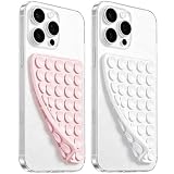
- 【PKYAA Double Sided Silicone Suction Phone Case Mount】PKYAA With Double Sided 40 Strong and Reliable individual suction cups, PKYAA provides a thicken and upgraded universal silicon suction mount for your phone.
- 【Friendly to Content Creators】If you are a content creator or an online influencer, you can create videos anywhere with this suction mount completely hands free with this silicone cell phone mount for cases.
- 【HANDS-FREE & Adhere to Mirrors】This Double Sided silicone suction phone case mount allows you to stick your phone to the mirror easily. No longer holding your phone in one hand to watch video tutorials while making up.
- 【Strong Grip on the Smooth Surface】You can easily hang your phone anywhere with a smooth surface. All you do is you clean off your phone and smooth surface. It is STURDY and it not only sticks to mirrors, it also sticks to windows, it sticks to refrigerators, tiles and other clean, flat surfaces.
- 【Press Down Firmly Every 30 Minutes】Use your palm or fingers to press the phone down firmly and check it's secure before letting go. Apply even pressure for a few seconds to allow the suction cup to adhere properly. To maintain the grip and prevent accidental falls, it's a good practice to periodically reapply pressure to the suction cup.
6. Measure the page and monitor real visitors
Use different checks for different questions. PageSpeed Insights can assess an individual page and may show both live diagnostics and field data. Search Console’s Core Web Vitals report groups eligible URLs using real-world field data. Manual checks reveal usability and accessibility problems a performance number cannot explain. Google’s tools and their roles are described in its Core Web Vitals documentation.
- Check representative pages in PageSpeed Insights. Test important templates, including a content page and any critical form or purchase flow. Review the suggested diagnostics alongside the Core Web Vitals results.
- Review Search Console’s Core Web Vitals report. Look for URL groups marked as needing improvement or poor, then inspect representative pages from those groups. The report uses field data and only includes eligible URLs with adequate data.
- Interpret missing field data cautiously. If a page or group has no field data, that can mean Google does not have enough data—not that the page has passed.
- Retest after changes. Re-run page-level checks and monitor field data as it becomes available. Confirm on a phone that the change improved the actual task, not just a displayed metric.
A lab diagnostic, field report, and hands-on usability check are complementary: one page’s live result does not represent every visitor, while field data may not exist for every URL.
Quick Recap
Product prices and availability are accurate as of the date/time indicated and are subject to change. Any price and availability information displayed on Amazon at the time of purchase will apply.

