
There is no single image size that fits every website slider. Check the specifications for your CMS, theme, or slider, then preview your image in the real component at desktop and mobile widths. The right image is the one that survives the component’s crop while keeping its subject visible, its text readable, and its file appropriate for your site’s delivery pipeline.
Start with the slider’s dimensions and crop behavior
Before exporting, find the image guidance for the component you will actually use. A slider may crop an image to fill a fixed frame, scale it proportionally, or use different crops at different screen sizes. Those behaviors determine what dimensions and composition will work.
Examples show why platform instructions matter: the U.S. National Science Foundation (NSF) recommends a wide proportion of 1.7:1 or wider and lists 1920 × 1080 pixels as its preferred full-width hero image size for its authoring component. Microsoft SharePoint’s Hero web part specifies layout-dependent ratios instead. These are specifications for those components, not universal web requirements. See the NSF hero-image guidance and Microsoft’s SharePoint Hero web part documentation.
Find the exact component requirements
- Identify the page builder, CMS, theme, or slider plugin that will display the image.
- Look for its recommended dimensions, aspect ratio, minimum resolution, focal-point controls, and responsive-image behavior.
- Check whether it uses one image at every width or accepts separate desktop and mobile images.
- Upload a test image and inspect the rendered result; the component’s actual crop is more useful than the source file’s dimensions alone.
If no dimensions are published, do not assume that a familiar banner size is correct. Use the intended container’s proportions as a starting point, then adjust after previewing the actual output.
Crashes, No Sound, or Screen Glitches?
Random freezes, missing sound and display glitches usually trace back to one bad driver. Find and replace yours safely.Free scan · under a minuteWindows Errors? Fix Them Before They Spread
Repair common Windows errors and clear accumulated junk for a smoother, more stable PC - no reinstall needed.Free scan · no reinstallUse platform examples only as examples
In SharePoint’s Hero web part, the Tiles layout uses an 8:3 component ratio while images scale to 4:3; Layers uses an 8:3 individual layer, with images near 9:16. Those differing ratios can produce different crops from the same source. The NSF’s 1920 × 1080 recommendation belongs to its full-width hero authoring component; it is not a general slider export rule.
#1 Best Overall

- 16MP Sensor: Captures detailed photos with a CMOS sensor for everyday shooting
- Optical Zoom: 4x optical zoom with a 27mm wide angle lens for flexible framing indoors or outdoors
- Full HD Video: Records 1080p video for travel clips, family moments, or simple vlogging
- Memory Support: Works with Class 10 SD, SDHC, or SDXC cards up to 512GB
- LCD Screen and Battery: 2.7in LCD screen with 2 AA alkaline batteries for convenient on-the-go use
Compose an image that survives desktop and mobile crops
Choose an original with enough resolution for the largest display size your component supports, then preview it at the widths your audience is likely to use. Responsive components can crop or resize imagery, so a subject centered in the original may still be obscured by a mobile crop, text overlay, or controls.
Protect the focal subject
- Keep faces, products, and other essential details away from edges where cropping is likely.
- Leave deliberate negative space where the headline or call to action will sit.
- Check both landscape desktop and narrow mobile layouts; do not judge only the source file.
- If a single composition cannot keep the subject and message balanced at all widths, prepare an alternate crop if the component supports art direction.
The NSF describes its responsive hero images as cropping and resizing across screen sizes, and SharePoint documents layout-specific image scaling. Their guidance reinforces the practical rule: test the image in the intended component, not just in an image editor.
Choose one crop or art direction
A single image crop is simpler to maintain and can work well when the subject remains clear after resizing. Art direction means serving a differently composed crop for a different context, such as a tighter mobile crop. Use it when a narrow viewport would otherwise cut off important content or leave the subject too small. Confirm that your CMS or frontend supports alternate sources before making separate files; uploading multiple versions alone does not make a page use them responsively.
What’s actually slowing this PC down?
Pick the symptom - the matching free tool is one click away.
Keep slider text readable and accessible
When a headline or button label can be live page text, do not bake it into the image. WCAG advises using text instead of images of text when the same presentation can be achieved with the technology. Live text can reflow, be translated, and be interpreted by assistive technology. See the W3C Web Content Accessibility Guidelines (WCAG) 2.1.
Rank #2
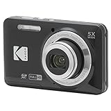
- 16MP Sensor: Captures detailed photos with a CMOS sensor for everyday shooting
- Optical Zoom: 5x optical zoom with a 28mm wide angle lens for flexible framing indoors or outdoors
- Full HD Video: Records 1080p video for travel clips, family moments, or simple vlogging
- Memory Support: Works with Class 10 SD, SDHC, or SDXC cards up to 512GB
- LCD Screen and Battery: 2.7in LCD screen and a rechargeable lithium-ion battery for on-the-go use
Check contrast on every slide
Text that is legible over one photograph may disappear over the next. Check the actual foreground and background in each slide, including controls. WAI notes that a semi-opaque background behind foreground content can help preserve contrast; avoid relying on a text shadow or a single image treatment without checking the result. Its carousel styling guidance also says buttons and links that are not inline in a block of text should be at least 44 × 44 CSS pixels.
Write appropriate image alternatives
Decide whether the image communicates meaningful information in context or merely decorates the page. Provide an appropriate text alternative for informative images; a decorative image may not need a descriptive alternative. Do not use the alt text to repeat nearby headline copy if that does not add useful information. The right alternative depends on the image’s function, not just its appearance.
Make motion controllable
If a carousel advances automatically, provide a visible control to pause or stop it. WAI explains that movement can be too fast or distracting and recommends that slide changes be communicated to all users, including screen reader users. Controls should work with a keyboard, have clear labels and visible states, and leave focus behavior predictable. Review the WAI Carousels Tutorial and its designing for web accessibility tips.
Quick wins for a faster PC:
Clear out junk files and repair common Windows errorsFree Scan →Scan for outdated or missing drivers - takes under a minuteDriver Scan →A carousel is not automatically better than a static hero. WAI notes that users can have difficulty discovering carousel content. If multiple rotating slides do not serve a real need, a static hero can make the message easier to find and avoids introducing motion controls.
Rank #3
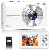
- Latest Digital Camera Built-in Fill Light : This compact digital camera is paired with a powerful CMOS processor and image stabilization to help you take & record the most exciting moments in 44 MP quality images & FHD 1080P quality videos anywhere, anytime. Plus, there is also a built-in fill light to help you take high quality pictures even in low light&dark settings, making this the perfect camera for all indoors/outdoors situations.
- Long-Lasting Battery Life & 16X Digital Zoom :This point and shoot camera will retain its battery charge even after long use. The controls and functions are easy to operate making this the perfect choice for children, teens and younger. This kids camera supports 16x digital zoom, you can zoom in or out the subject by pressing the W/T button for taking still photos to zoom in or out on distant objects and capture all the details you need.
- Multifunctional & Portable Digital Camera: This cheap digital camera is slim enough to fit in your pocket. You'll easily be able to take it with you on all your indoor/outdoor activities and adventures and ideal for beginners, children and teenagers. This kids digital camera is equipped with 20 filters, anti-shaking, self-timer, continuous shooting, date stamp, time-lapse recording, smile capture, internal MIC and speaker (recording sound videos), great for your daily photography needs.
- WEBCAM & PAUSE FUNCTION : More than just a FHD 1080p digital camera, it also works as a webcam for video calls and vlogging. Connect the camera to the computer, press shutter and power button at the same time and the camera will automatically turn on webcam mode for all your video calling and live streaming needs. The pause function allows you to pause when seeing playback videos.
- A Must Have Photography Device : This digital camera with SD card made from high-quality materials, this retro camera is safe and durable. Perfect for all ages to develop & improve their photographic abilities and observation skills. Our dedicated and experienced 24/7 support team is available for all after purchase troubleshooting, questions and technical help.
Fit images responsively in the page
A common CSS approach is to constrain an image to its available width while retaining its proportions:
img { max-width: 100%; height: auto; }
This can help an image fit a narrower layout without distortion. W3C documents this in technique C37 as one advisory way to support reflow, not a required implementation or a guarantee of conformance by itself. See W3C WAI C37. A slider may use its own container and crop rules, so check the result rather than assuming this CSS controls the entire component.
Export and validate the finished images
The sources cited here do not establish a universal file format, compression setting, or maximum file size for slider images. Those choices depend on your platform, delivery pipeline, and performance budget. Follow the CMS or build-system guidance, and compare visual quality with load performance on the devices and connections relevant to your audience.
Free tools Windows power users keep installed
One-click scans. No signup required.
- Export the image at the component’s required or intended dimensions, preserving the focal subject and negative space.
- Upload it through the normal publishing workflow so the site generates any required responsive variants.
- Preview the slider at desktop and mobile widths, including the narrowest layout you support.
- Check crop, image sharpness, headline and control contrast, and whether controls cover important image content.
- Test the carousel using keyboard input and verify that automatic movement can be stopped if it is enabled.
- Review loading behavior on the published page and revise the image or delivery settings if it is unnecessarily slow.
Common problems and fixes
- The subject is cut off on mobile: the component is cropping the image for a narrow frame. Reposition the focal point, choose a more flexible composition, or use an alternate mobile crop if supported.
- The image looks blurry: the source may be too small for the displayed area or may have been enlarged. Start with a sufficiently large original and inspect the rendered image at the actual display size.
- The headline disappears against some slides: contrast varies with the image. Adjust the text placement or image selection, or use a semi-opaque background behind the text and test every slide.
- Text in the image is too small or inaccessible: move essential wording into live HTML text where feasible and provide an appropriate text alternative for informative image content.
- Users cannot stop a moving carousel: add a visible, keyboard-operable pause or stop control and ensure slide changes are communicated accessibly.
- The image stretches or leaves unexpected space: check the component’s aspect ratio and scaling mode. Preserve proportions and verify how the slider container handles images rather than changing dimensions arbitrarily.
Or skip the browser setup
If you need a screenshot of the finished slider to review its crop, ScreenshotNeo can return a screenshot from one GET request. For example, this cURL command captures the rendered page at the target URL; replace the example URL with your published page:
Rank #4

- 16MP Sensor: Captures detailed photos with a CMOS sensor for everyday shooting
- Optical Zoom: 5x optical zoom with a 28mm wide angle lens for flexible framing indoors or outdoors
- Full HD Video: Records 1080p video for travel clips, family moments, or simple vlogging
- Memory Support: Works with Class 10 SD, SDHC, or SDXC cards up to 512GB
- LCD Screen and Battery: 2.7in LCD screen and a rechargeable lithium-ion battery for on-the-go use
curl -G "https://api.screenshotneo.com/v1/shot" -d access_key=YOUR_API_KEY --data-urlencode url=https://stripe.com -o shot.webp
See the ScreenshotNeo API documentation for request options. Cookie banners, popups, and chat widgets are removed before the shot; bot checks, blank pages, and failed loads are never billed. Its MCP server lets AI agents take screenshots, and 1,000 screenshots a month are free with no card; paid plans start at $5 for 3,000. Sign up for free.
Frequently Asked Questions
Is 1920 × 1080 the right size for every slider?
No. It is the NSF’s preferred full-width hero image size for its own authoring component, not a universal slider requirement.
Should a slider automatically advance?
Only if motion serves a clear purpose and users can pause or stop it. A static hero may be easier to discover.
Quick Recap
Product prices and availability are accurate as of the date/time indicated and are subject to change. Any price and availability information displayed on Amazon at the time of purchase will apply.

