
Test a responsive website by checking how it reflows and works across a range of viewport widths—not just by opening one phone preset. Use Chrome DevTools’ Responsive mode to inspect your site at exact widths, especially just below, at, and above each CSS breakpoint; then check navigation, forms, media, and other interactions. Lighthouse can flag viewport and image issues, but it cannot decide whether your layout is comfortable or usable, so finish with manual checks and, for important user journeys, a physical device.
What responsive testing should establish
A responsive page adapts its layout and controls as the available viewport changes. Testing therefore means sampling relevant widths and states, then checking both appearance and behavior. One preset—such as a particular phone—can miss a defect that appears only near a breakpoint or at an intermediate width.
Before testing, write down the narrowest and widest widths the site must support, plus representative widths in between. Use the breakpoints in your own CSS as boundaries: if a layout changes at a particular @media threshold, inspect the width just below it, the threshold itself, and the width just above it. Media queries are a key component of responsive design, as MDN explains.
- Coverage: Which viewport widths and orientations matter to your audience?
- Layout: Do columns, containers, text, and media reflow without overflow or collisions?
- Interaction: Can people reach and use navigation, forms, dialogs, and other controls?
- Environment: Does the experience hold up in relevant browsers, touch conditions, resolutions, and user-preference settings?
Test exact widths in Chrome DevTools
Chrome DevTools gives you a fast, repeatable way to vary viewport dimensions. Its documented preset widths include 320px, 375px, 425px, 768px, 1024px, 1440px, and 2560px. Treat these as convenient sampling points, not a standard that every site must support and not a replacement for your own breakpoint checks. See Chrome’s Device Mode guide for the current workflow.
Free tools Windows power users keep installed
One-click scans. No signup required.
#1 Best Overall

- FULL HD IPS DISPLAY - Enjoy vibrant, crystal-clear images with 178-degree wide-viewing angles
- AMD RYZEN 3 30 PROCESSOR - Everyday performance you can count on; Multitask, stream, game casually, and edit photos smoothly with responsive power and vibrant HDR visuals
- ENJOY UP TO 14 HOURS AND 15 MINUTES OF BATTERY LIFE - HP Fast Charge restores battery from 0 to 50% in approximately 45 minutes
- AMD RADEON 610M GRAPHICS - Experience smooth entertainment; Built for streaming and multitasking, enjoy realistic visuals and efficient performance for work and play
- STORAGE AND MEMORY - 512 GB PCIe NVMe M.2 SSD offers fast speed and efficient storage; and 8 GB LPDDR5 RAM memory boosts performance with higher bandwidth
- Open the page in Chrome, then open DevTools with the browser’s menu or keyboard shortcut.
- Turn on Device Mode using the device-toolbar toggle in DevTools.
- Leave the device selector set to Responsive and enter the exact width and height you want to inspect.
- At each representative width, inspect the page from top to bottom and exercise the controls that matter.
- Repeat around every CSS breakpoint: test just below, at, and just above the threshold. Use DevTools’ breakpoint bars when available; Chrome documents blue
max-widthand orangemin-widthbars, and selecting one changes the viewport to trigger that breakpoint.
Do not test only a large desktop and a narrow phone. Intermediate widths often expose awkward wrapping or cramped navigation before a layout reaches its intended mobile state. If the page changes behavior based on height as well as width, vary the height too. For layouts used in both portrait and landscape, test both orientations at relevant sizes.
Check layout, content, and controls at every size
At each test width, look for concrete failures rather than relying on an overall impression. A layout can technically fit the screen while still being difficult to read or operate.
- Horizontal overflow: Look for a horizontal scrollbar or content extending past the viewport. Find the element causing it rather than hiding overflow globally, which can conceal clipped content.
- Clipping and overlap: Check that headings, buttons, cards, fixed banners, and navigation do not cover or cut off one another.
- Wrapping and legibility: Ensure text wraps naturally and remains readable; check long words, URLs, labels, and buttons that may force a column wider than the screen.
- Reflow: Confirm that columns stack or resize in the intended order and that containers remain within the available width.
- Navigation and controls: Open and close menus, dialogs, accordions, date pickers, and other controls. Check that controls remain visible, reachable, and practical to use with touch where applicable.
- Forms and key journeys: Complete important forms and flows at narrow widths, including validation and error states. Check that focused fields and on-screen keyboards do not make necessary actions inaccessible.
- Media: Resize pages with images and video. Verify that they fit their containers and that responsive image sources provide an appropriately sized asset.
MDN describes unintended wrapping, clipped content, and incorrectly sized scroll containers as common small-viewport problems in its responsive design guidance. When a symptom appears, inspect the relevant element’s computed styles and layout rules in DevTools; changing the viewport can help isolate the width at which the problem starts.
Verify the viewport declaration
Check the document’s <head> for a viewport meta tag containing a width setting. The usual mobile-first form is:
The Tool Desk
Outbyte PC Repair FREEClear out junk files and repair common Windows errorsFree Scan →Outbyte Driver Updater FREEScan for outdated or missing drivers - takes under a minuteDriver Scan →Rank #2

- Intel Celeron N4120: 4 Cores & Threads, 1.1GHz Base Clock, Up to 2.6GHz Boost Clock, 4MB Cache, Intel UHD Graphics 600. The perfect combination of performance, power consumption, and value helps your device handle multitasking smoothly and reliably with four processing cores to divide up the work.
- 14" HD Display: 14.0-inch diagonal, HD (1366 x 768), micro-edge, anti-glare. See your digital world in a whole new way. Enjoy movies and photos with the great image quality and high-definition detail of 1 million pixels.
- Memory & Storage: 4 GB LPDDR4x & 64 GB eMMC Storage. Adequate high-bandwidth RAM to smoothly run multiple applications and browser tabs all at once. An embedded multimedia card provides reliable flash-based storage.
- Ports:2 x USB 3.0 Type-A,1 x USB 3.0 Type-C,1 x HDMI,1 x Headphone Jack
- Chrome OS: Chromebook is a computer for the way the modern world works, with thousands of apps. Enjoy the seamless simplicity that comes with Google Chrome and Android apps, all integrated into one laptop. It’s fast, simple, and secure.
<meta name="viewport" content="width=device-width">
Without an appropriate viewport declaration, some mobile browsers can use a wide virtual viewport—MDN says the initial containing block is typically 980px—and scale the page down. That can make a page designed for a narrow screen appear shrunken instead of reflowing as intended. MDN advises including the viewport meta tag in the document head; read its viewport meta tag reference.
Confirm that the declaration is present in the delivered page, not merely in a template or source file. Then check the rendered page at a narrow width. A tag alone does not make a layout responsive: the CSS and content still need to fit and adapt.
Use Lighthouse for targeted automated checks
Run Lighthouse with mobile-oriented settings to catch specific issues, then verify the findings in the page itself. Chrome’s content-width audit fails when window.innerWidth does not equal window.outerWidth; content wider than the viewport may be scaled down and become difficult to read. The responsive images audit compares rendered image size with the actual image and flags assets materially larger than needed.
Use audit output as a pointer, not a complete responsive verdict. A passing audit does not establish that a menu is intuitive, a dialog fits, or a touch control is usable. Likewise, an image finding identifies an asset-sizing concern; inspect which image and layout condition produced it before choosing a fix.
Recommended Free Tools
Rank #3

- Stunning 15.6" FHD IPS Display: Experience crisp 1920x1080 resolution on this 15.6 inch laptop with an IPS panel that delivers wide viewing angles and vivid colors. The narrow-bezel design maximizes screen real estate for comfortable viewing on this Win 11 laptop, whether you're studying or working.
- Celeron J4105 Processor & 256GB SSD: Powered by a reliable Celeron J4105 processor paired with 12GB DDR4 memory and a fast 256GB M.2 SSD. This laptop computer supports SSD expansion up to 2TB and TF card expansion up to 1TB, so your storage grows with your needs. Delivers smooth multitasking for daily productivity.
- AI-Powered Win 11 Laptop: Built-in AI features enhance your productivity with smart assistance for writing, summarizing, and task management. Pre-installed with Win 11 and includes Office 365 subscription. This student laptop is backed by 1-year warranty and 24/7 customer support.
- All-Day 7000mAh Battery & 180° Hinge: The high-capacity 7000mAh battery keeps this laptop powered through long classes or meetings. The 180-degree lay-flat hinge lets you share your screen effortlessly during presentations. This durable laptop computer adapts to your dynamic workflow.
- Versatile Connectivity Hub: Equipped with USB 3.2, Type-C, Mini HDMI, and 3.5mm audio jack to connect all your peripherals. Stay online anywhere with high-speed 5G WiFi and Bluetooth 4.2. This college laptop keeps you connected at home, in the library, or on the go.
- Open the page in Chrome and launch DevTools.
- Open the Lighthouse panel, select the relevant mobile-oriented settings, and run the audit.
- Review viewport-width and image findings, then reproduce each issue at the affected viewport.
- Make the change, rerun the audit under the same settings, and manually recheck the page and interactions.
Know what emulation does—and does not—cover
DevTools is efficient for precise widths and breakpoint work. Lighthouse is useful for repeatable checks it explicitly audits. Neither substitutes for all the conditions of a real browser and device. Emulation cannot fully establish how a site behaves with actual touch input, browser interface constraints, or a particular device’s hardware and rendering environment.
For high-value user journeys, repeat the checks on at least one physical narrow-screen device and in the browsers your audience supports. This is a practical quality-assurance recommendation, not a universal device matrix: select coverage based on your site, audience, and supported browsers. If your CSS uses media features for orientation, resolution, touch capability, or user preferences, test the relevant states as well. MDN documents these media-query capabilities in its media queries guide.
Make responsive checks reproducible
A small test record helps a team reproduce issues and confirm fixes. For each failure, note the page, viewport width and height, orientation, browser, steps to reproduce, expected result, and observed result. If it occurs around a breakpoint, record the threshold and the widths where the behavior changes. Include a screenshot when it clarifies clipping or overlap, but do not let a still image stand in for an interaction test.
- Keep a short list of representative widths and your actual CSS breakpoint boundaries.
- Record which controls and user journeys were exercised at narrow widths.
- Use the same viewport and audit settings when checking whether a fix worked.
- Separate a visual defect from an interaction failure; they may have different causes.
Or skip the browser setup
If you need reproducible screenshots across URLs or widths, a capture service can complement—not replace—interactive testing in DevTools and on devices. ScreenshotNeo is a website screenshot API and MCP server. Its screenshots can accept cookie or consent banners and remove more than 60 known consent platforms, newsletter popups, and chat widgets before capture; each step can be turned off. Bot checks or CAPTCHAs, blank pages, timeouts, failed loads, and cache hits are not billed, and the response identifies the page verdict and billing status in headers.
Quick wins for a faster PC:
Fix the driver behind crashes, sound loss and screen glitchesFind Drivers →Repair Windows errors before they cause bigger problemsFix Now →Scan for outdated or missing drivers - takes under a minuteDriver Scan →For one quick baseline capture, make a GET request with a URL. Add parameters when you need a particular viewport or other capture setting; the full option list and request details are in the ScreenshotNeo documentation.
Rank #4
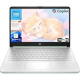
- Efficient Performance for Everyday Computing: Powered by Intel N150 processor with up to 3.6 GHz Intel Turbo Boost Technology, 6 MB L3 cache, 4 cores, and 4 threads, this HP laptop delivers responsive performance for web browsing, streaming, document editing, and multitasking. Paired with 4GB LPDDR5 RAM and 128GB UFS storage, it handles daily tasks smoothly. Includes 1-year Microsoft 365 Personal subscription for Word, Excel, PowerPoint, and cloud storage to maximize your productivity.
- 14-Inch HD Micro-Edge Display:Enjoy clear visuals on the 14-inch HD (1366 x 768) anti-glare screen with 250-nit brightness and 62.5% sRGB coverage. The micro-edge bezel delivers a 79% screen-to-body ratio in a compact design. An HP True Vision 720p HD camera with noise reduction and dual-array microphones supports clear video calls, remote work, and online learning.
- Modern Connectivity and Wireless Technology: Stay connected with Wi-Fi 6 (2x2) for faster wireless speeds and Bluetooth 5.4 for seamless pairing with accessories. Versatile port selection includes 1 USB Type-C 10Gbps with DisplayPort 1.2 for external displays, 2 USB Type-A 5Gbps ports for peripherals, 1 HDMI 1.4b port, 1 headphone/microphone combo jack, and 1 multi-format SD media card reader. Connect monitors, transfer files quickly, and expand your workspace with ease.
- All-Day Battery Life and Portable Design: Enjoy up to 11 hours of video playback, 7.5 hours of mixed usage, or 7.5 hours of wireless streaming on a single charge, perfect for students and professionals on the go. Weighing just 3.24 lb and measuring 12.76" x 8.86" x 0.71", this lightweight laptop fits easily in backpacks and bags. The stylish willow green top cover with matte finish and natural silver keyboard deck with vertical brushing pattern offer a modern, professional look.
- AI-Enhanced Productivity: Access Microsoft Copilot instantly with the dedicated Copilot key for faster assistance. AI Noise Reduction filters background sounds and improves voice clarity during calls. Dual speakers provide clear audio, while the full-size natural silver keyboard and HP Imagepad support comfortable typing and navigation.
curl -G "https://api.screenshotneo.com/v1/shot" -d access_key=YOUR_API_KEY --data-urlencode url=https://stripe.com -o shot.webp
ScreenshotNeo also offers an MCP server with take_screenshot, get_page_info, and capture_pdf tools for Claude, Cursor, and other MCP clients. The free plan includes 1,000 screenshots per month with no card; paid plans start at $5 for 3,000. Sign up free for 1,000 screenshots a month with no card.
Troubleshoot common responsive failures
The page looks tiny on a phone
Inspect the document head for a viewport meta tag with a width setting. Without it, a mobile browser may lay out the page against a wide virtual viewport and scale it down. Add or correct the declaration, then check the rendered page and its CSS at a narrow width.
A horizontal scrollbar appears at one width
Use DevTools to find which element extends beyond the viewport. Check fixed-width containers, long unbroken text, images, tables, and controls, then test immediately below and above the width where overflow starts. Avoid simply suppressing overflow if that would hide content.
Best Value
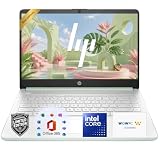
- 【Powerful Performance】Equipped with an Intel N150 CPU, featuring up to 4.4 GHz, 4 cores, and 4 threads, ensuring efficient and powerful multitasking capabilities.
- 【Expansive Display】The 14 Non-touch display offers clear and vibrant visuals, 250 nits brightness, and anti-glare coating, perfect for both work and entertainment.
- Designed for mobility with a slim 0.71-inch profile and lightweight 3.24 lb chassis, making it easy to carry between home, office, school
- 【Versatile Connectivity】Stay connected with multiple ports including USB 3.0 Type-C, USB 3.0 Type-A, HDMI, and a headphone/mic combo jack, along with Wi-Fi and Bluetooth for seamless wireless networking.
- One Year Microsoft 365
A layout breaks only near a breakpoint
Enter exact widths just below, at, and just above the relevant @media threshold. Inspect the rules that switch at that point and check whether the content can fit on both sides of the change. Repeat around adjacent breakpoints if the transition shifts the problem.
An image is too large or spills outside its container
Inspect the rendered image dimensions and responsive source selection at the affected width. Lighthouse can point out assets that are materially larger than their rendered size; choose an appropriately sized variant and recheck the layout.
A control is visible but difficult to use
Test the actual interaction at narrow widths, including opening, closing, focus, and any validation or expanded state. Then check the same flow with touch on a physical device when that interaction matters. A screenshot or automated viewport audit cannot establish usability by itself.
Frequently asked questions
Are Chrome’s preset widths a required responsive test matrix?
No. They are documented convenient viewport samples. Test your own supported range and CSS breakpoints; add widths that reflect your audience and layouts.
Can a Lighthouse pass prove that a site is fully responsive?
No. Lighthouse reports the issues covered by its audits. Manual layout and interaction checks are still needed, and important flows should be confirmed in relevant browsers and on a physical device.
Should I test landscape as well as portrait?
Yes, when the site is expected to work in both orientations or its layout responds to orientation. Check the relevant viewport dimensions and interactions in each state.
Quick Recap
Product prices and availability are accurate as of the date/time indicated and are subject to change. Any price and availability information displayed on Amazon at the time of purchase will apply.
Do these 3 things before closing this tab:
1Clear out junk files and repair common Windows errors2Scan for outdated or missing drivers - takes under a minute3Repair Windows errors before they cause bigger problems
