
Recommended Free Tools
iTechGuides is reader-supported. When you buy through links on our site, we may earn an affiliate commission. As an Amazon Associate I earn from qualifying purchases. Learn more
No typeface is easiest for everyone. Reading ease depends on the reader, the text size, the screen or paper, the task, and the layout around the letters. A well-designed typeface helps you distinguish characters and words, but line length, spacing, resizing, contrast, and personal preference can matter just as much.
The practical answer is to test candidate fonts in the conditions where people will actually read them, then preserve enough flexibility for readers to adjust the presentation.
Legibility and readability are related, but not identical
Legibility is how readily individual letters and words can be distinguished. It is affected by the shape of glyphs, the amount of internal and external space, stroke weight, and rendering quality. Readability is the broader ease of reading connected text over time. It includes legibility, but also line length, line spacing, paragraph structure, alignment, contrast, and whether the reader can comfortably change the text.
Do these 3 things before closing this tab:
1Clear out junk files and repair common Windows errors2Fix the driver behind crashes, sound loss and screen glitches3Repair Windows errors before they cause bigger problemsThis distinction is a useful design framework rather than a promise that one measured feature predicts every reading outcome. A typeface can have very clear letters yet become tiring in a long, tightly set paragraph. Conversely, a distinctive display face may work for a short heading but become difficult to follow at body-text size.
#1 Best Overall
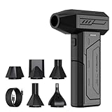
- Powerful Turbo Fan:CAGIWIRU Electric Air Duster have reached speed up to 130000RPM,Can efficient remove dust and debris.With LED light and Three Adjustable Speed to meet with different cleaning tasks.
- With Attached USB C Fasting Charging cable.Charing 3 hours,Enjoy up to 240 minutes of use on the lowest setting, For third speed can use for 25mins.with four charging options to meet with your needs.
- Wide Application: attached 5 different nozzles,making it suitable for a variety of scenes, such as car,pet, pc, keyboards, and other electronic devices. It also serves for office and home clean duster.
- Handy Design & Portable:Cordless air duster electric nozzle is Light weight and small size, design and comfortable to hold and space saving, convenient to carry around. You can put it in your room or inside the car without taking up space.
- Economical &Reusable: Built durable materials with a long-lasting battery,our CAGIWIRU air duster it's a sustainable alternative to disposable air cans.
Why there is no universal best font
A 2025 review of cognitive and perceptual research treats typeface choice as a situation-dependent decision. It discusses factors including visual crowding, serifs, inter-letter spacing, weight, and width, rather than identifying one winner for all readers and tasks. The review record supports a context-first approach: compare fonts with the same text, size, spacing, display, and task, and judge the result for the intended audience.
Context changes the answer in several ways:
- Reader: age, visual acuity, dyslexia, low vision, language, and familiarity with a script influence what feels clear.
- Medium: a high-resolution phone, a low-quality projector, an e-reader, and printed paper render the same outlines differently.
- Task: scanning labels, reading a novel, studying a table, and filling in a form place different demands on the type.
- Size and distance: details that are visible in a large heading can merge at small body-text sizes or when viewed from across a room.
- Layout: line width, leading, paragraph spacing, alignment, and resize behavior can make an otherwise suitable face uncomfortable.
Typeface features that support clear reading
Distinctive glyphs reduce confusion
Readers need to tell potentially confusable characters apart quickly. Designers therefore inspect pairs and groups such as lowercase i, l, and t; uppercase I and lowercase l; zero and capital O; and letters whose counters can close at small sizes. Numerals deserve their own check in dates, prices, measurements, and code.
Look at the complete word, not isolated specimens. Neighboring letters can create visual crowding, and a glyph that is clear alone may become ambiguous in a dense word. Test real headings, paragraphs, URLs, and the symbols your interface uses. If the content contains many numbers, compare lining and old-style numerals in the actual data rather than assuming one style will suit every audience.
Proportions and x-height affect apparent size
The x-height is the height of a typeface’s lowercase body relative to its overall size. Other proportions include the width of letters, the size of counters, and the length of ascenders and descenders. These features change how large and dense text appears at the same CSS or point size.
Use x-height and proportions as inspection points, not as a universal recipe. A larger apparent lowercase body may help at a small size, while very wide letters can make a line feel crowded or reduce the number of words visible at once. Compare fonts at the actual size, resolution, and line length you plan to publish.
Rank #2

- Screen Cleaner is Your Screen’s New Bestfriend! - EVEO is proud to present a screen cleaner that’s perfectly suited for your TV. Meet your new screen cleaner, computer screen cleaner, laptop cleaner, iPad cleaner, Macbook,tv cleaner or any other electronic device. Our screen cleaner spray and wipe along with the included plush microfiber cloth, easily removes dust, fingerprints & other smudges on the screen’s surface. Clean effectively for a streak-free screen
- Gentle on your Screens - Our screen cleaner spray and wipes is compatible to be used even for the most sensitive LCD, LED, CRT, and OLED screens in proper use. Be at ease knowing that this product is compatible with all the major brands: LG, SONY, Samsung, Sharp, iPad, iPhone, Android screens, Kindle, PC monitors - we’ve got you covered! Can be used as LCD screen cleaner, tv cleaner, smart tv screen cleaner, and more
- Premium Super Soft Plush Microfiber Cloth - Included in this efficient screen cleaning kit. This screen cleaner spray and wipe has our signature plush microfiber cloth specially designed to comply with screens and monitors and leave them streak-free. Has been shown to effectively absorbs stubborn stains, zero streaks, and no fiber shedding. Always use this together with our screen cleaner for the best results
- Easy-to-Use Screen Cleaner Kit + microfiber cleaning cloth - The EVEO Screen Cleaning Kit will easily be your new favorite tool when it comes to taking care of the things you love most, quick and easy solution for a streak-free screen. Simply screw on the sprayer gun on the screen cleaner bottle. Spray the cleaning liquid onto the microfiber cloth, then wipe the screen until desired cleanliness & shine is achieved.
- Quality Screen Care Kit Worth Purchasing - Enjoy a convenient Screen Cleaner anytime, anywhere you need it. Your satisfaction is our top priority. We stand behind the quality of our products and that’s why, you shouldn’t be worrying at all. We manufacture the Best Screen Cleaner. and can be used for laptop cleaning kit, laptop screen cleaner, tv screen cleaner for smart tv. MacBook screen cleaner, monitor cleaner or screen cleaner spray for electronic devices with microfiber cleaning cloth
Stroke weight and contrast must survive rendering
Stroke weight is the thickness of a letter’s main strokes; contrast is the difference between thick and thin strokes. Excessively light strokes can disappear on a dim display, while very heavy strokes can fill counters and make words look like dark blocks. Strong contrast may look elegant at display size but become fragile under anti-aliasing, compression, or inexpensive printing.
Check regular, semibold, and bold styles separately. A body face that is comfortable in regular weight may become cramped when a browser synthesizes bold text. Test text on the least capable display your audience is likely to use, with the color contrast and background you will ship.
Serifs are one variable, not a verdict
Serifs can help establish a visual rhythm in some text settings, while sans-serif forms may look cleaner or more stable in others. Current evidence does not justify a blanket serif-versus-sans rule. The 2025 review considers serifs alongside crowding, spacing, width, and weight, so the useful question is whether the complete design remains clear at the intended size and medium.
Compare a serif and a sans-serif candidate using identical text, size, line height, and column width. If one appears easier, record which conditions produced that result; do not generalize it to every device, reader, or language.
Spacing and layout can outweigh the font choice
Letter spacing and kerning
Kerning adjusts specific pairs, while tracking changes spacing across a range of letters. Tight settings can cause characters to touch or merge; excessive tracking breaks familiar word shapes and increases visual search. Use the typeface’s intended spacing as a starting point, then inspect words with repeated vertical strokes, punctuation, and capitals.
Rank #3

- 【Large size】:Measuring 800 x 300 mm/ 31. 5×12 inches, which is wider and taller than others. Large mouse pad can perfectly fit your keyboard and mouse of any size, and there is also ample space for peripherals such as phones, tablets, etc.
- 【LED backlight mouse pad】:Blade Hawks RGB mouse pad provides 7 static modes and 7 dynamic modes will give you the options you are looking for. Power-off memory function remembers the last lighting mode you selected. The super glow fiber Chroma will give you a colorful gaming setup that you want.
- 【Anti-slip rubber base】:Made from Natural rubber, this gaming mousepad will firmly grip your desktop, allowing you to enjoy the ultimate precision in the games you are most passionate about. It also comes with a texture that enhances this ability even further.
- 【Smooth and waterproof surface】: Micro-textured cloth surface, for extremely precise mouse control and a smooth movement. When liquid splashes on the gaming mouse pad, it forms water droplets and slides down. Will not delay your work or gameplay.
- 【Plug and play】: This mouse and keyboard pad is powered by USB, plug and play, no driver required. One button control light modes. Press one time to change the lighting mode, press twice to change the brightness, press and hold about 3 seconds turn ON/OFF.
Word spacing and paragraph spacing
Readers recognize words partly by their overall shape. Uneven or exaggerated word gaps interrupt that pattern and can create distracting rivers in justified text. Paragraph spacing should make sections visible without forcing the reader to reconstruct where one thought ends and another begins.
Line spacing and line length
Lines that are too close make it easy to jump to the wrong line; lines that are too far apart weaken the connection between lines in the same paragraph. Very long lines require large eye movements and make return sweeps harder, while very short lines create frequent breaks. W3C guidance for the Level AAA visual-presentation criterion discusses limiting line width, adjustable presentation, line spacing, and text resizing. It gives a maximum of 80 characters or glyphs, or 40 for Chinese, Japanese, and Korean text, as one way to meet that criterion—not as a universal typeface law. Read the W3C explanation of SC 1.4.8.
Alignment and justification
Left-aligned text with a consistent rag usually preserves predictable word spacing. Full justification can produce irregular gaps unless the line-breaking and hyphenation system is excellent. W3C’s SC 1.4.8 guidance specifically discusses avoiding full justification as part of its visual-presentation advice; it is not a blanket prohibition at every conformance level.
What the dyslexia-font evidence actually shows
Specialist typefaces marketed as dyslexia-friendly alter letterforms, spacing, or both. They may be preferred by some individuals, but the available studies do not establish a universal reading advantage.
The 2020 controlled study
Galliussi and colleagues tested 64 children with dyslexia and 64 control children. The experiment manipulated the letterform, inter-letter spacing, and inter-word spacing independently. The tested dyslexia-friendly letterform did not produce a reading-speed or accuracy advantage, and increasing spacing was not a general improvement across the tested conditions. The interaction between letterform and spacing mattered, which is why widening everything is not a reliable rule. See the full study.
The Tool Desk
Outbyte Driver Updater FREEScan for outdated or missing drivers - takes under a minuteDriver Scan →Outbyte PC Repair FREERepair Windows errors before they cause bigger problemsFix Now →Rank #4

- 【Softer and More Comfortable】Vaydeer wrist rest has unique diamond pattern, which is the combination of softness and aesthetics. The materials of wrist rest are improved into higher quality memory foam and covered with silky smooth lycra. The computer wrist rest makes you as comfortable and cushiony as like rest your wrists on clouds.
- 【Ergonomic Wrist Saver】The wrist rests for keyboard and mouse comes with a 17.32×3.15×0.83 inch keyboard wrist pad and a 5.94×3.15×0.83 inch mouse wrist support. Based on ergonomic design, the unique concave shape is the perfect fit for your wrist joints. The wrist rest pad fits most computer keyboards and laptops, improve hand and wrist posture, release your wrist and arm stress.
- 【Non-Slip Rubber Bottom】Featuring an anti-skid silicone base on the bottom, this wrist keyboard support stays firmly in place on your desk, preventing the padding from sliding around, ensuring stable and consistent wrist support during extended computer sessions.
- 【Better Experience & Pain Relief】Our keyboard arm rest is beneficial to alleviate the soreness caused by direct contact and friction between your arm and a hard desk surface, reducing the risk of wrist fatigue or carpal tunnel. The soft texture of memory foam can evenly distribute the pressure around your wrists and provide good support with just enough give.
- 【Helpful in Multiple Scenarios】Whether you're working, studying, writing, typing, gaming, this keyboard and mouse rest combo is an essential accessory to add comfort and support to your hands and wrists. It’s also a great gift for men, women, family, friend, coworker, gamer, teacher, etc.
The 2022 comparison
Another study involved 71 children aged 8–12, including 37 with a dyslexia diagnosis, and compared Dyslexie with Calibri on letter naming, word-reading efficiency, and passage reading. The indexed record establishes the design, but the source available here does not provide enough detail to quote a result responsibly. Consult the indexed record.
These findings do not prove that no reader benefits from a particular face. They show why a specialist font should be treated as an option to test, not as a guaranteed intervention or a substitute for assessment and support. Offer a readable default, allow users to choose another face, and make size and spacing adjustable.
Web accessibility: design for user overrides
On the web, authored defaults are only one presentation. Users may apply browser settings, custom styles, magnification, or assistive technology. WCAG 2.2 Success Criterion 1.4.12 tests whether content remains readable and operable when specified text-spacing overrides are applied. The W3C states: “The intent of this success criterion (SC) is to ensure that when people override author-specified text spacing to improve their reading experience, content is still readable and operable.” Read the W3C SC 1.4.12 guidance.
The test values are robustness thresholds, not mandatory default CSS values:
What’s actually slowing this PC down?
Pick the symptom - the matching free tool is one click away.
| Property | Override value to test | What to verify |
|---|---|---|
| Line height | At least 1.5 times the font size | Text, controls, and content remain visible and usable. |
| Paragraph spacing | At least 2 times the font size | Paragraphs do not overlap or hide following content. |
| Letter spacing | At least 0.12 times the font size | Words, labels, and buttons remain intact. |
| Word spacing | At least 0.16 times the font size | Columns, cards, menus, and form fields do not clip text. |
Test these overrides on navigation, dialogs, tables, error messages, sticky headers, and components with fixed heights. Common failures include clipped labels, overlapping buttons, hidden focus indicators, and containers that refuse to grow. Use flexible height, wrapping, and overflow behavior so increased spacing does not remove information or functionality.
How to choose and test a typeface
- Define the reading task. Write down whether the face is for long-form text, interfaces, captions, code, signage, or headings. Collect representative content, including the longest labels and the most important numbers.
- Set the real conditions. Use the planned font size, line height, column width, color contrast, device pixel density, and viewing distance. Do not judge a body face only in a large specimen.
- Screen glyph distinctions. Check confusable letters, numerals, punctuation, symbols, accents, and the scripts your content requires. Read complete words and sentences.
- Compare spacing as a system. Hold the text and display constant while trying the typeface’s default tracking, modest adjustments, different line heights, and realistic word spacing. Record where the text begins to look either crowded or fragmented.
- Test scanning and sustained reading. Ask readers to find a value in a table, follow a paragraph, and return to the next line. A face that looks attractive in a heading may fail during continuous reading.
- Include the intended audience. Gather feedback from people who use the product, including readers with low vision or dyslexia where relevant. Preference is useful evidence for a choice, but do not claim that preference proves a universal performance benefit.
- Apply accessibility changes. Resize text, increase line and paragraph spacing, add letter and word spacing, zoom the page, and use high-contrast settings. Confirm that content and controls remain available.
- Document the decision. Record the font, size, weights, spacing, column width, devices, and audience tested. This makes later changes repeatable instead of turning a font choice into a matter of taste.
A practical comparison framework
When two or more typefaces are candidates, keep the comparison fair. Change one variable at a time and score each option against the same evidence:
Best Value

- 【No Drill Mounted】Cable management tray can be assembled in as little as 3 minutes or less-simply. Side clips easily clampe the edge of desk, pass through the holes on the sides, and secure excess cables with baskets. Desk cable management supports inward or outward installation to meet your needs in different scenarios, and provides you with great convenience when collecting and organizing wires.
- 【Rubber Pad Protects Desk】Wire organizer under desk built-in soft rubber pads on the clamp protect your desk from scratches, so you will not damage your furniture or office.
- 【Sturdy and Beautiful】Cord management under desk is made of high-quality carbon steel and holds about 15 lbs. The wire basket has 2 holes on each side of the tray to enable your cables to pass freely. Cable baskets are suitable for desk thickness use from 0.4" to 2.4".
- 【Space Saving & Keep Organized】Desk cable management tray holds all your power cords, outlet strips, USB hubs and computer transformers hidden from your feet, and the data cables will not enter the vacuum cleaner to keep your desk clean and tidy. Desk wire organizer is also suitable for use in the kitchen and outdoors.
- 【Reduce Safety Risks】Cable tray under desk keeps all plugs away from your kids, no more worry about tripping. Using 2 holes wire tray saves extra space, helps you easily cabling and wire protection. The mesh design is not easy to accumulate dust, but avoids safety accidents caused by messy wires.
| Axis | Questions to ask | Warning sign |
|---|---|---|
| Glyph distinction | Can readers separate confusable letters, numerals, punctuation, and symbols at the smallest size? | Characters merge or require context to identify. |
| Apparent size | Does the lowercase body remain visible without making lines excessively wide? | The face looks tiny at the chosen size or forces awkwardly short lines. |
| Stroke behavior | Do regular and bold weights preserve counters on the weakest display or print process? | Light strokes vanish or heavy strokes fill in. |
| Density | Are letter and word gaps balanced for both scanning and paragraphs? | Words form dark clumps or disconnected fragments. |
| Audience fit | Do intended readers perform and feel comfortable with the face? | A decision relies only on designer preference or marketing claims. |
| Adaptability | Can users resize and apply spacing overrides without loss of content or function? | Fixed boxes clip text or controls become unreachable. |
Common mistakes and how to correct them
Declaring one font universally easiest
Fix: state the audience, task, medium, size, and layout for every recommendation. A result from one controlled condition cannot establish a global winner.
Changing several variables at once
Fix: hold text, size, width, display, and spacing constant while comparing letterforms. Otherwise you cannot tell whether a preference came from the font or the setting.
Widening all spacing automatically
Fix: adjust letter, word, line, and paragraph spacing separately. The 2020 study found no general benefit from increased spacing across its tested conditions, and some combinations performed differently.
Treating a dyslexia font as treatment
Fix: provide choice and adjustable presentation. A specialist face can be offered as an option, but it should not replace professional support or be presented as effective for every dyslexic reader.
Testing only a static mock-up
Fix: test the live interface with zoom, larger text, user spacing, keyboard focus, localization, and long content. Accessibility failures often appear in components that were not present in the specimen paragraph.
Bottom line: choose the reading experience, not a font label
An easy-to-read typeface has distinguishable glyphs, proportions and strokes that survive the intended size and medium, and spacing that supports word and line recognition. Those qualities work only when the surrounding layout is sound and readers can adapt it. Compare real text in real conditions, include the people who will read it, and keep the interface robust when users resize or restyle the text.
Quick Recap
Product prices and availability are accurate as of the date/time indicated and are subject to change. Any price and availability information displayed on Amazon at the time of purchase will apply.

