
Windows Errors? Fix Them Before They Spread
Repair common Windows errors and clear accumulated junk for a smoother, more stable PC - no reinstall needed.Free scan · no reinstallOutdated Drivers Are Slowing You Down
One free scan finds every outdated or missing driver and matches the right update for your exact hardware.Free scan · exact hardware matchiTechGuides is reader-supported. When you buy through links on our site, we may earn an affiliate commission. As an Amazon Associate I earn from qualifying purchases. Learn more
On a Kindle e-reader, open a book, tap the top of the page, and select the Aa icon. The Page Display panel is where you change themes, fonts, margins, spacing, alignment, orientation, reading progress, and the clock. Themes save a visual combination; the Layout tab changes how text is arranged. The exact controls depend on your Kindle model, app platform, and the book’s format.
Open the Kindle reading settings
Amazon’s e-reader instructions apply to Kindle devices from the sixth generation onward, but Amazon also warns that labels and available choices differ by model. Use the following path while a reflowable book is open:
- Open the book you want to read.
- Tap near the top of the screen to reveal the reading toolbar.
- Tap the Aa icon, labeled Page Display on supported e-readers.
- Choose Themes, Font, Layout, or More, then change the setting you need.
- Close the panel and read a few pages. Recheck the panel if a particular book does not respond as expected.
Kindle apps use a similar idea—open the reading controls and look for display or reading settings—but they do not all use the same tabs or expose the same options. Kindle for Web, Kindle for PC, Kindle for macOS, iOS, and Android can each present a different subset.
What a theme changes
A theme is a saved or selectable combination of reading-display preferences. On supported e-readers, the Themes tab can change the page background color, select a preferred theme, and save the current Font, Layout, and More settings. In other words, a theme is a convenient package of choices, not a promise that every Kindle screen or app offers identical colors and controls.
#1 Best Overall
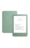
- Light and compact - With adjustable brightness, high contrast ratio, and fast page turns.
- Effortless reading in any light - Read comfortably with a 6“ glare-free display, adjustable front light—now 25% brighter at max setting—and dark mode.
- Escape into your books - Tune out messages, emails, and social media with a distraction-free reading experience.
- Read for a while - Get up to 6 weeks of battery life on a single charge.
- Take your library with you – 16 GB storage holds thousands of books.
Select or save a theme on an e-reader
- Open the book and tap the top of the screen.
- Tap Aa, then open Themes.
- Select one of the available presets, or adjust the other tabs first and save the resulting combination as a custom theme if your model offers that command.
- Return to the book and inspect a page with both normal paragraphs and headings. This confirms that the saved combination is comfortable across different text sizes.
A theme may include font, layout, and additional display choices that you have already configured. If a theme appears to change less than expected, the current model or app may expose only part of the theme system, or the book may impose its own formatting.
Theme controls in Kindle apps
Amazon’s app documentation describes preset and custom themes for particular app versions and lists platform-specific page-color choices. Do not assume that a color available on an e-reader is available in every app. If you cannot find a Themes tab, open the app’s reading menu and look for individual controls such as page color, margins, alignment, or continuous scrolling.
Use Layout to control margins and page shape
The Layout tab controls the geometry of the text block rather than the typeface itself. Depending on the device, it can adjust spacing between lines, paragraphs, words, and characters; margin size; portrait or landscape orientation; and text alignment.
Rank #2

- Light and compact - With adjustable brightness, high contrast ratio, and fast page turns.
- Effortless reading in any light - Read comfortably with a 6“ glare-free display, adjustable front light—now 25% brighter at max setting—and dark mode.
- Escape into your books - Tune out messages, emails, and social media with a distraction-free reading experience.
- Read for a while - Get up to 6 weeks of battery life on a single charge.
- Take your library with you - 16 GB storage holds thousands of books.
| Layout control | What it changes | When to use it |
|---|---|---|
| Margins | The horizontal space between the text and the screen edges. | Increase them for a shorter line and more visual breathing room; reduce them to fit more words per line. |
| Line spacing | The vertical gap between lines in a paragraph. | Increase it when lines feel crowded, especially with a larger font. |
| Paragraph spacing | The gap separating one paragraph from the next. | Increase it when paragraph boundaries are hard to spot. |
| Word and character spacing | The gaps within lines of text. | Adjust only when the default rhythm looks uneven; extreme values can make reading less natural. |
| Orientation | Portrait or landscape page direction where supported. | Use landscape for wider lines, tables, or a larger type size when the device permits it. |
| Alignment | Whether lines are justified or left aligned with a ragged right edge. | Choose the alignment that produces the most even, comfortable reading texture for you. |
Margins and line length
Changing margins changes how much horizontal space the text uses; it does not alter the book’s words. A smaller margin produces longer lines and fewer page turns. A larger margin produces shorter lines and can make a large type size easier to scan. If a control appears to do nothing, test it on a standard novel rather than a highly designed page, because the book’s formatting may constrain the result.
Alignment and Enhanced Typesetting
Justified text aligns both left and right edges, while left alignment leaves a ragged right edge. Amazon’s Enhanced Typesetting technology can adapt some layouts when the font is very large or line lengths are short. Its purpose is to reduce unusually large gaps between words or text that feels squeezed into a narrow measure. The exact behavior depends on the book and the settings you choose, so treat it as automatic adjustment rather than a separate margin control.
Font settings are separate from Layout
The Font tab offers the fonts that the device or book makes available and a font-size control. Amazon also documents a boldness adjustment on supported software. Some books include a publisher-embedded font; when that font is used, the book may offer a typeface that is not present in every title.
Rank #3
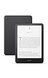
- Kindle Paperwhite – 7“ Paperwhite display with high contrast ratio and fast page turns.
- Ready for travel – The ultra-thin design has a larger glare-free screen so pages stay sharp no matter where you are.
- Escape into your books – Your Kindle doesn’t have social media, notifications, or other distracting apps.
- Battery life for your longest novel – A single charge via USB-C lasts up to 12 weeks.
- Read in any light – Adjust the display from white to amber to read in bright sunlight or in the dark.
Change typeface, size, or boldness
- Open the Page Display panel with the Aa icon.
- Choose Font.
- Select an available font, move the size control, and adjust boldness if that option appears.
- Read several paragraphs, including italic text, headings, and dialogue, before deciding that the combination works.
Font size changes the amount of text on each page and therefore the page count and progress indicators. It does not rewrite the book. A publisher-embedded font or other forced style can limit how much of this panel takes effect.
Free tools Windows power users keep installed
One-click scans. No signup required.
The More tab: progress and clock
The More tab contains additional reading controls. Amazon identifies reading-progress tracking and an option to display the clock among these controls on supported e-readers. Progress can be useful when you want an estimate based on the current book, chapter, or reading location; the clock is useful when you want the time visible without leaving the page. The labels and available choices can vary by model.
How Kindle e-readers and apps differ
| Platform | Controls documented by Amazon | Important qualification |
|---|---|---|
| Kindle e-reader | Themes, font, boldness on supported software, margins, spacing, orientation, alignment, progress, and clock may appear in the Page Display panel. | Amazon says the selection and names vary by e-reader model. |
| Kindle mobile apps | Depending on app version, page color, margins, alignment, continuous scrolling, and themes may be available. | One mobile platform may expose different choices from another. |
| Kindle for Web | A subset of visual controls documented for the web reader. | Do not expect every e-reader tab or control. |
| Kindle for PC | A platform-specific subset of display settings. | Menus and available adjustments can differ from macOS and mobile apps. |
| Kindle for macOS | A platform-specific subset of display settings. | Availability is determined by the app version and the book. |
Continuous scrolling, where offered, changes how pages are presented in an app; it is not the same as changing margins or line spacing. Likewise, an app’s page-color control may be separate from an e-reader’s saved theme.
Rank #4

- Our fastest Kindle Paperwhite ever – The next-generation 7“ Paperwhite display has a higher contrast ratio and 25% faster page turns.
- Upgrade your reading experience – The Signature Edition features an auto-adjusting front light, wireless charging, and 32 GB storage.
- Ready for travel – The ultra-thin design has a larger glare-free screen so pages stay sharp no matter where you are.
- Escape into your books – Your Kindle doesn’t have social media, notifications, or other distracting apps.
- Adapts to your surroundings – The auto-adjusting front light lets you read in the brightest sunlight or late into the night.
Why a setting may not work in one book
Fixed-layout content
Fixed-layout books preserve a designed page rather than reflowing ordinary text. Amazon states that fixed-layout content does not allow font-size changes. Because the page is effectively an arranged canvas, margin, spacing, orientation, or alignment controls may also have little or no effect.
Embedded or forced formatting
Publishing guidance warns that forced styles on normal text can override reader preferences. A book may embed a font, impose spacing, or apply a layout rule that takes precedence over your device setting. This is a book-format limitation, not necessarily a defective Kindle.
Recommended Free Tools
Model and software variation
Amazon’s general e-reader help confirms model variation but does not map every Themes or Layout control to every current Kindle model and software version. A missing option therefore cannot be treated as evidence that the feature is broken. Check the exact model’s Page Display menu and update the app or device through its normal settings when an option described for another platform is absent.
Best Value

- Kindle Paperwhite – 7“ Paperwhite display with high contrast ratio and fast page turns.
- Ready for travel – The ultra-thin design has a larger glare-free screen so pages stay sharp no matter where you are.
- Escape into your books – Your Kindle doesn’t have social media, notifications, or other distracting apps.
- Battery life for your longest novel – A single charge via USB-C lasts up to 12 weeks.
- Read in any light – Adjust the display from white to amber to read in bright sunlight or in the dark.
A practical setup for comfortable reading
There is no single correct combination, but a systematic adjustment avoids chasing several variables at once:
- Start with the default theme and a moderate font size.
- Choose a font that keeps letters distinct at the size you need.
- Adjust line spacing before changing margins. If lines are crowded, a little extra vertical space may solve the problem without wasting horizontal space.
- Set paragraph spacing so new paragraphs are visible without creating distracting gaps.
- Choose left alignment or justification according to the texture you find easier to follow. If justification creates conspicuous word gaps, try left alignment and compare the same page.
- Change margins last. Increase them for shorter lines or reduce them when you want more words per page.
- Try landscape only when a wider page genuinely helps, such as with a large type size or a book containing wide tables.
- Save the combination as a custom theme if your e-reader or app provides that option.
Evaluate the result on at least a few pages, because a setting that looks good on a heading can feel different in dense paragraphs, lists, or dialogue.
Do Kindle preferences apply to every book?
Amazon Customer Service documentation states: “Your preferences apply to all the books that you read on your Kindle.” The same documentation qualifies that display settings vary across device models. In practice, your selected preferences are intended to carry across compatible, reflowable books on that Kindle, while a fixed-layout title or a book with overriding formatting can limit the visible effect.
When changing devices or apps
An upgrade is not required merely to adjust reading preferences. Amazon documents visual settings in Kindle apps as well as on dedicated e-readers. A dedicated Kindle can still be preferable if you want the Page Display controls and an e-ink reading environment, but verify the exact model’s feature list before expecting a particular theme, margin range, orientation option, or boldness control. If you switch from an e-reader to an app, expect to recreate your preferred combination because the app may use different labels and expose fewer settings.
Troubleshoot an unresponsive setting
- Confirm the path: on an e-reader, tap the top of the book, then the Aa icon. In an app, open its reading or display menu.
- Test another title: use a normal reflowable book. If the control works there, the first book likely uses fixed layout or overriding styles.
- Check the platform: compare the control with the documentation for your specific app or e-reader model rather than another Kindle product.
- Look for a publisher font: an embedded font can make the font selector behave differently from a book using standard reader fonts.
- Separate visual effects: page color, themes, margins, alignment, and continuous scrolling are distinct controls. Changing one will not necessarily change the others.
- Reopen the menu: after selecting a value, close Page Display and reopen it to confirm the choice was retained.
These checks distinguish a missing platform feature from a book that was designed not to reflow. They also prevent you from changing several settings when only one is responsible for the reading problem.
Quick Recap
Product prices and availability are accurate as of the date/time indicated and are subject to change. Any price and availability information displayed on Amazon at the time of purchase will apply.

