
iTechGuides is reader-supported. When you buy through links on our site, we may earn an affiliate commission. As an Amazon Associate I earn from qualifying purchases. Learn more
Visual systems can improve productivity when they make priorities, progress and bottlenecks easier to see and act on. A task board, personal dashboard or operations display gives people a shared picture of work, supports faster feedback and helps teams coordinate. Visibility by itself does not guarantee more useful output: results depend on the quality of the measures, how information is framed, whether data is timely and accurate, and whether people experience the system as helpful rather than surveillance.
The practical approach is to design the display around a specific decision, use a small set of controllable measures, give the people doing the work access to the information, and review it on a predictable schedule. Treat every metric as a signal to investigate, not as a complete definition of performance.
What visual productivity management is
Visual productivity management is the deliberate use of visual information to guide work. The format can be simple or highly technical:
- Personal systems: a task board, calendar view, habit tracker or time-use dashboard that helps one person choose the next action and notice patterns.
- Team systems: a shared kanban board or stand-up display showing ownership, status, blocked work and upcoming commitments.
- Operational systems: a real-time dashboard for service levels, production flow, defects, queues or other measures that supervisors and frontline staff can influence.
A visual system is not the same as a wall of charts. It has a defined audience, a decision it is meant to support, named data owners and a routine for acting on what appears. “Productivity” must also be specified. It could mean useful output, quality-adjusted output, cycle time, customer response, learning progress, or the amount of time classified as nonproductive. A display that increases visible activity may leave quality and sustainable performance unchanged.
#1 Best Overall
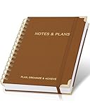
- Easily Stay On Track & Make The Most Of Your Time: ZICOTOs’ daily planner makes it easier than ever for you to stay organized, reduce stress & enjoy more free time! Arrange your schedule, priorities, to do’s and jot down plans & ideas on the daily notes section
- Smartly Plan Ahead & Boost Your Productivity: Absolutely clever & efficient! With the planner notebook you can break down your daily tasks into half-hourly focus blocks and map out priorities & follow-up duties to keep your day on track and enhance productivity
- Plenty Of Space For Efficient Planning: Stay focused & manage your time wisely! The 8.4x6.1” work planner & organizer notebook offers ample space for 105 days of life-changing planning with each day being spread across 2 pages - set yourself up for purposeful days
- Now Is The Best Time To Start: The daily planner is undated so you can start to add structure to your schedule and cultivate new planning habits right away! Beat procrastination, boost happiness & make each day count with the hourly planner
- Adds Beauty To Daily Planning: A gorgeous camel linen cover, chic golden letters, a gold ring wire and a clean, easy-to-use layout, elastic band - enjoy the lovely and modern design of the undated daily planner!
How a visual system can help
Make priorities and work-in-progress visible
When tasks are represented as cards, rows or stages, people can see what matters now, what is waiting and what should not be started. Limiting work in progress exposes overload that is easy to miss in a list of open requests. A clear owner and next action turn an abstract priority into something a person can do.
Close the feedback loop
Timely feedback helps people compare intended behavior with what actually happened. A personal time display can reveal frequent context switching; a team board can show that work stalls during review; an operations display can expose a queue before it becomes a customer problem. The display creates an opportunity to adjust, but it does not make the adjustment automatically.
Coordinate dependencies and bottlenecks
Shared visibility reduces the need to reconstruct status through meetings and messages. Teams can identify blocked items, balance work between stages and decide who needs help. This is especially useful when work crosses roles or locations and no single person sees the entire flow.
Support a regular management routine
A dashboard has value when it is paired with a conversation: What changed? Which signal is actionable? Who will test an adjustment, and by when? Without that routine, people may optimize the display itself or keep watching numbers without changing the underlying process.
Rank #2

- PRACTICAL AND VALUABLE -This undated weekly productivity notepad focus on the important work and get organized. Whether you're a project manager, small business owner, freelancer, academicians or master multitasker, the weekly to do list pad will be your new favorite daily office productivity planning tool.
- MINIMALISTIC & FLEXIBLE - It's a minimalist, dateless, flexible work calendar planner that you can start at any time. Weekly desktop planner has plenty of space to write your goal plan, work plan, student plan or personal schedule, keep track of priorities, and write notes on the back.
- DASHBOARD DESK PAD - The 8.5x12-inch week plan with 54 weeks is large enough for your scheduling and appointments full year. 120gsm high quality thick paper, The paper is thicker and slicker than regular note paper. Spiral binding, flip the page up and down to make writing more comfortable and convenient.
- LESS SCATTERED & MORE ORGANIZED - This weekly deskpad planner will completely change how you structure your work: by segmenting your tasks by area and tracking the most important details, you'll feel less scattered and more organized. We believe in helping you be fulfilled with your life and productive at the same time by using a weekly to do list notepad.
- IN A CLASS BY ONESELF - See your tasks and next steps for all of your projects in one week view. Stop the productivity-killing process of "context switching" and improve your productivity with features like: Weekly Theme and Highlights for at-a-glance planning Top 3 Priorities for the week 6 Focus Areas to segment and list tasks for goals, projects, or clients Daily Tracker for healthy habit-tracking and routine-tracking.
What the evidence actually shows
Research points to potential benefits, not a universal productivity uplift. The studies use different definitions, populations and methods, so their figures cannot be combined into one expected return.
| Source and setting | What was measured | Finding and qualification |
|---|---|---|
| Kim et al., TimeAware (2016) | Personal feedback framings over eight weeks | 24 participants; a significant framing effect and productivity improvement only in the negative-framing condition. This small deployment does not establish a result for other workplaces. |
| Office for National Statistics (2018), Great Britain Management and Expectations Survey | Management score and GVA per worker | A 0.1 increase in the derived management score was associated with a 9.6% increase in productivity. The analysis is correlational and does not show that dashboards or visual design caused the difference. |
| ONS model-based percentile comparison (2018) | Management-score distribution | The reported difference was 19% between the 25th percentile (0.34) and median (0.53), and 12% between the median (0.53) and 75th percentile (0.66). These are survey-model comparisons, not intervention effects. |
| INFORMS Management Science field experiment | Frontline employees’ access to performance information at a large U.S. gas utility | Direct access changed the time classified as nonproductive, but did not necessarily increase productive time. The result supports careful interpretation of transparency rather than a blanket promise. |
| MIT CISR, 2019 survey reported in a 2022 briefing | Dashboard effectiveness across companies | Among 1,311 firms, companies in the top quartile of dashboard effectiveness outperformed those in the bottom quartile on five internal and five external measures. The observational comparison does not prove dashboarding caused the performance gap. |
| Reinking, Arnold and Sutton (2020) | Corporate dashboard use, information quality and perceived performance | A cross-sectional field study of 323 U.S. middle- and upper-level managers. Results describe associations and perceptions, not a controlled productivity effect. |
| Shop-floor visualization-board case study (2023) | Reasons for moving from analog to digital boards | Evidence from 16 international companies discusses management practice and transition reasons; it does not establish a general productivity increase. |
| U.S. Government Accountability Office, GAO-24-107639 (August 2024) | Stakeholder views on digital worker surveillance | GAO reviewed 217 comments from 211 stakeholders. The comment set is not a representative worker survey and documents both perceived benefits and concerns. |
The MIT CISR authors Peter Weill and Stephanie Woerner wrote, “The best tool we have seen companies use to know where they are is real-time dashboarding.” That is their characterization of the practice, not proof that every dashboard improves output. Similarly, the ONS reported, “Our results show that a 0.1 increase in our derived management score is associated with a 9.6% increase in productivity.” The wording matters: an association is not a causal estimate for a visual system.
Why framing and metric design change the result
The TimeAware deployment illustrates how the same data can produce different behavior. Its authors reported, “The ambient widget seemed to help sustain engagement with data and enhance self-awareness.” They also found improvement only for participants who received negative framing focused on distracting activities. That does not mean negative messages should be imposed everywhere. It means the emotional and practical interpretation of feedback should be tested with the people who will use it.
Free tools Windows power users keep installed
One-click scans. No signup required.
A metric can also be technically accurate and still be a poor productivity measure. Keystrokes, logged hours, tickets closed or machine utilization are proxies. They may omit planning, mentoring, quality work, accessibility needs, recovery time or tasks whose value appears later. When a proxy becomes a target, people can increase the number while weakening the real objective. Pair activity signals with outcome and quality checks, and let workers explain context that the data cannot capture.
Rank #3

- Easily Stay On Track & Make The Most of Your Time: ZICOTOs’ daily planner makes it easier than ever for you to stay organized, reduce stress & enjoy more free time! Arrange your schedule, priorities, to do’s and jot down plans & ideas on the daily notes section
- Smartly Plan Ahead & Boost Your Productivity: Absolutely clever & efficient! With the planner notebook you can break down your daily tasks into half-hourly focus blocks and map out priorities & follow-up duties to keep your day on track and enhance productivity
- Plenty Of Space For Efficient Planning: Stay focused & manage your time wisely! The 9.3x6.3” (inner pages) work planner & organizer notebook offers ample space for 80 days of life-changing planning with each day being spread across 2 pages - set yourself up for purposeful days
- Now Is The Best Time To Start: The daily planner is undated so you can start to add structure to your schedule and cultivate new planning habits right away! Beat procrastination, boost happiness & make each day count with the hourly planner
- Adds Beauty To Daily Planning: A gorgeous champagne pink cover, chic gold foil letters, a golden ring wire and a clean, easy-to-use layout - enjoy the gorgeous and modern minimalist design of the undated daily planner!
How to build a useful visual system
- Define the decision. Write one sentence such as “choose the next task,” “spot a blocked order,” “check progress against a service goal” or “learn where planned time is being lost.” If the display has no decision attached, remove it or redesign it.
- Name the audience and owner. Specify who reads the information, who can change the process and who maintains definitions, permissions and data quality. A team board owned by nobody will become stale.
- Select a small set of actionable measures. Start with the few signals that answer the decision. Include an outcome or quality measure alongside activity or flow measures. Every number should have a definition, unit, target or comparison point, and an explanation of what action it can trigger.
- Check accuracy and freshness. Show when data was last updated and identify known gaps. A live-looking display built on yesterday’s extract can prompt the wrong intervention. Reconcile the display with the source system before using it for consequential decisions.
- Design the visual hierarchy. Put the current priority first, then exceptions, trends and detail. Use consistent status names, readable contrast, keyboard access and text alternatives for people who cannot rely on color or motion. Hide decorative charts that compete with the decision.
- Connect the display to the workflow. A blocked card should have a route to escalation; a missed threshold should identify the owner and next review; a personal alert should suggest a manageable change. If users must leave the system to act, document that handoff.
- Give users appropriate control. Let people inspect the underlying record, correct errors and add context. For workplace monitoring, explain collection, purpose, audience, retention and challenge procedures before deployment.
- Set a review-and-adjust cadence. Review the display at a predictable interval, record the decision made and retire measures that no longer affect action. Test whether the system improves the intended outcome without creating unacceptable quality, privacy or well-being costs.
How to visualize personal tasks and progress
A personal board can remain simple: Backlog, Next, Doing, Waiting and Done. Put a clear next action on each card, add a due date only when it is real, and limit the number of cards in “Doing.” A weekly review moves stale items back to the backlog, breaks oversized tasks into visible steps and checks whether the board still reflects actual commitments.
For time awareness, compare planned categories with actual categories over a defined period rather than judging a single day. Mark interruptions and recovery as context, not automatic failure. Use the result to change meeting placement, notification settings or task sequencing. The purpose is learning and choice, not maximizing a narrow activity count.
How teams and operations should use dashboards
Team displays work best when they show flow: incoming work, work in progress, blocked items, completed items and the constraint currently limiting throughput. Add ownership and an agreed service or quality check. During a stand-up, discuss exceptions and dependencies rather than reading every card aloud.
The Tool Desk
Outbyte PC Repair FREERepair Windows errors before they cause bigger problemsFix Now →Outbyte Driver Updater FREEScan for outdated or missing drivers - takes under a minuteDriver Scan →Operational dashboards should separate leading signals from outcomes. Queue length or cycle time can warn of a problem; defect rate, customer result or delivered value checks whether the response helped. Keep historical context so a temporary spike is not mistaken for a trend. If a measure cannot lead to an intervention by the audience viewing it, move it to a reporting layer instead of the action screen.
Rank #4

- Stay Organized and Focused: This planner is specifically designed to help individuals with ADHD or busy lifestyles prioritize their day with clear prompts, ensuring that the most important tasks are tackled first
- Comprehensive Layout: With 100 thoughtfully designed pages, including sections for daily scheduling, task prioritization, self-care, and brain dumps, this planner helps reduce distractions and keep your thoughts organized
- Motivation Through Rewards: Keep yourself engaged and motivated with built-in checklists and reward systems that make completing tasks more satisfying
- Flexible and Undated Design: Use this planner at your own pace—it's undated, so you can start anytime without worrying about wasted pages
- Durable and Convenient: Featuring a 7" x 10" size, a sturdy hardcover, and spiral binding for durability, this planner is easy to carry and perfect for daily use
Are employee productivity dashboards effective?
They can help when employees can see accurate information about work they control and when managers use it to remove obstacles. The utility field experiment on direct access suggests transparency can change behavior, but reducing time labeled “nonproductive” is not the same as increasing productive work. Effectiveness therefore depends on the metric and the decision attached to it.
Surveillance-style systems create additional risks. In its August 2024 report, the U.S. Government Accountability Office summarized differing stakeholder views on digital monitoring. Its review documented concerns about inaccurate measurement, privacy, bias, distrust and well-being. GAO wrote, “Stakeholders offered differing views on how digital surveillance tools affect worker productivity.” A responsible deployment should:
- state exactly what is collected and what is not;
- explain why each field is necessary and who can access it;
- set a retention period and prohibit unrelated secondary uses;
- provide a way to correct records and challenge interpretations;
- test for disparate effects across roles, schedules, disabilities and work locations;
- avoid automated discipline based on a proxy without human review and contextual evidence.
Trust is part of system performance. If people hide work, avoid difficult tasks or spend time managing the measurement, a more detailed dashboard can reduce the useful output it was meant to improve.
Crashes, No Sound, or Screen Glitches?
Random freezes, missing sound and display glitches usually trace back to one bad driver. Find and replace yours safely.Free scan · under a minuteWindows Errors? Fix Them Before They Spread
Repair common Windows errors and clear accumulated junk for a smoother, more stable PC - no reinstall needed.Free scan · no reinstallDigital dashboard or physical board?
A physical magnetic or dry-erase kanban board can be a sensible optional companion when a team shares a workspace and needs a quick stand-up view. It is easy to point at, update during a conversation and understand without a login. A digital system is preferable when work is distributed, history and permissions matter, or data must be connected to other systems.
Best Value

- Efficient Weekly Planning - Utilize the 52 Weeks Undated Planner to articulate and prioritize weekly goals and to-do lists. Assign specific tasks to each week for optimal efficiency while allowing flexibility without guilt if a week is missed.
- Elegant and Compact Design - Enjoy a thick cover with gold coil, offering a romantic and gentle aesthetic. The weekly planner notebook's perfect size at 6.1'' x 8.2'' ensures easy portability, making it convenient for daily use.
- Cultivate Healthy Life Habits - Undated weekly planners, weekly goals, To Do list, and habit tracker together for daily affairs. Track healthy habits for each week and use the checkbox as a visual reminder.
- Premium Paper Quality - Experience a smooth writing surface on thick, 100gsm paper that prevents bleed-through. The planner ensures a high-quality feel and enhances the overall writing experience.
- Versatile Usage - Ideal for managing daily affairs, cultivating healthy life habits, and maintaining overall progress. A quick glance provides a comprehensive overview of chores, making it the perfect companion for effective time planning.
Case-based research on visualization boards across 16 international companies discusses why organizations move from analog to digital management displays, but it does not show that buying a particular board increases productivity. Choose the medium that fits the team’s location, update habits, accessibility needs and requirement for audit history; do not treat the medium itself as the intervention.
How to tell whether the system is helping
Establish a baseline before changing the display. Define the primary outcome, the time window and the population, then track guardrails for quality and well-being. For example, a service team might watch response time as the primary outcome while checking reopen rate and employee-reported workload as guardrails. A personal system might examine completion of planned high-value tasks while checking whether urgent interruptions or recovery time are being suppressed.
Use a comparison that fits the setting: a phased rollout, a before-and-after period with stable definitions, or a pilot with a similar team. Record other changes that could explain movement. Do not claim causation from a dashboard association, a single enthusiastic user or a short-lived activity spike. At each review, keep, revise or remove a measure based on whether it led to a better decision.
Quick wins for a faster PC:
Scan for outdated or missing drivers - takes under a minuteDriver Scan →Repair Windows errors before they cause bigger problemsFix Now →Fix the driver behind crashes, sound loss and screen glitchesFind Drivers →Common failure modes and fixes
- Too many charts: remove measures that do not change a decision and place diagnostic detail behind a drill-down.
- Stale or disputed data: display update time, assign a data owner and provide a correction path.
- Proxy chasing: pair activity counts with quality and outcome measures, and discuss exceptions.
- Passive monitoring: schedule a review with a named action owner and due date.
- Untrusted surveillance: publish collection, access and retention rules before launch and involve workers in metric design.
- Unusable status definitions: document entry and exit criteria for each stage so two people classify the same work consistently.
- Accessibility barriers: use readable contrast, text labels, keyboard operation and non-color indicators.
- Permanent pilot mode: set a decision date for evaluating the primary outcome and retire the system if it does not help.
A practical decision checklist
- Can you state the decision the visual supports in one sentence?
- Are the measures controllable, accurately defined and fresh enough for that decision?
- Does the display include a quality or outcome check, not only activity?
- Can the people doing the work see, question and correct the information?
- Is there a named owner and a review cadence?
- Have privacy, accessibility, bias and well-being risks been assessed?
- What evidence would make you change or remove the system?
Visual systems are most useful as shared instruments for noticing, discussing and adjusting work. They increase the chance of better decisions by making work legible; they do not create productivity automatically. The strongest implementation is deliberately modest: a few trustworthy measures, visible context, an agreed action loop and enough human judgment to recognize what the numbers cannot see.
Quick Recap
Product prices and availability are accurate as of the date/time indicated and are subject to change. Any price and availability information displayed on Amazon at the time of purchase will apply.

