
iTechGuides is reader-supported. When you buy through links on our site, we may earn an affiliate commission. As an Amazon Associate I earn from qualifying purchases. Learn more
Yes—you can use a WinUI Gallery example as the starting point for a separate WinUI 3 desktop app, but treat it as source code to adapt rather than a universal copy-and-paste component. Create your own WinUI 3 project, inspect the example’s XAML and code-behind in the official Gallery repository, trace its styles, assets, helper classes, and package references, then port only the pieces your app needs. Build and test against your app’s Windows App SDK version, target architectures, accessibility requirements, and deployment model.
The Gallery is an interactive reference. A sample may depend on resources outside its page, use an experimental API, or assume the Gallery’s own navigation and data model. The workflow below shows how to separate the useful control or behavior from those assumptions without turning the sample into an unmaintainable copy of the Gallery application.
Understand what you are reusing
WinUI 3 is Microsoft’s recommended native UI framework for new Windows desktop applications. It is delivered through the Windows App SDK and uses XAML with C# or C++. Microsoft’s framework overview states that WinUI 3 runs on Windows 10 version 1809 (build 17763) and later, including Windows 11, and supports x86, x64, and ARM devices. Those are framework-level targets, not a guarantee that every Gallery sample or dependency supports every device, package combination, or deployment mode.
The Tool Desk
Outbyte PC Repair FREERepair Windows errors before they cause bigger problemsFix Now →Outbyte Driver Updater FREEFix the driver behind crashes, sound loss and screen glitchesFind Drivers →WinUI Gallery is the companion application and public code repository for exploring controls, styles, design guidance, and working examples. Microsoft’s samples and resources page describes the Gallery as a place to experiment with components and view XAML examples. The WinUI Gallery repository README explains that the sample pages expose the markup and code-behind used to create the examples, along with adaptive UI and design and accessibility guidance.
#1 Best Overall
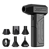
- Powerful Turbo Fan:CAGIWIRU Electric Air Duster have reached speed up to 130000RPM,Can efficient remove dust and debris.With LED light and Three Adjustable Speed to meet with different cleaning tasks.
- With Attached USB C Fasting Charging cable.Charing 3 hours,Enjoy up to 240 minutes of use on the lowest setting, For third speed can use for 25mins.with four charging options to meet with your needs.
- Wide Application: attached 5 different nozzles,making it suitable for a variety of scenes, such as car,pet, pc, keyboards, and other electronic devices. It also serves for office and home clean duster.
- Handy Design & Portable:Cordless air duster electric nozzle is Light weight and small size, design and comfortable to hold and space saving, convenient to carry around. You can put it in your room or inside the car without taking up space.
- Economical &Reusable: Built durable materials with a long-lasting battery,our CAGIWIRU air duster it's a sustainable alternative to disposable air cans.
“This app demonstrates all of the WinUI 3 controls and styles available to make a modern Windows app with the Windows App SDK.”
WinUI Gallery repository README
That distinction matters. You are normally reusing an implementation pattern—markup, event handlers, view-model logic, resources, or a control configuration—not importing a finished, independently packaged control. The Gallery’s page navigation, sample data, converters, and shared resources can be as important to the visual result as the few lines of XAML you first notice.
Check prerequisites and compatibility before touching the sample
Confirm the app framework and language
Start with a WinUI 3 desktop project that uses the same general Windows App SDK family as the sample. Your project can be C# or C++; the Gallery’s examples are written in the technologies supported by WinUI 3, but a C# event handler cannot be moved unchanged into a C++ project. Likewise, a C++ view-model, header, or projection-specific API call needs a deliberate translation before it belongs in a C# app.
Use Microsoft’s current WinUI setup guidance when creating the project. Template names and installer options can change with Visual Studio and Windows App SDK releases, so select the current WinUI 3 desktop template rather than relying on an old screenshot or a copied project file. Make sure the project builds and launches before adding Gallery code. A clean baseline gives you a known-good place to compare each change.
Separate framework support from sample support
Windows 10 version 1809 or later is the stated WinUI 3 framework baseline. It does not mean that an individual sample’s package, graphics API, helper library, or Windows feature has the same baseline. Check the sample’s project files and conditional code for target-specific requirements, then compare them with your project’s target framework, minimum version, runtime package, and architecture settings.
- Operating system: verify the minimum Windows version in your app and test on the oldest version you intend to support.
- Architecture: build the architecture you ship—x86, x64, ARM, or more than one—and check native dependencies separately for each.
- Windows App SDK: compare the package and runtime assumptions in the sample with the version referenced by your app.
- Language projection: confirm that namespaces and API signatures match C# or C++ in the destination project.
- Deployment: keep your app’s existing packaging and startup configuration unless the sample contains a dependency you intentionally need.
Choose a sample and classify its stability
Open the Gallery and find an example that demonstrates the behavior you actually need. A visually similar page is not always the best source: a navigation sample, for example, may include more application structure than a button, list, or layout sample. Record the control name, the interaction you want, and any note that mentions a supporting package or an experimental API.
The repository README warns that the Gallery uses an experimental Windows App SDK for some demonstrations of upcoming features. Experimental APIs can change signature, move, or disappear before a stable release. Before shipping code derived from one, look for a stable equivalent in the same repository or in the Windows App SDK version your product supports. If you must use the experimental API, isolate it behind a small view or service so replacing it later does not require rewriting the rest of the app.
Rank #2

- Screen Cleaner is Your Screen’s New Bestfriend! - EVEO is proud to present a screen cleaner that’s perfectly suited for your TV. Meet your new screen cleaner, computer screen cleaner, laptop cleaner, iPad cleaner, Macbook,tv cleaner or any other electronic device. Our screen cleaner spray and wipe along with the included plush microfiber cloth, easily removes dust, fingerprints & other smudges on the screen’s surface. Clean effectively for a streak-free screen
- Gentle on your Screens - Our screen cleaner spray and wipes is compatible to be used even for the most sensitive LCD, LED, CRT, and OLED screens in proper use. Be at ease knowing that this product is compatible with all the major brands: LG, SONY, Samsung, Sharp, iPad, iPhone, Android screens, Kindle, PC monitors - we’ve got you covered! Can be used as LCD screen cleaner, tv cleaner, smart tv screen cleaner, and more
- Premium Super Soft Plush Microfiber Cloth - Included in this efficient screen cleaning kit. This screen cleaner spray and wipe has our signature plush microfiber cloth specially designed to comply with screens and monitors and leave them streak-free. Has been shown to effectively absorbs stubborn stains, zero streaks, and no fiber shedding. Always use this together with our screen cleaner for the best results
- Easy-to-Use Screen Cleaner Kit + microfiber cleaning cloth - The EVEO Screen Cleaning Kit will easily be your new favorite tool when it comes to taking care of the things you love most, quick and easy solution for a streak-free screen. Simply screw on the sprayer gun on the screen cleaner bottle. Spray the cleaning liquid onto the microfiber cloth, then wipe the screen until desired cleanliness & shine is achieved.
- Quality Screen Care Kit Worth Purchasing - Enjoy a convenient Screen Cleaner anytime, anywhere you need it. Your satisfaction is our top priority. We stand behind the quality of our products and that’s why, you shouldn’t be worrying at all. We manufacture the Best Screen Cleaner. and can be used for laptop cleaning kit, laptop screen cleaner, tv screen cleaner for smart tv. MacBook screen cleaner, monitor cleaner or screen cleaner spray for electronic devices with microfiber cleaning cloth
Compare the two source routes
| Route | What it gives you | Best use | Important limitation |
|---|---|---|---|
| Browse the official repository | Sample page markup, code-behind, shared resources, assets, and project context | Tracing dependencies and copying a behavior accurately | You still must adapt namespaces, startup structure, packages, and target versions |
| Inspect the installed Gallery | Interactive behavior and the rendered result on your machine | Understanding states, transitions, keyboard behavior, and layout at runtime | The running app alone does not reveal every helper class or project-level dependency |
Use both when possible: observe the interaction in the Gallery, then use the repository as the authoritative place to inspect how that interaction is assembled. Microsoft links the repository as the Gallery’s source, and the repository can be browsed without treating the installed app as a black box.
Create a clean host app first
- Create the project: in Visual Studio, choose File → New → Project, search for the current WinUI 3 desktop template, and select C# or C++ to match your intended codebase. Template labels vary by Windows App SDK release.
- Run the untouched project: select a target architecture, build, and launch. Fix SDK, workload, signing, or deployment errors before importing any sample files.
- Identify your host page: note the startup window, root page, navigation frame, namespace, and resource dictionaries. The Gallery’s page assumes the Gallery’s own host; your app probably does not have the same navigation or resources.
- Make a small test surface: add a temporary page or panel where you can place the adapted control. A small surface makes it easier to compare the original and your version without disrupting production navigation.
Do not copy the Gallery repository’s entire solution into your application merely to obtain one example. The official materials show where the markup and code live, but they do not prescribe a universal folder-copy procedure for arbitrary apps. Starting from your own project keeps your package identity, startup path, namespace, and deployment choices intact.
Trace the sample before copying anything
Read the selected sample as a dependency graph. Begin with the page’s XAML, then follow every name that is not a platform control or a local property. For each reference, record where it is declared and whether your app already has an equivalent.
- Controls and panels: identify the WinUI controls, attached properties, templates, and layout containers used by the page.
- Resources: locate brushes, styles, control themes, data templates, converters, and merged dictionaries. A visual difference often comes from a resource dictionary rather than the control declaration.
- Code-behind: list event handlers, loaded/unloaded logic, keyboard commands, timers, and calls that modify visual state.
- View models and models: find observable properties, commands, collections, sample data, and notification interfaces.
- Assets: trace images, icons, fonts, JSON, and other files through their build action and package path.
- Packages and project settings: inspect project references, NuGet packages, target frameworks, conditional compilation, and capability declarations.
- Shared helpers: look for utility classes, extension methods, custom controls, and converters located outside the sample page’s folder.
Create a short checklist before editing your app. Mark each item as “already present,” “must port,” or “not needed.” This prevents the common failure in which a page compiles only because the Gallery solution supplies a helper or dictionary that was never noticed.
Recommended Free Tools
Port the XAML deliberately
Start with the smallest useful visual tree
Copy the control and the layout needed to display it, not the Gallery page’s entire shell. Put the markup inside your test surface and adjust the root element to your app’s existing layout. Replace Gallery-specific wrappers, sample navigation elements, and demonstration-only text with your app’s content.
Update the x:Class value, XML namespaces, and any local resource keys to match your project. If the sample uses a page-level resource dictionary, decide whether the style belongs only to that page or should move into App.xaml or a shared dictionary. Keeping a demonstration style local first reduces the chance of changing unrelated screens.
Preserve stateful properties and templates
Some properties are essential to behavior even when they look cosmetic. Selection mode, item sources, command bindings, visual-state groups, transitions, and control templates can determine whether a sample responds to input correctly. Port these as a set, then remove one item at a time only after confirming that the behavior still works.
Rank #3

- 【Large size】:Measuring 800 x 300 mm/ 31. 5×12 inches, which is wider and taller than others. Large mouse pad can perfectly fit your keyboard and mouse of any size, and there is also ample space for peripherals such as phones, tablets, etc.
- 【LED backlight mouse pad】:Blade Hawks RGB mouse pad provides 7 static modes and 7 dynamic modes will give you the options you are looking for. Power-off memory function remembers the last lighting mode you selected. The super glow fiber Chroma will give you a colorful gaming setup that you want.
- 【Anti-slip rubber base】:Made from Natural rubber, this gaming mousepad will firmly grip your desktop, allowing you to enjoy the ultimate precision in the games you are most passionate about. It also comes with a texture that enhances this ability even further.
- 【Smooth and waterproof surface】: Micro-textured cloth surface, for extremely precise mouse control and a smooth movement. When liquid splashes on the gaming mouse pad, it forms water droplets and slides down. Will not delay your work or gameplay.
- 【Plug and play】: This mouse and keyboard pad is powered by USB, plug and play, no driver required. One button control light modes. Press one time to change the lighting mode, press twice to change the brightness, press and hold about 3 seconds turn ON/OFF.
Check bindings rather than assuming their data context. The Gallery may assign a page-specific view model in code-behind, while your app assigns a shell-level or inherited data context. A binding that silently fails can leave an empty list or a disabled command without producing a compile error. Use your debugger’s binding diagnostics and verify property names, notification interfaces, and collection types.
Do these 3 things before closing this tab:
1Scan for outdated or missing drivers - takes under a minute2Repair Windows errors before they cause bigger problems3Fix the driver behind crashes, sound loss and screen glitchesResolve resource precedence
WinUI resources can be defined at application, window, page, or element scope. If your app already defines a key used by the sample, the nearer resource wins and may produce a different color, spacing, or template. Rename sample-specific keys when necessary, or deliberately map them to your design system instead of importing duplicate definitions.
Port code-behind and view-model logic
After the visual tree builds, move the smallest behavior unit that makes the sample useful. Copy an event handler together with the fields, methods, and initialization code it calls. Then adapt the handler to your app’s object names and lifetime.
Event handlers
Confirm that the XAML event name and the method signature match your language projection. A handler that references a Gallery-only element will compile only if you also port that element; otherwise, replace it with a named element in your app or move the behavior into a command. Avoid retaining demonstration handlers that only update explanatory text.
View models and commands
If the sample uses binding, port the observable properties, commands, and collection initialization as a coherent unit. Ensure changes raise the notification mechanism your binding relies on. For asynchronous commands, preserve cancellation and exception handling rather than copying only the line that starts the task. Connect the view model at the same point your app establishes other page data contexts, not in a static global that makes navigation and testing harder.
Window and navigation assumptions
Gallery pages may expect a particular frame, navigation service, title-bar configuration, or sample-selection context. Replace those calls with your app’s navigation and window services. If the sample only needs to open a dialog or change a visual state, keep that operation local to the page instead of importing the Gallery’s broader navigation infrastructure.
Move assets, styles, and package references
Add only the assets the adapted feature uses. Set their build action and path consistently with your project, then update URI references in XAML. Missing assets commonly appear as blank images or fallback glyphs rather than obvious build errors, so test packaged output as well as an unpackaged debug run if your app supports both.
Rank #4

- 【Softer and More Comfortable】Vaydeer wrist rest has unique diamond pattern, which is the combination of softness and aesthetics. The materials of wrist rest are improved into higher quality memory foam and covered with silky smooth lycra. The computer wrist rest makes you as comfortable and cushiony as like rest your wrists on clouds.
- 【Ergonomic Wrist Saver】The wrist rests for keyboard and mouse comes with a 17.32×3.15×0.83 inch keyboard wrist pad and a 5.94×3.15×0.83 inch mouse wrist support. Based on ergonomic design, the unique concave shape is the perfect fit for your wrist joints. The wrist rest pad fits most computer keyboards and laptops, improve hand and wrist posture, release your wrist and arm stress.
- 【Non-Slip Rubber Bottom】Featuring an anti-skid silicone base on the bottom, this wrist keyboard support stays firmly in place on your desk, preventing the padding from sliding around, ensuring stable and consistent wrist support during extended computer sessions.
- 【Better Experience & Pain Relief】Our keyboard arm rest is beneficial to alleviate the soreness caused by direct contact and friction between your arm and a hard desk surface, reducing the risk of wrist fatigue or carpal tunnel. The soft texture of memory foam can evenly distribute the pressure around your wrists and provide good support with just enough give.
- 【Helpful in Multiple Scenarios】Whether you're working, studying, writing, typing, gaming, this keyboard and mouse rest combo is an essential accessory to add comfort and support to your hands and wrists. It’s also a great gift for men, women, family, friend, coworker, gamer, teacher, etc.
For each non-framework namespace in the sample, locate the project or package that provides it. Add a package reference only when the code you kept requires it, and choose a version compatible with your app’s Windows App SDK and target framework. Do not copy the Gallery’s complete package list as a shortcut; unnecessary references increase restore time, deployment size, and future upgrade work.
Shared styles deserve special care. If a sample depends on a dictionary that contains several unrelated control themes, copy the required entries or merge the dictionary intentionally and document why. Test high-contrast and light/dark theme behavior after moving brushes and templates; a style that looks correct in the Gallery’s current theme may rely on resources your app does not define.
What’s actually slowing this PC down?
Pick the symptom - the matching free tool is one click away.
Handle API and Windows App SDK differences
Compare the API calls in the sample with the version selected by your project. A type can exist in one Windows App SDK release but be renamed, moved, or marked experimental in another. Build errors identify missing symbols, but behavioral changes may appear only when the control is exercised.
- Read the sample’s project file and note its Windows App SDK package or framework reference.
- Check whether the API is stable in the version your app supports. Treat repository notes about experimental APIs as a release risk, not as a promise of forward compatibility.
- Search your installed SDK metadata or IntelliSense for the corresponding type and namespace.
- Compile after each compatibility change so you know whether an error comes from the API itself or from later edits.
- Record any minimum Windows version or architecture requirement introduced by the replacement API.
If the sample depends on an experimental feature, isolate it behind a page, adapter, or service. Keep a stable fallback where practical, and recheck Windows App SDK release notes before shipping an update. Experimental Gallery examples can change or be removed before reaching a stable release.
Independent reader supportYour contribution helps us test, update, and keep practical guides available for everyone.Validate the adapted feature like production code
A successful build proves only that the current configuration can compile. Exercise the feature in the states the Gallery demonstrates and the states your application adds.
- Interaction: click, tap, keyboard-navigate, invoke commands, change selections, and repeat actions after navigating away and back.
- Layout: resize the window through the sizes your app supports; check narrow, wide, and high-DPI displays.
- Input and focus: verify tab order, visible focus, accelerator keys, pointer input, and focus restoration after dialogs.
- Accessibility: inspect accessible names, descriptions, roles, announcements, contrast, and high-contrast rendering. The Gallery highlights accessibility guidance, but your surrounding labels and data still need review.
- Theme: test light, dark, and high-contrast modes, including transitions while the page is open if your app allows them.
- Data boundaries: test empty, one-item, many-item, long-text, invalid-input, loading, and error states instead of only the Gallery’s sample data.
- Lifecycle: suspend, resume, navigate repeatedly, close dialogs, and close the window while asynchronous work is active.
- Packaging: run the packaged configuration and each architecture you distribute. A feature that works unpackaged can still fail because of asset paths, runtime availability, or package identity.
Keep the original Gallery open while testing so you can distinguish an intentional adaptation from an accidental regression. When your app’s design system changes spacing, colors, or typography, compare behavior and accessibility rather than trying to reproduce every pixel.
Common failures and focused fixes
The XAML parser reports an unknown type
Check the XML namespace, project reference, Windows App SDK version, and target framework. If the type is experimental or belongs to a package the sample uses, either add the compatible reference or replace the feature with a stable control. Do not solve the error by copying unrelated project files.
Best Value

- 【No Drill Mounted】Cable management tray can be assembled in as little as 3 minutes or less-simply. Side clips easily clampe the edge of desk, pass through the holes on the sides, and secure excess cables with baskets. Desk cable management supports inward or outward installation to meet your needs in different scenarios, and provides you with great convenience when collecting and organizing wires.
- 【Rubber Pad Protects Desk】Wire organizer under desk built-in soft rubber pads on the clamp protect your desk from scratches, so you will not damage your furniture or office.
- 【Sturdy and Beautiful】Cord management under desk is made of high-quality carbon steel and holds about 15 lbs. The wire basket has 2 holes on each side of the tray to enable your cables to pass freely. Cable baskets are suitable for desk thickness use from 0.4" to 2.4".
- 【Space Saving & Keep Organized】Desk cable management tray holds all your power cords, outlet strips, USB hubs and computer transformers hidden from your feet, and the data cables will not enter the vacuum cleaner to keep your desk clean and tidy. Desk wire organizer is also suitable for use in the kitchen and outdoors.
- 【Reduce Safety Risks】Cable tray under desk keeps all plugs away from your kids, no more worry about tripping. Using 2 holes wire tray saves extra space, helps you easily cabling and wire protection. The mesh design is not easy to accumulate dust, but avoids safety accidents caused by messy wires.
The page compiles but appears blank
Inspect the data context, binding names, collection initialization, and resource keys. Verify that the root element has a usable size and that visibility, opacity, and visual-state conditions are not hiding the content. A missing image or merged dictionary can also make a page look empty while the control itself is functioning.
A style looks different from the Gallery
Find the sample’s merged dictionaries and theme resources, then compare their scope with your app’s resources. Your application-level brush or style may intentionally override the sample. Port only the needed keys and adapt them to your design system instead of forcing the Gallery’s complete theme into the app.
Events fire twice or stop after navigation
Look for handlers attached in both XAML and code, or for subscriptions that are never removed when the page unloads. Match subscription and unsubscription to the page lifecycle, and avoid retaining a page through a long-lived service or static event.
Free tools Windows power users keep installed
One-click scans. No signup required.
The feature works on one architecture or Windows version only
Check native package assets, minimum OS declarations, conditional code, and runtime dependencies. The framework’s x86, x64, and ARM support does not automatically extend to every dependency in a sample. Build and run the exact combinations you plan to ship.
An experimental API breaks after an SDK update
Read the current repository sample and SDK release notes, then decide whether to pin a supported version temporarily, migrate to the new API, or remove the feature. Keeping experimental code isolated makes this decision affordable; spreading it through shared services and pages makes it a major rewrite.
Use the WinUI Notes tutorial when you need application structure
A Gallery page is ideal for learning a control, but it may not explain how to organize a complete application. Microsoft’s Build a WinUI 3 notes app tutorial starts after a blank project builds and demonstrates XAML, C#, local file storage, binding, and navigation. The tutorial specifically calls for Windows App SDK 1.7 or later; that requirement applies to the tutorial, not to every WinUI 3 app or every Gallery sample.
Use the tutorial for surrounding patterns—page navigation, persistence, and binding structure—while using the Gallery repository for the control or visual behavior you want. Keeping those roles separate avoids assuming that a demonstration page is a complete production architecture.
Outdated Drivers Are Slowing You Down
One free scan finds every outdated or missing driver and matches the right update for your exact hardware.Free scan · exact hardware matchWindows Errors? Fix Them Before They Spread
Repair common Windows errors and clear accumulated junk for a smoother, more stable PC - no reinstall needed.Free scan · no reinstallA repeatable handoff checklist
- Write down the exact Gallery behavior you need and the sample that demonstrates it.
- Check the sample for experimental APIs, extra packages, target-specific code, and shared resources.
- Create and run an independent WinUI 3 project with your intended language, Windows App SDK version, architecture, and deployment model.
- Map the sample’s XAML, code-behind, view model, assets, dictionaries, helpers, and package references.
- Port the smallest visual tree that demonstrates the behavior, then resolve namespace, resource, and binding differences.
- Move event or view-model logic with its supporting state, not as isolated snippets.
- Build after each logical change and keep your app’s startup, namespace, packaging, and navigation structure.
- Test interaction, resize behavior, keyboard and accessibility support, themes, lifecycle, data boundaries, and packaged output.
- Replace or isolate experimental APIs and document the Windows App SDK and minimum Windows versions that your feature requires.
The practical rule is simple: use the Gallery to discover and observe, use the repository to understand dependencies, and use your own project as the source of truth. That approach gives you the useful control or behavior without inheriting assumptions that belong only to the Gallery application.
Quick Recap
Product prices and availability are accurate as of the date/time indicated and are subject to change. Any price and availability information displayed on Amazon at the time of purchase will apply.

