
PC Slower Than It Used to Be?
A free scan shows the junk files, broken settings and background clutter dragging Windows down - then fixes them in one click.Free scan · Windows 10 & 11Crashes, No Sound, or Screen Glitches?
Random freezes, missing sound and display glitches usually trace back to one bad driver. Find and replace yours safely.Free scan · under a minuteiTechGuides is reader-supported. When you buy through links on our site, we may earn an affiliate commission. As an Amazon Associate I earn from qualifying purchases. Learn more
A developer portfolio can be more than a résumé rendered as a website: its case studies and interactions can show how you think and build. But an experience-first design only works if visitors can still reach the work, understand your contribution, and contact you without solving a puzzle. The goal is distinction with a clear, accessible route through the evidence—not interaction for its own sake.
Why make a portfolio feel like an experience?
A résumé records roles and accomplishments. A portfolio can show the decisions behind them: what problem a project addressed, what constraints shaped it, what you contributed, and what you learned. Marco Ayuste puts the distinction this way: “A resume lists what you have done; it does not show how you think or build.” (Marco Ayuste’s portfolio case study)


That does not mean every portfolio needs a cinematic opening or a custom interface. It means the site itself can be a deliberate project: its structure, writing, and interactions can demonstrate relevant craft while making the work easier to understand. The design should support the evidence rather than compete with it.
Three approaches, three different kinds of evidence
#1 Best Overall

- 11"x17" Precise Fit & Large-Capacity Artwork Storage:Tailored for 11"x17" / A3-sized creations, this portfolio folder for artwork doubles as a practical diamond art storage book and diamond painting storage book, perfectly fitting 11.18"x17.4" diamond paintings, sketches, and watercolors. Equipped with 30 top-loading non-refillable clear sheets, it’s a functional folder with plastic sleeves supporting double-sided storage for up to 60 pages, easily organizing both finished and in-progress works to solve your storage hassle.
- Archival-Grade Protection for Display Book & Presentation Book Performance:Crafted from acid-free, waterproof, non-stick, and non-glare polypropylene, this display book and presentation book features a thickened sturdy cover that resists cracking. The 5-mil high-transparency inner sleeves shield your pieces from dust, moisture, and scratches, ensuring long-term preservation of precious works in your artwork storage system without any damage.
- Tooth-Integrated Binding & User-Centric Art Portfolio Design:This robust art portfolio boasts a firm tooth-integrated binding system, paired with a non-loose-leaf structure that totally avoids page falling out even with repeated flipping. Its lay-flat design keeps your hands free whether you’re browsing finished works or working on new creations. A built-in inner pocket is engineered to facilitate keeping paper sheets securely in place when flipping pages, store blank paper, and keep small art items like stickers organized.
- All-in-One Storage & Portable Display for Art & Collectibles:Perfectly fits 11×17 inch standard-sized artworks, posters and photos as the core use; ideal for tidying up kids’ school art and handcrafts at home; also great for storing family portraits, old photos, movie/band posters, watercolor pieces and autographed collectibles; doubles as a portable display tool for craft fairs, school exhibitions, meetings and interviews, letting you flip and share works without damage while solving the trouble of limited wall space.
- Generous Size Design for 11x17 & A3 Art Storage:Features an outer shell with length 17 11/16" × width 12 13/16" and inner transparent sleeves with length 16 9/16" × width 11 13/16", perfectly fitting A3 artworks, matching-sized photos and posters for safe storage and clear, hassle-free display.
| Approach | What it demonstrates | Design trade-off |
|---|---|---|
| Case studies and technical writing | Project context, engineering decisions, experience, and the ability to explain technical work. Ayush Shetty describes using these elements in his portfolio. (Ayush Shetty’s case study) | Requires clear, substantive writing; a list of screenshots alone will not explain the decisions. |
| Scroll-driven WebGL scene | A custom interactive implementation, including a 3D beach scene and scroll-driven reveals. Marco Ayuste describes this as an intentional demonstration project. (Marco Ayuste’s case study) | Visual effects can create atmosphere, but should not be the only route to content. Ayuste describes a static, no-canvas reduced-motion path. (Implementation details) |
| Desktop-inspired interface | Interaction and visual experimentation through draggable windows, IDE-style navigation, and a shader background. Akash Parmar’s case study discusses keeping atmosphere from blocking interaction. (Akash Parmar’s case study) | Windows and unconventional navigation need to remain understandable and not obstruct access to projects. |
These are individual authors’ descriptions of their own sites, not independent evaluations. They show possible design choices, not a proven recipe for better hiring outcomes. One reader discussion captures both the appeal and the concern in the phrase “I built my portfolio like an interactive story instead of a resume”; a commenter also worried that elaborate interactions could demand too much time. That is anecdotal feedback, not evidence of general recruiter preferences. (Discussion on r/webdesign)
Make every interaction earn its place
Before adding motion, 3D, or custom navigation, name what it helps a visitor understand. A scroll reveal might introduce project context in sequence; a 3D scene might demonstrate a skill central to the work. If an effect exists only to delay access to the portfolio, it adds friction without adding useful evidence.
Rank #2
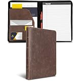
- FULL-SIZE ZIPPER PADFOLIO: Designed for standard 8.5 x 11 inch writing pads and letter-size documents, providing organized storage for meetings, interviews, presentations, and everyday business use.
- VINTAGE FAUX LEATHER DESIGN: Dark brown synthetic leather exterior features a vintage-inspired finish and book-style hardcover construction for a professional appearance.
- ZIP-AROUND CLOSURE: Full zipper closure helps keep papers, notes, business cards, and other contents contained while carrying the portfolio between meetings or appointments.
- BUILT-IN ORGANIZATION: Interior layout includes a document pocket, business card and ID pockets, pen loop, and additional storage compartments for frequently used work materials.
- TABLET AND DOCUMENT STORAGE: Interior pocket provides space for letter-size papers and compatible tablets up to 10.1 inches, helping keep work essentials together in one portfolio.
- Information access: Can a visitor quickly find your strongest work, role, contribution, and contact details?
- Evidence of thinking: Does each case study explain the problem, constraints, decisions, and result, rather than only display a screenshot?
- Interaction value: Does motion or 3D reveal something meaningful or demonstrate a skill relevant to your work?
- Accessibility: Can people navigate and understand the content with different input needs, and can nonessential motion be reduced?
- Resilience: Does the main content remain useful if effects are delayed, unavailable, or disabled?
These are practical design questions drawn from the examples and accessibility guidance, not a published scoring system. A useful test is to imagine a visitor who wants to inspect one project and leave: the experience should let them do that directly.
Plan for motion sensitivity and accessibility
WCAG 2.2, a W3C Recommendation, organizes accessibility criteria around four principles: content should be perceivable, operable, understandable, and robust. W3C recommends using the latest version of the guidelines. (WCAG 2.2)
For interaction-triggered motion, Success Criterion 2.3.3 says: “Motion animation triggered by interaction can be disabled, unless the animation is essential to the functionality or the information being conveyed.” W3C explains that motion can cause distraction or nausea for some people. Respecting a visitor’s reduced-motion preference is one way to prevent certain nonessential CSS animations. (Understanding Animation from Interactions)
The prefers-reduced-motion CSS media query is a documented technique, not an automatic accessibility pass. W3C’s technique describes using it to prevent motion; the applicable success criteria still need to be evaluated across the site’s content and controls. (W3C technique C39) A static alternative, such as the no-canvas path Ayuste describes, can preserve access to the content when an elaborate visual effect is not wanted or available.
Rank #4
Tell the project story, not just the project title
A case study is most useful when it helps a reader distinguish your work from the team’s overall output. For each featured project, explain the problem, your role, the constraints, the decisions you made, and the outcome you can substantiate. Add technical writing or experience context where it clarifies how you work; Shetty describes using all three rather than relying on a bare project gallery. (Ayush Shetty’s case study)
Keep the route into that explanation obvious. A visitor should not need to discover a hidden gesture or understand a desktop metaphor before finding the strongest work. Treat visual atmosphere as a layer around the story, not as a gate that visitors must pass through.
Choose a design that survives the simplest path
The right amount of interaction depends on what you want the portfolio to prove. A restrained page with detailed case studies can make engineering judgment visible through explanation. A more ambitious scene or interface can demonstrate frontend or visual work directly, provided the content remains understandable and usable without relying on that effect.
Ayuste reports Lighthouse scores of 90+ across performance, accessibility, best practices, and SEO for his site; this is his own report, with no year stated, and it is not an independently verified benchmark. (Marco Ayuste’s case study) It should not be treated as proof that a particular visual approach is fast or accessible for other sites. The stronger general lesson is to make the main work available through a dependable, straightforward path and assess accessibility beyond a single score or preference check.
Quick Recap
Product prices and availability are accurate as of the date/time indicated and are subject to change. Any price and availability information displayed on Amazon at the time of purchase will apply.
Free tools Windows power users keep installed
One-click scans. No signup required.

