
Free tools Windows power users keep installed
One-click scans. No signup required.
iTechGuides is reader-supported. When you buy through links on our site, we may earn an affiliate commission. As an Amazon Associate I earn from qualifying purchases. Learn more
Antihost offers managed WordPress hosting with free migration, one-click staging and a 14-day free trial.
The fastest way to improve WordPress navigation is to simplify the information architecture before changing the menu. List the tasks visitors come to complete, group related pages, remove obsolete or duplicate links, and give every destination a short, descriptive label. Then edit the menu using the workflow that matches your theme: block themes use Appearance > Editor > Navigation and the Navigation block, while classic themes commonly use Appearance > Menus.
After saving, test the published result at desktop and mobile widths. Check keyboard focus, submenu activation, screen-reader behavior, contrast, tap targets, every URL, and the browser Back button if you use client-side navigation. WordPress supplies responsive, keyboard, landmark, and ARIA capabilities in its Navigation block, but your theme styling and custom code still need verification.
The Tool Desk
Outbyte Driver Updater FREEFix the driver behind crashes, sound loss and screen glitchesFind Drivers →Outbyte PC Repair FREEClear out junk files and repair common Windows errorsFree Scan →What effective WordPress navigation should do
Navigation is the site’s answer to a visitor’s next question: “Where do I go now?” A useful menu makes the main destinations visible, groups related information, and lets people recover when they take a wrong turn. It should work with a mouse, keyboard, touch screen, and screen reader; remain usable on a narrow phone viewport; and expose real, crawlable URLs.
Improvement is not the same as adding more links. Every additional top-level choice increases scanning effort and makes mobile menus harder to operate. The goal is a small, understandable set of routes that reflects what visitors actually need, not the organization chart or every page in the dashboard.
#1 Best Overall
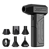
- Powerful Turbo Fan:CAGIWIRU Electric Air Duster have reached speed up to 130000RPM,Can efficient remove dust and debris.With LED light and Three Adjustable Speed to meet with different cleaning tasks.
- With Attached USB C Fasting Charging cable.Charing 3 hours,Enjoy up to 240 minutes of use on the lowest setting, For third speed can use for 25mins.with four charging options to meet with your needs.
- Wide Application: attached 5 different nozzles,making it suitable for a variety of scenes, such as car,pet, pc, keyboards, and other electronic devices. It also serves for office and home clean duster.
- Handy Design & Portable:Cordless air duster electric nozzle is Light weight and small size, design and comfortable to hold and space saving, convenient to carry around. You can put it in your room or inside the car without taking up space.
- Economical &Reusable: Built durable materials with a long-lasting battery,our CAGIWIRU air duster it's a sustainable alternative to disposable air cans.
Audit your information architecture before editing a menu
1. Inventory the destinations people need
Start with a list of the pages and actions visitors use most. Use available analytics, recurring support questions, search terms from your site, and input from people who speak with customers. Include practical destinations such as contact, pricing, documentation, account access, store categories, or service areas when they are relevant to your site.
Mark each item as a primary task, a supporting resource, or an administrative/rare destination. Primary tasks normally belong in the main navigation. Supporting resources can be grouped under a relevant section or linked contextually within content. Rare destinations may belong in the footer or a utility menu instead of competing with the main choices.
Recommended Free Tools
2. Remove dead, duplicate, and misleading links
Open each existing destination and confirm that it is published, current, and useful. Remove links to deleted pages, old campaigns, duplicate versions of the same information, and labels that promise something the destination does not provide. If two pages serve nearly the same purpose, consolidate them or make their different audiences explicit before deciding where they belong.
3. Draw a hierarchy visitors can predict
Group pages by the visitor’s mental model. For example, “Services” can contain individual service pages, while “Resources” can contain guides and documentation. Keep related items together and avoid placing a child page under a parent that has no meaningful relationship to it.
Sketch the hierarchy on paper or in a simple outline before opening WordPress. A top-level label should describe a meaningful category or task. A submenu should contain items that genuinely belong to that category, not a miscellaneous list of leftovers.
4. Write labels that describe the destination
Use short, familiar words that tell people what they will find after clicking. “Pricing” is clearer than “Explore options”; “Documentation” is clearer than “Knowledge hub” unless that phrase is already established for your audience. Keep wording and capitalization consistent across all items. Avoid unexplained abbreviations and marketing slogans that hide the destination.
What’s actually slowing this PC down?
Pick the symptom - the matching free tool is one click away.
Rank #2

- Screen Cleaner is Your Screen’s New Bestfriend! - EVEO is proud to present a screen cleaner that’s perfectly suited for your TV. Meet your new screen cleaner, computer screen cleaner, laptop cleaner, iPad cleaner, Macbook,tv cleaner or any other electronic device. Our screen cleaner spray and wipe along with the included plush microfiber cloth, easily removes dust, fingerprints & other smudges on the screen’s surface. Clean effectively for a streak-free screen
- Gentle on your Screens - Our screen cleaner spray and wipes is compatible to be used even for the most sensitive LCD, LED, CRT, and OLED screens in proper use. Be at ease knowing that this product is compatible with all the major brands: LG, SONY, Samsung, Sharp, iPad, iPhone, Android screens, Kindle, PC monitors - we’ve got you covered! Can be used as LCD screen cleaner, tv cleaner, smart tv screen cleaner, and more
- Premium Super Soft Plush Microfiber Cloth - Included in this efficient screen cleaning kit. This screen cleaner spray and wipe has our signature plush microfiber cloth specially designed to comply with screens and monitors and leave them streak-free. Has been shown to effectively absorbs stubborn stains, zero streaks, and no fiber shedding. Always use this together with our screen cleaner for the best results
- Easy-to-Use Screen Cleaner Kit + microfiber cleaning cloth - The EVEO Screen Cleaning Kit will easily be your new favorite tool when it comes to taking care of the things you love most, quick and easy solution for a streak-free screen. Simply screw on the sprayer gun on the screen cleaner bottle. Spray the cleaning liquid onto the microfiber cloth, then wipe the screen until desired cleanliness & shine is achieved.
- Quality Screen Care Kit Worth Purchasing - Enjoy a convenient Screen Cleaner anytime, anywhere you need it. Your satisfaction is our top priority. We stand behind the quality of our products and that’s why, you shouldn’t be worrying at all. We manufacture the Best Screen Cleaner. and can be used for laptop cleaning kit, laptop screen cleaner, tv screen cleaner for smart tv. MacBook screen cleaner, monitor cleaner or screen cleaner spray for electronic devices with microfiber cleaning cloth
5. Decide what belongs outside the primary menu
Not every useful link needs to be a top-level item. Search, login/logout, social links, a language selector, and a prominent call to action can be separate controls or related blocks. Contextual links inside a page can lead to deep content without making the global menu carry the entire site.
Identify whether you use a block or classic theme
The editing screen depends on the active theme. Confirm the theme type before following a menu tutorial; the wrong workflow can make a menu appear to be missing.
| Theme type | Where navigation is edited | How it reaches the front end | Important limitation |
|---|---|---|---|
| Block theme | Appearance > Editor > Navigation, using the Navigation block | A Navigation block must be placed in a template part such as the Header, connected to the menu, and saved | Creating or editing a menu in the Site Editor does not automatically place it on a visible page |
| Classic theme | Usually Appearance > Menus | The menu is assigned to one of the menu locations exposed by the theme | Names and available locations vary by theme |
In the block editor, the Navigation block is a container for the blocks that let visitors move around your site. Related blocks can include navigation links, search, social links, page lists, the site title and logo, login/logout controls, and buttons.
Edit navigation in a block theme
Open or create the menu
- Sign in to WordPress and open Appearance > Editor > Navigation.
- Select the navigation menu you want to change. You can rename, duplicate, delete, reorder, or edit menus from this area.
- If no suitable menu exists, create one and give it a clear internal name that identifies its purpose, such as “Primary” or “Documentation.”
Add and organize items
- Open the menu and select the Navigation block’s inserter.
- Add a page, a custom link, or another supported navigation item. Enter a destination URL for a custom link and a label that describes where it leads.
- Drag items into the intended order. Treat each item as an individual block, so the normal block editor controls can be used to move or configure it.
- To create a submenu, place related links under a parent and convert the relevant item to a submenu structure using the Navigation block controls. Keep the nesting shallow enough to operate comfortably on a phone and with a keyboard.
Understand Page List behavior
A new Page List can automatically display published pages. That is convenient for a site whose hierarchy is carefully maintained, but it can also expose pages as soon as they are published. If you convert the Page List into individually editable links, newly published pages will no longer be added automatically. Choose automatic listing only when that ongoing behavior is intentional.
Do these 3 things before closing this tab:
1Scan for outdated or missing drivers - takes under a minute2Clear out junk files and repair common Windows errors3Fix the driver behind crashes, sound loss and screen glitchesPlace the menu on the site
- Open the Header or another template part where visitors should see the menu.
- Insert a Navigation block if one is not already present.
- Use the block’s menu selector to connect it to the menu you created or edited.
- Save the template part and the overall editor changes.
- Preview representative pages, not just the home page. Headers and navigation can differ between templates.
This final placement step explains a common failure: a menu can exist in Appearance > Editor > Navigation yet be absent from the public site because no visible Navigation block is linked to it.
Configure display controls
Use the Navigation block settings to choose whether submenus appear on hover or on click, whether submenu arrows are shown, and whether the menu uses an overlay. Overlay visibility can be set to never, mobile, or always. Select the least complex behavior that still makes the menu usable at the widths your audience visits.
Rank #3

- 【Large size】:Measuring 800 x 300 mm/ 31. 5×12 inches, which is wider and taller than others. Large mouse pad can perfectly fit your keyboard and mouse of any size, and there is also ample space for peripherals such as phones, tablets, etc.
- 【LED backlight mouse pad】:Blade Hawks RGB mouse pad provides 7 static modes and 7 dynamic modes will give you the options you are looking for. Power-off memory function remembers the last lighting mode you selected. The super glow fiber Chroma will give you a colorful gaming setup that you want.
- 【Anti-slip rubber base】:Made from Natural rubber, this gaming mousepad will firmly grip your desktop, allowing you to enjoy the ultimate precision in the games you are most passionate about. It also comes with a texture that enhances this ability even further.
- 【Smooth and waterproof surface】: Micro-textured cloth surface, for extremely precise mouse control and a smooth movement. When liquid splashes on the gaming mouse pad, it forms water droplets and slides down. Will not delay your work or gameplay.
- 【Plug and play】: This mouse and keyboard pad is powered by USB, plug and play, no driver required. One button control light modes. Press one time to change the lighting mode, press twice to change the brightness, press and hold about 3 seconds turn ON/OFF.
Edit navigation in a classic theme
- Open Appearance > Menus in the WordPress dashboard.
- Select an existing menu or create a new one.
- Add pages, custom links, or other available content types, then edit each navigation label so it describes the destination.
- Drag items to reorder them. Indent related items to create submenus where the theme supports them.
- In the menu-location settings, assign the menu to the theme location intended for the primary header or another relevant area.
- Save the menu, then view the public site at desktop and mobile widths.
Classic themes expose different location names and may style or transform the menu differently. If the menu is saved but does not appear, inspect the theme’s available locations and confirm that the header template actually renders the assigned location.
Choose the right menu pattern
There is no universally best pattern. Compare the number and depth of choices, label discoverability, keyboard and screen-reader operation, mobile reachability, maintenance effort, and whether every destination remains directly crawlable.
Quick wins for a faster PC:
Repair Windows errors before they cause bigger problemsFix Now →Scan for outdated or missing drivers - takes under a minuteDriver Scan →Clear out junk files and repair common Windows errorsFree Scan →| Pattern | Best fit | Advantages | Risks to check |
|---|---|---|---|
| Single-level menu | A small site with a handful of high-priority destinations | Fast scanning, fewer interaction states, and straightforward keyboard operation | Can become crowded when every page is promoted to the top level |
| Nested submenus | A larger site with clear categories and related child pages | Groups destinations and keeps the primary row shorter | Deep or hover-only nesting can be hard to discover, reach, or operate by keyboard and touch |
| Mobile overlay | A narrow viewport where a full horizontal menu cannot fit | Preserves space and gives touch users a focused list of links | Focus, close behavior, back-button behavior, tap targets, and screen-reader announcements must be tested |
Keep nesting purposeful
Use a submenu when the parent label is a useful category or landing page and the child links are clearly related. Do not create several levels merely to avoid deciding which destinations matter. If a visitor must open multiple menus to reach a common task, promote that task or provide a contextual shortcut.
Make labels discoverable without relying on visual styling
A visitor should understand an item from its text and surrounding structure. Icons, color, hover effects, and animation may reinforce a label, but they should not be the only clues. If a theme uses a parent item only as a submenu trigger, verify that keyboard and touch users can still reach the category’s content through a separate link or landing page when appropriate.
Make mobile navigation usable
Preview at narrow widths rather than assuming the desktop header will collapse correctly. Check that the menu trigger is visible, has a sufficiently large touch target, and does not overlap the logo, search control, or other header elements. The Navigation block’s overlay setting lets you choose whether this focused menu appears on mobile, at every width, or never.
For an overlay, test the complete interaction: opening it, moving through every item, opening and closing submenus, dismissing it with the close control, and returning to the page at the same scroll position. If Escape is supported by the theme or custom code, verify it closes the overlay and returns focus sensibly. Use the browser Back button after opening and after following a link so the overlay does not trap visitors in an unexpected history state.
Rank #4

- 【Softer and More Comfortable】Vaydeer wrist rest has unique diamond pattern, which is the combination of softness and aesthetics. The materials of wrist rest are improved into higher quality memory foam and covered with silky smooth lycra. The computer wrist rest makes you as comfortable and cushiony as like rest your wrists on clouds.
- 【Ergonomic Wrist Saver】The wrist rests for keyboard and mouse comes with a 17.32×3.15×0.83 inch keyboard wrist pad and a 5.94×3.15×0.83 inch mouse wrist support. Based on ergonomic design, the unique concave shape is the perfect fit for your wrist joints. The wrist rest pad fits most computer keyboards and laptops, improve hand and wrist posture, release your wrist and arm stress.
- 【Non-Slip Rubber Bottom】Featuring an anti-skid silicone base on the bottom, this wrist keyboard support stays firmly in place on your desk, preventing the padding from sliding around, ensuring stable and consistent wrist support during extended computer sessions.
- 【Better Experience & Pain Relief】Our keyboard arm rest is beneficial to alleviate the soreness caused by direct contact and friction between your arm and a hard desk surface, reducing the risk of wrist fatigue or carpal tunnel. The soft texture of memory foam can evenly distribute the pressure around your wrists and provide good support with just enough give.
- 【Helpful in Multiple Scenarios】Whether you're working, studying, writing, typing, gaming, this keyboard and mouse rest combo is an essential accessory to add comfort and support to your hands and wrists. It’s also a great gift for men, women, family, friend, coworker, gamer, teacher, etc.
Do not hide critical destinations only behind hover. Hover is unavailable on many touch devices and is difficult to reproduce reliably with a keyboard. If you select hover visibility for submenus, provide an equivalent click and keyboard path and test it on the published site.
Verify accessibility instead of assuming it
WordPress documents that the Navigation block supports responsive view, keyboard navigation, a <nav> landmark role, and ARIA attributes without additional code. Those are capabilities, not a substitute for checking the rendered menu. Theme CSS, plugins, custom JavaScript, and unusual markup can still create barriers.
Keyboard-only test
- Start at the top of a representative page and press Tab until the logo, menu trigger, or first navigation item receives focus.
- Confirm that focus is visibly distinct from the surrounding text and that the order follows the visual and logical order of the header.
- Use the keyboard command that activates a link or control, then move through every top-level item and submenu item.
- Open and close each submenu without a mouse. Check that focus does not jump to an unrelated part of the page.
- If a mobile overlay is present, open it, traverse all links, close it, and confirm focus returns to the control that opened it.
Screen-reader and semantic checks
Use a screen reader available on your operating system to locate the navigation landmark and hear the accessible names of links and controls. Submenu state should be understandable when it changes, and an overlay should announce its purpose and controls. Verify that decorative icons do not replace meaningful text and that duplicate navigation regions have distinguishable labels when the theme creates more than one.
Visual and motor checks
- Check text and background contrast in normal, hover, active, and focus states.
- Ensure focus indicators are not removed by theme CSS.
- Confirm that links and controls can be activated without precise pointer movements.
- Test zoom and narrow widths so labels do not overlap or become clipped.
- Check that submenu content is not hidden behind other header elements or cut off by overflow rules.
Use client-side navigation without breaking the web
Some WordPress implementations enhance navigation with JavaScript. The documented approach can fetch destination HTML, replace designated regions, update browser history, load required assets, and announce progress to screen readers. These enhancements should feel faster without changing the underlying navigation contract.
Keep complete server-rendered HTML and directly usable URLs. WordPress states that this server-rendered output remains crawlable by search engines. Test a destination with JavaScript disabled or unavailable, open a link in a new tab, refresh a deep URL, and use the browser Back and Forward buttons. If any route works only after a script runs, treat that as a defect rather than an acceptable enhancement.
Independent reader supportYour contribution helps us test, update, and keep practical guides available for everyone.Test every change systematically
- Save and preview: save the menu and relevant template part, then preview the published site rather than relying only on the editor canvas.
- Check representative templates: inspect the home page, a standard page, a post or documentation page, a search result, and any custom landing-page template.
- Check widths: test a wide desktop view, a tablet-sized view, and at least one narrow phone width. Resize slowly to catch the breakpoint where the layout changes.
- Follow every destination: open each top-level and submenu link, including custom links, and confirm it reaches the intended page without an unexpected redirect or error.
- Repeat the keyboard and screen-reader checks: do this after theme or plugin updates, not only after menu edits.
- Record ownership: note who approves menu changes, who checks links, and how often the inventory is reviewed.
Troubleshoot common navigation failures
The menu exists in the editor but is missing on the site
- With a block theme, open the Header or relevant template part and confirm a Navigation block is present and connected to the intended menu.
- Save both the menu changes and the template-part changes.
- With a classic theme, return to Appearance > Menus and verify that the menu is assigned to the location rendered by the active theme.
- Check whether a different header template is used on the page where the menu is absent.
The mobile menu is missing or unusable
- Confirm the Navigation block’s overlay visibility is not set to never when the design requires an overlay.
- Inspect the narrow layout for a hidden trigger, overlapping elements, clipped labels, or a stacking-order problem.
- Open the published page in a private window or after clearing cached assets if the editor shows a newer header than the public page.
- Run the keyboard and screen-reader checks again; a visually present trigger can still be unreachable or unnamed.
New pages appear unexpectedly
Check whether the menu uses an automatic Page List. It can include newly published pages by design. Convert it to individually editable links when the menu must remain curated, then add or remove destinations deliberately.
Best Value

- 【No Drill Mounted】Cable management tray can be assembled in as little as 3 minutes or less-simply. Side clips easily clampe the edge of desk, pass through the holes on the sides, and secure excess cables with baskets. Desk cable management supports inward or outward installation to meet your needs in different scenarios, and provides you with great convenience when collecting and organizing wires.
- 【Rubber Pad Protects Desk】Wire organizer under desk built-in soft rubber pads on the clamp protect your desk from scratches, so you will not damage your furniture or office.
- 【Sturdy and Beautiful】Cord management under desk is made of high-quality carbon steel and holds about 15 lbs. The wire basket has 2 holes on each side of the tray to enable your cables to pass freely. Cable baskets are suitable for desk thickness use from 0.4" to 2.4".
- 【Space Saving & Keep Organized】Desk cable management tray holds all your power cords, outlet strips, USB hubs and computer transformers hidden from your feet, and the data cables will not enter the vacuum cleaner to keep your desk clean and tidy. Desk wire organizer is also suitable for use in the kitchen and outdoors.
- 【Reduce Safety Risks】Cable tray under desk keeps all plugs away from your kids, no more worry about tripping. Using 2 holes wire tray saves extra space, helps you easily cabling and wire protection. The mesh design is not easy to accumulate dust, but avoids safety accidents caused by messy wires.
A submenu works with a mouse but not a keyboard
Review the chosen hover or click behavior and test the actual rendered controls. Make sure a visible focus state exists, activation opens the submenu, and focus can reach each child link. Replace hover-only behavior or custom scripts that interfere with the Navigation block’s normal keyboard operation.
Links work visually but fail with JavaScript disabled
Restore a server-rendered link to the destination and treat the enhancement as optional. Verify direct loading, refresh, Back, and Forward behavior before re-enabling the script.
Keep navigation healthy as the site changes
Navigation is a maintained system, not a one-time design task. Review the destination inventory when pages are created, renamed, consolidated, or retired. Remove links to obsolete campaigns promptly, and decide whether new pages should enter an automatic Page List or require a deliberate menu edit.
Assign an owner for menu changes and a second person to check high-value paths. A lightweight review can include the primary tasks, every submenu, mobile overlay behavior, keyboard focus, and the URLs that generate the most support questions. Document the intended hierarchy so a future editor does not add a new top-level item simply because it is easy to do.
When a theme, plugin, header template, or custom script changes, repeat the published-site tests. A menu can remain visually similar while its focus order, ARIA state, overlay behavior, or crawlable markup changes underneath.
Quick Recap
Product prices and availability are accurate as of the date/time indicated and are subject to change. Any price and availability information displayed on Amazon at the time of purchase will apply.

