
Outdated Drivers Are Slowing You Down
One free scan finds every outdated or missing driver and matches the right update for your exact hardware.Free scan · exact hardware matchPC Slower Than It Used to Be?
A free scan shows the junk files, broken settings and background clutter dragging Windows down - then fixes them in one click.Free scan · Windows 10 & 11iTechGuides is reader-supported. When you buy through links on our site, we may earn an affiliate commission. As an Amazon Associate I earn from qualifying purchases. Learn more
The reliable way to find inconsistent UI components is to audit both the design files and the running website. Define the component library, coded components, design tokens, routes, states, themes, and breakpoints in scope; inventory repeated patterns; compare each instance with explicit rules; fix shared causes instead of isolated screens; then verify component states and representative pages, including accessibility.
A tidy design file is not proof that production is consistent. Detached design instances, local overrides, duplicate code, hardcoded values, and outdated builds can all create differences that appear only in the shipped interface.
What counts as an inconsistent UI component?
Inconsistency is any difference that violates an agreed component rule without a documented reason. The difference may be visual, behavioral, structural, or accessibility-related. Examples include a primary button using a different height on one route, two inputs showing different focus states, cards using slightly different corner radii, or an alert with insufficient contrast in one theme.
Quick wins for a faster PC:
Fix the driver behind crashes, sound loss and screen glitchesFind Drivers →Clear out junk files and repair common Windows errorsFree Scan →Not every difference is a defect. A compact button may be intentional in a dense toolbar, and a larger hit area may be required for accessibility. The audit must therefore record the expected rule and the reason for any exception, rather than treating identical pixels as the only goal.
#1 Best Overall
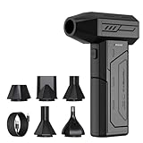
- Powerful Turbo Fan:CAGIWIRU Electric Air Duster have reached speed up to 130000RPM,Can efficient remove dust and debris.With LED light and Three Adjustable Speed to meet with different cleaning tasks.
- With Attached USB C Fasting Charging cable.Charing 3 hours,Enjoy up to 240 minutes of use on the lowest setting, For third speed can use for 25mins.with four charging options to meet with your needs.
- Wide Application:Upgraded attached 5 different nozzles,making it suitable for a variety of scenes, such as car,pet, pc, keyboards, and other electronic devices. It also serves for office and home clean duster.
- Handy Design & Portable:Cordless air duster electric nozzle is Light weight and small size, design and comfortable to hold and space saving, convenient to carry around. You can put it in your room or inside the car without taking up space.
- Warranty & Support: Our Electric air duster comes with 5 years warranty and 24/7 customer service. During this period, if you have any questions,pls kindly feel free to contact us.
Drift usually enters through one of four paths:
- A design instance becomes detached from its library component and is edited locally.
- A developer overrides a shared component for one screen or copies its markup into a new implementation.
- Tokens are bypassed with hardcoded colors, spacing, type sizes, or breakpoints.
- The design library and production package evolve separately, so the documented component no longer describes the deployed one.
1. Set the audit scope and source of truth
Start by writing down exactly what the audit covers. A vague instruction such as “check the website” produces an incomplete list and makes later comparisons impossible.
Map the products, routes, and states
List each product or sub-application, its important routes, and the representative states that can expose drift. Include authenticated and unauthenticated areas when they share components. For each route, note the responsive widths, themes, localization conditions, and interaction states that matter.
- Routes: landing pages, dashboards, settings, checkout or account flows, and error pages.
- Responsive states: at least the breakpoints your product supports, plus a narrow phone and a wide desktop view if those are common real-world widths.
- Interaction states: default, hover, focus-visible, pressed, disabled, loading, validation error, success, and empty states where applicable.
- Themes and modes: light, dark, high-contrast, brand themes, and any operating-system preference that changes rendered values.
- Content extremes: long labels, translated strings, multiline errors, missing images, and unusually large numbers.
Choose representative routes rather than trying to inspect every page manually at the start. A route that uses a component in several contexts is more valuable than a page containing only one instance.
Do these 3 things before closing this tab:
1Repair Windows errors before they cause bigger problems2Scan for outdated or missing drivers - takes under a minute3Clear out junk files and repair common Windows errorsIdentify the authoritative artifacts
Document the artifacts that define expected behavior and who owns each one:
- The current design library and its version or last approved revision.
- The coded component package, including the version used by the site being audited.
- Design-token definitions for color, typography, spacing, radii, elevation, motion, and breakpoints.
- Usage guidance covering when to use a component, which variants are valid, and which combinations are prohibited.
- The engineering and design owners responsible for approving changes.
There is no universal architecture in which one artifact always outranks the others. What matters is an explicit mapping. For example, record that the design library’s “Button/Primary” maps to a particular coded component and token set, and state which version is expected in production. If design and code are maintained separately, record both versions and the release that should connect them.
Figma’s implementation guidance recommends auditing current design and code together and involving engineering, because a design-only review can miss drift in shipped implementation. Treat that as a scope rule: the design file describes intent, while the built site is the output users actually experience.
2. Build a documented inventory of repeated patterns
Create one inventory that can be filtered by component, route, owner, and severity. Begin with patterns that appear often and have visible impact: buttons, inputs, cards, navigation, forms, alerts, tables, dialogs, and status indicators. Add one-off components later; they can reveal drift, but repeated components provide the fastest signal.
Free tools Windows power users keep installed
One-click scans. No signup required.
| Inventory field | What to record | Why it matters |
|---|---|---|
| Pattern name | Button, text input, card, alert, navigation item, or a product-specific pattern | Lets you group the same behavior across routes |
| Variant and state | Primary, secondary, destructive; default, focus, disabled, loading, and other relevant states | Prevents a valid variant from being mistaken for an inconsistent one |
| Location | Product, route, component story, design page, viewport, and theme | Shows the scope and reach of a finding |
| Design reference | Library component and token references, including version | Identifies the expected rule |
| Implementation reference | Coded component, package version, selector, or template | Connects the finding to a changeable source |
| Observed difference | Exact property or behavior that differs | Makes the finding reproducible instead of subjective |
| Status and owner | Unreviewed, accepted exception, fix planned, verified; responsible team | Prevents findings from disappearing after the audit |
Capture instances, not just component names
“Card is inconsistent” is not actionable. Record the card’s route, variant, content condition, actual dimensions or token values, and a screenshot or story reference. Note whether the difference appears in the design file, the rendered site, or both. A useful record states: “The billing page uses a 12-pixel radius while the approved card token is 8 pixels; the design instance is detached and the production class has a local radius override.”
Rank #2

- Screen Cleaner is Your Screen’s New Bestfriend! - EVEO is proud to present a screen cleaner that’s perfectly suited for your TV. Meet your new screen cleaner, computer screen cleaner, laptop cleaner, iPad cleaner, Macbook,tv cleaner or any other electronic device. Our screen cleaner spray and wipe along with the included plush microfiber cloth, easily removes dust, fingerprints & other smudges on the screen’s surface. Clean effectively for a streak-free screen
- Gentle on your Screens - Our screen cleaner spray and wipes is compatible to be used even for the most sensitive LCD, LED, CRT, and OLED screens in proper use. Be at ease knowing that this product is compatible with all the major brands: LG, SONY, Samsung, Sharp, iPad, iPhone, Android screens, Kindle, PC monitors - we’ve got you covered! Can be used as LCD screen cleaner, tv cleaner, smart tv screen cleaner, and more
- Premium Super Soft Plush Microfiber Cloth - Included in this efficient screen cleaning kit. This screen cleaner spray and wipe has our signature plush microfiber cloth specially designed to comply with screens and monitors and leave them streak-free. Has been shown to effectively absorbs stubborn stains, zero streaks, and no fiber shedding. Always use this together with our screen cleaner for the best results
- Easy-to-Use Screen Cleaner Kit + microfiber cleaning cloth - The EVEO Screen Cleaning Kit will easily be your new favorite tool when it comes to taking care of the things you love most, quick and easy solution for a streak-free screen. Simply screw on the sprayer gun on the screen cleaner bottle. Spray the cleaning liquid onto the microfiber cloth, then wipe the screen until desired cleanliness & shine is achieved.
- Quality Screen Care Kit Worth Purchasing - Enjoy a convenient Screen Cleaner anytime, anywhere you need it. Your satisfaction is our top priority. We stand behind the quality of our products and that’s why, you shouldn’t be worrying at all. We manufacture the Best Screen Cleaner. and can be used for laptop cleaning kit, laptop screen cleaner, tv screen cleaner for smart tv. MacBook screen cleaner, monitor cleaner or screen cleaner spray for electronic devices with microfiber cleaning cloth
Find high-reuse patterns first
Use component usage data, route analytics, or a repository search to identify the most repeated patterns. Buttons and inputs are good starting points because small differences are highly visible and their states affect keyboard and assistive-technology users. Cards and navigation are useful next because they often have many product-specific variants.
Do not discard one-off components. Figma’s implementation guidance notes that one-off components can be a source of drift. Mark them as low-reuse or special-purpose in the inventory so they receive an intentional review rather than being silently copied into the system.
3. Compare each instance with explicit rules
Comparison works only when “correct” is defined. For each component, list the approved anatomy, tokens, variants, states, content rules, and accessibility requirements. Then compare design instances and rendered code against that list.
Recommended Free Tools
Audit the design side
- Check whether instances are connected to the current library component.
- Look for detached instances, local property overrides, and hidden layers that change spacing or typography.
- Check colors, type styles, spacing, radii, and effects against the current token definitions.
- Confirm that every displayed variant is an approved variant, not a visually similar duplicate.
- Check content guidance: label length, icon position, helper text, and error-message treatment.
Figma describes visual consistency, component, accessibility, and content checks as distinct audit categories. Keep those categories separate in the inventory so a component can pass visual review while still failing keyboard behavior or content guidance.
Audit the production side
- Inspect the component actually rendered by the deployed or release candidate build, not only the source package.
- Trace computed styles back to tokens or component rules and flag hardcoded values.
- Search for duplicate markup, copied styles, route-specific selectors, and conditional branches that bypass the shared component.
- Exercise every documented variant and state, including focus-visible and error states that may not appear in a static screenshot.
- Check responsive behavior at the breakpoints in scope and at intermediate widths where wrapping or overflow can expose a defect.
Compare the design reference and production output as two records. A mismatch in both may indicate an outdated rule; a mismatch only in production points toward implementation drift; a mismatch only in design may mean the library or usage documentation needs correction.
Classify the discrepancy
| Category | Typical evidence | Likely first action |
|---|---|---|
| Detached or outdated instance | Design object no longer follows library updates | Reconnect or rebuild the instance, then verify content and layout |
| Override | Local property changes a shared component’s value | Confirm whether the override is intentional; remove it or document it |
| Hardcoded value | Color, spacing, type, or radius is not tied to a token | Replace with the approved token where the semantic meaning matches |
| Token mismatch | Design and code use different token names or resolved values | Correct the mapping or token definition, then update consumers |
| Duplicate implementation | Two components provide the same job with different APIs or styles | Choose a canonical component and plan consumer migration |
| Missing or inconsistent variant | A route needs a state not represented in the library or package | Decide whether to add a supported variant or keep a documented exception |
4. Prioritize findings by reach and risk
Fixing every difference in discovery order wastes effort. Prioritize the combination of reuse, user visibility, accessibility risk, and change leverage.
| Priority | Use it for | Example |
|---|---|---|
| Immediate | Accessibility failures, broken interaction states, or defects in a shared component used on critical flows | Focus indicator disappears on every form field in the account flow |
| High | Highly reused visual drift or a token mismatch affecting many routes | All secondary buttons resolve to two different background tokens |
| Medium | Visible differences with limited reach or a clear duplicate implementation | One settings page uses a copied card component |
| Planned | Low-reuse differences with no user harm and a costly migration | A legacy report has a documented compact table variant |
Record the reason for each priority. A simple formula is not necessary; a short explanation such as “used in 18 routes, affects keyboard focus, fix belongs in one shared component” is more useful than an unexplained score. Group findings that share a root cause so one token or component change can resolve several instances.
5. Fix the shared cause, then update consumers
Correct tokens and shared components first
When several screens share the same defect, change the semantic token or shared component rather than applying a patch to each screen. For example, if all primary buttons use the wrong vertical padding, correct the button’s spacing token or implementation and let consumers inherit the change.
Rank #3

- 【Large size】:Measuring 800 x 300 mm/ 31. 5×12 inches, which is wider and taller than others. Large mouse pad can perfectly fit your keyboard and mouse of any size, and there is also ample space for peripherals such as phones, tablets, etc.
- 【LED backlight mouse pad】:Blade Hawks RGB mouse pad provides 7 static modes and 7 dynamic modes will give you the options you are looking for. Power-off memory function remembers the last lighting mode you selected. The super glow fiber Chroma will give you a colorful gaming setup that you want.
- 【Anti-slip rubber base】:Made from Natural rubber, this gaming mousepad will firmly grip your desktop, allowing you to enjoy the ultimate precision in the games you are most passionate about. It also comes with a texture that enhances this ability even further.
- 【Smooth and waterproof surface】: Micro-textured cloth surface, for extremely precise mouse control and a smooth movement. When liquid splashes on the gaming mouse pad, it forms water droplets and slides down. Will not delay your work or gameplay.
- 【Plug and play】: This mouse and keyboard pad is powered by USB, plug and play, no driver required. One button control light modes. Press one time to change the lighting mode, press twice to change the brightness, press and hold about 3 seconds turn ON/OFF.
Before changing a shared source, list its consumers and identify intentional differences. A global token change can affect a dark theme, a compact density mode, or an embedded product that has separate requirements. Make the smallest source-level correction that expresses the intended rule, and record the expected impact.
Migrate duplicate consumers deliberately
If two implementations serve the same purpose, select a canonical component based on approved behavior, accessibility, ownership, and adoption—not merely on which one looks newer. Add the missing variant or API to the canonical component when that is safer than forcing consumers into unrelated workarounds. Migrate routes in batches, remove the old implementation when no consumers remain, and keep a compatibility note if releases are staggered.
Handle exceptions as first-class decisions
Some differences are valid. Product-specific branding, a compact toolbar, a touch target requirement, or a legacy integration may justify an exception. Document:
- The component and exact property that differs.
- The user, product, or accessibility requirement behind it.
- The routes, themes, and states where it is allowed.
- The owner and review date.
- Whether the exception should eventually become a supported variant.
An exception without a boundary becomes a new source of drift. Give it a named variant or explicit condition when possible, rather than encouraging future developers to copy its styles.
6. Validate components and representative pages
Use stories to represent the state space
Create or update component stories for every approved variant and important state. Include long content, validation messages, loading, disabled, focus-visible, dark mode, and responsive conditions when they can change the output.
Storybook’s visual-testing documentation describes a screenshot workflow: “They work by taking screenshots of every story and comparing them to previous versions to identify visual changes.” Use those comparisons to flag changes, not to decide automatically that every change is wrong. Review each difference against the intended component or token update.
A code change does not always produce a visual change, and a visual change can be caused by content, fonts, browser rendering, or environment differences. Storybook cautions that this can create false positives. Keep the baseline stable, record intentional updates, and investigate unexplained diffs instead of approving them in bulk.
What’s actually slowing this PC down?
Pick the symptom - the matching free tool is one click away.
Add component-level accessibility checks
Run accessibility checks against the rendered stories. Storybook’s accessibility documentation describes audits of rendered DOM against WCAG-based heuristics, while Chromatic documents accessibility regression checks on stories through CI and component-level testing. These checks can catch issues such as missing labels, invalid roles, poor contrast, and keyboard-focus problems at the component boundary.
Rank #4

- 【Softer and More Comfortable】Vaydeer wrist rest has unique diamond pattern, which is the combination of softness and aesthetics. The materials of wrist rest are improved into higher quality memory foam and covered with silky smooth lycra. The computer wrist rest makes you as comfortable and cushiony as like rest your wrists on clouds.
- 【Ergonomic Wrist Saver】The wrist rests for keyboard and mouse comes with a 17.32×3.15×0.83 inch keyboard wrist pad and a 5.94×3.15×0.83 inch mouse wrist support. Based on ergonomic design, the unique concave shape is the perfect fit for your wrist joints. The wrist rest pad fits most computer keyboards and laptops, improve hand and wrist posture, release your wrist and arm stress.
- 【Non-Slip Rubber Bottom】Featuring an anti-skid silicone base on the bottom, this wrist keyboard support stays firmly in place on your desk, preventing the padding from sliding around, ensuring stable and consistent wrist support during extended computer sessions.
- 【Better Experience & Pain Relief】Our keyboard arm rest is beneficial to alleviate the soreness caused by direct contact and friction between your arm and a hard desk surface, reducing the risk of wrist fatigue or carpal tunnel. The soft texture of memory foam can evenly distribute the pressure around your wrists and provide good support with just enough give.
- 【Helpful in Multiple Scenarios】Whether you're working, studying, writing, typing, gaming, this keyboard and mouse rest combo is an essential accessory to add comfort and support to your hands and wrists. It’s also a great gift for men, women, family, friend, coworker, gamer, teacher, etc.
Automated checks are not a complete accessibility assessment. They do not prove that a full task is usable with a screen reader, that focus order makes sense across a page, or that every browser and input method behaves correctly. Treat them as a repeatable layer that complements manual keyboard and assistive-technology review.
Review real pages and interactions
After component checks pass, review representative routes in the built site. Confirm that composition does not introduce differences that are invisible in isolation:
- Containers may impose widths, overflow, or z-index behavior that changes a dialog or menu.
- Real content may wrap labels, alter card heights, or expose truncation defects.
- Routing and state management may skip loading, error, or empty states shown in stories.
- Theme and breakpoint inheritance may resolve different tokens than the isolated component.
- Browser defaults, fonts, and device pixel ratios can affect rendered spacing and text metrics.
Capture the build or commit being reviewed and the viewport, browser, theme, and state used for each sign-off. This makes a later regression distinguishable from an environment difference.
How to check whether the live site matches the design system
- Choose a release or deployed environment. Record its URL, build identifier, feature flags, theme, and user role. Do not compare an unreleased design change with an older production build without labeling the mismatch.
- Select representative routes. Include a high-traffic page, a form-heavy page, a content-dense page, and a route known to use unusual variants.
- Exercise the important states. Tab through controls, trigger validation, open menus and dialogs, resize the viewport, switch themes, and test long or missing content.
- Compare against the mapped source. Check component anatomy, token-resolved values, behavior, and content guidance rather than relying only on pixel similarity.
- Record each difference. Save the route, state, viewport, expected rule, observed result, screenshot or story, and suspected source of the defect.
- Trace and fix upstream. Determine whether the difference comes from the design instance, token mapping, shared code, route composition, or an intentional exception.
- Repeat after deployment. Recheck the same routes and states in the new build, then keep the inventory item linked to the verification evidence.
This process answers “does the live site match?” without claiming that one pass covers every route, browser, responsive width, or interaction. Coverage is defined by the routes and states you recorded.
Common audit mistakes and their remedies
Auditing only the design file
A clean library can coexist with stale production code. Add engineering to the audit, inspect the built output, and verify the package version used by the deployed site.
Checking only the default state
Focus, error, loading, disabled, dark-theme, and narrow-screen states often contain the largest defects. Represent them in stories and in route-level review.
Fixing screens one at a time
Screen-level patches hide the root cause and make future drift more likely. Trace repeated differences to tokens, shared components, or duplicate implementations before editing consumers.
The Tool Desk
Outbyte PC Repair FREERepair Windows errors before they cause bigger problemsFix Now →Outbyte Driver Updater FREEFix the driver behind crashes, sound loss and screen glitchesFind Drivers →Removing every override automatically
An override may encode a legitimate product or accessibility requirement. Confirm intent, then either remove it or turn it into a documented variant or exception.
Best Value

- 【No Drill Mounted】Cable management tray can be assembled in as little as 3 minutes or less-simply. Side clips easily clampe the edge of desk, pass through the holes on the sides, and secure excess cables with baskets. Desk cable management supports inward or outward installation to meet your needs in different scenarios, and provides you with great convenience when collecting and organizing wires.
- 【Rubber Pad Protects Desk】Wire organizer under desk built-in soft rubber pads on the clamp protect your desk from scratches, so you will not damage your furniture or office.
- 【Sturdy and Beautiful】Cord management under desk is made of high-quality carbon steel and holds about 15 lbs. The wire basket has 2 holes on each side of the tray to enable your cables to pass freely. Cable baskets are suitable for desk thickness use from 0.4" to 2.4".
- 【Space Saving & Keep Organized】Desk cable management tray holds all your power cords, outlet strips, USB hubs and computer transformers hidden from your feet, and the data cables will not enter the vacuum cleaner to keep your desk clean and tidy. Desk wire organizer is also suitable for use in the kitchen and outdoors.
- 【Reduce Safety Risks】Cable tray under desk keeps all plugs away from your kids, no more worry about tripping. Using 2 holes wire tray saves extra space, helps you easily cabling and wire protection. The mesh design is not easy to accumulate dust, but avoids safety accidents caused by messy wires.
Approving every screenshot diff
Visual tools identify changes; people still decide whether a change is intended. Investigate false positives caused by fonts, browser differences, content, or environment configuration.
Leaving findings without owners
An inventory is useful only when someone can resolve and verify each item. Assign an owner, status, target release, and evidence of completion.
Keep consistency from decaying
Make the inventory and component stories part of normal delivery rather than a one-time cleanup. Require new variants to include a design reference, token mapping, usage rule, story, and accessibility review. Review changes to shared tokens for their consumer impact, and reject new hardcoded values when an approved semantic token exists.
Keep implementation guidance beside the coded component and link it to the design reference. When a component changes, update the design library, package, stories, and migration notes in the same work item or release plan. For products with separate release schedules, record which combinations of design and code versions are supported.
Rerun visual and accessibility checks in continuous integration, but retain periodic route-level audits. Component tests catch regressions in represented states; page reviews catch composition, content, routing, and responsive problems that isolated stories cannot model. The right cadence depends on release frequency and risk, so define it around major component changes, new themes, and high-impact product launches rather than an arbitrary universal interval.
A practical end-to-end example
Suppose an audit finds three card appearances: an 8-pixel radius in the design library, a 12-pixel radius on the dashboard, and a 10-pixel radius in a copied marketing component.
- The inventory records each route, theme, breakpoint, design reference, implementation reference, and computed radius.
- The comparison shows that the dashboard uses a detached design instance and a local CSS override, while the marketing component is a duplicate implementation.
- The team confirms that no product requirement calls for different radii and marks the issue high priority because cards appear on many routes.
- The shared card token is set to the approved value, the coded card component consumes that token, and dashboard consumers are reconnected.
- The marketing component is migrated to the canonical card with an approved marketing layout variant if its content structure differs.
- Stories capture default, image-missing, long-title, dark-theme, and narrow-width states. Screenshot and accessibility checks run in CI.
- Reviewers inspect the dashboard and marketing pages with real content, then close the inventory entries only after the deployed build shows the intended result.
The important outcome is not merely three matching corners. The shared token, canonical component, documented variant, and verification evidence make the same defect less likely to return.
Frequently Asked Questions
How often should a website undergo a UI consistency audit?
Run focused checks whenever shared components, tokens, themes, or major routes change, and schedule broader route-level reviews around significant releases. The appropriate interval depends on release frequency and product risk rather than a universal calendar.
Can visual regression tests replace manual UI review?
No. Screenshot comparisons cover the stories and environments represented in the test suite. Manual review of representative pages is still needed for composition, real content, routing, responsive behavior, browser differences, and interaction flows.
What should I do when a component difference is intentional?
Record the exact difference, its user or product requirement, allowed scope, owner, and review date. Give recurring exceptions a named variant or explicit condition so they are not copied as undocumented overrides.
Quick Recap
Product prices and availability are accurate as of the date/time indicated and are subject to change. Any price and availability information displayed on Amazon at the time of purchase will apply.
What’s actually slowing this PC down?
Pick the symptom - the matching free tool is one click away.

