
iTechGuides is reader-supported. When you buy through links on our site, we may earn an affiliate commission. As an Amazon Associate I earn from qualifying purchases. Learn more
Compare candidate layouts using the same screen content, app state, and user task, then check which one makes the important information and action clearest across the iPhone sizes and settings your app supports. Xcode previews make it practical to inspect variants side by side; use a real iPhone when a simulated preview cannot answer a display or interaction question.
The goal is not to find the most attractive screenshot. It is to identify the layout that remains understandable, operable, and visually coherent as the available space, text size, language, orientation, and system appearance change.
Set up a fair comparison
A layout comparison is useful only when the candidates are being judged against the same problem. Give each version the same content, labels, and app state, and ask a person reviewing them to complete the same task. For example, compare two product-detail screens by asking where someone would find the price and add an item—not by showing one version with extra information or a different primary action.
Keep the purpose of the screen in view. A layout that looks orderly in a static image may still make the next step hard to find, while a visually denser screen may work well if its grouping and hierarchy are clear. Judge appearance after checking whether the design supports the task.
#1 Best Overall
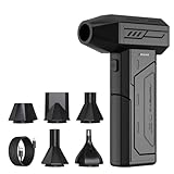
- Powerful Turbo Fan:CAGIWIRU Electric Air Duster have reached speed up to 130000RPM,Can efficient remove dust and debris.With LED light and Three Adjustable Speed to meet with different cleaning tasks.
- With Attached USB C Fasting Charging cable.Charing 3 hours,Enjoy up to 240 minutes of use on the lowest setting, For third speed can use for 25mins.with four charging options to meet with your needs.
- Wide Application:Upgraded attached 5 different nozzles,making it suitable for a variety of scenes, such as car,pet, pc, keyboards, and other electronic devices. It also serves for office and home clean duster.
- Handy Design & Portable:Cordless air duster electric nozzle is Light weight and small size, design and comfortable to hold and space saving, convenient to carry around. You can put it in your room or inside the car without taking up space.
- Warranty & Support: Our Electric air duster comes with 5 years warranty and 24/7 customer service. During this period, if you have any questions,pls kindly feel free to contact us.
Write the task in one sentence before opening a preview: read a status, choose an option, submit a form, start playback, or find a setting. Record the relevant starting state as well. A screen with an empty list can behave very differently from the same screen with long names, an error message, or several selected items. Reproduce those states in every candidate so that content differences do not masquerade as layout improvements.
Use the same wording, capitalization, numbers, images, and labels in each version. If one design has a shorter button label or fewer rows, make a separate content test rather than mixing that variable into the layout decision. The comparison should answer one question at a time: which arrangement communicates and supports the fixed task better?
Compare the dimensions that affect use
Hierarchy and the primary action
Check whether the most important information is easy to locate and whether the primary action stands out without competing with secondary controls. Ask a reviewer to identify the screen’s purpose and the next step. If they have to scan several equally prominent elements to find it, the hierarchy may need work.
Crashes, No Sound, or Screen Glitches?
Random freezes, missing sound and display glitches usually trace back to one bad driver. Find and replace yours safely.Free scan · under a minuteWindows Errors? Fix Them Before They Spread
Repair common Windows errors and clear accumulated junk for a smoother, more stable PC - no reinstall needed.Free scan · no reinstallLook at the order in which a person encounters title, status, supporting details, and action. A clear hierarchy does not require every element to be large or bold; it requires emphasis to match importance. The candidate that makes the key fact and next action apparent with less searching is usually the stronger starting point.
Test the hierarchy with the content that is most likely to vary. A long account name, a multi-line error, or a larger Dynamic Type setting can push a button down or make two headings appear equally prominent. If the primary action becomes indistinguishable from secondary actions in those states, note that as a functional weakness rather than a cosmetic issue.
Grouping and scanability
Related controls and information should read as related. Look at spacing, alignment, and visual grouping together: alignment can help people scan, while inconsistent gaps can make one section appear disconnected or make unrelated items seem like a group.
Trace a quick visual path through each candidate. Can a reviewer tell which label belongs to which field, which value belongs to which heading, and which controls operate together? Consistent edges and deliberate spacing should support that path. Do not reward a layout merely for fitting more items on screen if the relationships among those items become ambiguous.
Do these 3 things before closing this tab:
1Clear out junk files and repair common Windows errors2Scan for outdated or missing drivers - takes under a minute3Repair Windows errors before they cause bigger problemsRank #2

- Screen Cleaner is Your Screen’s New Bestfriend! - EVEO is proud to present a screen cleaner that’s perfectly suited for your TV. Meet your new screen cleaner, computer screen cleaner, laptop cleaner, iPad cleaner, Macbook,tv cleaner or any other electronic device. Our screen cleaner spray and wipe along with the included plush microfiber cloth, easily removes dust, fingerprints & other smudges on the screen’s surface. Clean effectively for a streak-free screen
- Gentle on your Screens - Our screen cleaner spray and wipes is compatible to be used even for the most sensitive LCD, LED, CRT, and OLED screens in proper use. Be at ease knowing that this product is compatible with all the major brands: LG, SONY, Samsung, Sharp, iPad, iPhone, Android screens, Kindle, PC monitors - we’ve got you covered! Can be used as LCD screen cleaner, tv cleaner, smart tv screen cleaner, and more
- Premium Super Soft Plush Microfiber Cloth - Included in this efficient screen cleaning kit. This screen cleaner spray and wipe has our signature plush microfiber cloth specially designed to comply with screens and monitors and leave them streak-free. Has been shown to effectively absorbs stubborn stains, zero streaks, and no fiber shedding. Always use this together with our screen cleaner for the best results
- Easy-to-Use Screen Cleaner Kit + microfiber cleaning cloth - The EVEO Screen Cleaning Kit will easily be your new favorite tool when it comes to taking care of the things you love most, quick and easy solution for a streak-free screen. Simply screw on the sprayer gun on the screen cleaner bottle. Spray the cleaning liquid onto the microfiber cloth, then wipe the screen until desired cleanliness & shine is achieved.
- Quality Screen Care Kit Worth Purchasing - Enjoy a convenient Screen Cleaner anytime, anywhere you need it. Your satisfaction is our top priority. We stand behind the quality of our products and that’s why, you shouldn’t be worrying at all. We manufacture the Best Screen Cleaner. and can be used for laptop cleaning kit, laptop screen cleaner, tv screen cleaner for smart tv. MacBook screen cleaner, monitor cleaner or screen cleaner spray for electronic devices with microfiber cleaning cloth
Compare repeated structures as well. Lists, cards, rows, and form fields should establish a pattern that can be recognized quickly. When one candidate uses a different alignment or gap for an otherwise identical row, ask whether that difference communicates meaning or simply adds visual noise.
Control spacing and safe areas
Check that controls have room to be distinguished and used, and that content respects system safe areas. Consider device features or system UI that may overlap the interface. An edge-to-edge composition that appears balanced in one preview can feel cramped or obscure content in another context.
Inspect the edges first: the top area near system indicators, the bottom area near the home indicator, and any side edge used for navigation or a prominent control. A title, field, or button that sits too close to an edge may look acceptable in a still image yet lose clarity when system elements or a different orientation are present.
Spacing also affects recognition. If adjacent controls appear to run together, a person may not know which one will respond. If gaps are too large, related content can look unrelated and the main task can appear fragmented. Compare the balance of internal padding, gaps between controls, and separation between groups rather than judging any one measurement in isolation.
The Tool Desk
Outbyte PC Repair FREEClear out junk files and repair common Windows errorsFree Scan →Outbyte Driver Updater FREEScan for outdated or missing drivers - takes under a minuteDriver Scan →Resilience across sizes and settings
Look for clipped or crowded text, compressed controls, and a hierarchy that stops working as available space changes. Also test the orientations, text sizes, and localizations the app supports. Where relevant, include right-to-left reading direction: translated strings and a changed reading direction can affect alignment, order, and the space a label needs.
Apple’s Human Interface Guidelines recommend checking the largest and smallest layouts as an efficient initial pass. The extremes reveal failures quickly: the smallest relevant layout can expose wrapping, overlap, and cramped controls, while the largest can reveal excessive empty space, weak grouping, or a hierarchy that no longer guides the eye.
Do not assume that a layout that scales proportionally will remain usable. Text may wrap instead of shrinking, a row may need to reflow, and a horizontal arrangement may need a different order in another orientation. Compare how the design adapts, not just whether every element remains technically visible.
Rank #3

- 【Large size】:Measuring 800 x 300 mm/ 31. 5×12 inches, which is wider and taller than others. Large mouse pad can perfectly fit your keyboard and mouse of any size, and there is also ample space for peripherals such as phones, tablets, etc.
- 【LED backlight mouse pad】:Blade Hawks RGB mouse pad provides 7 static modes and 7 dynamic modes will give you the options you are looking for. Power-off memory function remembers the last lighting mode you selected. The super glow fiber Chroma will give you a colorful gaming setup that you want.
- 【Anti-slip rubber base】:Made from Natural rubber, this gaming mousepad will firmly grip your desktop, allowing you to enjoy the ultimate precision in the games you are most passionate about. It also comes with a texture that enhances this ability even further.
- 【Smooth and waterproof surface】: Micro-textured cloth surface, for extremely precise mouse control and a smooth movement. When liquid splashes on the gaming mouse pad, it forms water droplets and slides down. Will not delay your work or gameplay.
- 【Plug and play】: This mouse and keyboard pad is powered by USB, plug and play, no driver required. One button control light modes. Press one time to change the lighting mode, press twice to change the brightness, press and hold about 3 seconds turn ON/OFF.
Make a simple comparison record
A short record keeps the decision from becoming a memory contest between screenshots. For each candidate, note the task result and observations under the same headings: primary information, primary action, grouping, control spacing, safe-area behavior, smallest layout, largest layout, orientation, text size, localization, and right-to-left presentation when applicable.
Free tools Windows power users keep installed
One-click scans. No signup required.
Use concrete observations rather than vague scores. “The error message pushes the submit button below the visible area at the largest text setting” is more useful than “layout B feels crowded.” Record the configuration in which an issue appears and whether it blocks the task, slows scanning, or is merely a visual preference. This makes it easier to resolve trade-offs with the product team.
If both candidates pass the task and adaptability checks, compare secondary qualities such as visual tone and consistency with the rest of the app. Aesthetic preference is a reasonable tie-breaker after the practical requirements are satisfied, not a substitute for them.
A step-by-step way to choose
- Define the task. Write down what the person should understand or do on the screen. Keep that goal fixed for every candidate, and state what counts as completion.
- Match the content and state. Use identical labels, data, images, and relevant app state in each layout. Include representative long and short values if they are part of the supported experience. This prevents content differences from masquerading as design improvements.
- Start with the smallest and largest relevant layouts. Apple’s Human Interface Guidelines recommend using the largest and smallest layouts as an efficient first check. Inspect the extremes for clipping, crowding, excessive empty space, and a collapsed hierarchy before spending time on every intermediate size.
- Compare hierarchy, grouping, spacing, and safe areas. Use the same criteria for each candidate. Note where the primary information and action appear, whether related items scan as a group, whether repeated rows align, and whether controls and content have enough room around system edges.
- Check supported contexts. Inspect the orientations, device sizes, text sizes, and localizations that matter for the product. Include right-to-left presentation when relevant, and check whether translated labels change wrapping, order, or alignment.
- Try realistic content variations. Keep the core comparison controlled, then add the longest expected label, a multi-line message, an empty state, and an error or loading state if the screen can show them. These cases reveal whether the chosen hierarchy survives normal app states.
- Use Xcode previews to inspect variants. Xcode’s preview canvas can show views with device and environment settings. Variant controls support side-by-side checks such as appearance, contrast, orientation, and Dynamic Type. Apple’s guidance is: “Use variant mode to compare your view in different configurations.”
- Review the extremes again after revisions. A spacing or typography fix that helps one configuration can create clipping or a weaker hierarchy elsewhere. Recheck both ends and any context where the earlier candidate failed.
- Validate uncertain behavior on hardware. A simulated device can help expose clipping and layout issues, but Apple notes that some display behavior is best previewed on actual devices. Check the physical device when the preview leaves a question unresolved, especially for edge placement, display overlap, or interaction feel.
- Choose the version that best serves the task. Prefer the layout that makes key information and the next action clearer while remaining robust in the contexts the app supports. Use aesthetic preference as a tie-breaker, not a substitute for those checks.
Use Xcode previews for configuration checks
Previews are useful while a view is being developed because they let you inspect it in the canvas with device and environment settings, and can include sample data. That lets a team review a layout without rebuilding a complete navigation flow for every screenshot. Set up each candidate with the same sample data, then switch the preview device or environment while keeping the view itself constant.
Variant mode is especially useful when the question is comparative. Place configurations next to one another to inspect light and dark appearance, contrast changes, orientation, and Dynamic Type behavior. Side-by-side views make it easier to spot a title that wraps in one configuration, a button that loses emphasis, or a group whose alignment changes unexpectedly.
Apple’s layout guidance says to preview an app on multiple devices, using different size classes, localizations, and text sizes. Treat that as a coverage list for the contexts your product supports. You do not need to claim that one preview represents every iPhone; instead, identify the relevant configurations and inspect each candidate under the same set.
Use previews to narrow down candidates and find obvious layout failures. They do not eliminate the need to validate the contexts that matter to your app: a preview is a way to inspect a view, not proof that every supported device, text setting, or real display behaves as intended.
Rank #4

- 【Softer and More Comfortable】Vaydeer wrist rest has unique diamond pattern, which is the combination of softness and aesthetics. The materials of wrist rest are improved into higher quality memory foam and covered with silky smooth lycra. The computer wrist rest makes you as comfortable and cushiony as like rest your wrists on clouds.
- 【Ergonomic Wrist Saver】The wrist rests for keyboard and mouse comes with a 17.32×3.15×0.83 inch keyboard wrist pad and a 5.94×3.15×0.83 inch mouse wrist support. Based on ergonomic design, the unique concave shape is the perfect fit for your wrist joints. The wrist rest pad fits most computer keyboards and laptops, improve hand and wrist posture, release your wrist and arm stress.
- 【Non-Slip Rubber Bottom】Featuring an anti-skid silicone base on the bottom, this wrist keyboard support stays firmly in place on your desk, preventing the padding from sliding around, ensuring stable and consistent wrist support during extended computer sessions.
- 【Better Experience & Pain Relief】Our keyboard arm rest is beneficial to alleviate the soreness caused by direct contact and friction between your arm and a hard desk surface, reducing the risk of wrist fatigue or carpal tunnel. The soft texture of memory foam can evenly distribute the pressure around your wrists and provide good support with just enough give.
- 【Helpful in Multiple Scenarios】Whether you're working, studying, writing, typing, gaming, this keyboard and mouse rest combo is an essential accessory to add comfort and support to your hands and wrists. It’s also a great gift for men, women, family, friend, coworker, gamer, teacher, etc.
Know when a real iPhone is necessary
Software previews are an efficient first line of checking, but they cannot settle every display or interaction question. If a simulated configuration leaves uncertainty about content near a device feature, edge-to-edge spacing, or how a control behaves in hand, repeat the check on the relevant hardware.
Use the same app state and task on the device as in the preview. Look for clipping, obscured content, unexpected system overlap, and whether the primary action remains easy to recognize and operate. Hardware validation is targeted confirmation of uncertain cases, not a reason to abandon previews or purchase equipment before the layout has been narrowed down.
Quick wins for a faster PC:
Scan for outdated or missing drivers - takes under a minuteDriver Scan →Repair Windows errors before they cause bigger problemsFix Now →Fix the driver behind crashes, sound loss and screen glitchesFind Drivers →Keep App Store previews separate from design evaluation
App Store previews are footage captured on device to demonstrate an app’s features, functionality, and interface. Apple says they can appear on product pages and in search results, and may be used in Apple Ads. The cited publishing guidance allows up to three previews for each supported language, each up to 30 seconds long.
Those limits describe how an app is presented to prospective customers. They are not evidence that one layout is more usable, and they do not test every supported configuration. A promotional video or screenshot can show one selected state; it does not establish how a candidate responds to other device sizes, text settings, orientations, or localizations.
Prepare store media after the interface decision, or at least keep its purpose separate during review. Use layout comparisons to test task clarity and adaptability; use App Store previews to explain features and interface behavior in a concise presentation.
Common comparison mistakes and how to correct them
- Comparing different content: Extra copy, a different label, or another app state can change apparent density and hierarchy. Put the same content in each candidate before judging layout.
- Judging only at one size: A design that works in one preview may clip or crowd at a supported extreme. Start with the smallest and largest relevant layouts, then inspect other supported configurations.
- Confusing empty space with poor efficiency: Space can separate groups and strengthen hierarchy. Ask whether it clarifies the task before trying to fill it.
- Rewarding density by itself: Fitting more information is not an improvement if related items are hard to distinguish or the next action is buried. Judge scanability and task completion together.
- Treating appearance as the whole test: A polished screen can still obscure the primary action. Tie the comparison to a specific user task and check whether the action and information are easy to find.
- Forgetting accessibility and localization: Text size changes and longer or right-to-left strings can affect the composition. Preview the settings and languages the app actually supports.
- Checking only the happy path: Long labels, errors, empty states, and selected states can expose different constraints. Keep the same representative states in both candidates.
- Assuming a preview answers every hardware question: Use a real device when simulated behavior does not resolve a display or interaction concern.
- Changing several variables at once: If typography, content, and layout all change, you cannot tell what caused an improvement. Hold the task and content steady, then test deliberate changes separately.
- Using store media as a usability check: App Store previews communicate an app to prospective customers; they do not replace layout checks across device and accessibility configurations.
Or skip the browser setup
For a web-rendered prototype or reference page, ScreenshotNeo can capture a page with one GET request. It is a website screenshot API, not an iOS simulator: it will not render native app screens or replace Xcode previews. Use a publicly reachable web version of a prototype if you want a browser-based reference image. The ScreenshotNeo documentation describes the API.
Recommended Free Tools
curl -G "https://api.screenshotneo.com/v1/shot" -d access_key=YOUR_API_KEY --data-urlencode url=https://stripe.com -o shot.webpReplace the example URL with the address of your web-rendered prototype. ScreenshotNeo can accept cookie or consent banners and remove more than 60 known consent platforms, newsletter popups, and chat widgets before capture; each step can be turned off. Bot checks or CAPTCHAs, blank pages, timeouts, failed loads, and cache hits are not billed, and response headers indicate the page verdict and billing status. Its MCP server provides take_screenshot, get_page_info, and capture_pdf for AI agents using Claude, Cursor, or another MCP client. The free plan includes 1,000 shots a month with no card; paid plans start at $5 for 3,000 shots.
Sign up for 1,000 free screenshots a month, with no card required.
Best Value

- 【No Drill Mounted】Cable management tray can be assembled in as little as 3 minutes or less-simply. Side clips easily clampe the edge of desk, pass through the holes on the sides, and secure excess cables with baskets. Desk cable management supports inward or outward installation to meet your needs in different scenarios, and provides you with great convenience when collecting and organizing wires.
- 【Rubber Pad Protects Desk】Wire organizer under desk built-in soft rubber pads on the clamp protect your desk from scratches, so you will not damage your furniture or office.
- 【Sturdy and Beautiful】Cord management under desk is made of high-quality carbon steel and holds about 15 lbs. The wire basket has 2 holes on each side of the tray to enable your cables to pass freely. Cable baskets are suitable for desk thickness use from 0.4" to 2.4".
- 【Space Saving & Keep Organized】Desk cable management tray holds all your power cords, outlet strips, USB hubs and computer transformers hidden from your feet, and the data cables will not enter the vacuum cleaner to keep your desk clean and tidy. Desk wire organizer is also suitable for use in the kitchen and outdoors.
- 【Reduce Safety Risks】Cable tray under desk keeps all plugs away from your kids, no more worry about tripping. Using 2 holes wire tray saves extra space, helps you easily cabling and wire protection. The mesh design is not easy to accumulate dust, but avoids safety accidents caused by messy wires.
Frequently asked questions
Frequently Asked Questions
How do I compare two iPhone app layouts fairly?
Use the same task, content, labels, app state, and representative data in both versions. Compare hierarchy, grouping, spacing, safe areas, and adaptability before considering visual preference.
Which iPhone app design is easier to use?
The easier design is the one that makes the important information and primary action clearer, lets related content scan as a group, and remains usable across the device sizes, orientations, text sizes, and localizations the app supports.
What’s actually slowing this PC down?
Pick the symptom - the matching free tool is one click away.
What should I check first when reviewing a mobile layout?
Start with the smallest and largest relevant layouts. Look for clipped text, crowded controls, excessive empty space, and a hierarchy that fails at either extreme, then check other supported contexts.
Can Xcode previews compare different iPhone configurations?
Yes. Xcode previews provide a canvas with device and environment settings, and variant mode supports side-by-side checks such as appearance, contrast, orientation, and Dynamic Type. Use the same view and sample data in each variant.
Do I need a physical iPhone to compare layouts?
Not for the core workflow. Previews can reveal many clipping and layout problems. Use actual hardware when a simulated preview cannot answer a display or interaction question, such as uncertain edge placement or system overlap.
Why do localization and right-to-left checks matter?
Translated strings can be longer, and right-to-left presentation can change alignment and order. Those changes may cause wrapping, crowding, or a weaker hierarchy even when the default-language layout looks correct.
Are App Store screenshots or previews enough to judge a layout?
No. They present selected features and interface footage. Apple allows up to three previews per supported language, each up to 30 seconds, but those publishing limits do not test accessibility, localization, orientation, or device adaptability.
What is a useful tie-breaker when two layouts pass the checks?
After both support the task and relevant configurations, choose the one that best fits the app’s visual system and communicates the intended tone. Aesthetic preference should come after usability and adaptability checks.
The Bottom Line
Hold the task and content steady, start with the smallest and largest supported layouts, and compare hierarchy, grouping, control spacing, safe areas, orientations, text sizes, and localizations. Use Xcode preview variants for fast side-by-side checks, then confirm unresolved display or interaction questions on real hardware. Choose the layout that keeps the key information and action clear—not simply the one that looks best in one screenshot.
Quick Recap
Product prices and availability are accurate as of the date/time indicated and are subject to change. Any price and availability information displayed on Amazon at the time of purchase will apply.

