
Crashes, No Sound, or Screen Glitches?
Random freezes, missing sound and display glitches usually trace back to one bad driver. Find and replace yours safely.Free scan · under a minutePC Slower Than It Used to Be?
A free scan shows the junk files, broken settings and background clutter dragging Windows down - then fixes them in one click.Free scan · Windows 10 & 11iTechGuides is reader-supported. When you buy through links on our site, we may earn an affiliate commission. As an Amazon Associate I earn from qualifying purchases. Learn more
There is no single font size that is readable for everyone on every phone. Choose a comfortable default for your content and platform, then make sure people can enlarge the text and still use the page or app. For the web, WCAG calls for text to be resizable up to 200% without loss of content or functionality; it does not prescribe a universal minimum body size. Native apps should use the platform’s text-scaling features rather than relying on a fixed size.
What font size should I use for readable text on a small screen?
Start with the platform’s normal text conventions and the role of the text. A paragraph, a button label, a caption, and a large headline have different jobs; they do not need the same size. Then check the actual words in the intended layout, including at the largest text setting the platform supports.
Small screens make line length and available space limited, but shrinking text to fit is usually the wrong first fix. Rework the layout, allow text to wrap, or reduce nonessential content before making important instructions or controls difficult to read. A short label that fits at one size may become unclear if clipped at another.
What’s actually slowing this PC down?
Pick the symptom - the matching free tool is one click away.
Font size is only one part of readability. Typeface shape, weight, contrast, line spacing, the script being displayed, and viewing distance all affect how text is perceived. A size that works for one font or language may not work equally well for another. There is no cross-device study or official figure establishing a single best size for all readers in the sources cited here.
#1 Best Overall
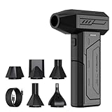
- Powerful Turbo Fan:CAGIWIRU Electric Air Duster have reached speed up to 130000RPM,Can efficient remove dust and debris.With LED light and Three Adjustable Speed to meet with different cleaning tasks.
- With Attached USB C Fasting Charging cable.Charing 3 hours,Enjoy up to 240 minutes of use on the lowest setting, For third speed can use for 25mins.with four charging options to meet with your needs.
- Wide Application:Upgraded attached 5 different nozzles,making it suitable for a variety of scenes, such as car,pet, pc, keyboards, and other electronic devices. It also serves for office and home clean duster.
- Handy Design & Portable:Cordless air duster electric nozzle is Light weight and small size, design and comfortable to hold and space saving, convenient to carry around. You can put it in your room or inside the car without taking up space.
- Warranty & Support: Our Electric air duster comes with 5 years warranty and 24/7 customer service. During this period, if you have any questions,pls kindly feel free to contact us.
A practical starting point is therefore a decision process, not a magic number: use a platform-appropriate default for each text role, make the text responsive to user preferences, and validate the complete screen at larger settings. A default is the size people first encounter; resizing support is what lets them choose a more comfortable size. These solve different problems, and a good default cannot replace a working enlargement path.
When comparing two candidate sizes, put them in the real interface and judge more than the apparent height of the letters. Check whether readers can distinguish the words at the intended viewing distance, whether the size suits the text’s role, whether weight and contrast remain adequate, and whether the layout still works after enlargement. Raw numbers alone cannot settle the comparison, especially across web, iOS, and Android units.
Does WCAG specify a minimum font size?
No. WCAG 2.1 Success Criterion 1.4.4 specifies a resizing capability, not a minimum default font size. It says: “Except for captions and images of text, text can be resized without assistive technology up to 200 percent without loss of content or functionality.” See the W3C explanation of Resize Text.
Recommended Free Tools
For a website, this means the relevant question is not simply whether body text is a particular number of CSS pixels. A page that starts with a chosen size can still fail readers if zooming or text enlargement hides content, makes controls unreachable, or breaks a task. Conversely, meeting the resize criterion does not tell you which default size is most comfortable for your audience. Choose that default for the content and design, then verify the page remains usable when enlarged.
The 200% figure is a test target for text resizing, not a claim that every reader will want that exact size, nor an instruction to set the default text to twice its original size. The criterion includes stated exceptions for captions and images of text. For ordinary text, the core issue is whether people can enlarge it without losing content or functionality. A page that technically enlarges text but hides a submit button or cuts off an important instruction has not preserved the task.
Do not confuse that requirement with a frequently repeated “16px WCAG minimum.” WCAG 2.1 SC 1.4.4 does not say body text must begin at 16 CSS pixels. A nominal size is only one part of the design, and the criterion is about whether users can resize text successfully. If choosing a default, test it with your actual typeface, content, and layout rather than treating a number as proof of accessibility.
Rank #2

- Screen Cleaner is Your Screen’s New Bestfriend! - EVEO is proud to present a screen cleaner that’s perfectly suited for your TV. Meet your new screen cleaner, computer screen cleaner, laptop cleaner, iPad cleaner, Macbook,tv cleaner or any other electronic device. Our screen cleaner spray and wipe along with the included plush microfiber cloth, easily removes dust, fingerprints & other smudges on the screen’s surface. Clean effectively for a streak-free screen
- Gentle on your Screens - Our screen cleaner spray and wipes is compatible to be used even for the most sensitive LCD, LED, CRT, and OLED screens in proper use. Be at ease knowing that this product is compatible with all the major brands: LG, SONY, Samsung, Sharp, iPad, iPhone, Android screens, Kindle, PC monitors - we’ve got you covered! Can be used as LCD screen cleaner, tv cleaner, smart tv screen cleaner, and more
- Premium Super Soft Plush Microfiber Cloth - Included in this efficient screen cleaning kit. This screen cleaner spray and wipe has our signature plush microfiber cloth specially designed to comply with screens and monitors and leave them streak-free. Has been shown to effectively absorbs stubborn stains, zero streaks, and no fiber shedding. Always use this together with our screen cleaner for the best results
- Easy-to-Use Screen Cleaner Kit + microfiber cleaning cloth - The EVEO Screen Cleaning Kit will easily be your new favorite tool when it comes to taking care of the things you love most, quick and easy solution for a streak-free screen. Simply screw on the sprayer gun on the screen cleaner bottle. Spray the cleaning liquid onto the microfiber cloth, then wipe the screen until desired cleanliness & shine is achieved.
- Quality Screen Care Kit Worth Purchasing - Enjoy a convenient Screen Cleaner anytime, anywhere you need it. Your satisfaction is our top priority. We stand behind the quality of our products and that’s why, you shouldn’t be worrying at all. We manufacture the Best Screen Cleaner. and can be used for laptop cleaning kit, laptop screen cleaner, tv screen cleaner for smart tv. MacBook screen cleaner, monitor cleaner or screen cleaner spray for electronic devices with microfiber cleaning cloth
WCAG also has a separate text-spacing criterion. Its guidance describes tolerating user overrides that include line height of at least 1.5 times the font size. That is an override-tolerance example, not a rule that every author must set the default line height to exactly that value. The distinction matters: text should remain usable when readers adjust spacing, even if your initial design uses different spacing. See W3C’s explanation of Text Spacing.
Platform approaches: web, iPhone, and Android
CSS pixels, iOS points, and Android scale-independent pixels (sp) are platform-specific units. Their numeric values should not be compared as if they were interchangeable measurements of how large text will look. The practical comparison is whether text responds to user settings and whether the layout continues to work.
| Where you are designing | Use this approach | What to verify |
|---|---|---|
| Mobile website | Use responsive text and preserve browser text resizing or zoom; do not treat a single CSS size as proof of accessibility. | Text can be enlarged to 200% without losing content or functionality, as required by WCAG 2.1 SC 1.4.4. |
| iOS or iPadOS app | Use semantic system text styles and Dynamic Type-compatible scaling instead of fixed-size text where possible. | Text follows the user’s content-size setting and remains legible and operable at enlarged accessibility sizes. |
| Android app | Define text in scale-independent pixels (sp) so it responds to the user’s font-size setting. | At the largest font setting, text remains displayed in portrait and landscape where available, without clipping or obscuring other content. |
These approaches are alternatives matched to the platform, not competing values on one shared scale. A web developer should check browser resizing and zoom; an iOS developer should use the system’s semantic text styles and Dynamic Type behavior; an Android developer should use sp so system text-size preferences affect the interface. For all three, the comparison ends with the same practical question: can people read and complete the task when text is larger?
Mobile websites
For web content, select a readable default within a responsive type scale, then test the experience with browser zoom and text enlargement. WCAG’s 200% benchmark applies to the ability to resize text without losing content or functionality; it is not a recommended default size. Check pages with long paragraphs, navigation, dialogs, forms, and error messages, not just a simple article page.
On a page, test the pieces that tend to have different layout constraints: a paragraph wrapping over several lines, a compact navigation area, a form label beside or above its field, a dialog with actions, and an error message that may be longer than its original placeholder. Enlargement should not make readers lose access to the content or the controls needed to act on it. If a design depends on a fixed line break or fixed-height box, see whether it still makes sense when words wrap onto extra lines.
The Tool Desk
Outbyte Driver Updater FREEScan for outdated or missing drivers - takes under a minuteDriver Scan →Outbyte PC Repair FREERepair Windows errors before they cause bigger problemsFix Now →Do not assume a single CSS pixel value settles the question. The cited WCAG criterion is about resize capability and preserving function, not a prescribed initial size. Choose a scale that fits the site’s content hierarchy and then test with enlargement. If a paragraph is comfortable but a button label becomes clipped, the fix may be the button’s space and wrapping behavior rather than shrinking the site’s text across the board.
Rank #3

- 【Large size】:Measuring 800 x 300 mm/ 31. 5×12 inches, which is wider and taller than others. Large mouse pad can perfectly fit your keyboard and mouse of any size, and there is also ample space for peripherals such as phones, tablets, etc.
- 【LED backlight mouse pad】:Blade Hawks RGB mouse pad provides 7 static modes and 7 dynamic modes will give you the options you are looking for. Power-off memory function remembers the last lighting mode you selected. The super glow fiber Chroma will give you a colorful gaming setup that you want.
- 【Anti-slip rubber base】:Made from Natural rubber, this gaming mousepad will firmly grip your desktop, allowing you to enjoy the ultimate precision in the games you are most passionate about. It also comes with a texture that enhances this ability even further.
- 【Smooth and waterproof surface】: Micro-textured cloth surface, for extremely precise mouse control and a smooth movement. When liquid splashes on the gaming mouse pad, it forms water droplets and slides down. Will not delay your work or gameplay.
- 【Plug and play】: This mouse and keyboard pad is powered by USB, plug and play, no driver required. One button control light modes. Press one time to change the lighting mode, press twice to change the brightness, press and hold about 3 seconds turn ON/OFF.
iOS and iPadOS apps
Apple’s Accessibility Human Interface Guidelines list 17 pt as the default and 11 pt as the minimum for custom type sizes on iOS and iPadOS. These are Apple’s platform-specific recommendations for custom type sizes, not a universal minimum for all phones, content, or users. Apple recommends supporting larger text, ideally at least 200%; its guidance gives watchOS a 140% exception. See Apple’s Accessibility Human Interface Guidelines.
Use those Apple values in their stated context: they describe guidance for custom type sizes on iOS and iPadOS. They do not mean every label, caption, or heading should be 17 pt, and they do not establish a minimum for websites or Android. Text has different roles, and a platform recommendation still needs to be checked against the actual font, contrast, layout, and content.
For UIKit apps, Apple recommends system text styles and automatic font adjustment so text follows the user’s chosen content-size setting. The implementation guidance is in Scaling Fonts Automatically. If a design needs custom typography, preserve scaling behavior rather than assuming a fixed point size will remain appropriate for every reader.
In practice, check the whole screen after Dynamic Type changes the font size. A text view that scales while its parent remains fixed in height can still truncate content; a title that grows may need more vertical room; and controls may need to move or wrap. The goal is not simply to make glyphs larger, but to preserve the user’s ability to understand the screen and reach its actions.
Android apps
Google advises developers to define text sizes in scale-independent pixels (sp), which respond to the user’s text-size setting. Fixed dimensions can clip or obscure text as it grows. Google also advises checking that all text is displayed at the largest font setting, in portrait and landscape where available. See Android Accessibility Help: Text scaling.
Use sp for text instead of a fixed dimension so the person’s setting can scale it. Then inspect the app at the largest font setting, not only at the default or one intermediate size. Check both orientations where available because the available width and height change, which can affect wrapping, the amount of content visible, and whether controls remain on screen. Flexible layouts and natural wrapping help avoid clipping as the text grows.
Rank #4

- 【Softer and More Comfortable】Vaydeer wrist rest has unique diamond pattern, which is the combination of softness and aesthetics. The materials of wrist rest are improved into higher quality memory foam and covered with silky smooth lycra. The computer wrist rest makes you as comfortable and cushiony as like rest your wrists on clouds.
- 【Ergonomic Wrist Saver】The wrist rests for keyboard and mouse comes with a 17.32×3.15×0.83 inch keyboard wrist pad and a 5.94×3.15×0.83 inch mouse wrist support. Based on ergonomic design, the unique concave shape is the perfect fit for your wrist joints. The wrist rest pad fits most computer keyboards and laptops, improve hand and wrist posture, release your wrist and arm stress.
- 【Non-Slip Rubber Bottom】Featuring an anti-skid silicone base on the bottom, this wrist keyboard support stays firmly in place on your desk, preventing the padding from sliding around, ensuring stable and consistent wrist support during extended computer sessions.
- 【Better Experience & Pain Relief】Our keyboard arm rest is beneficial to alleviate the soreness caused by direct contact and friction between your arm and a hard desk surface, reducing the risk of wrist fatigue or carpal tunnel. The soft texture of memory foam can evenly distribute the pressure around your wrists and provide good support with just enough give.
- 【Helpful in Multiple Scenarios】Whether you're working, studying, writing, typing, gaming, this keyboard and mouse rest combo is an essential accessory to add comfort and support to your hands and wrists. It’s also a great gift for men, women, family, friend, coworker, gamer, teacher, etc.
Do not treat the largest setting as a cosmetic preview. Look for any words cut off by a container, labels that disappear behind icons, text that covers another control, and important content that is no longer reachable. If the layout breaks, adjust its constraints and structure rather than defeating the user’s setting by fixing text at a smaller size.
How to choose and validate a default size
- Identify the text’s role. Separate body copy, labels, controls, captions, and headings. Prioritize the text readers need to understand or act; do not force every element into one size. A headline can establish hierarchy, while a field label needs to remain tied clearly to its field and an action label needs to stay legible on the control.
- Use the platform’s scaling model. On the web, use responsive text that remains resizeable. In iOS and iPadOS apps, prefer semantic system text styles and automatic adjustment. In Android apps, use sp rather than fixed dimensions for text. Avoid comparing a CSS pixel count, a point count, and an sp count as if the same number necessarily appears equally large.
- Preview representative content. Test realistic paragraphs, long words, numbers, links, button labels, and the languages and scripts your product supports. Inspect the actual font weight and contrast on the target screen rather than judging only a design mockup. A short sample may not expose wrapping problems that appear in real instructions or an error message.
- Enlarge text to the applicable target. For web content, test enlargement through 200% against WCAG 2.1 SC 1.4.4. For native apps, test the enlarged accessibility settings supported by the platform; on Android, include the largest font setting Google calls out. Confirm both the text and the action that follows from it remain available.
- Check narrow and rotated layouts. Test narrow devices and, where the app supports it, both portrait and landscape. Watch for clipped lines, overlapping elements, hidden controls, truncated important information, and unintended horizontal scrolling. Long headings and button labels can reveal problems that a brief placeholder conceals.
- Adjust the layout before reducing type. Let text wrap, add vertical space, reposition controls, or simplify the screen. If a specific element must remain compact, test that choice against the importance of the information and the user’s ability to enlarge it. Do not solve a layout constraint by silently removing the user’s scaling option.
- Repeat with spacing changes. Check that user-adjusted line, paragraph, letter, and word spacing does not break the layout. W3C’s text-spacing guidance includes an override example with line height at least 1.5 times the font size; treat it as a resilience check, not a required default. Look for words or controls colliding when extra spacing is applied.
- Review the task from beginning to end. Follow a reader from opening the screen through understanding its content, finding a control, completing the action, and seeing any confirmation or error message. Enlargement must not preserve the paragraph but make the next step impossible to find.
When comparing candidate defaults, record the platform and unit, whether the size follows user settings, and what happens to representative content at larger settings. Then compare legibility at the intended viewing distance and the integrity of the layout. This gives a meaningful basis for choosing between sizes without suggesting that a particular number is universally right.
Independent reader supportYour contribution helps us test, update, and keep practical guides available for everyone.Why weight, contrast, and spacing change the result
Two typefaces set to the same nominal size can have different apparent sizes, character shapes, and spacing. Check the typeface with real content and at the sizes users will encounter. Avoid using a font size alone as the readability test.
Apple’s guidance notes, “Thicker weights are easier to read for smaller font sizes.” That does not mean every small label should be bold: heavier text can change hierarchy and visual density. Evaluate weight alongside the actual typeface and background. Apple’s contrast guidance specifies 4.5:1 for text up to 17 pt and 3:1 for 18 pt text or bold text. Those figures are Apple’s stated guidance and point-size context, not a replacement for testing enlarged text. Details appear in Apple’s Accessibility Human Interface Guidelines.
Keep the contrast figures in the context Apple gives them. They are guidance tied to point sizes and weight, not a universal shortcut for choosing a font size. Higher contrast or a heavier weight may help distinguish text, but neither gives users the ability to enlarge it, and neither prevents a clipped line. Readability checks work together: resize support, contrast, suitable weight, spacing, and flexible layout address different parts of the experience.
Free tools Windows power users keep installed
One-click scans. No signup required.
Line spacing and wrapping affect how easily readers can track text, especially after enlargement. A layout that looks balanced at its default size may become crowded with larger letters or user-adjusted spacing. Give text room to expand; avoid fixed-height containers that cut off descenders or later lines, and do not depend on a single line break to preserve meaning.
Best Value

- 【No Drill Mounted】Cable management tray can be assembled in as little as 3 minutes or less-simply. Side clips easily clampe the edge of desk, pass through the holes on the sides, and secure excess cables with baskets. Desk cable management supports inward or outward installation to meet your needs in different scenarios, and provides you with great convenience when collecting and organizing wires.
- 【Rubber Pad Protects Desk】Wire organizer under desk built-in soft rubber pads on the clamp protect your desk from scratches, so you will not damage your furniture or office.
- 【Sturdy and Beautiful】Cord management under desk is made of high-quality carbon steel and holds about 15 lbs. The wire basket has 2 holes on each side of the tray to enable your cables to pass freely. Cable baskets are suitable for desk thickness use from 0.4" to 2.4".
- 【Space Saving & Keep Organized】Desk cable management tray holds all your power cords, outlet strips, USB hubs and computer transformers hidden from your feet, and the data cables will not enter the vacuum cleaner to keep your desk clean and tidy. Desk wire organizer is also suitable for use in the kitchen and outdoors.
- 【Reduce Safety Risks】Cable tray under desk keeps all plugs away from your kids, no more worry about tripping. Using 2 holes wire tray saves extra space, helps you easily cabling and wire protection. The mesh design is not easy to accumulate dust, but avoids safety accidents caused by messy wires.
Spacing tolerance deserves a specific test because readers may change spacing themselves. W3C’s example includes line height at least 1.5 times the font size as part of the overrides a design should tolerate. That is not a mandate to use that line height as the default everywhere. Instead, verify that added line height and other spacing changes do not make text overlap, hide content, or make controls unusable.
How to check that larger text does not break your app
Test actual screens rather than only checking a font setting in isolation. A useful review follows a reader through the interface: opening a screen, understanding its content, reaching a control, completing the task, and seeing any validation or error message.
- Content: Are full sentences and essential labels visible? Do words wrap naturally, and can users reach any text that moves below the fold? Check that the end of a longer paragraph is not clipped inside a container.
- Controls: Can users still identify and activate buttons, tabs, menus, and form fields? Is a control label separated clearly from nearby text? Make sure enlarging a label does not obscure the control or push its actionable area out of reach.
- Structure: Do dialogs, cards, menus, and navigation accommodate added lines? Do containers expand rather than crop text? If a card grows taller, check whether its next action remains easy to locate.
- Orientation and width: Does the layout work at the narrowest supported width and in both orientations where applicable? A layout can behave differently when a larger font meets a short, wide screen or a narrow portrait view.
- Spacing and contrast: Does the screen remain readable when spacing is increased? Is text distinguishable from its background at the chosen size and weight? These checks support legibility but do not substitute for text resizing.
- Task completion: Can a reader still submit a form, dismiss a dialog, or understand an error and correct it? Check the resulting confirmation or next screen, not only the first view.
When a test fails, fix the specific constraint: remove a fixed height, allow wrapping, increase a container’s flexibility, or reorganize the screen. If enlarging text causes horizontal scrolling or hides a required action, the nominal default size is not the only issue; the layout needs to tolerate the reader’s setting. Retest the same path after making the change, since a fix to one screen can alter the location of controls or content elsewhere in the flow.
Quick wins for a faster PC:
Fix the driver behind crashes, sound loss and screen glitchesFind Drivers →Clear out junk files and repair common Windows errorsFree Scan →Scan for outdated or missing drivers - takes under a minuteDriver Scan →Common mistakes to avoid
- Calling one size the universal minimum. The cited web criterion establishes resizing support, while Apple and Google describe platform-specific mechanisms and recommendations. None supplies one minimum that applies across all devices and readers.
- Treating 16 CSS pixels as a WCAG rule. WCAG 2.1 SC 1.4.4 does not set a universal body-text size; it addresses resizing without loss of content or functionality.
- Using fixed native-app text dimensions. Android text should use sp to respond to system scaling, and iOS/iPadOS interfaces should make use of Dynamic Type-compatible text behavior.
- Testing only the default setting. A layout can appear flawless at its initial size and still truncate instructions or controls when a reader enlarges text.
- Assuming contrast or bold weight solves small text. Weight and contrast contribute to legibility but do not replace resizing support or a layout that can adapt.
- Comparing units as if they were equivalent. A point, a CSS pixel, and an Android sp value belong to different platform systems. Compare their behavior and resulting layouts, not just their numerals.
- Checking only a short sample. A one-word label can fit while a realistic sentence, long word, number, or translated string wraps or collides with nearby elements. Test representative content and supported scripts.
- Locking text into a fixed-height box. Larger type and spacing may need additional lines. A box that crops extra lines can hide meaning even when the text size itself scales correctly.
- Reducing text before reconsidering the layout. If a screen becomes crowded, first consider wrapping, adding space, moving controls, or simplifying nonessential content. Preserving the user’s scaling preference is part of the solution.
Frequently Asked Questions
What is the minimum readable font size on a phone?
There is no universal minimum established by the cited guidance. Apple lists 17 pt as the default and 11 pt as the minimum for custom type sizes on iOS and iPadOS, but those are platform-specific recommendations. WCAG 2.1 SC 1.4.4 requires web text to be resizable up to 200% without loss of content or functionality; it does not prescribe a minimum default size.
How do I make text larger on iPhone or Android?
On iPhone or iPad, use Dynamic Type-compatible system text styles and automatic font adjustment so text can follow the user’s content-size setting. On Android, define text in scale-independent pixels (sp) so it responds to the system’s font-size setting. In both cases, test the interface after enlargement, not just the font setting.
How can I check that larger text does not break my app?
Test actual screens at enlarged settings and follow a complete task. Check that sentences and labels are not clipped, controls remain visible and usable, containers can grow, and layouts work at narrow widths and in portrait and landscape where applicable. On Android, Google specifically advises checking the largest font setting. Allow wrapping and flexible layouts rather than fixing text at a smaller size.
Is 16px the WCAG minimum for body text?
No. WCAG 2.1 Success Criterion 1.4.4 does not prescribe a universal minimum body-text size. It requires text resizing up to 200% without loss of content or functionality, with stated exceptions for captions and images of text.
Should I use the same font size on a website, iPhone app, and Android app?
Do not treat their unit values as interchangeable. Use responsive web text and verify browser resizing or zoom, use semantic system styles and Dynamic Type on iOS or iPadOS, and use sp on Android. Choose defaults for each platform and text role, then compare how legible the text is and whether the layout survives user enlargement.
The Bottom Line
Choose a comfortable default for the text’s role and platform, but do not rely on a number alone. Support the platform’s resizing behavior—200% web enlargement under WCAG 2.1 SC 1.4.4, Dynamic Type on iOS/iPadOS, and sp-based scaling on Android—and test real screens at larger settings. If text clips or controls disappear, make the layout more flexible before shrinking the type.
Quick Recap
Product prices and availability are accurate as of the date/time indicated and are subject to change. Any price and availability information displayed on Amazon at the time of purchase will apply.

