
iTechGuides is reader-supported. When you buy through links on our site, we may earn an affiliate commission. As an Amazon Associate I earn from qualifying purchases. Learn more
For a production-ready React color picker, keep the selected value in application state, provide a labeled text field as well as visual controls, and treat image sampling and the browser eyedropper as optional enhancements. If users can edit gradients or OKLCH values, store that richer structure instead of flattening it into a hex string.
How do I add a color picker to a React form?
Make the color a controlled form value: the picker reports changes, while the parent component owns the current value, reset behavior, validation, persistence, and any preview. PrimeReact’s ColorPicker documentation demonstrates the basic value and onChange pattern. Its newer InputColor documentation describes a compositional approach in which separate components provide the color area, sliders, swatches, inputs, transparency display, and eyedropper.
Choose what the form actually stores before building the interface. A simple setting might need one CSS color string. A design tool may need a structured color value, including its color space and alpha, or a structured gradient with multiple stops. Treat the picker’s display as an editor for that data, not as the data model itself.
Quick wins for a faster PC:
Clear out junk files and repair common Windows errorsFree Scan →Scan for outdated or missing drivers - takes under a minuteDriver Scan →Repair Windows errors before they cause bigger problemsFix Now →Keep text entry in the same state flow
Pair the visual picker with a labeled text field that lets people inspect or enter the value directly. Decide which formats the field accepts and which format the application persists. Validate edits and give textual feedback associated with the field. While someone is typing an incomplete value, preserve that draft rather than replacing it immediately with the last valid color; otherwise ordinary editing can feel like data loss.
#1 Best Overall
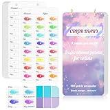
- 【Note】Compatible with different types of pens. Multiple layers using water-based pens may result in minor surface pilling.
- 【Durable & Practical Design】This color diary features a premium 300 gsm white card cover with a purple watercolor design and a matching solid purple back cover. The color swatch notebook measures 3.5×7 inches, with two top pre-punched holes and 1-inch gold metal rings for easy page turning, secure storage, and long-lasting use.
- 【Organize Up to 480 Colors】Each color chart template includes 20 single-sided pages, with 24 swatch boxes per page and space for self-assigned numbering, allowing you to record and display up to 480 unique colors. Perfect as a color chart book or color swatches book, it helps artists keep paint samples, mixing notes, and palettes in order. Each swatch box also includes space to note the color brand and type, ensuring every hue is easy to find, classify, and reference.
- 【Premium 300 GSM Paper】Crafted with thick 300g card stock, this swatch card resists bleed-through and warping. Ideal for watercolor, gouache, colored pencils, markers, or pastels, making it a versatile tool for students and professionals. Each outline provides a smooth surface for accurate pigment testing.
- 【Portable & Flexible Use】Compact and easy to carry, this colors swatch book doubles as a creative color swatch charts logbook wherever inspiration strikes. The removable pages make it convenient to expand or rearrange, turning your color chart card collection into a personalized swatch reference for painting, design, or travel.
When connecting the control to a form library, make sure the library remains the owner of the submitted value. Test that changing the picker updates the form, reset restores the intended value, and validation errors are announced and visible. Do not assume that a component preserves every CSS feature just because it accepts a string: test parsing and serialization for alpha, modern space-separated syntax, and any out-of-gamut colors your product supports.
Which React color-picker approach should I choose?
These options document different integration styles and feature sets; the descriptions are not independent audits of accessibility, performance, or maintenance. The current release details, API stability, bundle impact, and license are not stated in the cited component pages summarized here, so verify them for the exact package version you plan to ship.
| Option | What its documentation describes | Important qualification |
|---|---|---|
| PrimeReact ColorPicker | Controlled value and change handling; popup and inline presentation; hex, RGB, and HSB value formats. | PrimeReact’s ColorPicker documentation says the component is currently not compatible with screen readers. Its page describes text-field support as planned, not as an available feature. |
| PrimeReact InputColor | An unstyled compound component with a two-dimensional area, channel sliders, swatches, inputs, transparency grid, formats including HSBA, HSLA, RGBA, and OKLCHA, and native EyeDropper integration. | These are documented features, not independent confirmation of assistive-technology behavior, performance, or release status. |
| React Aria color components | Documentation shows color state shared among color components and an eyedropper-button example that checks whether the EyeDropper API exists. | The example is an integration pattern, not a guarantee of browser availability or a complete browser-support matrix. |
| Colorshot | The project page advertises React 18 or later, solid colors, linear, radial, conic, and repeating gradients, CSS color strings, OKLCH, and accessibility features. | These are maintainer statements. The project page does not establish an independent accessibility audit, current release details, or comparative performance. |
Choose against the behavior your product needs rather than a feature-count list. Check controlled form integration, invalid and partial text input, supported output formats, keyboard and screen-reader interaction, image sampling, eyedropper fallback and cancellation, gradient types and stops, color-space handling, and package constraints. The sources described here do not provide an independent head-to-head test or benchmark, so they do not establish a universal winner.
Recommended Free Tools
Rank #2
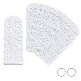
- Blank Color Swatch--You will receive 60 sheet blank sheets (dimensions: 16x5.5cmx0.3mm/6.3x2.17 inchx0.3mm), enabling creation of up to 720 unique color swatches. This meets the core needs of color enthusiasts and artists for recording multiple color references and exploring color mixing, providing ample capacity for daily creative work
- Paper Material--Crafted from paper with a smooth, refined surface, it applies only to acrylic marker tools. Single-sided thickened design eliminates the pain point of pigment bleeding through to the reverse side at its source. Colors apply smoothly without bleeding, and deliver clear, consistent color results
- Pre-punched Design--Pre-punched floral center holes allow direct coloring within petal areas, serving as both precise color markers and elegant decorative elements. The hole design also facilitates quick color comparison and matching, enhancing color accuracy and doubling creative efficiency
- Loose-leaf Storage--Includes 2pcs binding rings. Pre-punched design allows easy assembly into a loose-leaf color swatch book. Organize freely by markers series or shade intensity, for efficient searching, browsing, and adding swatches—say goodbye to messy color charts
- Multi-Scene Adaptability--Designed for color enthusiasts, professional artists, and crafters, it serves as a versatile tool for recording color chart, preserving color schemes, and referencing palette combinations for acrylic markers
How do I pick a color from an image in React?
Image sampling is different from selecting a color anywhere on the user’s screen. A typical interface previews an uploaded or available image and lets a user select a point on it. The pixel the pointer appears to indicate may not have the same coordinates as the source image: previews can be scaled, cropped, or letterboxed, and device pixel ratio can also matter.
Design the interaction so users can tell which image they are sampling and can still enter a value manually. Before implementing pixel reads, validate the coordinate mapping and image-access rules against current browser documentation and your image sources. The cited material does not establish a complete canvas or file-reading implementation, including cross-origin behavior, so it is not a sound basis for copying a pixel-sampling code recipe.
Can a React color picker use the browser eyedropper?
Yes, as an enhancement where the browser exposes the EyeDropper API. Keep a normal picker and editable text value available whether or not the API exists. React Aria’s documented example checks for API presence before offering the action; it does not promise availability in every browser.
Rank #3

- Compact and Portable Design: Suitable size, these cards can accommodate 54 reference colors for each season while being convenient for handheld use. Each card has perforations and come with a bead chains, making it easy to put in a pocket or hang on a keychain
- Seasonal Color Theory Based: These cards are designed based on seasonal color theory, aiming to help you choose the most pleasing color tone for your wardrobe.Each card contains the popular main colors of each season
- Easy Color Matching: Take an original photo of your face under natural light, and then place a color chart on the photo. By comparing various colors, it is easy to find the color that suits you best, making your fashion choices more personalized and flattering
- Fun and Engaging Experience: Share this process with friends and get their opinions to confirm the best color choices. This interactive approach makes the experience fun and engaging, turning color selection into a social activity
- Annual Updates: A set of 6 cards, including 12 major seasonal colors, is updated annually to reflect the latest trendy colors. Stay ahead of the fashion curve and ensure your wardrobe always looks fresh and stylish
Present screen sampling as a user-initiated action, and handle both an unavailable API and a user canceling or otherwise failing to complete the action. Give each case a useful fallback, such as returning to the picker or text field, instead of leaving the form in an ambiguous state. The cited sources do not establish a complete 2026 compatibility matrix or every API security and user-activation rule, so avoid precise support claims unless verified for your target browsers.
Do not promise that screen sampling captures a display’s full wide-gamut color. Chrome DevTools’ eyedropper documentation says its picker samples in sRGB and clips colors outside sRGB to the nearest value. That describes the DevTools picker, not necessarily every browser implementation, but it illustrates why sampling and color-space fidelity should not be treated as interchangeable.
How do I support OKLCH and gradients in a React color picker?
First decide whether the product is editing a single color or a gradient. A gradient needs more than a list of color strings: its state may need the gradient kind, direction or geometry, ordered stops, stop positions, and interpolation choice. Serialize that structured state to CSS at a boundary, and test parse-edit-serialize round trips so an edit does not silently discard authored information.
Rank #4

- 【40 Blank Watercolor Swatch Cards — Refill for Your Binder】40 blank-format watercolor swatch cards (7" x 3.5" each) with boxes and center-cut holes for precise color matching. Fits any standard 6-ring A6 color swatch binder.
- 【Premium 300gsm Watercolor Paper】Thick 300gsm double-sided paper (single-side printing) handles watercolor, gouache, acrylic inks, and colored pencils—no bleeding or buckling.
- 【6-Hole Punched for Easy Rearrangement】Pre-punched with 6 holes, compatible with A6 6-ring binders. Easily reorder pages by brand, palette, or project in your color diary.
- 【Box-with-Center-Hole Layout for Quick Matching】Place paint samples directly over the center-cut holes for instant color matching. Build a clean, consistent color chart card library.
- 【Versatile Refill for All Artists】Perfect for beginners or pros. Use in studio, classroom, or plein-air. Expand your painters color diary swatch card collection anytime.
Interpolation space changes the colors produced between gradient stops. W3C CSS Images Level 4 documents gradient interpolation choices that include Oklch. The W3C CSS Color Module Level 4 Candidate Recommendation Draft dated 26 September 2026 covers CSS color values, interpolation, and gamut mapping. These standards describe CSS behavior; a draft is not proof that every feature is implemented consistently in every browser.
When OKLCH or another modern color space is in scope, test how your chosen component and application represent, display, edit, and export those values. Avoid converting automatically to hex if that would discard color-space or gradient information. Decide how the application handles values outside the target display gamut, and test the serialized result in the browsers and display conditions that matter to your users. Oklch can be a useful gradient interpolation choice when seeking a more chroma-preserving transition, but it does not guarantee that every resulting color fits a target gamut.
What accessibility checks should a production color picker pass?
Accessibility depends on the actual controls and interaction, not on the label “color picker.” Require a programmatically associated label, keyboard operation for sliders, swatches, text input, and popovers, visible focus, and a way to hear or inspect the current value. Do not make users infer a value or an important state from a visual gradient alone.
Best Value

- Notice: This color card is compatible with various types of pens. Multiple layers of water-based pen coloring may cause slight surface pilling. Thank you for your understanding.
- 1.Portable Size:With 7.48x3.54 inch size, this painters color diary is lightweight and easy to carry in bags, handbags and art storage bags for outdoor painting, studio creation. The loose-leaf design of color swatches color analysis combines pink cover, the comprehensive practical performance of color palette book makes the color card set become an essential professional tool for all kinds of color research.
- 2.300-Color Classification:This painters color diary allows users to store 15 color swatches on each single page, and the complete 20 sheets inner page design supports holding up to 300 colors in total for unified color management. Every inner page of the color palette grid comes with pre-punched 3mm holes, which greatly assists you in accurate color comparison, color matching and visual color analysis work.
- 3.Loose-leaf Design:Color palette book is equipped with 2 pieces of 0.98 inch inner diameter round golden metal loose-leaf rings, and these metal rings own sturdy structure and smooth opening and closing function. The loose-leaf rings can stably fix the inner pages together, realizes flexible repeated use for long-term color recording.
- 4.High-Quality Material:Our color chart cards are made of premium thick paper with durable texture. This high-quality paper material resists ink seepage and bending deformation perfectly in daily use, keeping every color display neat and clear without messy marks.
- Test the full workflow with keyboard-only navigation, including opening and closing popovers and moving through slider values.
- Check the picker and surrounding content for visible focus and sufficient contrast.
- Associate validation messages with their fields and state errors or selection with text or another cue as well as color.
- Test with the screen-reader and browser combinations used by your audience; do not infer support from a component’s feature list.
The W3C CSS Color Module Level 4, §3.1, dated 26 September 2026, states: “Although colors can add significant information to documents and make them more readable, color by itself should not be the sole means to convey important information.” PrimeReact’s ColorPicker documentation also currently discloses a screen-reader compatibility limitation. Together, these are reasons to verify the interaction in the target environment rather than assume a component label or claim guarantees accessible behavior.
What should you verify before shipping?
- Confirm the chosen package’s current release, React compatibility, API, license, and maintenance status.
- Test controlled changes, reset, validation, persistence, and text entry in the real form.
- Confirm that accepted and exported values retain required alpha, color-space, and gradient information.
- Exercise image coordinate mapping and image-access behavior with the actual image sources you support.
- Test eyedropper availability, cancellation, and fallback paths in target browsers.
- Check keyboard, focus, screen-reader, and non-color status communication with the actual component.
- For gradients, test stop editing, interpolation, serialization, and out-of-gamut rendering in target browsers.
There is no evidence in the cited component and standards material for a performance or accessibility winner among these approaches. Make the decision from tested fit to your required controls, data model, and supported environments.
Quick Recap
Product prices and availability are accurate as of the date/time indicated and are subject to change. Any price and availability information displayed on Amazon at the time of purchase will apply.

