
Free tools Windows power users keep installed
One-click scans. No signup required.
iTechGuides is reader-supported. When you buy through links on our site, we may earn an affiliate commission. As an Amazon Associate I earn from qualifying purchases. Learn more
A readable billboard is built for a brief glance, changing light, movement, weather, and a wide range of visual abilities. Start with strong luminance contrast, a non-glare finish, conventional type, character heights based on the real viewing distance, generous spacing, and one unmistakable message. Then validate the finished sign from the approach path instead of trusting a monitor preview.
This checklist explains how to make outdoor advertising easier to read for people with low vision, color-vision differences, older eyes, and anyone viewing from a moving vehicle or an oblique angle. It also separates accessibility guidance from requirements that may apply under local sign, transportation, or advertising rules.
Why billboard readability is an accessibility issue
Road users and pedestrians rarely study a billboard. They see it for a limited interval while moving, often through glass, at an angle, and under lighting that changes from bright sun to dusk, rain, or artificial illumination. A person may correctly distinguish the letters yet still fail to understand the message before the sign disappears from view. Federal human-factors guidance identifies font, character size, contrast, symbols versus words, lighting, weather, viewing distance, and the viewer’s acuity and age as interacting factors in roadside-display legibility.
Quick wins for a faster PC:
Scan for outdated or missing drivers - takes under a minuteDriver Scan →Repair Windows errors before they cause bigger problemsFix Now →Fix the driver behind crashes, sound loss and screen glitchesFind Drivers →Accessibility therefore is not just a matter of making a file look attractive at full size. The design must preserve a clear signal when the substrate reflects light, when a lamp creates a hotspot, when rain lowers apparent contrast, and when a viewer has reduced acuity or color discrimination. The most reliable approach is to control the variables you can control and test the physical or simulated sign under realistic conditions.
#1 Best Overall
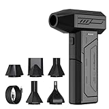
- Powerful Turbo Fan:CAGIWIRU Electric Air Duster have reached speed up to 130000RPM,Can efficient remove dust and debris.With LED light and Three Adjustable Speed to meet with different cleaning tasks.
- With Attached USB C Fasting Charging cable.Charing 3 hours,Enjoy up to 240 minutes of use on the lowest setting, For third speed can use for 25mins.with four charging options to meet with your needs.
- Wide Application: attached 5 different nozzles,making it suitable for a variety of scenes, such as car,pet, pc, keyboards, and other electronic devices. It also serves for office and home clean duster.
- Handy Design & Portable:Cordless air duster electric nozzle is Light weight and small size, design and comfortable to hold and space saving, convenient to carry around. You can put it in your room or inside the car without taking up space.
- Economical &Reusable: Built durable materials with a long-lasting battery,our CAGIWIRU air duster it's a sustainable alternative to disposable air cans.
Set contrast before choosing colors
Use a simple light-on-dark or dark-on-light relationship
Choose either light characters on a dark field or dark characters on a light field, and keep the surface non-glare. The 2010 ADA Standards state that characters and their background shall have a non-glare finish. Glossy vinyl, laminated films, wet paint, and nearby lighting can create reflections that erase otherwise adequate contrast.
The U.S. Access Board says that higher contrast improves legibility, particularly for people with low vision. Its ADAAG background guidance reports that signs are more legible for people with low vision when characters contrast with their background by at least 70 percent. That 70 percent figure is advisory evidence, not a universal numeric threshold in the ADA Standards.
Understand what the 70 percent figure does and does not mean
The ADA Standards do not specify one minimum contrast number. The Access Board explains that accurate light-reflectance measurement is difficult in the field because sign materials, surface texture, illumination, viewing angle, and weather all affect the result. Treat 70 percent luminance contrast as a strong design target, then verify the actual sign rather than assuming a color-code value predicts outdoor performance.
What’s actually slowing this PC down?
Pick the symptom - the matching free tool is one click away.
Rank #2

- Screen Cleaner is Your Screen’s New Bestfriend! - EVEO is proud to present a screen cleaner that’s perfectly suited for your TV. Meet your new screen cleaner, computer screen cleaner, laptop cleaner, iPad cleaner, Macbook,tv cleaner or any other electronic device. Our screen cleaner spray and wipe along with the included plush microfiber cloth, easily removes dust, fingerprints & other smudges on the screen’s surface. Clean effectively for a streak-free screen
- Gentle on your Screens - Our screen cleaner spray and wipes is compatible to be used even for the most sensitive LCD, LED, CRT, and OLED screens in proper use. Be at ease knowing that this product is compatible with all the major brands: LG, SONY, Samsung, Sharp, iPad, iPhone, Android screens, Kindle, PC monitors - we’ve got you covered! Can be used as LCD screen cleaner, tv cleaner, smart tv screen cleaner, and more
- Premium Super Soft Plush Microfiber Cloth - Included in this efficient screen cleaning kit. This screen cleaner spray and wipe has our signature plush microfiber cloth specially designed to comply with screens and monitors and leave them streak-free. Has been shown to effectively absorbs stubborn stains, zero streaks, and no fiber shedding. Always use this together with our screen cleaner for the best results
- Easy-to-Use Screen Cleaner Kit + microfiber cleaning cloth - The EVEO Screen Cleaning Kit will easily be your new favorite tool when it comes to taking care of the things you love most, quick and easy solution for a streak-free screen. Simply screw on the sprayer gun on the screen cleaner bottle. Spray the cleaning liquid onto the microfiber cloth, then wipe the screen until desired cleanliness & shine is achieved.
- Quality Screen Care Kit Worth Purchasing - Enjoy a convenient Screen Cleaner anytime, anywhere you need it. Your satisfaction is our top priority. We stand behind the quality of our products and that’s why, you shouldn’t be worrying at all. We manufacture the Best Screen Cleaner. and can be used for laptop cleaning kit, laptop screen cleaner, tv screen cleaner for smart tv. MacBook screen cleaner, monitor cleaner or screen cleaner spray for electronic devices with microfiber cleaning cloth
| Color relationship | Why it can work | Checks before production |
|---|---|---|
| White or yellow characters on black | Creates a pronounced light-dark separation and is listed by Accessibility Standards Canada as a highly visible outdoor example. | Check glare from white ink, lamps, and wet surfaces; confirm that yellow remains distinct under the intended lighting. |
| White characters on charcoal or dark blue | Maintains a dark field while avoiding a completely black appearance. | Check that the blue does not become too dark or lose separation at dusk and in shadow. |
| White characters on dark green or purple | Provides the low-glare, pronounced contrast recommended for outdoor signs when the hue is sufficiently dark. | Test with viewers who have color-vision differences; do not rely on hue alone. |
| Dark characters on a light, matte field | Can remain legible in daylight when the background is even and non-reflective. | Watch for backlighting, sky reflection, and washed-out ink in bright sun. |
Keep copy away from visual noise
Do not place important words directly on photographs, gradients, textures, or busy patterns. The Access Board warns that variated or textured backgrounds can reduce contrast and compromise readability. If an image is essential, put the headline and call to action on a solid, high-contrast panel with enough padding to prevent edges or details from touching the letterforms. A translucent overlay may still show texture through the type; an opaque panel is more dependable.
Control glare and uneven illumination
Contrast can fail even when the artwork appears correct. Inspect reflections from vehicle headlights, sun at low angles, floodlights, and protective films. Look for shadows cast by frames, seams, supports, or nearby objects. A non-glare finish is a baseline requirement in the 2010 ADA Standards for regulated visual characters, and it is a sensible baseline for commercial billboards as well.
Choose type that remains recognizable at a distance
Use conventional letterforms
Select a straightforward sans serif or similarly conventional face with open counters, distinct letter shapes, and consistent strokes. Avoid italic, oblique, script, highly decorative, or unusual styles. Narrow, ultra-light, condensed, and hairline treatments can disappear when viewed obliquely or when illumination is uneven. Keep capitalization purposeful: a short headline may use title case or capitals, but a whole paragraph in all capitals is harder to scan because word shapes become less distinctive.
Rank #3

- 【Large size】:Measuring 800 x 300 mm/ 31. 5×12 inches, which is wider and taller than others. Large mouse pad can perfectly fit your keyboard and mouse of any size, and there is also ample space for peripherals such as phones, tablets, etc.
- 【LED backlight mouse pad】:Blade Hawks RGB mouse pad provides 7 static modes and 7 dynamic modes will give you the options you are looking for. Power-off memory function remembers the last lighting mode you selected. The super glow fiber Chroma will give you a colorful gaming setup that you want.
- 【Anti-slip rubber base】:Made from Natural rubber, this gaming mousepad will firmly grip your desktop, allowing you to enjoy the ultimate precision in the games you are most passionate about. It also comes with a texture that enhances this ability even further.
- 【Smooth and waterproof surface】: Micro-textured cloth surface, for extremely precise mouse control and a smooth movement. When liquid splashes on the gaming mouse pad, it forms water droplets and slides down. Will not delay your work or gameplay.
- 【Plug and play】: This mouse and keyboard pad is powered by USB, plug and play, no driver required. One button control light modes. Press one time to change the lighting mode, press twice to change the brightness, press and hold about 3 seconds turn ON/OFF.
Calculate character height from the real viewing distance
Size the letters from the longest realistic approach distance and the actual path of travel, not from a desktop proof or phone preview. ADA character-height tables use the uppercase letter I as the reference character. For characters located more than 120 inches above the ground, the 2010 ADA Standards and related Access Board guidance specify a minimum of 3 inches for viewing distances below 21 feet, then add 1/8 inch for every additional foot beyond 21 feet.
Do these 3 things before closing this tab:
1Repair Windows errors before they cause bigger problems2Scan for outdated or missing drivers - takes under a minute3Clear out junk files and repair common Windows errors| Viewing distance used for the calculation | Minimum character height under the stated rule | How to read the result |
|---|---|---|
| Below 21 feet | 3 inches | Applies to characters positioned above 120 inches from the ground, within the range covered by the table. |
| 30 feet | 4 1/8 inches | 3 inches plus 9 feet beyond 21 feet, multiplied by 1/8 inch per foot. |
| 50 feet | 6 5/8 inches | 3 inches plus 29 feet beyond 21 feet, multiplied by 1/8 inch per foot. |
These calculations are a floor for the specified sign conditions, not a promise that a billboard will be readable at speed. A larger character may be necessary when the message is viewed from a side angle, when the sign is partially obstructed, when the background is bright, or when the audience includes many older viewers. Measure the longest approach at which the first critical word must be recognized, and size the entire message around that requirement.
Protect stroke clarity
Do not let outlines, drop shadows, bevels, or effects create a second edge around the letters. A subtle separation treatment can help a difficult background, but it should not produce multiple competing contours. Check small interior spaces in letters such as e, a, and s, and make sure adjacent letters do not merge when the sign is viewed from the travel lane.
Rank #4

- 【Softer and More Comfortable】Vaydeer wrist rest has unique diamond pattern, which is the combination of softness and aesthetics. The materials of wrist rest are improved into higher quality memory foam and covered with silky smooth lycra. The computer wrist rest makes you as comfortable and cushiony as like rest your wrists on clouds.
- 【Ergonomic Wrist Saver】The wrist rests for keyboard and mouse comes with a 17.32×3.15×0.83 inch keyboard wrist pad and a 5.94×3.15×0.83 inch mouse wrist support. Based on ergonomic design, the unique concave shape is the perfect fit for your wrist joints. The wrist rest pad fits most computer keyboards and laptops, improve hand and wrist posture, release your wrist and arm stress.
- 【Non-Slip Rubber Bottom】Featuring an anti-skid silicone base on the bottom, this wrist keyboard support stays firmly in place on your desk, preventing the padding from sliding around, ensuring stable and consistent wrist support during extended computer sessions.
- 【Better Experience & Pain Relief】Our keyboard arm rest is beneficial to alleviate the soreness caused by direct contact and friction between your arm and a hard desk surface, reducing the risk of wrist fatigue or carpal tunnel. The soft texture of memory foam can evenly distribute the pressure around your wrists and provide good support with just enough give.
- 【Helpful in Multiple Scenarios】Whether you're working, studying, writing, typing, gaming, this keyboard and mouse rest combo is an essential accessory to add comfort and support to your hands and wrists. It’s also a great gift for men, women, family, friend, coworker, gamer, teacher, etc.
Set spacing and hierarchy for a quick glance
Use measurable spacing targets
For visual-character signage, the U.S. Access Board’s 2022 Chapter 7 guidance recommends line spacing of 135% to 170% of character height and character spacing of 10% to 35% of character height. These ranges prevent lines from colliding and help individual letters remain distinct. Start near the more generous end when the sign will be viewed at an angle, in poor weather, or by people with low vision.
Build one reading order
Establish a dominant message before adding supporting information. The viewer should encounter the headline first, understand the offer or action second, and identify the logo or attribution last unless the brand name is itself the message. Use position, scale, weight, and whitespace to create that order instead of relying on several colors or decorative arrows.
- Give the headline the largest, clearest type and the strongest contrast.
- Keep supporting copy materially smaller only when it remains readable at the same approach distance; otherwise remove it.
- Separate headline, supporting copy, logo, and call to action with whitespace or solid panels.
- Align related elements consistently so the eye does not search across the board.
- Reserve high-salience color for one purpose, such as the call to action, and preserve sufficient luminance contrast around it.
Keep the message short enough to comprehend
There is no single federal word-count limit that guarantees billboard readability. The usable amount of copy depends on approach speed, viewing distance, font, character size, contrast, lighting, weather, symbols, and the audience’s visual acuity. A driver may decode every word yet fail to understand the sentence before reaching the next decision point.
Best Value

- 【No Drill Mounted】Cable management tray can be assembled in as little as 3 minutes or less-simply. Side clips easily clampe the edge of desk, pass through the holes on the sides, and secure excess cables with baskets. Desk cable management supports inward or outward installation to meet your needs in different scenarios, and provides you with great convenience when collecting and organizing wires.
- 【Rubber Pad Protects Desk】Wire organizer under desk built-in soft rubber pads on the clamp protect your desk from scratches, so you will not damage your furniture or office.
- 【Sturdy and Beautiful】Cord management under desk is made of high-quality carbon steel and holds about 15 lbs. The wire basket has 2 holes on each side of the tray to enable your cables to pass freely. Cable baskets are suitable for desk thickness use from 0.4" to 2.4".
- 【Space Saving & Keep Organized】Desk cable management tray holds all your power cords, outlet strips, USB hubs and computer transformers hidden from your feet, and the data cables will not enter the vacuum cleaner to keep your desk clean and tidy. Desk wire organizer is also suitable for use in the kitchen and outdoors.
- 【Reduce Safety Risks】Cable tray under desk keeps all plugs away from your kids, no more worry about tripping. Using 2 holes wire tray saves extra space, helps you easily cabling and wire protection. The mesh design is not easy to accumulate dust, but avoids safety accidents caused by messy wires.
Write the shortest wording that conveys the intended action. Remove introductory phrases, repeated claims, secondary qualifiers, and contact details that can be delivered through another channel. If a phone number, URL, or legal line is mandatory, test whether it can be recognized at the same distance as the main message; if not, redesign the information hierarchy or use a legally acceptable alternative such as a memorable short address.
Use symbols only when they are immediately familiar
A symbol can be faster than a word, but an unfamiliar icon adds interpretation time. Pair a non-obvious symbol with a concise label, and check that the symbol remains distinct for people with color-vision differences. Do not encode the only meaning in red versus green, blue versus purple, or another hue pair.
Independent reader supportYour contribution helps us test, update, and keep practical guides available for everyone.Production checklist: from artwork to installed sign
- Define the viewing task. Record the travel lane or pedestrian path, the longest realistic approach distance, expected viewing angle, vehicle speed or walking pace, and the first instant at which the key message must be understood.
- Build a high-contrast base. Select a light-on-dark or dark-on-light treatment, target pronounced luminance contrast, and remove gradients, textures, and photographic detail behind critical copy.
- Specify the finish. Choose a non-glare material or coating and document how the production substrate handles reflections, moisture, and illumination.
- Set character height. Apply the relevant ADA table using the uppercase I reference. For characters above 120 inches from the ground, use 3 inches below 21 feet, then add 1/8 inch for each additional foot beyond 21 feet.
- Choose and tune the typeface. Use conventional letterforms, check stroke weight and counters, and remove decorative effects that create competing edges.
- Set spacing and hierarchy. Keep line spacing between 135% and 170% of character height and character spacing between 10% and 35% where the visual-character guidance applies. Make one message dominant.
- Inspect the color-managed final file. Evaluate the actual output profile and proof, not only a bright monitor that may exaggerate saturation or contrast.
- View at distance and angle. Stand at the longest approach distance and in the relevant lane or path. Check whether the headline can be identified before the viewer passes the sign.
- Test changing conditions. Inspect daylight, dusk or night lighting, rain, reflections, shadows, likely obstructions, and uneven illumination. Recheck after printing or installation because substrate, retroreflective film, lighting, and weather can change perceived contrast.
- Run a comprehension review. Ask reviewers with varied visual acuity and color-vision differences to identify the message quickly. Record misread words, missed symbols, and cases where the reading order is unclear, then revise and repeat the distance test.
How to compare two billboard designs
When stakeholders disagree about two layouts, compare the factors that determine real-world performance rather than judging which mockup looks more polished. Use the same viewing distance, angle, lighting, and output material for both versions.
| Comparison axis | Questions to ask |
|---|---|
| Contrast and glare resistance | Which design preserves separation in sun, headlights, rain, and artificial lighting? Does either finish create a reflection over the headline? |
| Character height | Are the critical words large enough at the longest approach distance, or is one design shrinking type to fit extra copy? |
| Typeface and stroke clarity | Are letterforms conventional, with open counters and distinct shapes, or do effects and narrow strokes blur together? |
| Spacing | Does either layout maintain the 135%–170% line-spacing and 10%–35% character-spacing guidance where applicable? |
| Message length and comprehension | Can a viewer state the message after one glance, or does the design require reading several lines in sequence? |
| Background complexity | Is critical text on a clean field, or do images, gradients, and textures compete with it? |
| Conditions and viewing angles | Which version remains understandable in daylight, low light, weather, and oblique views? |
Troubleshoot common readability failures
| Observed problem | Likely cause | Correction |
|---|---|---|
| Letters disappear in sunlight | Insufficient luminance contrast, reflective finish, or a pale background. | Increase light-dark separation, move copy to an opaque panel, and use a non-glare finish; verify on the installed material. |
| Headline is readable but not understood | Too many words, a weak reading order, or insufficient glance time. | Remove secondary wording, enlarge the dominant message, and test comprehension rather than letter recognition alone. |
| Words blur together at an angle | Condensed or decorative type, tight tracking, thin strokes, or inadequate character height. | Use conventional letterforms, increase spacing within the 10%–35% guidance range, strengthen strokes, and retest from the lane. |
| Design works on screen but fails after installation | Substrate, film, lighting, weather, or reflections changed perceived contrast. | Inspect the final printed or displayed material under daylight, dusk, rain, and nighttime illumination; revise the production specification if necessary. |
| Some viewers confuse colors | Meaning depends on hue alone or the selected colors have weak luminance separation. | Add text or shape cues, increase luminance contrast, and have reviewers with color-vision differences identify the message. |
Know the limits of ADA guidance for commercial billboards
The visual-character provisions in the 2010 ADA Standards are written for regulated signs and built-environment elements. A commercial billboard may also be subject to local sign ordinances, transportation-agency rules, zoning limits, advertising restrictions, and permit conditions. The accessibility checklist here is a practical baseline, not a substitute for confirming the requirements that govern the specific location, structure, and jurisdiction.
Use the named standards carefully: the 2010 ADA Standards provide the non-glare requirement and character-height table; the U.S. Access Board’s 2022 Chapter 7 guidance provides the spacing ranges and explains why a single contrast minimum is not specified; its ADAAG background guidance reports the 70 percent contrast finding; and Accessibility Standards Canada gives outdoor examples of pronounced low-glare contrast that remains effective in natural and low-light conditions. Applying all of them means designing for measurable separation, physical viewing conditions, and fast comprehension rather than for a static screen image.
Quick Recap
Product prices and availability are accurate as of the date/time indicated and are subject to change. Any price and availability information displayed on Amazon at the time of purchase will apply.

