
What’s actually slowing this PC down?
Pick the symptom - the matching free tool is one click away.
iTechGuides is reader-supported. When you buy through links on our site, we may earn an affiliate commission. As an Amazon Associate I earn from qualifying purchases. Learn more
The best WordPress mobile plugin depends on what is broken. Choose WP Mobile Menu for a responsive navigation upgrade, WP Responsive Menu for a more customizable sliding menu, WPtouch for a legacy theme that is not responsive, SuperPWA for installable app-like behavior, and AMP for WP only when you have a specific AMP publishing workflow. These plugins are not interchangeable: a menu plugin changes navigation, while a PWA or AMP plugin changes how content is delivered and used.
Start with the mobile problem, not the plugin list
A phone visitor can encounter several different problems on a WordPress site. The navigation may be difficult to tap, the theme may remain desktop-sized, visitors may want an app-style shortcut, or a publishing team may need AMP output. Installing a plugin for the wrong problem can add duplicate menus, conflicting templates, broken analytics, or a second version of the same content.
| Mobile problem | Most relevant option | What it changes | When to avoid it |
|---|---|---|---|
| The theme is responsive, but its navigation is awkward on a phone | WP Mobile Menu | Adds a mobile-focused responsive menu | When the theme already has an accessible, fast mobile menu that needs no extra behavior |
| You need a highly configurable slide-out menu | WP Responsive Menu | Turns the WordPress menu into a customizable sliding responsive menu | When another menu system is already active and cannot be disabled cleanly |
| The theme is old or does not adapt to narrow screens | WPtouch | Provides a mobile-specific presentation for iPhone and Android visitors | When the current theme is already fully responsive and content parity is essential without maintaining a second presentation |
| You want visitors to install the site like an app | SuperPWA | Adds Progressive Web App behavior such as installation support and app-style launching | When the site cannot reliably serve HTTPS or you have not planned caching and offline behavior |
| You publish or support an AMP-specific delivery workflow | AMP for WP or AMP | Produces or supports AMP-formatted output | When you only want a faster mobile site; responsive design and ordinary performance work may be a better fit |
| You need a native-style off-canvas navigation pattern | ShiftNav | Provides an off-canvas responsive navigation menu | When a simpler menu would meet the need with fewer moving parts |
The WordPress.org mobile directory lists these products as separate categories of functionality. Its installation counts are useful as signs of adoption, not proof of speed, accessibility, security, or compatibility with your site.
Free tools Windows power users keep installed
One-click scans. No signup required.
Shortlist: what each leading option is best at
WP Mobile Menu: best general responsive-menu upgrade
WP Mobile Menu is the most direct choice when your site already renders correctly on small screens but its navigation does not. The directory describes it as a mobile-menu plugin and reports more than 70,000 active installations in 2026. It is appropriate for replacing a cramped desktop menu with a touch-oriented mobile navigation layer while leaving the rest of the theme intact.
#1 Best Overall

- 【Strong Adsorption】The inspiration of the silicone phone suction case comes from the adhesive force of the octopus. Each suction cup phone mount is 3.15 inches long and 2.17 inches wide, with 24 independent suction cups providing a stronger and more stable suction force, so you don't have to worry about your phone falling during use.
- 【Back of Phone Suction Grip】Remove the adhesive film on the phone suction cup and stick it on the phone case. You can then fix the phone on any smooth surface, which is very convenient. (The phone suction cup cannot be removed and reused after being attached to the phone case. It is recommended to attach it to a regular phone case, not a valuable one.)
- 【Widely Used】Our non-slip silicone phone sticky grip mount attaches to almost any flat phone case and make it compatible with common mobile phones such as iPhone and Android.You can shoot, watch videos or video calls in the kitchen, gym, dance studio, bathroom and other places.
- 【Capture the Wonderful Picture】Whether you are a TikTok creator or just like to share videos and photos, this phone suction cup can help you hands-free capture wonderful videos and photos for sharing with friends.
- 【Note】You can fix the phone suction cup on a smooth surface such as a mirror or glass. If necessary, wipe the suction cup with a damp cloth to obtain stronger suction. Before releasing your hand, make sure the phone is firmly fixed. (Not applicable to rough walls, wooden surfaces, and other uneven surfaces)
Before installing it, identify the menu location your theme currently uses and check whether the theme outputs a desktop menu and a mobile menu at the same time. A successful configuration should expose one clear navigation control at a given breakpoint, preserve keyboard access, and keep the logo, search, account links, and primary content reachable without excessive scrolling.
WP Responsive Menu: best for a configurable sliding menu
WP Responsive Menu is aimed at sites that need more control over a slide-out navigation pattern. WordPress.org describes it as a highly customizable sliding responsive menu and reports more than 30,000 active installations. Choose it when the menu’s position, animation, trigger, hierarchy, or visual treatment needs to be tuned beyond what the theme provides.
Customization is also the main risk. Every animation, overlay, icon, and nested submenu needs to remain usable with touch, a keyboard, and a screen reader. Keep the menu structure shallow where possible, give the close control a visible label, and verify that opening the drawer does not leave focus behind an invisible overlay.
WPtouch: best for a legacy non-responsive theme
WPtouch is designed for sites whose existing theme does not provide a satisfactory mobile layout. Its WordPress.org listing says it makes WordPress mobile-friendly for iPhone and Android and reports more than 50,000 active installations. It supplies a mobile-specific presentation rather than merely changing the navigation.
That separate presentation can rescue an older site, but it introduces a content-parity responsibility. Compare posts, pages, menus, forms, custom post types, advertising, analytics, structured data, and cookie controls between desktop and mobile views. If a feature is available only in one presentation, visitors may receive a materially different site. A responsive theme migration may be a cleaner long-term solution when the existing theme is no longer maintained.
SuperPWA: best for an installable Progressive Web App
SuperPWA is the focused choice when the goal is app-like behavior rather than a different layout. The PWA directory describes it as converting a WordPress website into a Progressive Web App instantly and reports more than 40,000 active installations. A PWA can give visitors an install option, an app-style launch surface, and selected offline behavior, but it does not automatically make a poorly designed site responsive.
Rank #2

- SUPERIOR COMFORT — Unlike traditional circular ear buds, the design of EarPods is defined by the geometry of the ear. Which makes them more comfortable for more people than any other ear bud–style headphones.
- HIGH-QUALITY AUDIO — The speakers inside EarPods have been engineered to maximize sound output and minimize sound loss, which means you get high-quality audio.
- BUILT-IN REMOTE — EarPods with USB-C plug also include a built-in remote that lets you adjust the volume, control the playback of music and video, and answer or end calls with a pinch of the cord.
- COMPATIBILITY — Works with all devices that have a USB-C port.
- INTEGRATED MICROPHONE — A built-in microphone precisely captures your voice while you’re on the phone, taking a FaceTime call, or summoning Siri — so you’re always heard loud and clear.
Decide in advance what should work offline. A static shell, an article already visited, and a form that requires a live connection have different reliability and privacy requirements. Caching stale pages, logged-in screens, checkout flows, or personalized dashboards can create confusing or unsafe results. Test the install prompt, icon, start URL, cache updates, logout behavior, and recovery after a failed update on both major mobile platforms.
Quick wins for a faster PC:
Clear out junk files and repair common Windows errorsFree Scan →Scan for outdated or missing drivers - takes under a minuteDriver Scan →AMP for WP: best for an AMP-specific publishing workflow
AMP for WP is relevant when your organization intentionally publishes AMP output or must support an existing AMP process. Its official WordPress.org page records version 1.1.12 released on March 2, 2026, more than 70,000 active installations, a minimum WordPress version of 3.0, and testing through WordPress 7.1.3. Those labels are directory metadata and should not be interpreted as a guarantee that it will work with every theme, PHP version, or plugin combination.
AMP output can require template, script, advertising, analytics, and form adjustments. Confirm that your required components have an AMP-compatible implementation and that canonical and AMP URLs, metadata, redirects, sitemaps, and analytics remain coherent. If you do not have an AMP requirement, first test the ordinary responsive site and its Core Web Vitals; adding a second output path can cost more maintenance than it saves.
AMP: best when you need the broader AMP project workflow
The WordPress.org mobile directory lists AMP with more than 400,000 active installations and describes it as “An easier path to great Page Experience for everyone. Powered by AMP.” It is a larger, separately maintained option from AMP for WP. Compare its current integrations and validation behavior with the requirements of your theme and publishing stack rather than assuming that the higher installation count makes it the right choice.
ShiftNav: best for a native-style off-canvas menu
ShiftNav is listed as a native-style off-canvas responsive navigation menu and has more than 10,000 active installations according to WordPress.org directory metadata. It is a reasonable candidate when the navigation should behave like a dedicated mobile drawer. As with any off-canvas menu, verify focus management, Escape-key handling, body-scroll locking, contrast, and the ability to reach every link without relying on a gesture.
Comparison of the main choices
| Plugin or project | Primary job | Active installations shown in the 2026 directory | Theme dependence | Main operational concern |
|---|---|---|---|---|
| AMP | AMP publishing and delivery | 400,000+ | High; templates and integrations need validation | Maintaining a second output format and its component rules |
| WP Mobile Menu | Responsive mobile navigation | 70,000+ | Medium; must coexist with the theme’s menu locations | Duplicate controls or inaccessible overlays |
| WPtouch | Mobile-specific presentation | 50,000+ | High; it can replace the theme presentation on mobile | Content and feature parity between presentations |
| SuperPWA | Progressive Web App behavior | 40,000+ | Medium; depends on HTTPS, manifest, caching, and service-worker scope | Stale or inappropriate offline content |
| WP Responsive Menu | Customizable sliding responsive menu | 30,000+ | Medium; menu markup and breakpoints can conflict | Animation, focus, and nested-menu usability |
| ShiftNav | Off-canvas responsive navigation | 10,000+ | Medium; must integrate with the existing menu structure | Scroll locking, focus trapping, and overlay behavior |
| AMP for WP | AMP-specific output | 70,000+ | High; compatibility is site-specific | Validation, canonical URLs, scripts, and third-party integrations |
Active-installation figures can change as WordPress.org updates its directory. They are not a ranking and do not replace a staging test.
Rank #3

- Secure Hold: Our PopSockets adhesive phone grip gives your cell phone a secure, comfortable hold in hand to help prevent drops while texting, taking photos, or scrolling on the go. Designed to stick firmly to most phone cases and devices.
- Hands-Free Made Easy: Easily turn your PopSocket into a phone stand to prop up your phone anywhere, perfect for watching videos, video calls, or following recipes. A must-have phone holder that keeps your device secure and ready for anything.
- Compatibility: Works with all phones, tablets, and Kindles. Sticks best to smooth, hard plastic cases and may not adhere to silicone or textured cases. Easily swap your PopTop to change up your style.
- Black PopSockets: Simple, refined, and endlessly versatile. A timeless essential for any phone.
- Travel Must-Have for People On the Go: A must-have travel accessory for flights, flying, airports, air travel, airplanes, planes, international trips, cruises, and long travel days. Key gadget for your airport haul, travel accessories and must-haves.
How to choose without creating a second mobile problem
1. Establish whether the theme is already responsive
Open representative pages at narrow widths, not just the home page: an article, archive, search results, contact form, logged-in screen if applicable, and any page with a table or embedded media. Check for horizontal scrolling, clipped buttons, unreadable text, overlapping fixed elements, and controls that cannot be reached with a thumb or keyboard. If the layout itself fails, a menu plugin alone will not fix it.
Inspect the theme’s customizer or site editor for existing mobile-navigation controls. A second plugin should replace or extend a known system, not silently add another hamburger icon. Record the current menu location and take a backup before changing it.
2. Define the outcome in one sentence
- “I need one reachable menu button and a usable drawer.” Choose a navigation plugin.
- “I need the old theme to have a separate phone layout.” Evaluate WPtouch and a theme replacement.
- “I want visitors to install the site and open it like an app.” Evaluate SuperPWA.
- “Our content pipeline requires AMP URLs or validation.” Evaluate AMP or AMP for WP.
3. Check maintenance and compatibility evidence
On each plugin’s directory page, review the latest release date, tested WordPress version, support activity, PHP requirements, changelog, and unresolved compatibility reports. The AMP for WP labels above show why this matters: a plugin can have a recent release and still require testing with your particular theme and extensions.
Do not treat a large installation count as a security audit. Confirm that the plugin is maintained, that you can update it safely, and that your host can restore a backup or staging copy if an update breaks the front end.
4. Decide whether you can accept a second presentation or cache
WPtouch and AMP may create an alternate rendering path. SuperPWA introduces a service worker and cache. These are architectural changes, not cosmetic toggles. Document which URLs, assets, cookies, forms, and logged-in areas each path can serve, and include those paths in monitoring and release testing.
Installation and testing procedure
Prepare a reversible test
- Make a complete backup of the database and files, and confirm that the restore process works.
- Clone the site to staging or use a maintenance window. Do not test a new mobile presentation first on a high-traffic production page.
- Record the active theme, child theme, cache/CDN configuration, analytics, cookie-consent tool, forms, ecommerce or membership features, and current menu locations.
- Test the baseline on at least one narrow Android viewport, one narrow iPhone viewport, and a desktop browser with responsive emulation. Capture screenshots and note page-specific defects.
Install a navigation plugin
- In WordPress, open Plugins > Add New Plugin.
- Search for the exact plugin name, inspect the author and directory details, then select Install Now and Activate.
- Open the plugin’s settings screen, select the intended WordPress menu, and set the mobile breakpoint only after checking the theme’s existing breakpoint.
- Disable the theme’s competing mobile menu or hide only the duplicate control, if the theme supports that safely. Do not hide a control with CSS while leaving an inaccessible duplicate in the document.
- Preview the menu at the narrowest target width and with browser zoom increased. Check opening, closing, submenus, search, external links, focus order, Escape-key behavior, and body scrolling.
- Clear page, object, CDN, and browser caches, then repeat the test as a logged-out visitor.
Menu setting names vary by plugin version. The principle is constant: one trigger, one drawer or panel, a visible close action, predictable focus, and no blocked page content.
Rank #4

- [360 ° Flexible Rotation Design] Comes with a rotatable lanyard ring that supports 360 ° free rotation, effectively solving the problem of twisted and tangled lanyards
- [Wide compatibility] The ultra-thin 0.02-inch design does not block the charging port at all, and both wired and wireless charging can be used directly without removing the pad. Compatible with most smartphones such as iPhone, compatible with various wristbands, lanyards, crossbody straps, and keychains
- [Durable and Portable Material] Premium rust-resistant stainless steel material with good flexibility, which not only avoids scratching the phone case, but also has excellent anti rust and anti fading performance
- [Multi scenario Practical] Paired with a lanyard or wristband, hands-free use can be achieved. The phone is within reach and not easily dropped, ideal for daily commuting and outdoor activities. Suitable for full coverage phone cases, does not support half coverage phone cases
- [Quality Service] If you find any damage or other issues with the product upon receipt, please contact us immediately. We will handle it quickly
Install WPtouch on a legacy theme
- Test every important template on staging before activation, including archives, custom post types, forms, comments, and account pages.
- Install and activate WPtouch from Plugins > Add New Plugin.
- Use its configuration screen to select the mobile presentation and review the mobile menu, branding, typography, and content controls.
- Compare desktop and mobile pages side by side. Restore missing widgets, calls to action, structured data, consent controls, and analytics deliberately rather than assuming they transfer.
- Check cache rules so a mobile response is not served to desktop visitors or vice versa. Purge all caches after changing the mobile theme.
Install SuperPWA
- Confirm the production site uses HTTPS and that the intended start URL works without a login.
- Install and activate SuperPWA from Plugins > Add New Plugin.
- Configure the application name, short name, icons, start URL, display mode, theme color, and background color according to your brand and content structure.
- Choose caching behavior conservatively. Exclude checkout, account, administration, personalized dashboards, and any form whose offline submission has not been designed and tested.
- Test installation from a supported mobile browser, opening from the installed icon, navigation while offline, recovery after reconnecting, cache updates after a release, and uninstalling the app.
An installable icon is not proof that every page works offline. Treat offline support as a defined subset of URLs with an explicit fallback for unavailable network requests.
Evaluate AMP or AMP for WP
- List the templates and integrations that must appear in AMP: posts, pages, archives, ads, analytics, forms, video, embeds, and structured data.
- Install the selected AMP solution on staging and run its validation tools across representative URLs.
- Check that canonical relationships, redirects, metadata, XML sitemaps, internal links, and analytics remain correct.
- Test consent, subscriptions, comments, search, login, and any JavaScript-dependent interaction. Replace or remove components that cannot work in the AMP output.
- Compare publishing and rollback procedures with the ordinary responsive site before enabling the output for all traffic.
Accessibility and performance checks that every mobile plugin needs
Touch and keyboard operation
- Make the trigger and close control large enough to activate without precision tapping, with visible focus styling.
- Ensure the menu can be operated with a keyboard and that focus moves into the drawer and returns to the trigger when it closes.
- Use a meaningful accessible name such as “Open menu” and update it when the state changes.
- Do not rely on color, hover, or a swipe gesture to reveal navigation.
- Prevent background content from being accidentally activated while a modal-style drawer is open.
Content parity
For a mobile-specific theme or AMP output, compare headings, canonical content, images and alternative text, author information, dates, related links, forms, consent notices, and structured data. A page that looks fast but omits the primary conversion or navigation path is not a successful mobile implementation.
Performance and caching
Measure before and after with the same URLs, device emulation, and cache state. A menu plugin can add CSS and JavaScript; a PWA can add a service worker and cache; an alternate theme can add or remove assets; AMP can change the rendering path. Attribute any improvement or regression to the specific change rather than assuming that “mobile plugin” means faster.
Test cold loads, repeat visits, slow connections, and cache invalidation after publishing. Purge layered caches in a deliberate order: plugin or page cache, object cache where relevant, CDN, then browser. Verify that logged-in and logged-out responses are not mixed.
Independent reader supportYour contribution helps us test, update, and keep practical guides available for everyone.Common failure modes and fixes
Two hamburger buttons appear
Disable the theme’s mobile menu or change the plugin’s display location and breakpoint. Inspect the page source and keyboard tab order to confirm that only one control remains; hiding one visually is not enough.
Recommended Free Tools
The drawer opens but the page cannot be scrolled or closed
Check body-scroll locking, the z-index of the overlay, the close button’s stacking order, and focus behavior. Test Escape and a tap outside the panel. If another script controls scrolling, disable one scroll-lock implementation rather than stacking both.
Best Value
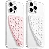
- 【PKYAA Double Sided Silicone Suction Phone Case Mount】PKYAA With Double Sided 40 Strong and Reliable individual suction cups, PKYAA provides a thicken and upgraded universal silicon suction mount for your phone.
- 【Friendly to Content Creators】If you are a content creator or an online influencer, you can create videos anywhere with this suction mount completely hands free with this silicone cell phone mount for cases.
- 【HANDS-FREE & Adhere to Mirrors】This Double Sided silicone suction phone case mount allows you to stick your phone to the mirror easily. No longer holding your phone in one hand to watch video tutorials while making up.
- 【Strong Grip on the Smooth Surface】You can easily hang your phone anywhere with a smooth surface. All you do is you clean off your phone and smooth surface. It is STURDY and it not only sticks to mirrors, it also sticks to windows, it sticks to refrigerators, tiles and other clean, flat surfaces.
- 【Press Down Firmly Every 30 Minutes】Use your palm or fingers to press the phone down firmly and check it's secure before letting go. Apply even pressure for a few seconds to allow the suction cup to adhere properly. To maintain the grip and prevent accidental falls, it's a good practice to periodically reapply pressure to the suction cup.
Mobile visitors see missing forms or widgets
Compare the mobile-specific template with the desktop template and add the missing component through the plugin’s template controls or a compatible widget area. Recheck consent, validation messages, spam protection, and analytics events after the change.
Visitors receive stale PWA pages
Review the service-worker cache strategy and versioning, remove content that should never be cached, and test an update from an old installed copy. Provide an online fallback and a clear recovery path when a cached shell cannot load fresh content.
AMP pages fail validation or lose functionality
Use the validator output to identify the exact component or attribute, then update the template or replace the incompatible integration. Recheck canonical links and analytics after each fix. Do not send all traffic to the AMP path until representative templates pass and rollback is documented.
The plugin breaks after a theme or WordPress update
Reproduce the issue on staging, switch temporarily to a default theme to isolate the conflict, and deactivate plugins one at a time. Restore the last known-good backup if the front end or administration is inaccessible. Record the conflicting versions before contacting support.
Maintenance plan
- Review plugin and WordPress updates on staging first, especially when a menu, theme, cache, service worker, or AMP component changes.
- Run a smoke test after every update: home page, article, search, menu, form, login or account flow, and one representative mobile-only or PWA/AMP URL.
- Recheck accessibility after visual customization; a color or animation change can remove focus visibility or trap keyboard users.
- Monitor 404s, redirect loops, canonical mismatches, JavaScript errors, cache headers, and mobile conversion events.
- Keep a rollback copy and document which plugin owns the menu, mobile template, service worker, and AMP output.
- Remove abandoned experiments. Two overlapping mobile plugins create more failure paths than a single, well-tested solution.
Cost, support, and lock-in
The directory evidence establishes free WordPress.org listings and active installations, but it does not establish current premium-extension prices, support tiers, renewal terms, or affiliate arrangements. Check the plugin’s current listing and vendor terms before budgeting. Include the cost of staging, accessibility review, compatibility work, monitoring, and a possible theme migration—not only the download price.
Consider lock-in before enabling a second presentation or delivery format. Export or document menu structures, icons, manifests, cache exclusions, AMP templates, redirects, and analytics settings so that another developer can remove the plugin without losing navigation or URLs.
Decision guide
| If your answer is… | Start with… | First test |
|---|---|---|
| “The site layout is fine, but the menu is hard to use.” | WP Mobile Menu | One trigger, one drawer, keyboard and touch operation |
| “I need a particular slide-out style and detailed controls.” | WP Responsive Menu | Breakpoints, nested menus, focus, animation, and overlay behavior |
| “The old theme is not usable on a phone.” | WPtouch, alongside a longer-term theme review | Content, forms, analytics, and conversion parity |
| “Visitors should be able to install the site.” | SuperPWA | HTTPS, manifest, install flow, cache scope, and offline fallback |
| “Our publishing or distribution process requires AMP.” | AMP or AMP for WP | Validation, canonical URLs, integrations, and rollback |
| “I want a native-style off-canvas navigation.” | ShiftNav | Scroll lock, focus trap, close controls, and screen-reader labels |
Bottom line
For most responsive WordPress sites, begin with a navigation-only solution and choose WP Mobile Menu for the straightforward path or WP Responsive Menu when the sliding interaction needs extensive customization. Use WPtouch when the theme itself cannot provide a usable mobile layout. Choose SuperPWA for installation and app-like behavior, not as a substitute for responsive design. Choose AMP or AMP for WP only when AMP is a defined publishing requirement and your team can test the additional output path. Whatever you select, deploy it on staging, remove overlapping mobile systems, and verify accessibility, caching, content parity, and rollback before sending mobile visitors to it.
The Tool Desk
Outbyte Driver Updater FREEScan for outdated or missing drivers - takes under a minuteDriver Scan →Outbyte PC Repair FREERepair Windows errors before they cause bigger problemsFix Now →Quick Recap
Product prices and availability are accurate as of the date/time indicated and are subject to change. Any price and availability information displayed on Amazon at the time of purchase will apply.

