
Recommended Free Tools
iTechGuides is reader-supported. When you buy through links on our site, we may earn an affiliate commission. As an Amazon Associate I earn from qualifying purchases. Learn more
Strong videographer websites help a potential client answer three questions quickly: Is this the right kind of work? Can I trust this person or studio? How do I get in touch? These 19 examples offer different ways to answer them, from separating services by role to using project captions, credentials, or a distinctive visual identity.
This is a curated inspiration list, not an objective ranking or a complete census. One source, Framekit, discloses that five sites in its 19-example collection were built by its customers; its selection and observations should be read with that commercial context in mind. The examples below are design cues, not a standardized performance comparison.


What makes a videographer website useful to a client?
A portfolio is more than a reel: it is a presentation and sales tool. Put relevant work where prospective clients can find it, make your services and audience understandable, and give visitors an obvious next step. Sitebuilder Report recommends keeping work within two clicks and including an about page, contact details, social links, and testimonials. Those are practical guidelines, not a formula every portfolio must follow.
Organize the work around the way people hire you. If you work across distinct roles or markets, separate those paths instead of making every visitor sort through one undifferentiated gallery. Give projects enough context to show what they are—such as client, format, role, or collaborators when appropriate—and use a visual style that feels right for the work and intended buyer.
The examples are grouped by the design decision they illustrate, not by a score. The descriptions below draw on the named example guides; websites can change, so treat these as ideas to evaluate rather than guarantees about every current page detail.
Make your services and audience easy to recognize
Rachel Morrison: separate work by role
Framekit highlights Rachel Morrison’s separation of directing and cinematography. That distinction can help a buyer who needs one specific role get to relevant work without guessing which projects demonstrate it.
Philip Bloom: pair a concise position with supporting material
Framekit describes Philip Bloom’s site as using a concise positioning line alongside a blog. The useful lesson is to state what you do plainly, then offer supporting material for visitors who want more context or expertise.
What’s actually slowing this PC down?
Pick the symptom - the matching free tool is one click away.
Sam Kolder: turn a recognizable style into a clear offer
Framekit presents Sam Kolder as an example of packaging a recognizable visual style as a product or service. A distinctive look can be part of the offer, but the site still needs to explain what a client can hire you to deliver.
Brandon Li: route different enquiries separately
Framekit points to separate enquiry routes for different kinds of opportunity on Brandon Li’s site. Distinct contact paths can reduce friction when one portfolio serves more than one type of potential client.
Jason Magbanua: answer buyer questions up front
Framekit notes that Jason Magbanua surfaces rates, FAQs, and wedding playlists. For a wedding-video buyer, practical information and examples of the finished experience can be as useful as a strong showreel.
Here Now Films: lead with the client outcome
Zarla describes Here Now Films’ headline, “The film you’ll be known for,” as an outcome-focused positioning line, alongside visible credentials and client logos. A headline can frame the value of the work; any credentials or logos used as proof should be accurate and authorized.
The Tool Desk
Outbyte Driver Updater FREEFix the driver behind crashes, sound loss and screen glitchesFind Drivers →Outbyte PC Repair FREERepair Windows errors before they cause bigger problemsFix Now →Use project context to make the work legible
Harvest Film Company: caption the work and keep the presentation restrained
Zarla describes Harvest Film Company with a dark, restrained presentation and project captions that identify format and client. Its positioning sentence, as reproduced by Zarla, is “A results-driven, creative-focused, video production company.” Clear captions help a visitor understand what they are seeing instead of asking them to infer the brief from images alone.
Jennie Butler: let a clean grid do the organizing
Sitebuilder Report describes Jennie Butler’s portfolio as using a clean grid and minimal navigation. A simple structure can make a range of work scannable when the projects themselves should take priority.
Joel Santos: make a specialty apparent through the work
Sitebuilder Report characterizes Joel Santos’s portfolio around documentary and travel work. A focused body of projects can signal a specialty without forcing visitors to interpret a broad, mixed gallery.
Feels Digital: show a multidisciplinary studio coherently
Sitebuilder Report describes Feels Digital as spanning photography, video, and animation. When a studio offers several related disciplines, grouping them clearly helps visitors see the breadth without obscuring the video work.
Choose a visual identity that fits the work
Alexandros Maragos: let full-screen imagery carry the first impression
Sitebuilder Report describes full-screen imagery and a restrained palette on Alexandros Maragos’s site. This approach gives visual work prominence, while restrained navigation can keep the presentation from competing with it.
Fiona Ziegler: open with a full-screen video hero
Sitebuilder Report highlights a full-screen video hero for Fiona Ziegler. A moving opening image can establish tone immediately; it should still leave visitors with a clear way to find projects and contact information.
Andrew Cussens: lean into cinematic presentation
Sitebuilder Report describes Andrew Cussens’s site as cinematic. That can reinforce the experience of the work, provided the visual treatment supports rather than slows down discovery.
Johnny Harris: bring a travel-journal sensibility to the portfolio
Sitebuilder Report identifies a travel-journal visual treatment on Johnny Harris’s site. A portfolio’s surrounding presentation can echo the subject matter and storytelling style, making the experience feel more distinctive than a generic grid.
Loved Up Films: make wedding work feel playful
Sitebuilder Report presents Loved Up Films as using a playful wedding-film identity. A warmer, less formal presentation may suit a personal event service better than a corporate production aesthetic.
Best Value
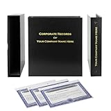
- Complete LLC Record Book – Includes Operating Agreement templates, meeting minutes, and membership ledger.
- Premium 3-Ring Binder & Slipcase – Durable, professional presentation for all your entity records.
- Operating Agreement & Membership Certificates (Numbered 1-20) – Ready-to-use legal forms for quick business organization.
- Customizable Index Tabs- Suited for your Business needs!
- This Product DOES NOT include a Corporate Seal Embosser**
Harvest Film Company: use restraint as a positioning choice
The same example also shows how a dark, minimal treatment can signal a different tone from a playful or highly animated portfolio. Neither style is a universal best practice; the relevant test is whether the design matches the work and the buyer’s expectations.
Independent reader supportYour contribution helps us test, update, and keep practical guides available for everyone.Build credibility beyond the reel
Roger Deakins: connect a portfolio with teaching and authority
Framekit uses Roger Deakins as an example of including teaching and authority as part of a filmmaker’s online presence. For a practitioner whose reputation includes education or industry knowledge, that material can give visitors another useful way to understand the work.
Here Now Films: make credentials visible and substantiated
Alongside its client-outcome headline, Here Now Films is described by Zarla as showing credentials and client logos. Use proof that visitors can verify and that you have permission to display; a row of marks is not a substitute for relevant projects.
Do these 3 things before closing this tab:
1Repair Windows errors before they cause bigger problems2Fix the driver behind crashes, sound loss and screen glitches3Clear out junk files and repair common Windows errorsPhilip Bloom: give interested visitors a deeper route
A supporting blog, as in Framekit’s description of Philip Bloom’s site, can provide context beyond the portfolio itself. It is most useful when it serves the same audience and strengthens the visitor’s understanding of your work.
How to apply these ideas to your own portfolio
- Define the intended buyer. Decide which clients and project types the site should attract. Make that focus apparent in the opening copy and the work you lead with.
- Organize projects by the way clients search. Separate roles, formats, industries, or service lines when those distinctions matter to a buyer. Keep relevant work easy to reach rather than burying it in a long mixed gallery.
- Add useful project labels. Identify the client or project context, format, and your role where appropriate. Credit collaborators when their contribution matters to understanding the work.
- Choose a visual treatment that supports the offer. Full-screen video, a minimal grid, a dark palette, or a playful identity can each work for different audiences. Avoid visual effects that make navigation or viewing the work harder.
- Make trust and contact practical. Include accurate credentials, testimonials, or client names where appropriate, plus a clear enquiry route. If different services attract different enquiries, give each a fitting path.
- Check the experience from a client’s perspective. Can someone find relevant work quickly, understand what you contributed, and see how to contact you? Sitebuilder Report’s two-click suggestion is a useful benchmark, not a strict rule.
What website platform should a videographer use?
The platform is a tool choice; it does not replace decisions about audience, project organization, credibility, and contact. Wix’s vendor-authored guide lists Wix, Wix Studio, Format, Pixpa, and SITE123. Sitebuilder Report’s filmmaker collection identifies Squarespace, WordPress, and Webflow among the platforms used by examples. These lists are not a current feature or price comparison, and platform capabilities can change.
Choose based on the portfolio you need to maintain: how easily you can organize and update projects, present video, and give visitors a reliable contact path. A university portfolio guide recommends embedding video hosted on Vimeo or YouTube, a practical way to present video without making the site itself the only place a visitor can view it. Verify current platform features, pricing, and video-hosting terms before committing.
Finally, the numbers in example collections are editorial counts, not industry statistics: Framekit presents 19 examples, Sitebuilder Report 65, and Zarla 12. They do not establish market performance or how videographers generally build their sites.
Free tools Windows power users keep installed
One-click scans. No signup required.
Quick Recap
Product prices and availability are accurate as of the date/time indicated and are subject to change. Any price and availability information displayed on Amazon at the time of purchase will apply.

