You make a scatter plot in Excel to compare 2 sets of data. Unlike a Line Chart, a scatter plot displays compared values in both X (horizontal) and Y (vertical) axis.
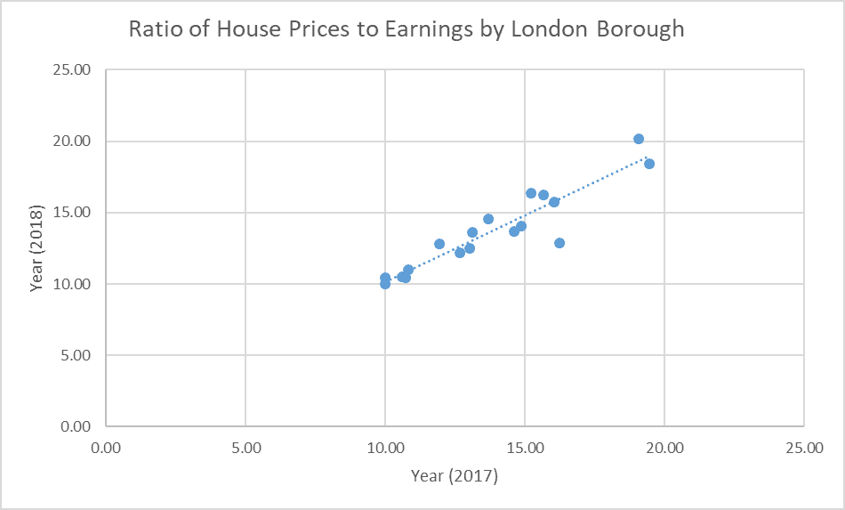
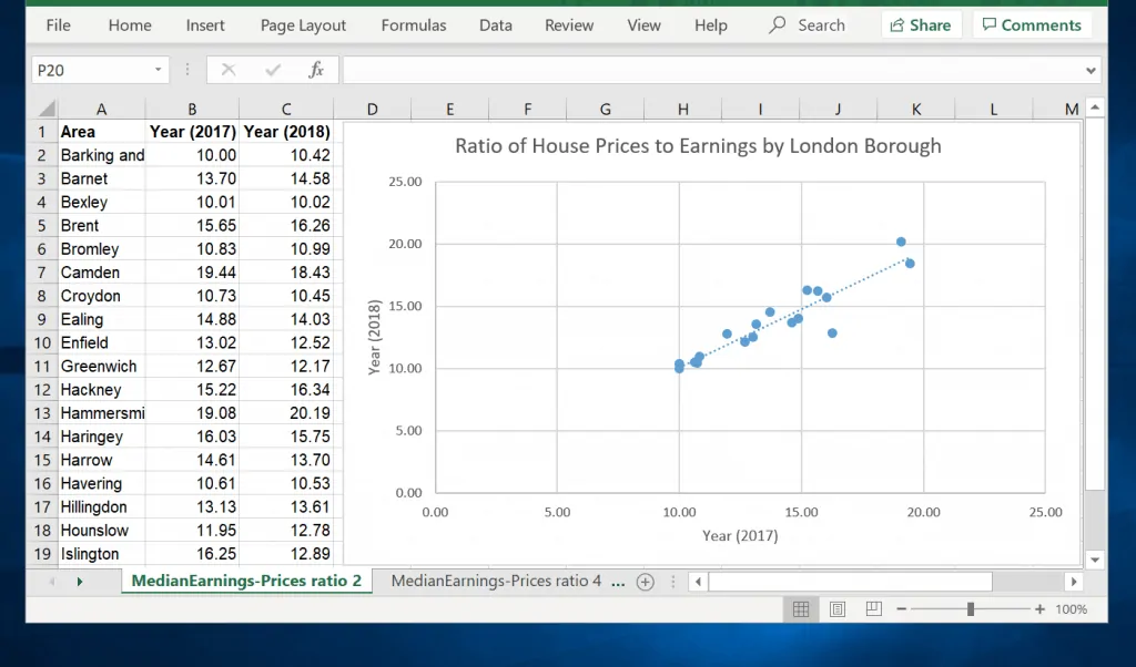
The chart above compares housing affordability index for 2017 and 2018 in some London boroughs. If you look closely, Excel scatter plot plotted the data for 2017 in the horizontal (X axis) and that of 2018 in the vertical (Y axis).
In this guide I will show you how to make a scatter plot like this. The guide also covers how to make scatter plots in Excel with multiple data sets. It concludes with how to edit scatter plots.
Option 1: Make a Scatter Plot with Two Sets of Data
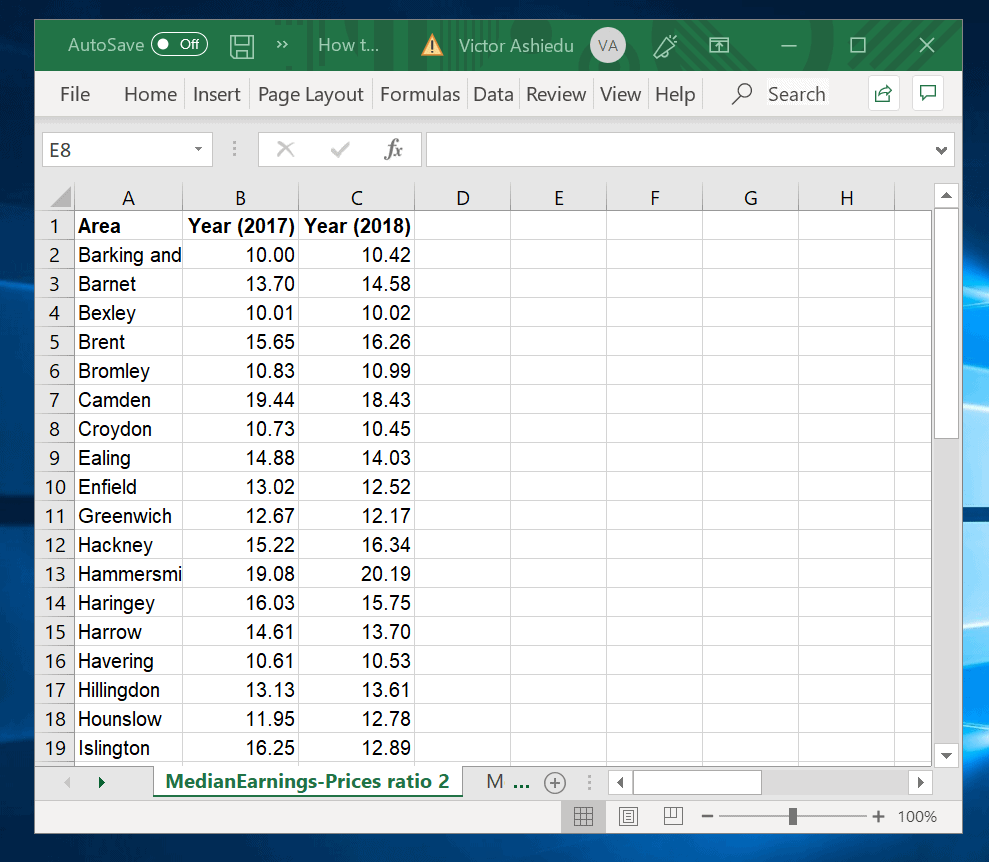
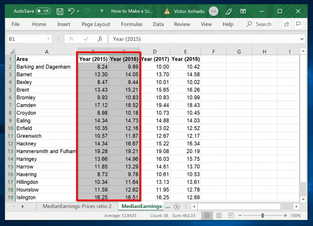
At the minimum you require two data sets to make a scatter plot in Excel. In this guide, I will show you how to make a scatter plot with the data shown above.
Here is how you make a scatter plot in Excel:
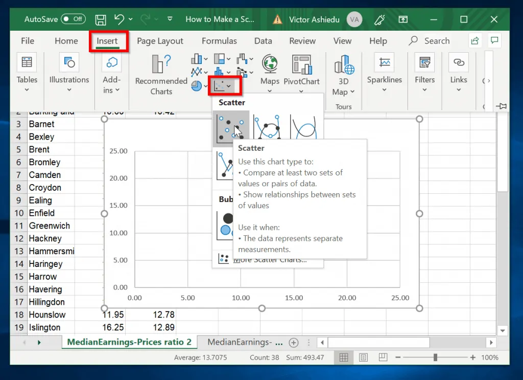
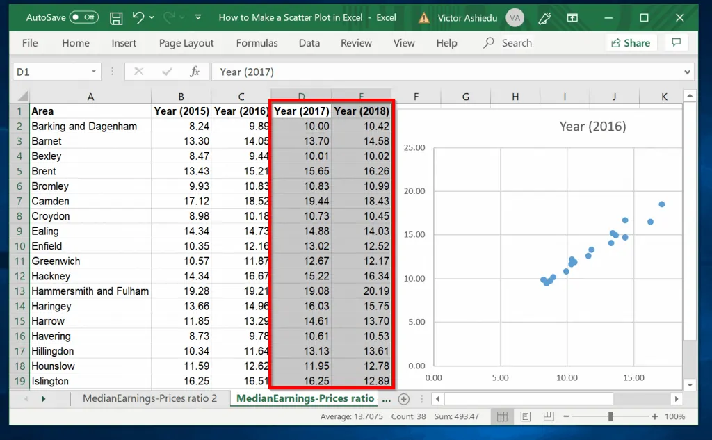
- Select the 2 data sets including their column headers.
When selecting your data, DO NOT include the common data column. In the data shown above, the common data is the Area column.
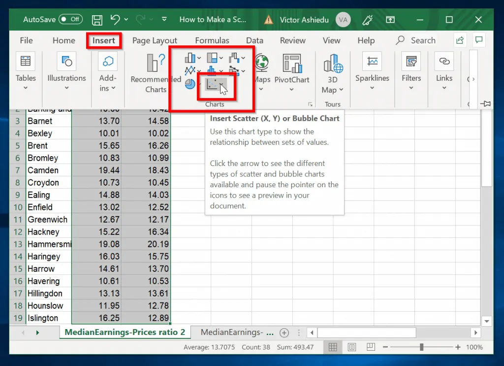
- Next, click Insert tab. Then, on the charts section, click Insert Scatter (X Y) or Bubble Chart.
- Finally, select a scatter chart type. The scatter plot (chart) will display. To make your work neat, drag and drop the chart away from the data (see the second image below).
Option 2: Make a Scatter Plot with Multiple Data Sets
If you wish to make a scatter plot in Excel with more than 2 data sets, it requires additional steps.
Here is how you plot a scatter chart with multiple data sets:
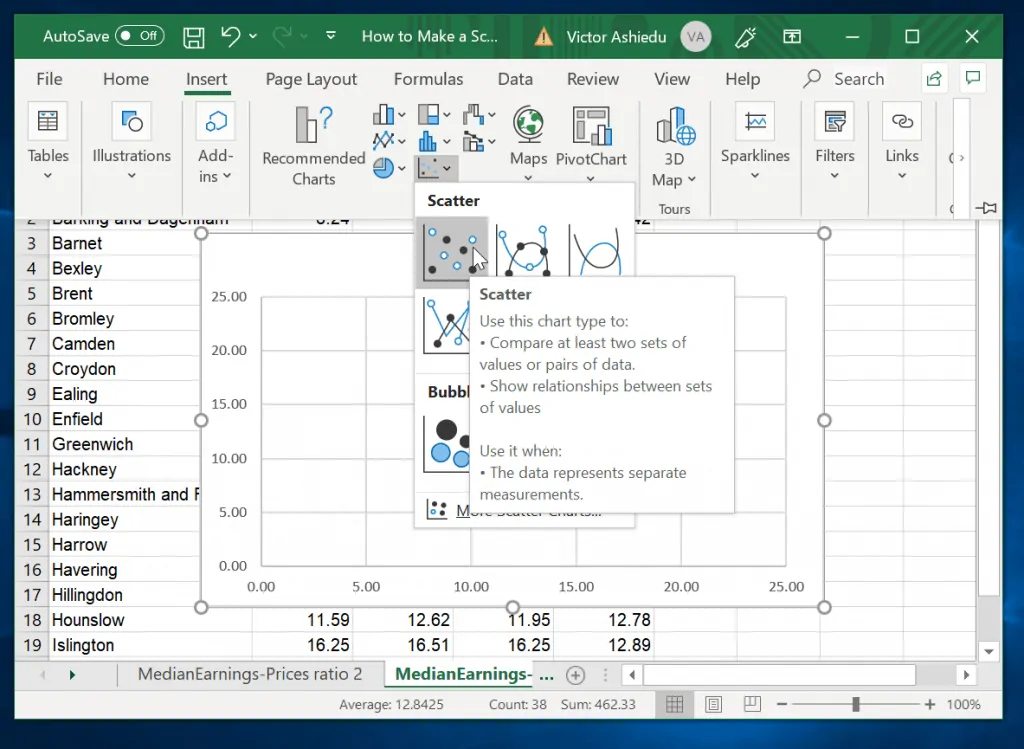
- Select the first 2 data sets you wish to plot, including their column headers.
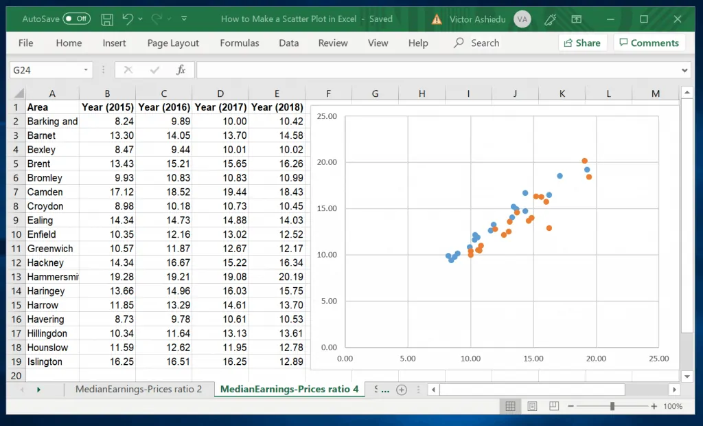
- Next, click Insert tab. Then, on the charts section, click Insert Scatter (X Y) or Bubble Chart. Then select the chart type. The scatter chart will be plotted (Se the second image below).
To add the next data sets to the scatter plot, follow the steps below:
- Select the next sets of data you wish to include into the scatter plot in Excel.
- Next, copy the data (Ctrl + C or right-click, then copy). Click on the chart, then click the Home tab.
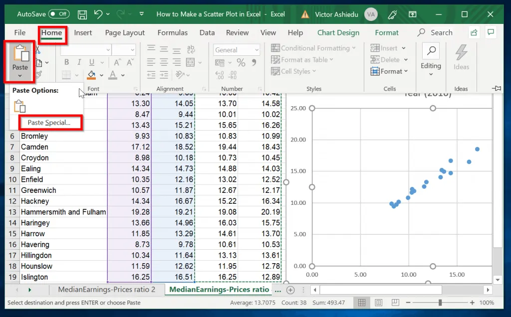
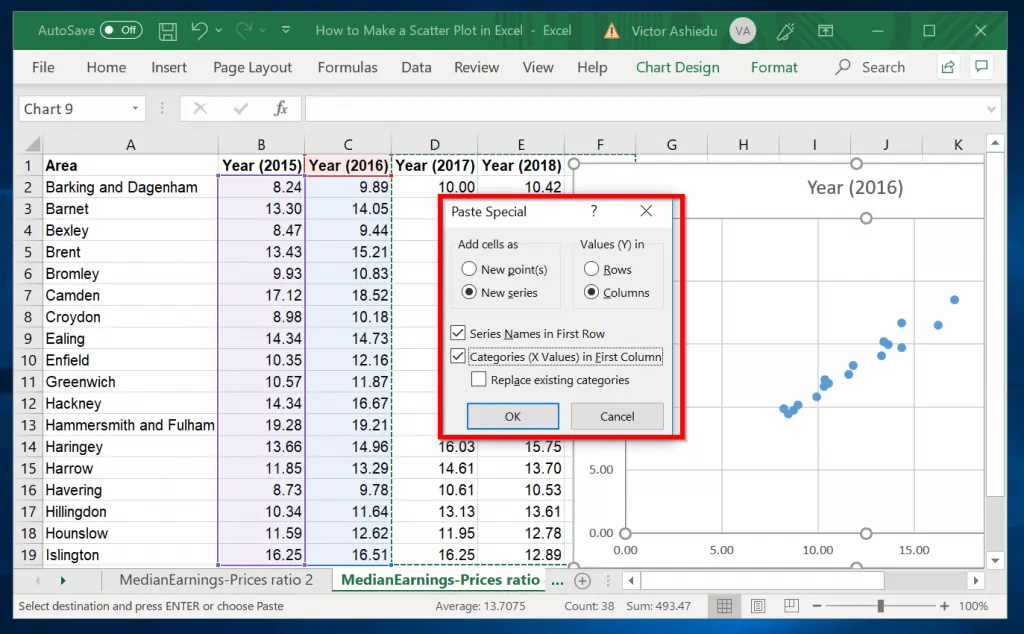
- Next, click the drop-down beneath Paste option and select Paste Special. When the Paste Special option opens, select the options shown in the image below. Then click Ok. The second scatter plot will be displayed (See the second image below).
How to Add Labels to Scatter Plot in Excel
To add data labels to scatter plot in Excel, follow the steps below:
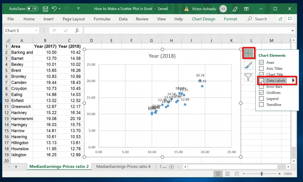
- Click on the chart. Chart Edit options will be displayed on the top right of the scatter plot chart.
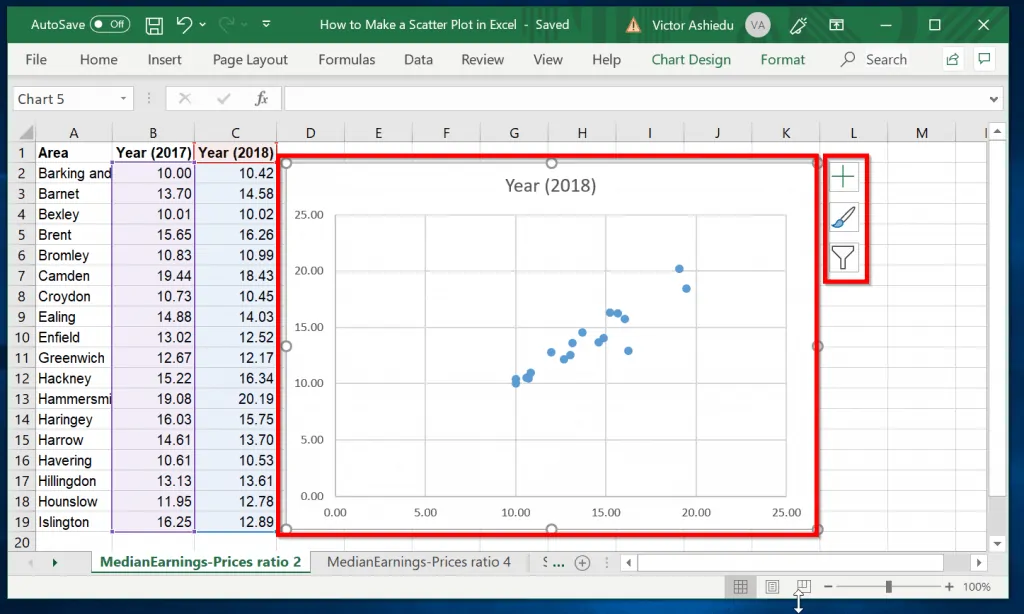
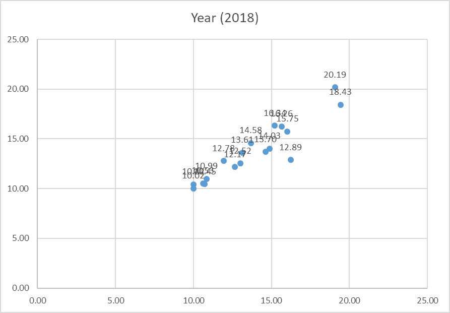
- To add data labels, click the + (plus) sign. Then check the box beside Data labels. Data labels will be displayed on the scatter plot.
How to Edit Scatter Plot in Excel
In the last section of this guide, I will demonstrate how to:
- Add, Remove and Edit scatter plot title
- Add a Trendline, Legend and Axis titles to scatter plot
How to Add, Remove, or Edit Scatter Plot Title
- Click on the chart. Chart Edit options will be displayed on the top right of the scatter plot chart.
- To remove the scatter chart title, click on the + (plus) sign. Then, uncheck the box beside Chart Title. The Chart Title will be removed from the chart.
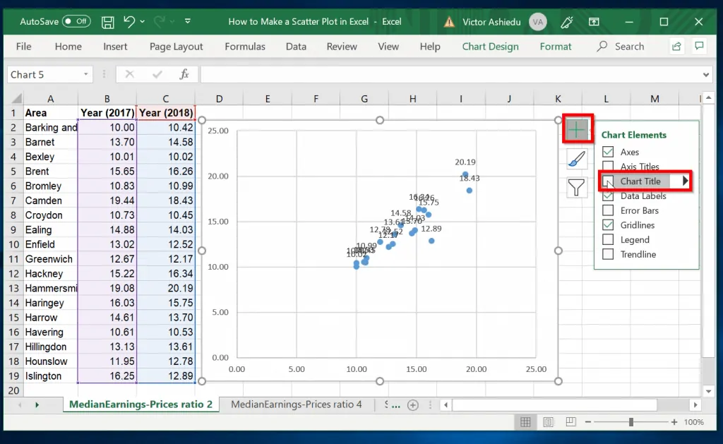
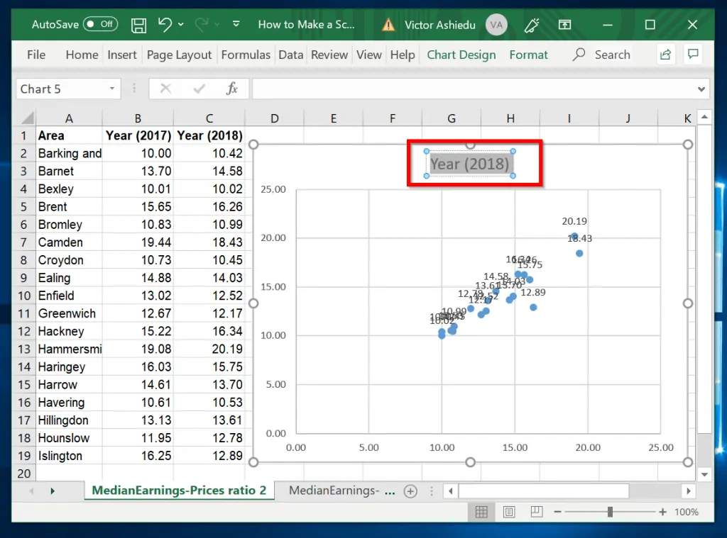
- To rename the chart title, click on the title and change the name.
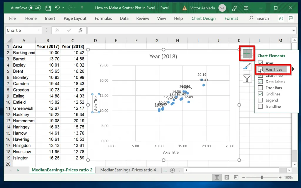
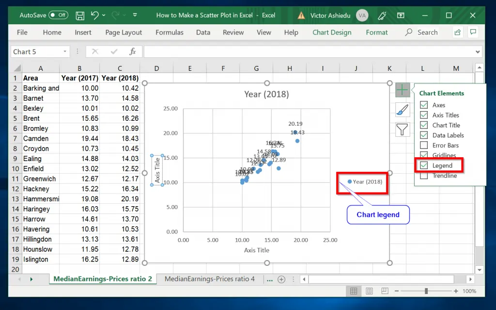
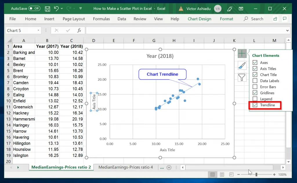
How to Add a Trendline, Legend, or Axis Title to Scatter Plot
- Click on the chart. Chart Edit options will be displayed on the top right of the scatter plot chart.
- Next, click the + sign top right of the chart. To add scatter chart axis titles, check the box beside Axis Titles (First image below). Check the Legend box to display chart legend on the chart (second image). Finally, to display Trendline, check the box beside Trendline.
Conclusion
Making scatter plots in excel is as easy as that! I hope I made your day with this guide.
If you have any questions or comments, use the “Leave a Reply” form at the end of the page.
Alternatively, you could share your experience with Scatter by leaving a comment using the “Leave Reply” form at the bottom of this page.


Hello, is there a way to make a scatterplot diagram with categorical data on both the x and y axis? Thank you.