If you are reading this, you probably realized that having a sidebar on mobile devices is not necessary. This Itechguide teaches you how to hide the sidebar for mobile in WordPress.
Overview
For most WordPress themes, when you add sidebar widgets – primarily intended for larger screens – these sidebar widgets also display on mobile devices.
In the first instance, on a mobile device, a sidebar is no longer a “sidebar” but more of a “bottom bar”. Furthermore, on mobile devices, sidebars display after the main post – defeating the purpose of having them.
Moreover, having unnecessary sidebars on mobile devices may contribute to slow load times on these devices.
However, if your theme does not offer this option, use the steps in this guide to hide the sidebar on mobile devices.
Step 1: Find The Sidebar DIV ID For Your Theme
Hiding sidebar on Mobile devices in WordPress essentially involves modifying the sidebar div with CSS. However, to modify the div with CSS, you need the div ID.
Follow the steps below to find the div ID for the sidebar of the theme you use for your WordPress website:
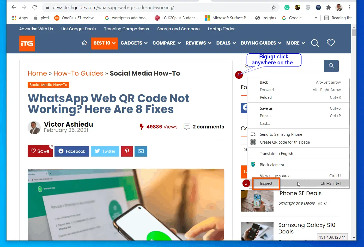
- Open a post or page on Google Chrome or the new Microsoft Edge browser.
- Then, right-click anywhere on the sidebar and select Inspect.
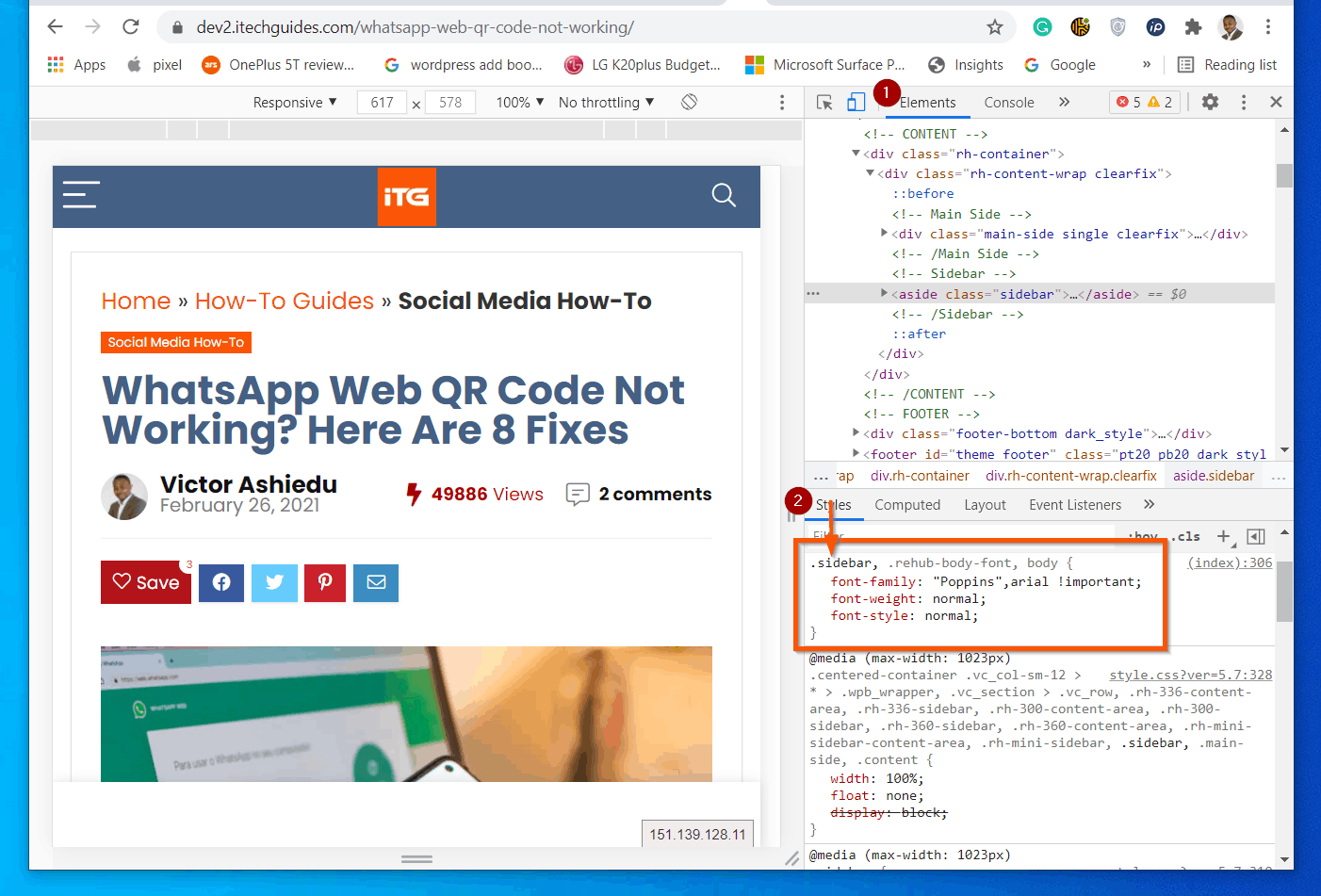
- The Inspect element will open some codes on the right of the page. This has an upper part (labelled 1 in the screenshot below). It also has a lower part (labelled 2 in the screenshot).
On the lower part, the Styles tab will be selected by default. To locate your sidebar div ID, look for an element with the word “sidebar”. Some themes may simply use “sidebar”. Others may use “sidebar-main” or “main-sidebar”.
Step 2: Add this CSS Code to Your Site
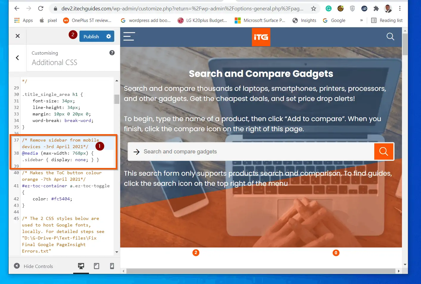
The next step is to add this code to the “Additional CSS” section of your WordPress theme. This is the code that hides sidebars for mobile devices in WordPress.
@media (max-width: 768px)
 .sidebar {
     display: none;
 }
Follow the steps below to add the above CSS code to your theme:
- Sign in to your WordPress site as an administrator.
- Then, on the left pane, hover over Appearance and select Customise.
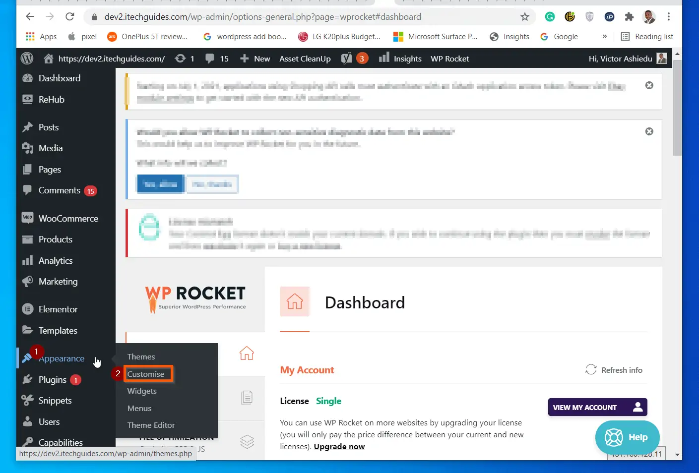
- When the Customise option opens, scroll down and click Additional CSS.
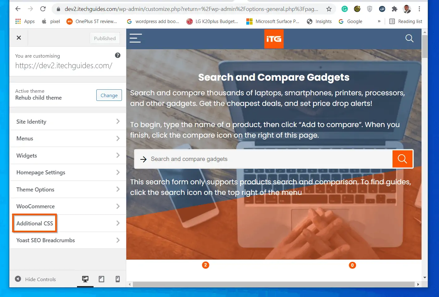
- Finally, copy, paste and amend this code into one of the sections – then, on the top click Publish.
@media (max-width: 768px)
 .sidebar {
     display: none;
}/* Remove sidebar from mobile devices -3rd April 2021*/
Step 3: Clear Cache and Test
To be clear, the last section effectively hid the sidebar for mobile devices in WordPress. However, I decided to add this section because if you use a caching plugin or CDN, you will need to clear the cache for the changes to take effect immediately.
After clearing the cache in the caching plugin and/or CDN, open the website on a mobile device. If the change does not reflect immediately, use Incognito (Chrome) or InPrivate (Microsoft Edge).
Conclusion
I hope you were able to hide sidebar for mobile devices in your WordPress site with the steps in this guide.
I also hope you found the guide helpful and easy to understand? If you found the guide helpful, click Yes to “Was this post Helpful?” below.
You could also offer your feedback with the “Leave a comment” form found at the end of this page.
Finally, for more WordPress guides, visit our WordPress & Websites How-Tos page.
![WordPress Lost Password Redirects to Page Not Found [Fixed]](https://www.itechguides.com/wp-content/uploads/2024/03/WordPress-Lost-Password-Redirects-to-Page-Not-Found-Fixed.webp)


thank you so much its working
The sidebar div “ID” you found (.sidebar) is actually a class, not an ID. That’s why you select it using “.” instead of “#” (“#” is the ID selector). The div you found only has a class, not an ID.
Thanks for the helpful article. It really makes it pretty easy to identify the codes for your sidebar and how you can stop it displaying on mobile.
With all the drive to make websites faster, its strange that there are no default options available in WordPress.
Appreciate your work 🙂
It shouldn’t be a surprise. The code you have in the post for the @media query is not structured right. It IS missing brackets.
Tomasz has it done the RIGHT way.
Plus, using CSS to hide a big chunk of the page is a horrible idea. all the processing for it STILL happens – it’s just never shown to the user in the browser.
Thanks for the feedback.
I had to wrap the sidebar class code in an extra pair of braces to make it work:
@media (max-width: 768px) {
.sidebar {
display: none;
}
}
It is a bit strange that you needed to include the extra braces. However, I am glad you made it work for you and thanks for staring!